About
Randy Krum
President of InfoNewt.
Data Visualization and Infographic Design

Infographic Design

Infographics Design | Presentations
Consulting | Data Visualizations

DFW DataViz Meetup

Join the DFW Data Visualization and Infographics Meetup Group if you're in the Dallas/Fort Worth area!

Search the Cool Infographics site

Custom Search

Subscriptions:


Feedburner

The Cool Infographics® Gallery:

How to add the
Cool Infographics button to your:

Cool Infographics iOS icon

- iPhone
- iPad
- iPod Touch


Read on Flipboard for iPad and iPhone

Featured in the Tech & Science category

Flipboard icon

Twitter Feed
From the Bookstore

Caffeine Poster

The Caffeine Poster infographic

Entries in pollution (15)

Tuesday
Dec082015

The Global Carbon Budget 2015

The Global Carbon Budget 2015 infographic

The Global Carbon Budget 2015 full report and infographic have just been released this week.

You can also download the infographic as a HiRes JPG or PDF

Emissions from fossil fuels and industry grew 0.6% in 2014 and are projected to decline by -0.6% in 2015. This marks a break in the rapid emissions growth of 2.4% the previous decade.

The great infographic was designed by Nigel Hawtin working with Owen Gaffney at the Future Earth Media Lab for the Global Carbon Project. 

Designers can learn from Nigel's careful use of color to clearly highlight the stories in the data, and use of black and gray for all of the reference data. Clear Creative Commons license, and each section can be broken apart to easily post on Twitter and in social media.

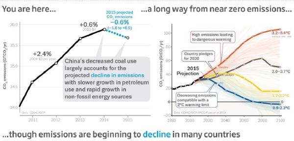
Because the infographic will be shared as a stand-alone piece on the Internet (without the full report or surrounding text) it's missing the URL to the full report. The URL text should be included in the actual infographic JPG image so readers can find their way back to the original full-size version on the publisher's site.

Thursday
Nov192015

Go Green to Breathe Clean

Go Green to Breathe Clean infographic

Go Green to Breathe Clean infographic designed by GridSpace at HypothesisGroup proposes a way to solve "sick building syndrome" by adding plants to a room.

Indoor pollutants are found in the office and at home. They can cause a wide variety of serious respiratory and central nervous system problems. What to do? Plants have the answer with natural pollutant-fighting power. Which plants work the best to remove pollutants, and which pollutants are the most dangerous? Infographic content and design by GridSpace at HypothesisGroup. Follow on Instagram @hypothesisgroup. www.hypothesisgroup.com

The infographic is portrayed in a linear and simple way. It's in an easy to read but stylized font, and doesn't use any intense colors to distract the viewer. You can follow the information down the page without getting bored or distracted. 

It has an ideal amount of content. The creators chose to target only 5 common air pollutants that cause health risks, and then recommended 8 plants. Even with this amount of information they are still able to help the reader pick the ideal plant for their needs and environment. By using the circular graph, it's different and the reader can compare the similarities and differences between the plants rather quickly and easily.

It's interesting that they used LinkedIN's SlideShare as the platform to publish the original infographic and then embedded into their own blog post

Thanks to Majorie for sending in the link!

Tuesday
May082012

Client Infographic: Most Polluted Cities 2012

Most polluted cities 2012 American Lung Association State of the Air

Every year the American Lung Association releases a new State of the Air Report sharing their test results of air pollution across the U.S.  This year, InfoNewt is working with them to release a series of infographic designs based on the 2012 report starting with the Most Polluted Cities in the United States 2012.

Air pollution remains a serious threat to our health.

For 13 years, the American Lung Association has analyzed data from state air quality monitors to compile the State of the Air report. The more you learn about the air you breathe, the more you can protect your health and take steps to make our air cleaner and healthier. Here’s what we learned about air pollution from 2008–2010, the best, most recent data. 

InfoNewt, with designer Jeremy Yingling, helped the American Lung Association look through their data to pull out one clear story to use in the infographic design.  The three-part story starts with an introduction to the problem (what is air pollution and how is it measured), the main visual shows the testing results from the three different types of air pollution on the map of the U.S. and ends with a call-to-action with what readers can do with this information.

The full 179-page report is available online here, but a big report with tables of data doesn’t convey a clear, understandable message to the general public.  The use of an infographic to summarize one part of the report and put the data into context that even kids can understand is a very effective way for the American Lung Association to reach a much broader audience.

There is a lot more information contained in the report, but the key to success here was focusing on visualizing just one story (where is the worst air pollution?) very clearly.

Thanks to the team at the American Lung Association for being great to work with!

Tuesday
Aug092011

Client Infographic: A Solar Innovation Story

Solar Savings: A Solar Innovation Story from ExtraSpace.com is a new infographic by InfoNewt and designer Jeremy Yingling.  This one tells the story of how the company is adding solar panels to the roof space on some of it’s self storage facilities all across the country.  The environmental, financial and community benefits are huge, and this was only the first year of a multi-year plan.

Extra Space Storage is on a mission to produce solar powered clean energy and reduce the carbon footprint of our 850+ self storage facilities. We aim to install 20,000 solar panels this year, and increase the pace of panel installation every year. Energy efficient clean power is good for our customers and our neighborhoods, our planet, and our investors. By the end of 2011 this program will save 2,000 tons of carbon dioxide and 100 acres of fir trees.

An infographic is a fantastic way for Extra Space to tell their story to customers, investors and anyone interested in alternative energy solutions.  It puts their efforts into context and shows the potential of how large their cumulative environmental impact could become.

You can follow Extra Space Storage on Facebook and Twitter (@extraspace)

Monday
May042009

50 Cars or 1 Bus? Infographic Advertising!

Great visual ad by Flygbussarna in Sweden!  Combining a physical construction of a bus made out of cars on the side of the road, a live webcam, and live infographic information on the website!

Every day thousands of cars are driven to and from Swedish airports. Every car holds only 1,2 persons on average which is to be compared with the Airport Coach that takes over 50. Needless to say, this makes no sense whatsoever from an environmental standpoint. To highlight this, an enormous bus was built out of 50 cars on the side of the highway to the airport. On the website, a live camera not only shows the installation 24/7 but also analyses the image and tracks each and every car going by. This data is then being used to highlight just how much emission we could save just by going by bus instead.

 Thanks to @yplim on Twitter!


Wednesday
Apr152009

GE: Plug into the Smart Grid


Great interactive infographic website from GE for their Plug Into The Smart Grid ad campaign.  Beautiful graphics, fast, clean interface and all-around good job.  The viewer can change the setting, and see the infographic results change in response.

My son loves the Augmented Reality part!  Not really infographic, but fun.

Friday
Mar062009

Ford's New Green HUD Designs


Ford is working with design firms to develop concepts for a new HUD for its hybrid and future all-electric cars.  Here's the article from BusinessWeek.

Found on Twitter from Mitul69

Monday
Feb092009

"The Graph" - The Future of Solar Power


Known as "The Graph" in scientific circles, this chart projects the future of solar power.  It was highlighted in a Fast Company article in December 2008.
The Graph was created by a scientific organization that counsels the German government, but it has since become a prized piece of propaganda, embedded in glossy brochures and PowerPoint presentations by solar companies from California to gray-skied Saxony. At the left-hand, present-tense end of the scale, solar power is a microscopic pencil line of gold against the thick, dark bands of oil and natural gas and coal, an accurate representation of the 0.04% of the world's electricity produced by solar power as of 2006. The band grows slowly thicker for 20 years or so, and then around 2040 a dramatic inversion occurs. The mountain-peak lines indicating the various fossil fuels all fall steeply away, leaving a widening maw of golden light as solar power expands to fill the space. By 2060, solar power is the largest single band, and by 2100 it is by far the majority share.

Thursday
Oct092008

Watercube, The Book


Watercube, is a new book by Ethel Baraona Pohl.  The book is about the National Aquatics Centre built in Beijing for the 2008 Olympics, and has some cool infographics inside.  Some of the graphics were contributed by architect César Reyes Nájera.  A review of the book can be found here on www.v2com.biz
WATERCUBE: The Book is a complete monographic publication about the National Swimming Center for the Beijing Olympics 2008. With an exhaustive description about the Watercube we present a detailed study of the project. The book makes an holistic approach to the project that starts with a brief description of urban and social changes that China has been experienced in the last decade. These facts have encouraged the construction boom that made possible these kind of projects occur in cities like Beijing.

 
This page compared the amount of steel used to built the Watercube to some of the most well known buildings around the world.
This page shows a comparison to the same set of buildings around the world, but shows the tons of CO2 produced due to the steel used in their construction.


This page is one of the years of the timeline leading up to the construction of the Watercube.

Here you can buy Watercube, by Ethel Baraona Pohl, on Amazon.com.

Special thanks to Ethel for sharing the images from her book, and allowing me to post them on Cool Infographics!

Friday
Sep262008

The Rush to Wind Farms!


The rush to wind farming is an interesting article in The Atlantic.  With Federal subsidies, its almost like a land rush.  The planned expansion of wind farm sites is impressive.

Thanks for sending in the link Garrett (also posted on Capturing Ephemera)!