About
Randy Krum
President of InfoNewt.
Data Visualization and Infographic Design

Infographic Design

Infographics Design | Presentations
Consulting | Data Visualizations

DFW DataViz Meetup

Join the DFW Data Visualization and Infographics Meetup Group if you're in the Dallas/Fort Worth area!

Search the Cool Infographics site

Custom Search

Subscriptions:


Feedburner

The Cool Infographics® Gallery:

How to add the
Cool Infographics button to your:

Cool Infographics iOS icon

- iPhone
- iPad
- iPod Touch


Read on Flipboard for iPad and iPhone

Featured in the Tech & Science category

Flipboard icon

Twitter Feed
From the Bookstore

Caffeine Poster

The Caffeine Poster infographic

Entries in environment (49)

Tuesday
Oct252016

Earth's Temperature Timeline

A Timeline of Earth's Average Temperature infographic

A Timeline of Earth's Average Temperature is another great data visualization design by Randall Monroe at XKCD.com! Real data and a humorous take on historical events!

A Timeline of Earth's Average Temperature since the last ice age glaciation. When people say "The climate has changed before," these are the kinds of changes they're talking about.

It's a long design on purpose. That's what drives the context of the data so strongly. 22,000 years of small changes and major historical events and then "Oh shoot..."

Found on FlowingData

Friday
Aug262016

Animal Migrations In Motion

Animal Migrations In Motion

Animal Migrations In Motion is a fantastic animated & interactive data visualization of the predicted migration patterns of almost 3,000 species in North and South America as our climate changes.

As climate change alters โ€จhabitats and disrupts ecosystems, where willโ€จ animals move to survive?โ€จ And will human development prevent them from getting there?

This map shows the average direction mammals, birds, and amphibians need to move to track hospitable climates as they shift across the landscape.

Researchers from University of Washington and The Nature Conservancy modeled potential habitat for 2954 species using climate change projections and the climatic needs of each species.

This map was created by Dan Majka, who works for The Nature Conservancy's North America Region science team.

This visualization would not have been possible without the incredible prior work of the hint.fm wind map, cambecc's earth wind map, and Chris Helm's adaptation of cambecc's code.

It's mesmerising to watch! Just like some of the prior designs that inspired this one listed above. It's interactive, so you can move and zoom the part of the map being shown.

The description does leave a few unanswered questions. For instance:

  • What time period is being shown here?
  • What predicted climate changes and assumptions are being used?
  • What species are shown and how were they chosen?

Found on FlowingData!

Tuesday
Dec082015

The Global Carbon Budget 2015

The Global Carbon Budget 2015 infographic

The Global Carbon Budget 2015 full report and infographic have just been released this week.

You can also download the infographic as a HiRes JPG or PDF

Emissions from fossil fuels and industry grew 0.6% in 2014 and are projected to decline by -0.6% in 2015. This marks a break in the rapid emissions growth of 2.4% the previous decade.

The great infographic was designed by Nigel Hawtin working with Owen Gaffney at the Future Earth Media Lab for the Global Carbon Project. 

Designers can learn from Nigel's careful use of color to clearly highlight the stories in the data, and use of black and gray for all of the reference data. Clear Creative Commons license, and each section can be broken apart to easily post on Twitter and in social media.

Because the infographic will be shared as a stand-alone piece on the Internet (without the full report or surrounding text) it's missing the URL to the full report. The URL text should be included in the actual infographic JPG image so readers can find their way back to the original full-size version on the publisher's site.

Thursday
May302013

Water in the Anthropocene

Water in the Anthropocene is a very cool infographic video looking at the different ways we humans are changing the global water cycle.

Water in the Anthropocene is a 3-minute film charting the global impact of humans on the water cycle.

Evidence is growing that our global footprint is now so significant we have driven Earth into a new geological epoch — the Anthropocene.

Human activities such as damming and agriculture are changing the global water cycle in significant ways.

The data visualisation was commissioned by the Global Water Systems Project for a major international conference (Water in the Anthropocene, Bonn, Germany, 21-24 May, 2013). 
conference2013.gwsp.org

The film is part of the first website on the concept of humans as a geological force, anthropocene.info

Thanks to Owen for sending in the link!

Friday
Apr262013

2,000 Years of Continental Climate Changes

2,000 Years of Continental Climate Changes

Climate change is a complicated, and sometimes controversial, global topic.  I really like this data visualization of 2,000 Years of Continental Climate Changes that was included as part of the report published by the “2K Network” of the International Geosphere Biosphere Program (IGBP) Past Global Changes (PAGES) project.

Thirty-year mean temperatures for the seven PAGES 2k continental-scale regions arranged vertically from north to south. Colors indicate the relative temperature. The most prominent feature of nearly all of the regional temperature reconstructions is the long-term cooling, which ended late in the19th century. North America includes a shorter tree-ring-based and a longer pollen-based reconstruction. Modified from: PAGES 2k Consortium, 2013, Continental-scale temperature variability during the past two millennia, Nature Geoscience, DOI:10.1038/NGEO1797.

Each color band represents a 30-year mean temperature found on each continent.  Their choice of data visualization method is very compelling, and visualizes a huge amount of data in a small space.

I also love that a good data visualization can attract attention and build awareness all by itself.

Found on the post by Andrew Revkin on the NY Times Dot Earth blog.

Thursday
Dec062012

MHPM's Infographic CSR (Corporate Sustainability Report)

MHPM's Infographic CSR (Corporate Sustainability Report)

MHPM Project Managers has taken a different approach with the release their first CSR (Corporate Sustainability Report).  Instead of the normal text report that other companies release, MHPM created an infographic poster with all of their sustainability information.  It serves as a great example to their clients of how even CSR data can be designed in an engaging way.

MHPM Project Leaders passed a milestone towards integrating sustainable practices into its business operations today, with the release of its first annual corporate sustainability report.

MHPM’s corporate sustainability report evaluates MHPM’s impact on the environment and the community, its transportation practices and workplace policies. The findings reveal areas for improvement and provide a benchmark against which to measure future performance.

Designed by InfoNewt, this poster was printed at 24” x 36” by MHPM and is also available online on the Corporate Sustainability Report section of their website.  The front side of the post visualizes all of the data, and puts most of it into context by comparing to prior year results.  The back side of the design includes all of the required text, which keeps the front side less cluttered and easy to read.  The entire design is inspired by the Global Reporting Initiative’s guidelines.

This is a fantastic use of infographic design principles!  The full size, high-resolution poster is available as a PDF download from the CSR page.

Tuesday
May082012

Client Infographic: Most Polluted Cities 2012

Most polluted cities 2012 American Lung Association State of the Air

Every year the American Lung Association releases a new State of the Air Report sharing their test results of air pollution across the U.S.  This year, InfoNewt is working with them to release a series of infographic designs based on the 2012 report starting with the Most Polluted Cities in the United States 2012.

Air pollution remains a serious threat to our health.

For 13 years, the American Lung Association has analyzed data from state air quality monitors to compile the State of the Air report. The more you learn about the air you breathe, the more you can protect your health and take steps to make our air cleaner and healthier. Here’s what we learned about air pollution from 2008–2010, the best, most recent data. 

InfoNewt, with designer Jeremy Yingling, helped the American Lung Association look through their data to pull out one clear story to use in the infographic design.  The three-part story starts with an introduction to the problem (what is air pollution and how is it measured), the main visual shows the testing results from the three different types of air pollution on the map of the U.S. and ends with a call-to-action with what readers can do with this information.

The full 179-page report is available online here, but a big report with tables of data doesn’t convey a clear, understandable message to the general public.  The use of an infographic to summarize one part of the report and put the data into context that even kids can understand is a very effective way for the American Lung Association to reach a much broader audience.

There is a lot more information contained in the report, but the key to success here was focusing on visualizing just one story (where is the worst air pollution?) very clearly.

Thanks to the team at the American Lung Association for being great to work with!

Monday
Apr092012

CSR and Sustainability Report: Volvo Shaping the Future of Transport

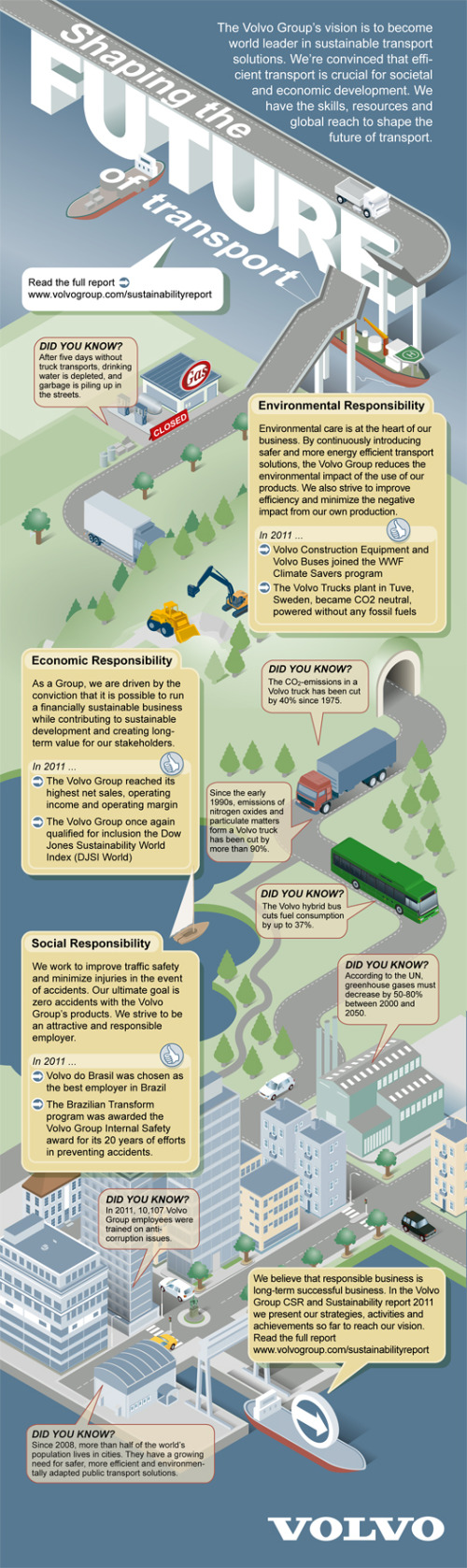
Volvo’s new infographic puts their 2011 CSR (Corporate Social Responsibility) and Sustainability Report into a tidy, easy to read design! Shaping the Future of Transport focuses on Volvo’s environmental, economic, and social responsibility.

All you need to know about the Volvo Group’ CSR and Sustainability Report 2011.

The Volvo Group’s vision is to become world leader in sustainable transport solutions.  We’re convinced that efficient transport is crucial for societal and economic development.  We have the skills, resources and global reach to shape the future of transport.

This is a fantastic use of an infographic as a corporate communication tool.  Volvo is using this infographic as an awareness tool to put their Sustainability Report in front of more readers and broaden the awareness of their efforts.  It’s designed as a top-level overview, and if the reader wants more information, they know how to find the full report.

The illustrations obviously represent the varied forms of transport that Volvo is involved in, and my only criticism is that the design is mostly text.  They list locations, percentages, company historical events and other statistics about Volvo that should all be data visualizations.  At they bottom, they should include the URL to the original landing page, and a copyright statement.

On the original landing page, the whole infographic is a link to their online Sustainability Report front page, but it would have been nice for them to use an HTML Image Map to make the separate statistics and call-outs link to the specific, related web pages in the report.

Thanks to Gustaf for sending in the link!

Friday
Feb102012

What's In Your Trash?

The What’s In Your Trash infographic explores what constitutes trash in America.  From Bolt Insurance, this design breaks down all of the stuff we throw away.

The cleaning services industry brings in more than $50 billion a year, from janitorial services to residential cleaning agencies, and the industry is projected to continue growing. Americans generated more than 250 tons of garbage in 2010. In BOLT’s What’s In Your Trash infographic, find out what is really in your trash and how important cleaning services and janitorial services are. Through recycling and waste incineration, as much as 90% of waste can bypass the landfill! Presented as an infographic (created for BOLT by Infographic World) to help you more easily visualize and retain this important information.

Although there is a lot of text here that could have been visualized (big fonts aren’t a data visualization), I really like the doughnut segments split apart to show different components of the trash.  It helps tell the story and lead the reader through the information top-to-bottom of the design.

Thanks to Jane for sending in the link!

Wednesday
Nov092011

SPAM: More than an Annoyance?

The SPAM: More than an Annoyance? infographic asks the question “Are there actual physical effects of email spam that impact the environment?”  From WebpageFX.com, I like the simple, focused message in this design.

We discovered that a certain amount of Spam emails is actually the equivalent to the level of Green House Gas (GHG) emissions released from driving 3 feet.  Discover how far the number of 2010 spam emails can take you across the world!  You’ll be shocked!  We also highlight the nations most responsible for the furthered adverse impact of Spam’s GHG emissions on our environment.  Our hope is that awareness may create change.  And a great start to doing your part is by personally installing a spam filter on you’re own email account, forwarding spam emails to spam@uce.gov, as well as informing others!

There are a handful of statistics in the infographic that fall into the lazy-designer “large font” style of visualization.  These could have easy been visualized to make the design better.  I do like the shaped clouds to indicate countries and breaking down the different actions related to spam, and relating them to the total carbon footprint.

Although I like the overall design, it is missing some key items.  Data sources?  URL?  WebpageFX’s logo?  License information?

Thanks to Trevin for sending in the link!