About
Randy Krum
President of InfoNewt.
Data Visualization and Infographic Design

Infographic Design

Infographics Design | Presentations
Consulting | Data Visualizations

DFW DataViz Meetup

Join the DFW Data Visualization and Infographics Meetup Group if you're in the Dallas/Fort Worth area!

Search the Cool Infographics site

Custom Search

Subscriptions:


Feedburner

The Cool Infographics® Gallery:

How to add the
Cool Infographics button to your:

Cool Infographics iOS icon

- iPhone
- iPad
- iPod Touch


Read on Flipboard for iPad and iPhone

Featured in the Tech & Science category

Flipboard icon

Twitter Feed
From the Bookstore

Caffeine Poster

The Caffeine Poster infographic

Entries in Television (16)

Monday
Jun042018

The Family Banners of Westeros

The Family Banners of Westerns infographic

The Family Banners of Westeros infographic from UK Feather Flags describes the meaning behind the designs on the flags from the popular HBO television show Game of Thrones.

Here is an excellent infographic that we have designed which takes a look at the meanings of the family banners of Westeros from the amazing television show called Game of Thrones. Learn all about the House Lannister banner, the House Stark banner, the House Targaryen banner and more by checking out this piece.

Thanks to Dave for sending in the infographic!

Wednesday
Oct162013

The Ultimate Loss

The Ultimate Loss infographic

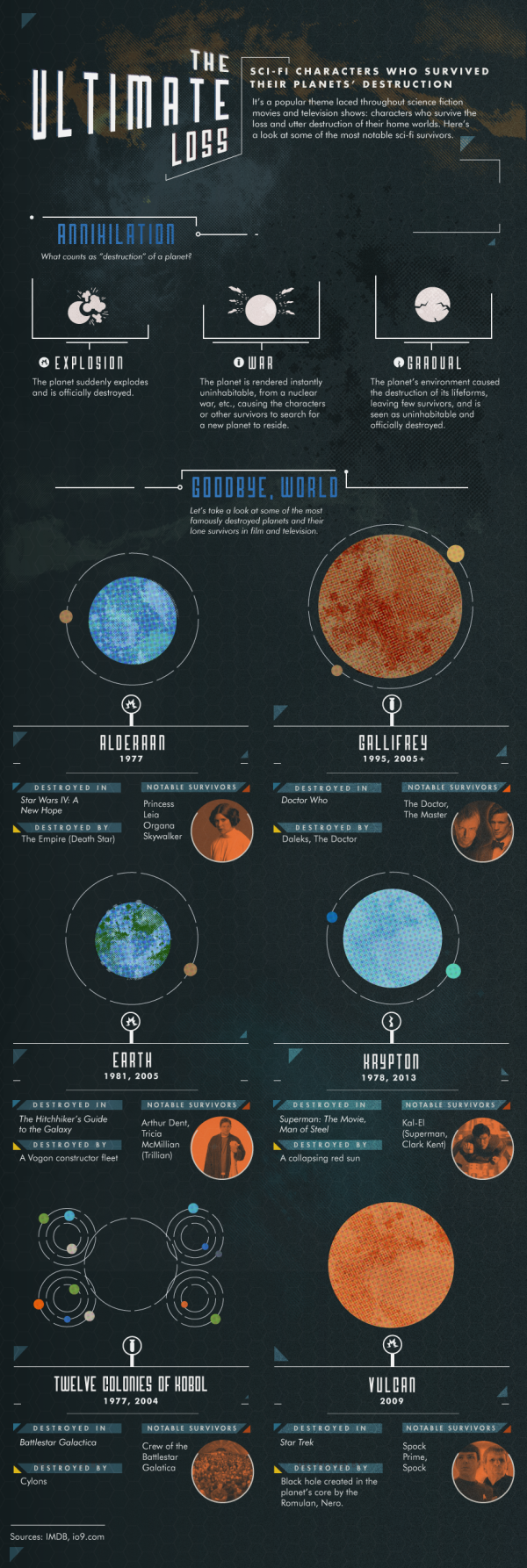
The Ultimate Loss infographic from Confused highlights some of the most famous SciFi characters that are the last survivors of their home worlds destruction.

Sci-Fi characters who survived their planets’ destruction.

It’s a popular theme laced throughout science fiction movies and television shows: characters who survive the loss and utter destruction of their home worlds.  Here’s a look at some of the most notable sci-fi survivors.

Knowing the infographic image will be shared on other sites, this design is missing some crucial information in the footer.  The biggest omission is a mention or logo from the company that published it, Confused.com.  The footer should also include a copyright statement, and the URL to the infographic landing page where readers can find the original full-size version.

Found on visualnews.com

Wednesday
Sep042013

The Guide to Star Trek Uniforms

The Guide to Star Trek Uniforms infographic

The Gude to Star Trek Uniforms infographic from Costume Supercenter. Make sure you know what uniform your wearing!

When the original Star Trek television series started, male and female officers wore similar outfits. The male Star Trek uniforms consisted of black pants, black boots and a velour shirt with the symbol on the left side. Females wore the same type of shirt, with black boots and tights, and a black skirt, although in some cases they wore black pants. The color of shirt worn identified the branch the crew member belonged to. Those in green shirts worked for command personnel, while beige stood for operations, and blue was for medical personnel only. The velour shirts were changed to nylon shirts starting in the third season. You can find many of the Star Trek Costumes here.

Don’t be the red-shirted ensign!

The footer of the design should include the copyright information and the URL to the original infographic landing page so readers can see the full-size infographic.  The Costume Supercenter logo should also be somewhere on the design to connect the infographic to the publishing company.

Found on Visual.ly

Friday
Jun282013

Ba-tee-nga: Sheldon Cooper Presents Fun With Tees

Bah-tee-nga: Sheldon Cooper Presents Fun With Tees infographic

Ba-tee-nga: Sheldon Cooper Presents Fun With Tees infographic from RIPT Apparel shows every t-shirt that Sheldon Cooper from Big Bang Theory wore each episode of every season.

We have all seen The Big Bang Theory, and its awesome cast of nerds. But did you ever wonder about Sheldon’s graphic tees and how many different ones there actually were? This weeks infographic takes a look at the many shirts of Sheldon Cooper titled “Ba-TEE-nga: Sheldon Cooper Presents Fun With Tees”. Much like RIPT Apparel’s graphic tees, this is a mash-up of the famous saying Sheldon made popular; “Bazinga”, coupled with his awesome web show – “Sheldon Cooper Presents Fun With Flags”. The graphic shows all of Sheldon’s shirts from the pilot episode through season 6 episode 7. Yeh that’s a ton of Tees!

An ideal topic for an infographic!  Can you imagine how boring this would have been as a text list in a blog post?!? 

Thanks to Bill for submitting the link via Twitter!  Bazinga!

Tuesday
Mar052013

The History of Prime Time Television

The History of Prime Time Television infographic poster


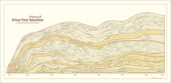
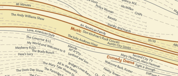
The History of Prime Time Television is a new infographic poster from HistoryShots co-founder and designer Larry Gormley.  Covering 70+ years of television history, the timeline plots out the most important/popular/trendsetting shows grouped by genre.

This graphic charts the history of prime time television from the origins of the industry in 1940s to the present day. More than 550 of the most important, popular, and trendsetting television shows are mapped into more than 20 genres. Shows selected have won critical acclaim according to recognized television critics or have wide audience appeal based on Nielsen ratings and awards won. The number of years each show has been aired is mapped allowing you to quickly see how long each show lasted.

This graphic was created by Larry Gormley. Reebee Garofalo’s Genealogy of Pop/Rock Music was a key inspiration for the design.

Compared to prior designs, it looks like this new project presented the additional challenge of visualizing multi-year television series, which were addressed with extended dotted lines showing the date range for each television show.

The History of Prime Time Television infographic poster

The design is available for purchase as a 41”x20” poster for $39.00 from the HistoryShots site.


Monday
Feb252013

The Social Grammys

The Social Grammys infographic

I missed posting this before the actual Grammys, but I really like the design.  The Social Grammys from Activ8Social looks at the online stats of the biggest names in music.

What is the only thing that could be more exciting than this year’s Grammy Awards? An infographic about the Grammy Awards, of course! Before we see them rock the red carpet, we wanted to see how the biggest names in music size up against each other in terms of their social reach.

To find out who would win the “Social Grammys,” we analyzed the Facebook, Twitter, Instagram, and YouTube accounts of the nominees for the Best New ArtistSong of the YearRecord of the Year, and Album of the Year. There’s no question that the nominees all have a substantial and influential online presence but some are shockingly stronger in some areas than others. One surprising statistic is “Thinking About You” artist, Frank Ocean, has over 1 million more followers on Twitter than he has fans on Facebook. Another interesting statistic is the fact that only 42% of the nominees have Instagram accounts.

I thought the photos of the artists shown through the grids of squares representing the number of YouTube subscribers was really clever and well done.  

Wednesday
Feb062013

The History of Doctor Who Companions

The History of Doctor Who Companions infographic

The History of Doctor Who Companions infographic from mirror.co.uk gives us a guide to all the companions that Doctor Who has travelled with and a sneak peak on the newest one.  Along with the names and photos come statistics of gender, species, and who is the worst and the best companions.

It’s goodbye Amy Pond after Karen Gillan left in a tear-jerking mid-season finale, The Angels Take Manhattan. You can read our review here.

But how will Amy be remembered in the pantheon of best and worst Doctor Who companions? Did she hit the lofty heights of a Rose Tyler or a Leela? Or sink to the lowly lows of Ace and - Time Lords preserve us - Bonnie Langford as Mel Bush?

Take a look at the amazing infographic below and make up your own minds while learning all there is to know about the Doctor’s Tardis co-travelers…

I’m generally opposed to using photos in an infographic design because their full-color nature add a lot of visual complexity to a design.  In this case, photos work better than illustrations by making the different characters easily recognizable.

Thanks to Chris for sending in the link!

Wednesday
Dec262012

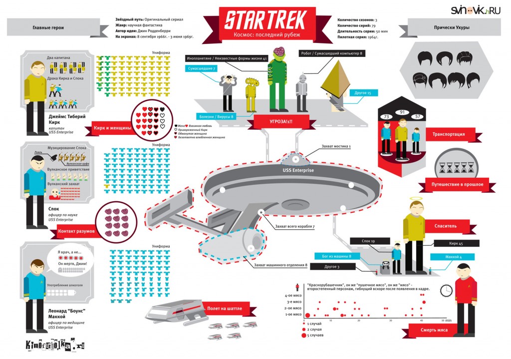
Star Trek: The Original Series

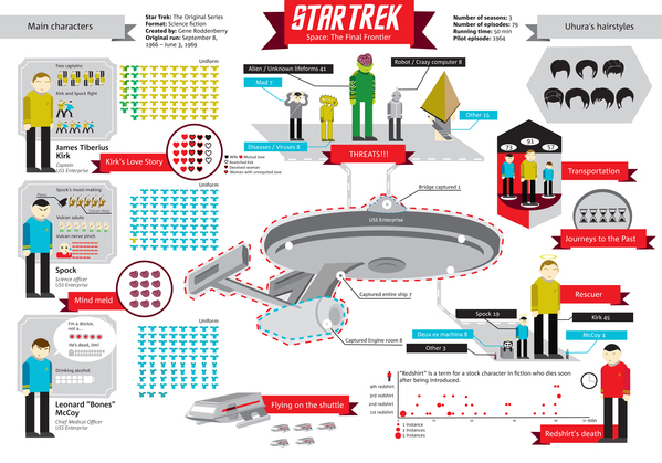
The Star Trek infographic designed by Natalya Platonova was originally designed in Russian for Svinovik.ru. This infographic is a visual overview of some quirky statistics from the complete original series (three seasons).

Overall, very well done!  As a Trekkie myself, the visualizations are fun facts about the series, and well designed.  I like that the quantitative values (like the uniforms worn) are shown as the actual numbers and not scaled. 

A couple of framing pieces of information would have been helpful.  The original design is published along with a text article, but some introductory text in the infographic itself would be nice because the image file gets shared without any of the text from the article.  The fotter should include some type of copyright or Creative Commons license and the URL for readers to be able to find the original, full-size versions.

Here’s the original version in Russian:

Found on Visual Loop!

Tuesday
Nov272012

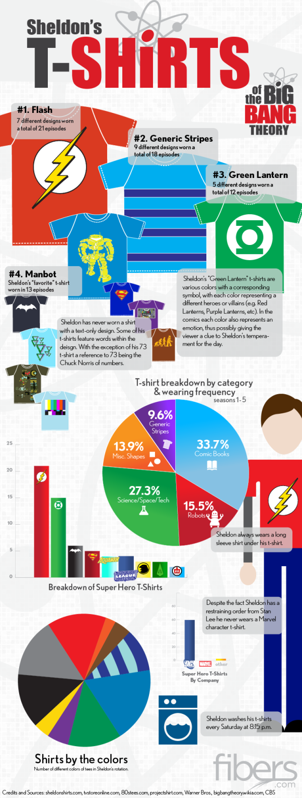
Sheldon's T-Shirts of The Big Bang Theory

Sheldon's T-Shirts of The Big Bang Theory infographic

If you have seen the comedy show The Big Bang Theory, then you know Sheldon…. If you haven’t seen it, go watch it and get back to us.  Have you ever noticed his wardrobe?  The Sheldon’s T-Shirts infographic from fibers.com tells you his favorite shirts, how often he wears his shirts, and even what colors he wears the most! 

Graphs, Charts and illustrated T-Shirts with correlating sizes to wearing frequency - would there be any other way to visualize Sheldon Cooper’s t-shirt collection from The Big Bang Theory? We think not.

Big thanks to Sheldon’s Shirts where we got most of the data for this graphic. You can find a lot of Sheldon’s Shirts for purchase on the following websites:

This is just a fun infographic that uses some data visualization to appeal to fans of the show.  Good design using publicly available data that has been complied in an engaging way.

The charts actually very well done.  Charts are color-coded to match the data.  Icons are included on the bars or in the pie slices, so no chart legends are needed.  This makes the data faster and easier to understand.

Found on Fibers.com

Friday
Oct052012

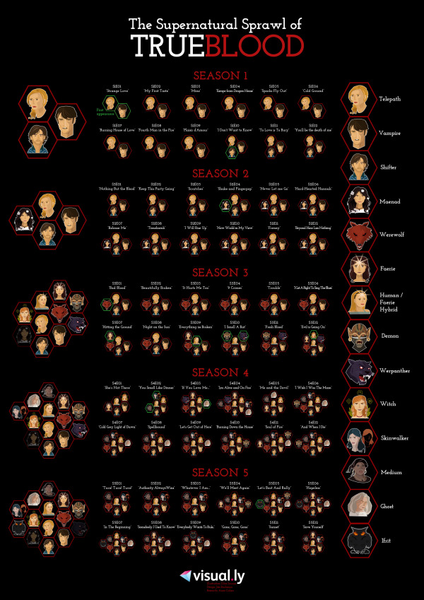
The Supernatural Sprawl of True Blood

the supernatural sprawl of true blood infographic

The HBO phenomenon that captured our attention it’s first season has become hard to follow. The Supernatural Sprawl of True Blood infographic created by Jess Bachman from visual.ly breaks down the types of characters that have appeared so far in each season and each episode.

TrueBlood started as a show about the relationship between humans and vampires. But over the course of five seasons, the list of supernatural creatures has been steadily expanding. Love it or hate it, there are a lot of supes — and keeping track of them all is becoming increasingly complex. This infographic should help you sort it all out.

The design does a good job of using unique, recognizable illustrations for each type of creature, and then grouping them together for each episode.  It’s also very obvious that the episodes have consistently gotten more complicated as the show progressed.

Credit for the illustrations goes to Ilias Sounas, and thanks to Jess for sending in the link!