About
Randy Krum
President of InfoNewt.
Data Visualization and Infographic Design

Infographic Design

Infographics Design | Presentations
Consulting | Data Visualizations

DFW DataViz Meetup

Join the DFW Data Visualization and Infographics Meetup Group if you're in the Dallas/Fort Worth area!

Search the Cool Infographics site

Custom Search

Subscriptions:


Feedburner

The Cool Infographics® Gallery:

How to add the
Cool Infographics button to your:

Cool Infographics iOS icon

- iPhone
- iPad
- iPod Touch


Read on Flipboard for iPad and iPhone

Featured in the Tech & Science category

Flipboard icon

Twitter Feed
From the Bookstore

Caffeine Poster

The Caffeine Poster infographic

Entries in SciFi (8)

Wednesday
Mar072018

Which Sci-Fi Movie Should I Watch?

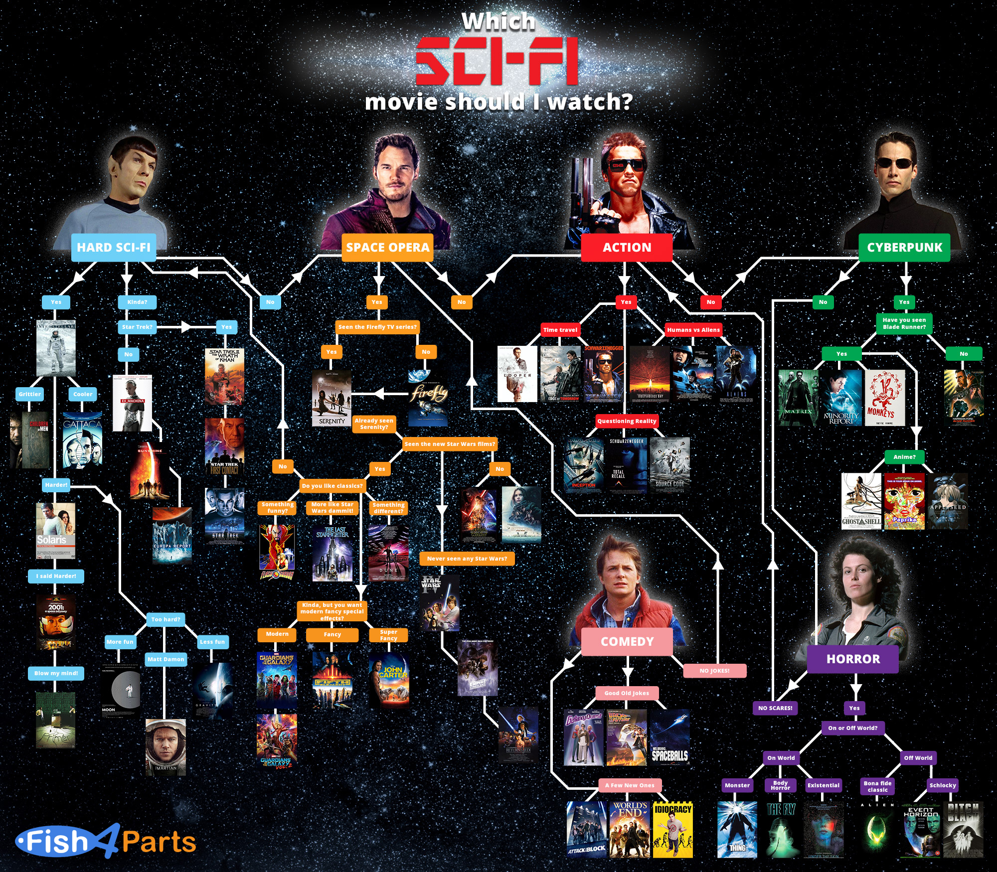
Which Sci-Fi Movie Should I Watch flow chart

Which Sci-Fi Movie Should I Watch flow chart from Fish 4 Parts is a reccomendation of a Sci-Fi films based on your genre of choice. 

If you’re wondering which film to watch tonight or this weekend, there’s a few we’d like to recommend. According to your taste, of course! We’ve focused on the best of Sci-Fi. If you fancy some Sci-Fi horror, comedy, action or something a bit different, but don’t know what to watch, take a look at this graphic!

Thanks to Dave for sending in the link!


Tuesday
Jun062017

The Sci-Fi Timeline

The Sci-Fi Timeline

The Sci-fi genre contains some fantastic and horrifying ideas about the future, but how far away are they? The Sci-Fi Timeline created by Glow places classic sci-fi movies and games on a very long timeline.

We're all used to seeing movies and games set in the future, but often the date can seem a bit abstract.

We've brought together some of our favourites to show yo the timeline and where they all fit. There were some surprises!

See for yourself, and decide if the writers got it right!

Thanks to David for the link!

Wednesday
Apr202016

How Much Would Darth Vader's Suit Cost?

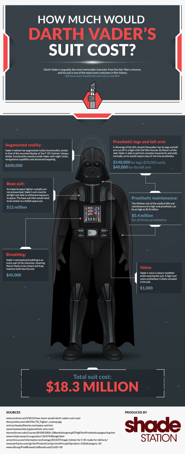
How Much Would Darth Vader's Suit Cost? infographic

How Much Would Darth Vader's Suit Cost? After Shade Station added up all the state of the art equipment like augmented reality in his helmet, his suit being on par with a NASA space suit, as well as all the medical bills from his prosthetic limbs. The total cost was around $18.3 Million! No worries though, the dark side always seems to have enough money to spend.

Darth Vader is arguably the most memorable character from the Star Wars universe, and his suit is one of the most iconic costumes in film history. But how much would that suit cost in real life?

Quick and easy infographic that does a good job of telling one story really well. I would have visualized the different expenses to show show where most of the money goes.

Thanks to Dave for sending in the link! 

Wednesday
Aug132014

50 Years of Visionary Sci-Fi Computer Interfaces

50 Years of Visionary Sci-Fi Computer Interfaces infographic

The 50 Years of Visionary Sci-Fi Computer Interfaces infographics from Glow New Media does a great job of visually showing you how sci-fi movies and tv shows predict we will interact with computers.

Science fiction imagines the future. This amazing infographic brings together 50 years of SciFi in movies and shows us how our imagination leads us into the future of computer interface design. Enjoy!

This infographic isn’t visualizing any data, it’s just showing the visual shots of how we might interface with computers.  So have already happened, like mobile devices from Quantum Leap, and others are still very speculative, like Tron’s Human Computer Convergence.

Thanks to David for sending in the link!

Monday
Jun302014

The Periodic Table of Fictional Minerals

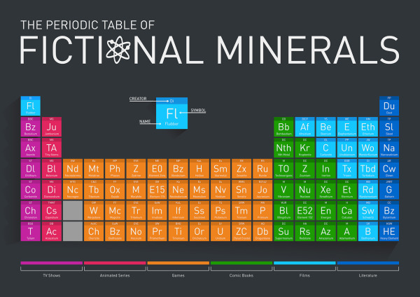
The Periodic Table of Fictional Minerals infographic

Periodic tables are always helpful whether your in chemistry class, or reading an infographic that uses the idea! The Periodic Table of Fictional Minerals infographic from Buy Metal Online is about the many different fictional materials made up for tv shows, animated series, games, comic books, films, and literature.

This infographic we have made is a periodic table of metals, minerals and other elements that don’t exist, except in popular culture (notably films, TV shows, animated series, games, comic books and literature). The table is a fun play on the real-life periodic table and demonstrates just how many fictional elements there are.

Infographic images need to be able to be shared on their own, so the design should include the publisher’s logo, a copyright and the uRL to the original infographic landing page.

Thanks to David for sending in the link! 

Wednesday
Oct162013

The Ultimate Loss

The Ultimate Loss infographic

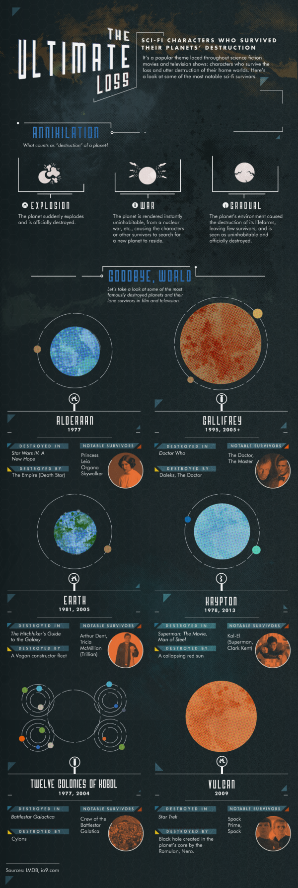
The Ultimate Loss infographic from Confused highlights some of the most famous SciFi characters that are the last survivors of their home worlds destruction.

Sci-Fi characters who survived their planets’ destruction.

It’s a popular theme laced throughout science fiction movies and television shows: characters who survive the loss and utter destruction of their home worlds.  Here’s a look at some of the most notable sci-fi survivors.

Knowing the infographic image will be shared on other sites, this design is missing some crucial information in the footer.  The biggest omission is a mention or logo from the company that published it, Confused.com.  The footer should also include a copyright statement, and the URL to the infographic landing page where readers can find the original full-size version.

Found on visualnews.com

Friday
Sep272013

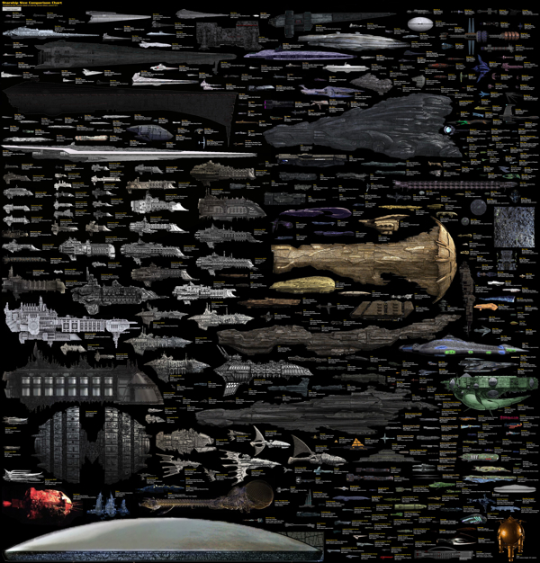
SciFi Starship Comparison Chart

SciFi Starship Comparison Chart infographic

This is a massive Starship Size Comparison Chart, created by designer Dirk Loechel and posted on DeviantArt.

The design gathers ships from many different science fiction movies, tv shows and games, and sizes them down to a common scale so viewers can grasp the relative size of how large and small the ships they recognize are.

As this get shared heavily online, it would be nice to have the URL back to the original, full-size version included in the design.

I love this size comparison design!  The subtitle mentions that Dirk's design is "based on the work of others"  A much smaller Starship Size Comparison Chart was one of the first posts on Cool Infographics back in July of 2007, and that version is no longer available online.

Thanks to Mary Kaye for sending me the link!

Monday
Jul012013

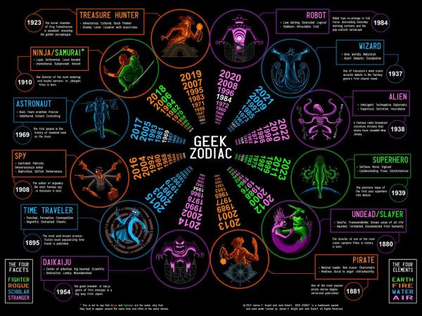
The Geek Zodiac

The Geek Zodiac infographic poster

Very cool poster of the 12 aspects of geekdom.  The Geek Zodiac was designed by James Wright & Joshua G. Eckert from the GeekZodiac.com.  

Soon to be available as a poster on The Geek Zodiac Store.

I was able to find the poster image on the Doctor Who and the T.A.R.D.I.S. feed on Facebook, but not on the GeekZodiac.com site.