About
Randy Krum
President of InfoNewt.
Data Visualization and Infographic Design

Infographic Design

Infographics Design | Presentations
Consulting | Data Visualizations

DFW DataViz Meetup

Join the DFW Data Visualization and Infographics Meetup Group if you're in the Dallas/Fort Worth area!

Search the Cool Infographics site

Custom Search

Subscriptions:


Feedburner

The Cool Infographics® Gallery:

How to add the
Cool Infographics button to your:

Cool Infographics iOS icon

- iPhone
- iPad
- iPod Touch


Read on Flipboard for iPad and iPhone

Featured in the Tech & Science category

Flipboard icon

Twitter Feed
From the Bookstore

Caffeine Poster

The Caffeine Poster infographic

Entries in Star Wars (8)

Tuesday
May242016

Massive Infographic of Star Wars A New Hope

Star Wars A New Hope Infographic

This is a massive infographic depicting the entire story of Star Wars IV: A New Hope. Printed it measures 123m long (over 400ft). Online this infographic is 1,024 pixels wide by 465,152 pixels long! Designed by illustrator and graphic novelist Martin Panchaud, it was designed in Adobe Illustrator CC.

SWANH.NET is an adaptation of Star Wars Episode IV in a style that was inspired by infographics. One story in one piece of 123 meters length.

It was created with Adobe Illustrator CC in 2016. Its exact measures are: 1024 x 465152 px / 27 x 12307 cm / 10.6 x 4845.3-inch

This long ribbon reminds the ancient Chinese script rolls that had to be rolled in and rolled out simultaneously in order to be read. I like this stretch between ages, cultures, and technologies.

However, internet likes short stories and summaries, quickly understandable contents. With my work I aimed to create a contrast to that.

These are only a few small pieces. You go immediately to the SWANH site to view the entire, fantastic infographic!


Martin also posted a number of great images as a Making Of feature to show the development process of the infographic.

Wednesday
Apr202016

How Much Would Darth Vader's Suit Cost?

How Much Would Darth Vader's Suit Cost? infographic

How Much Would Darth Vader's Suit Cost? After Shade Station added up all the state of the art equipment like augmented reality in his helmet, his suit being on par with a NASA space suit, as well as all the medical bills from his prosthetic limbs. The total cost was around $18.3 Million! No worries though, the dark side always seems to have enough money to spend.

Darth Vader is arguably the most memorable character from the Star Wars universe, and his suit is one of the most iconic costumes in film history. But how much would that suit cost in real life?

Quick and easy infographic that does a good job of telling one story really well. I would have visualized the different expenses to show show where most of the money goes.

Thanks to Dave for sending in the link! 

Monday
Feb092015

The Massive SciFi Starship Size Comparison Chart

The Final SciFi Starship Spaceship Size Comparison Chart infographic

The massive SciFi Starship Size Comparison Chart is one of my favorite infographic design projects. Designed by Dirk Loechel and shared on DeviantArt, this is a project he has been working on for years. I posted an earlier version of his design in 2013 here which was hugely popular. Dirk’s notes claim that this may be the last update.

The last update

For real this time: This is the final major content update, though if there are issues I’ll still fix them. I also haven’t forgotten I wanted to vectorize the writing. It’s still on the radar. But content-wise, I think that is about all I can put in. 

Also, I added the ISS. For scale. It’s on top, with a yellow frame so it’s relatively easy to find.

Lots of errors fixed, lots of new ships too. Well, off for now, but I’ll be replying in the comments more or less regularily. 

This is probably at least for the forseseeable future the last round of adding ships. I have pretty much all I wanted now (excepting some old scifi, and many Anime series, which tend to not have many usable images). Lots of new content.

And that’s it for now. Enjoy the new-and-improved chart! 

This is one of the visual designs that clearly demonstrates why visuals can be much more effective than text descriptions. Especially when it comes to comparing size and scale. You just don’t comprehend the scope when someone tells you that the Star Wars Executor Class Super Star Destroyer is 19,000 meters long. You have to see it in comparison to something you already know.

The images on DeviantArt are high enough in resolution, that you can download and print it out as a poster yourself to hang on your wall. The full-size poster resolution is 4,268 x 5,690 pixels. Most of the ships are clustered by franchise (Star Wars, Star Trek, Halo, Eve, Warhammer, etc.). As a reality check, the International Space Station (ISS) is included for reference.

Found on Geyser of Awesome, Nerd Approved and Nerdist

Wednesday
Oct012014

Star Wars Commander

Star Wars Commander infographic

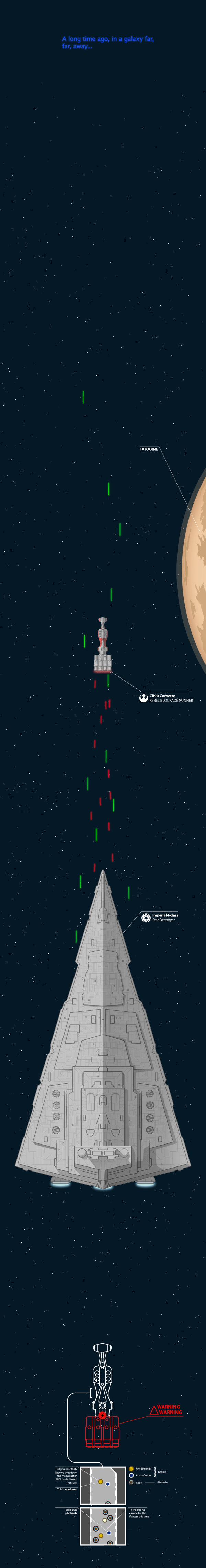
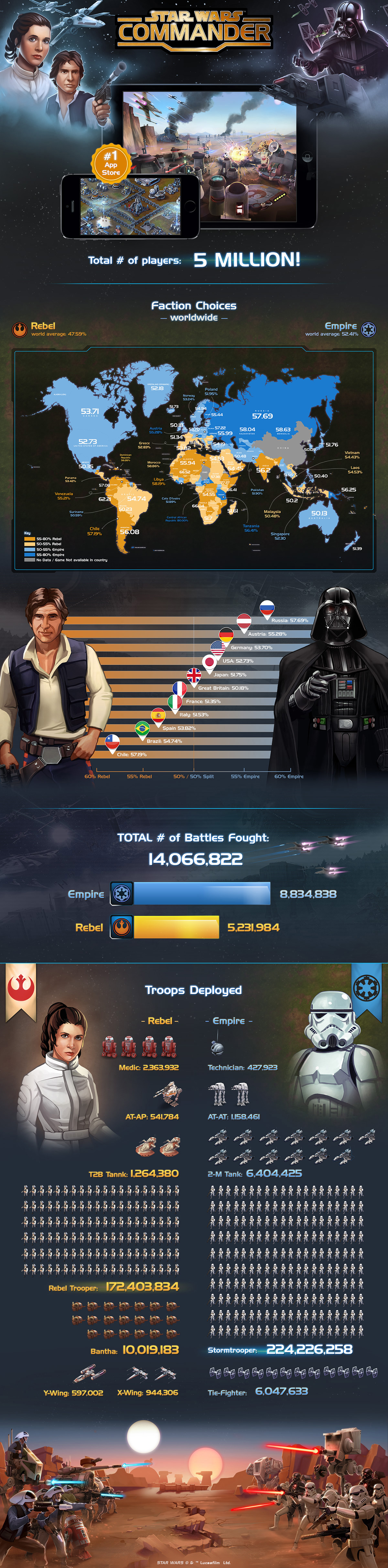
The Star Wars Commander infographic created by Disney Interactive highlights the new mobile game of the Star Wars saga. Since it’s launch on August 21st, 5 million players have chosen a side. May the Force be with you!

This morning we received word that The Empire is holding strong in the Galactic Civil War against Rebel Forces in Star Wars: Commander. Five million players globally are now engaged in the epic battle, with Imperial forces gaining ground quickly. Below is an infographic recovered from Bothan spies that details troop deployment and battle statistics (a high-res version of the image can be found here).

Highlights from the intercept include:

  • Five million players have now joined the war (downloaded Star Wars: Commander since its launch on August 21).
  • With more than 57 percent of its players representing the Empire, Russia is one of the strongest Empire strongholds. Other nations that have fallen to the Emperor include Austria, Germany, Finland and the Ukraine.
  • India stands out as a strong member of the Rebel Alliance, as are most countries across South America and Africa.
  • The United States is nearly unanimous in its following of the Dark Side, with the single exception of North Dakota. The force is strong in North Dakota.
  • Half a billion troops have been deployed across both factions.

One of my current favorite games!  I’m a Rebel!

It’s great seeing some major companies like the LucasArts division of Disney starting to use more infographics to promote their properties.  They have all of this data gathered internally about people playing the game, and it’s a great way to share some of these statistics.

The graphics are beautiful, the separation between factions is easy to understand with the color-coding, and the overall design is instantly recognizable as part of the Star Wars brand.

There’s no key to the scale in the Troops Deployed section at the bottom, and it’s not intuitive. I think each character represents roughly 500,000 troops in the first few, but then it gets weird because the Rebel Troopers, Stormtroopers and Banthas don’t make any sense. The Rebel Troopers would have to represent just over 700,000 troops for each icon. Beautiful design, but they got the math wrong so the visualizations don’t all match the data.

Also, the longer rows of characters are indecipherable. We can understand rows of 10 icons, but these varying rows of 7, 12 and even 20 icons across are not easy for readers to grasp.

It was very difficult to track down the original posting (thanks Bex!).  The footer should include the URL link back to the infographic landing page so readers can find the original, full-size version. You also want the infographic to help drive traffic back to your site, and most people that share infographics do NOT link back to the original. Include the link in the infographic so readers can always find their way to your site.

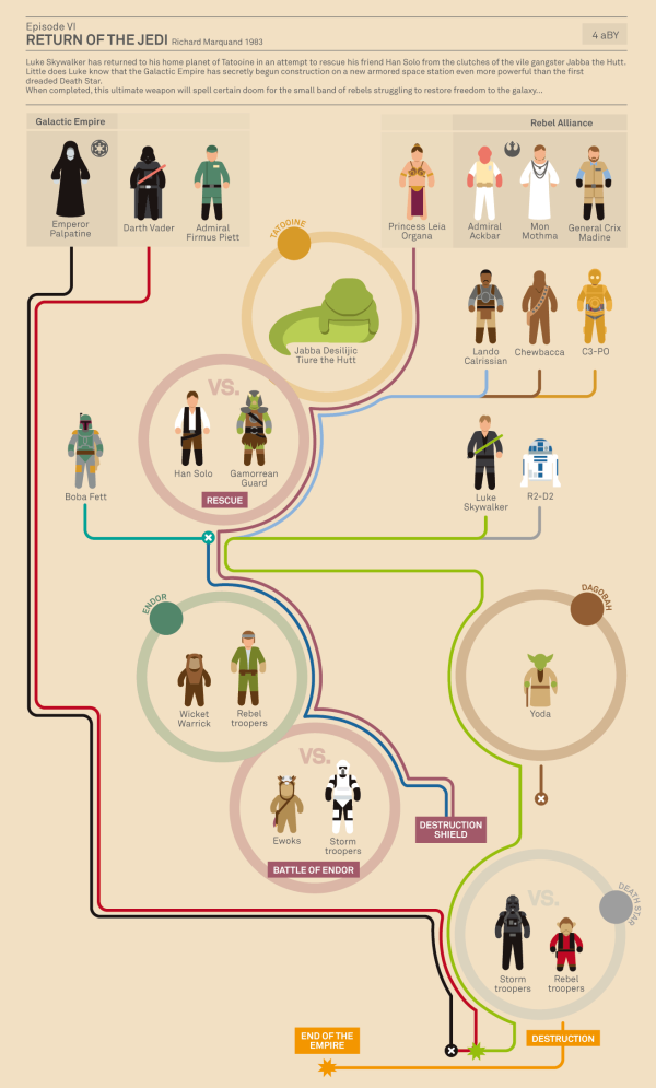
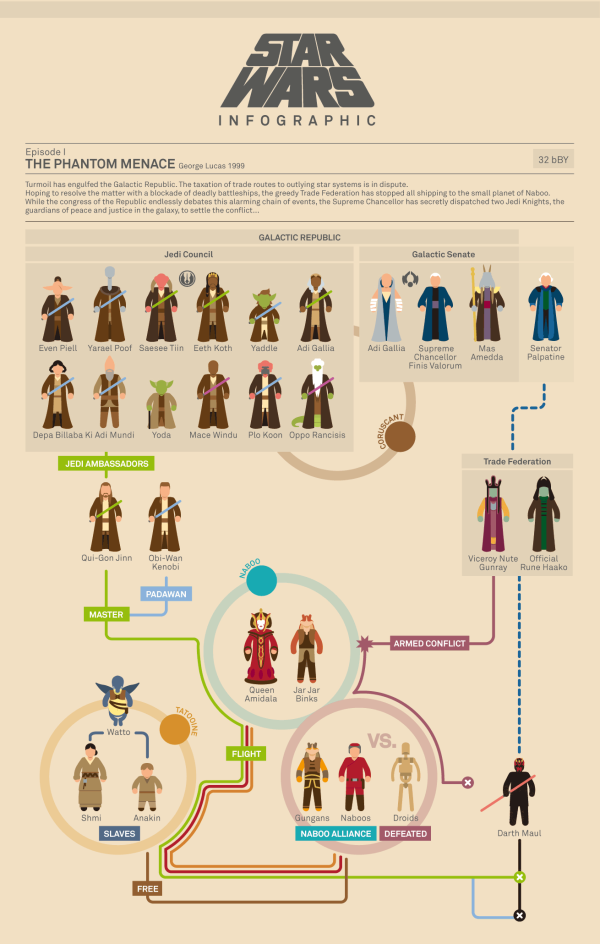
Found on: The Disney Blog

Tuesday
Nov122013

Star Wars Episodes IV-VI Character Poster

Star Wars Episodes IV-VI Character Poster

The Star Wars Episodes IV-VI Character Poster from designer Wes Anderson is a fantastic visual tribute to the Star Wars series.  The limited run of 500 printed posters sold out in a few days on Spoke Art, but everyone can still admire the design online.

In 1978 my father took me as an excuse to go see that movie about silly robots and spaceships that everybody was talking about. I didn’t get much at that time, since I was very young, but what I do remember well is how much I enjoyed beginning my first geeky action figures collection that came right after the movie. My first figure ever was Luke Skywalker, a figure that got lost over the years. I’m still looking for it on my parent’s attic. Where are you Luke Skywalker?

With the time I became a fan, of course. As homage to that great moment of my life, here’s a new poster featuring (almost) every character of the first Star Wars trilogy in order of appearance. It is of course limited and numbered. If you want a copy, this link will take you to Spoke Art Gallery’s online shop where you can easily order one and receive it at your front door. We gave the mailmen specific orders to be dressed as Storm troopers during delivery, but they didn’t take it so well, so they probably won’t.

Star Wars Episodes IV-VI Character Poster detail


Found on Nerd Approved, Technabob, and the Fire Wire blog

Thursday
Apr182013

Star Wars vs. Star Trek

Star Wars vs Star Trek infographic

Which one wins, Star Wars or Star Trek? This is one of the most heavily debated question of all time. The Star Wars vs Star Trek infographic from hark.com and TrekNews.net will not give you the answer on who is better… However, it will give you some concrete numbers on things like awards, social media followers, number of video games, and movies.

The war wages on. The battle between two of sci-fi’s most iconic franchises, Star Trek and Star Wars, is a battle that has been discussed by fans for over 30 years. The recent news of J.J. Abrams accepting the director’s job on the next Star Wars film, only fanned the flames.

Today’s infographic pits the two franchises against each other once again — with criteria including number of films, box office gross, number of Academy, Grammy and Emmy Awards, video games, books, toys, and social media followers.

This is a fun topic, perfect to incite discussion and links from the online community.  My only criticism of the design is the many of the statistics are not visualized.  Big fonts are not visualizations, so the infographic would be easier to comprehend if numbers like the Total Box Office Gross proceeds were visualized.

Found on infographicjournal.com

Monday
Dec242012

Defending the Death Star

Defending the Death Star with A little Data Center Design infographic

Old age meets new age. Defending the Death Star with A little Data Center Design takes a concept that people can relate to (Star Wars) and applies modern day data center technologies. Brought to you by Data Center Reports.

When Aristotle first explained the concept of “hamartia” in Poetics, he probably didn’t know just how many hero and villain stories would be driven forward by fatal flaws in character, judgment or planning. The Star Wars saga is an epic tale that is powered by fatal flaws – yet we couldn’t help but wonder how things might have turned out had the Empire used a little of today’s security insights to better protect the superweapon better known as the Death Star.

This infographic design tells a good story with illustrations.  No big data sets to visualize, but a simple story that’s incredibly easy for the reader to understand.  The Star Wars comparison puts the different technologies into context for the reader.

The footer should include a copyright and the URL link to the original infographic so readers can easily find the original high-resolution version.

Found on Data Center Reports

Monday
Sep242012

Star Wars Infographic Flowcharts

Star Wars infographics

Marc Morera has designed some amazing Star Wars infographics charting the character progression, deaths and conflicts in the Star Wars movies, the animated series, comic books and major novels.  On the landing page, you will find them organized chronologically, so the Animated Series fits in between movies II and III.

Characters are illustrated as recognizable isotypes.  Each character’s plot line is color-coded, and the lines from the appropriate characters converge at circles representing the major conflicts along each story timeline. 

Star Wars infographics

The two examples shown here are reduced in size to fit on the blog, so go check out all of them on Marc Murera’s site for high-resolution versions.