About
Randy Krum
President of InfoNewt.
Data Visualization and Infographic Design

Infographic Design

Infographics Design | Presentations
Consulting | Data Visualizations

DFW DataViz Meetup

Join the DFW Data Visualization and Infographics Meetup Group if you're in the Dallas/Fort Worth area!

Search the Cool Infographics site

Custom Search

Subscriptions:


Feedburner

The Cool Infographics® Gallery:

How to add the
Cool Infographics button to your:

Cool Infographics iOS icon

- iPhone
- iPad
- iPod Touch


Read on Flipboard for iPad and iPhone

Featured in the Tech & Science category

Flipboard icon

Twitter Feed
From the Bookstore

Caffeine Poster

The Caffeine Poster infographic

Entries in safety (17)

Thursday
Feb192015

Busting Myths About Hand Sanitizers

Busting Myths About Hand Sanitizers infographic

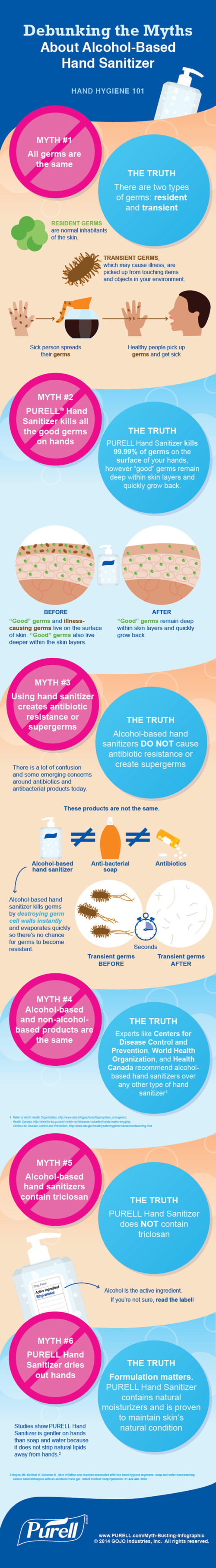
The Debunking the Myths About Alcohol-Based Hand Sanitizer infographic from PURELL clears up some of the most common misconceptions about their products. 

All germs are bad germs, right? Not necessarily. Using hand sanitizer dries out hands? Some don’t, but PURELL® Advanced Hand Sanitizer won’t strip your hands of their natural moisturizers. There is much confusion today around antibiotics, antibacterial soaps and hand sanitizers, as well as their effectiveness and whether they contain harmful chemicals like Triclosan (which Purell does not). Learn the truth about alcohol-based hand sanitizers as 7 of their most common myths are debunked for good.

Infographics are a fantastic way for companies to help consumers better understand complicated products and issues. Health and safety are some of the top concerns from consumers, and the team at PURELL has done a great job here of addressing the top concerns and misunderstandings they hear about their products.

The use of the infographic as part of a larger marketing campaign is also a great use of the data and design assets that have been created. The larger campaign includes videos, a SlideShare presentation, the infographic and a downloadable PDF.

Wednesday
Feb052014

The Best Temperatures for Cooking Fats & Oils

The Best Temperatures for Cooking Fats & Oils infographic

What a great topic for an infographic!  Different oils have different smoking points. and the Kitchen 101: Cooking Fats & Oils infographic from Chasing Delicious helps you make sense of them.

When it comes to cooking and baking, there is no shortage of fats and oils. Plants, flowers, seeds, nuts, animal fat, and milk almost all seem to end up as a cooking oil or fat at one point in time or another. And today, a trip down the oil isle makes it clear just how many choices exist. But can they all be used interchangeably? And if not, what do you have to take into consideration?

The answer to the first question is a big no. And to answer the second question, you must take in to consideration four main aspects of a cooking oil or fat: 1. smoking point, 2. flavor, 3. how it interacts with other ingredients, and 4. its nutritional value.

No, you can’t just trade out EVOO for peanut oil and expect the same results on the stove!

The circular bar chart is easy to understand for the audience, and the color gradients make comparisons simple between the different oils and fats.  The light colors used in the center arcs make the text hard to read though.  Available as small printed posters, this infographic would make a great addition to any kitchen.

Found on Lifehacker

Tuesday
Jul022013

Can Washroom Soap Can Make You Sick?

Can Washroom Soap Can Make You Sick? infographic

Can Washroom Soap Can Make You Sick? from GOJO Industries brings to light a growing health risk in public restrooms everywhere.  Restaurants, offices, stores, hotels and more.  Those bulk soap dispensers (on the wall or built into the counter) that janitors refill by just pouring in more soap can easily become infected, and the bacteria can survive and grow inside the soap dispenser!  Yuck!

It’s hard to believe, but you could actually walk away with more bacteria on your hands after washing with soap from a refillable bulk soap dispenser in a public restroom. The contamination could even include fecal matter!

How could this be? Check out the infographic below to find out how this happens, discover smart alternatives, and see how you can help protect your family’s health by being a voice for change.

Designed by InfoNewt, this design walks the reader through a clear sequence of information.  It conveys a simple story with easy to understand information and clear sources for credibility.

  • What’s the problem? 
  • How does it happen?
  • What’s the specific risk?
  • What’s the solution to the problem?
  • What can the reader do?

This is a persuasive infographic design that ends with a very specific call-to-action.  Sign the e-petition online to support the cause or forward the infographic to someone that can make a difference.

Thursday
Jun062013

Most Reliable Cars

Most Reliable Cars infographic

Are you looking for a new car? The Most Reliable Cars infographic from MoneySupermarket rates how reliable the manufacturers are as well as specific car models. The lower the score, the more reliable the car is. If your current car isn’t on the list. Maybe it is time to get a new one.

It is never a pleasant experience to find yourself stranded next to a broken down vehicle at the side of the road, particularly during the winter. Breakdown cover can help to reduce the pain somewhat, but it is still worth making sure that you pick the most reliable car available.

MoneySupermarket.com has therefore teamed up with Warranty Direct to put together the following lists which highlight the most reliable cars on the road. This is decided upon by taking into account overall reliability and the average cost of repairs for these manufacturers and models – coming up with an overall Reliability Index (RI) score. Just for reference- the average RI is 100, and the lower the score the better.

We’ve broken this down by both car make and by individual vehicle models to come up with a definitive list which could prove invaluable to you during the car buying process.

This is a really good use of bar charts.  The company logos or car photos and the relevant data is built directly into the chart so there is no need for a chart legend.  Very easy to read and understand.

Thanks to Mark for sending in the link!

Monday
Jan072013

Can You Protect Yourself from Hackers at CES?

Can You Protect Yourself from Hackers at CES? infographic

Are you headed to CES in Las Vegas this week?  Do you know how to protect your electronic devices?  The Is Your Device Safe at CES? infographic from Novell shows us some heartbreaking stats.

The Numbers Don’t Lie

You don’t think it will ever happen to you, do you? Well, think again. With a laptop or tablet being stolen every 53 seconds you can literally lose your mobile device at any minute. Oh, and by the way, you’re losing a lot more than that precious device: sensitive company documents, passwords, credit card information, etc. So what are you doing to protect that phone/iPad/laptop? Apparently very little as only 4% of smartphones have Mobile Device Management security installed on them. Take a look at a few of the scary numbers and some ideas you could implement to protect your device and your precious content.

This design is long, but there’s a lot of information to share.  I like the simple color scheme, and there’s some really good data included in here.  However, most of the statistics are shown in text only, which is disappointing.

I’ve said it many times here on Cool Infographics.  Big fonts are not data visualizations.  You want your readers to comprehend and remember the numbers you are showing them in your infographic design.  To be successful at that you need to put the numbers into context for the reader, by visually comparing them to another value or showing them the scale of the value.

Thanks to Mat for sending in the link!


Thursday
Dec202012

Fire Code Regulations for Live Christmas Trees in Schools

Fire Code Regulations for Live Christmas Trees in Schools infographic

Fire Code Regulations for Live Christmas Trees in Schools is an informational infographic from the team at Balsam Hill, an online retailer for artificial Christmas trees.  This design is meant to help school officials and purchasing agents all over the country, and not really intended for the general public online.

Setting up a real Christmas tree in a school requires detailed knowledge of a state’s Christmas tree fire code. School fire code regulations for real Christmas trees vary by city and state, and can be overwhelming to puzzle out due to a confusing and sometimes conflicting set of rules. The Balsam Hill Christmas Tree Company has compiled each state’s school fire code regulations for live trees into an infographic for schools and school districts to reference. Look through the infographic to help you decide whether or not an artificial Christmas tree may be a more practical alternative for your school this holiday season.

From a marketing perspective, this design succeeds tremendously.  The overall message is clear: “Regulations around live Christmas trees in schools are complicated.  An artificial tree would be much easier.”  Balsam Hill put together a ton of research (look at the number of sources!), and even though they were able to gather the state level regulations, many cities, counties and individual school districts have their own regulations that may be contradictory.  A number of major cities with different regulations than their state are highlighted, but that list is incomplete.  It only shows a few cities that have different regulations to let the reader know that state level fire codes aren’t the only regulations that schools have to follow.

The design does a good job of clarifying very complicated information, but that can only go so far.  The regulations are actually very complex, so this is still a very long design to thoroughly visualize the data.  Great job using visual design to help readers understand a very complex issue!

You can see additional designs that also cover the regulations for Hotels and Churches.

Monday
Oct292012

Halloween Statistics 2012: Creepy Calculations

 Halloween Statistics 2012: Creepy Calculations infographic

It is that time of the year again! Halloween is the perfect time for costumes, scary movies, and Charlie Brown! How do you spend your halloween? Halloweencostumes.com has put together some Creepy Halloween Statistics to show some of this holiday’s most popular happenings. 

What are you most looking forward to this Halloween? Collecting copious amounts of your favorite candy? Dressing up in a trendy  costume? Enjoying a horror movie marathon? Find out what other Americans will be up to this year, with our Ultimate Visual Guide to Halloween Statistics! You’ll discover popular costumes for you and fido, a count-down of the best sweet treats, suggestions for a Halloween playlist and more spooktacular stats!

I really like this design.  The color scheme, the design style, and the easy-to-understand top-to-bottom progression of information.  There are a few statistics that I would like to see visualized, like the Trick-or-Treating By The Numbers section where the values are only shown in big fonts.  I really like the different moon phases to visualize the stats at the top.

The Top 5 lists are a little text-heavy, and it would have been nice to see movie posters or CD artwork to go along with the entries.

In the footnote at the bottom, missing are both a copyright statement (or Creative Commons) and a URL link to the original infographic landing page so readers can find the full-size version.

Thanks to Elise for sending in the link!

Monday
Jun042012

Digital Technology in Your Car

Digital Technology in Your Car

Here is an infographic from Allianz called Digital Technology in Your Car that illustrates current technology in our cars to keep us safe and entertain us.

Digital technology has transformed and continues to transform every aspect of our lives. In the motor industry, technology developed throughout the years has enhanced our safety and comfort. The introduction of modern safety mechanisms such as lane departure warning and brake assist systems as well as iphone applications such as Driver Reviver and Car Butler has seen technology faithfully assisting drivers in times of need. With technology advancing and disseminating at a rapid rate, Global Positioning System units have already become a staple accessory in Australian cars.

There’s not much in the way of data visualizations in this one, but it does tell a good story about the history of new technology in your car, and what’s coming soon.  There’s too much text, but the use of icons and illustrations helps the story.  

I’m not sure what all the dead space at the bottom is.  Plenty of room for the copyright, company logo, URL to the original landing page and even a mention of the designer.

Bring on the self-driving cars!

Thanks to Sandra for sending in the link!

Tuesday
Mar272012

Seven Motorcycle Safety Tips

The Seven Motorcycle Safety Tips infographic comes to us from Bisnar|Chase. This infographic gives some helpful tips on saftey to prevent injuries, but if you do have an accident, they’d like to help!

Motorcycle safety is no joking matter. Please take your safety seriously. If you do become injured in a motorcycle accident we would like to help. Contact us immediately to schedule your free consultation with our reputable California motorcycle accident lawyers.

A couple things I really like about this design.

  • It tells a simple, easy-to-understand story
  • Clean design, not too much visual noise
  • Good illustrations to illustrate each safety tip and statistic
  • Each of the values included are visualized to make them quick and easily to read

The data source is listed in the infographic, but it’s missing a copyright statement and a URL to the original infographic posting at the bottom.  The page with the original posting is also missing sharing buttons for social media, so it’s difficult for readers to share the infographic.

Thanks to Chris for sending in the link!

Wednesday
Mar142012

Romance Reboot: Safe Online Dating Tips from ADT

What did you do for Valentines day? Did you go on a date? Did you meet them online? The Romance Reboot: Safe Online Dating Tips from ADT infographic from homesecuritysource.com provides tips for the 5.5 million singles who use online dating on how to stay safe while finding their true love!

This one is cool because of the new, innovative way to animate the infographic.  You’ll have to view it on the original posting to see it, but the illustrations and visualizations are animated as you slowly scroll down the page.  This design itself is too gaudy for my tastes, but BIG kudos to the designers for trying something new to push the envelope of infographic design!

The bottom is missing the URL for the original posting, which is a big mistake because it makes it hard for readers to find the cool animated version.  It’s also missing a copyright statement and any mention of the designer(s).

Thanks to Andrew for sending in the infographic!