About
Randy Krum
President of InfoNewt.
Data Visualization and Infographic Design

Infographic Design

Infographics Design | Presentations
Consulting | Data Visualizations

DFW DataViz Meetup

Join the DFW Data Visualization and Infographics Meetup Group if you're in the Dallas/Fort Worth area!

Search the Cool Infographics site

Custom Search

Subscriptions:


Feedburner

The Cool Infographics® Gallery:

How to add the
Cool Infographics button to your:

Cool Infographics iOS icon

- iPhone
- iPad
- iPod Touch


Read on Flipboard for iPad and iPhone

Featured in the Tech & Science category

Flipboard icon

Twitter Feed
From the Bookstore

Caffeine Poster

The Caffeine Poster infographic

Entries in hackers (2)

Tuesday
Aug272013

World's Biggest Data Breaches Visualization

World's Biggest Data Breaches Visualization

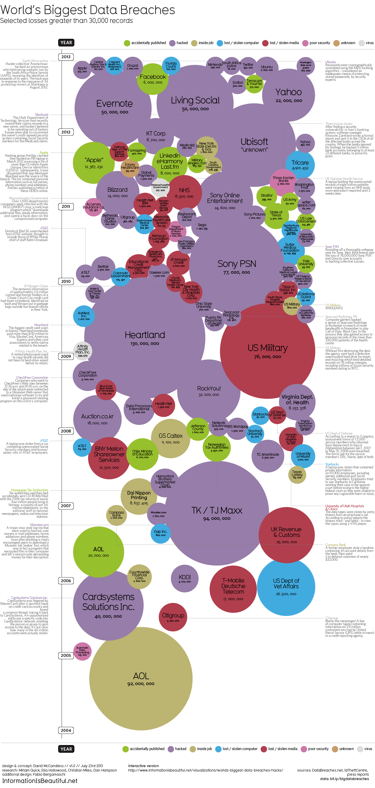
David McCandless and the team from Information Is Beautiful recently released both static (seen above) and interactive versions of the new World’s Biggest Data Breaches visualization.

This weekend, Apple’s developer site was hacked. 275,000 logins, passwords and other records potentially compromised. Two days before that, popular open-source operating system Ubuntu had its forums hacked. 1.82 million records stolen.

Are those big data breaches? Or just pin-points in the big data universe?

We’ve pulled out the interesting and funny stories out of the data. Click on the bubbles to read.

A fantastic design, the interactive version allows you to adjust the sorting, circle size and color-coding parameters.  It’s very easy for the reader to understand how one data breach fits into the overall history of stolen data.

In a move for transparency, the entire data set gathered and used in the design is available publicly to anyone through a Google Docs Spreadsheet.  Anyone can access the source data to verify the visualization or to create their own.

Found on Fast Company

Monday
Jan072013

Can You Protect Yourself from Hackers at CES?

Can You Protect Yourself from Hackers at CES? infographic

Are you headed to CES in Las Vegas this week?  Do you know how to protect your electronic devices?  The Is Your Device Safe at CES? infographic from Novell shows us some heartbreaking stats.

The Numbers Don’t Lie

You don’t think it will ever happen to you, do you? Well, think again. With a laptop or tablet being stolen every 53 seconds you can literally lose your mobile device at any minute. Oh, and by the way, you’re losing a lot more than that precious device: sensitive company documents, passwords, credit card information, etc. So what are you doing to protect that phone/iPad/laptop? Apparently very little as only 4% of smartphones have Mobile Device Management security installed on them. Take a look at a few of the scary numbers and some ideas you could implement to protect your device and your precious content.

This design is long, but there’s a lot of information to share.  I like the simple color scheme, and there’s some really good data included in here.  However, most of the statistics are shown in text only, which is disappointing.

I’ve said it many times here on Cool Infographics.  Big fonts are not data visualizations.  You want your readers to comprehend and remember the numbers you are showing them in your infographic design.  To be successful at that you need to put the numbers into context for the reader, by visually comparing them to another value or showing them the scale of the value.

Thanks to Mat for sending in the link!