About
Randy Krum
President of InfoNewt.
Data Visualization and Infographic Design

Infographic Design

Infographics Design | Presentations
Consulting | Data Visualizations

DFW DataViz Meetup

Join the DFW Data Visualization and Infographics Meetup Group if you're in the Dallas/Fort Worth area!

Search the Cool Infographics site

Custom Search

Subscriptions:


Feedburner

The Cool Infographics® Gallery:

How to add the
Cool Infographics button to your:

Cool Infographics iOS icon

- iPhone
- iPad
- iPod Touch


Read on Flipboard for iPad and iPhone

Featured in the Tech & Science category

Flipboard icon

Twitter Feed
From the Bookstore

Caffeine Poster

The Caffeine Poster infographic

Entries in drinks (23)

Thursday
Jul192018

Interactive Infographic From Coca-Cola Spain

Coca-Cola Spain is using the tool ThingLink to add animation and interactivity to their marketing infographics. ThingLink allows you to create "hotspots" that pop-up additional images, text and even videos.
Description: Coca-Cola Spain masters the art of digital storytelling by using interactive infographics on their blog.  In addition to it's attractive design, this infographic captures viewer attention with the use of motion (via GIFs).  In the infographic below, Coca-Cola shares how they have driven employment and progress in Spain since 1953. 

Thursday
Jan112018

Abita Beer Release Calendar 2018

Abita Beer Release Calendar 2018

In case you're not familiar with Abita Beers, it's a fantastic brewery out of Louisiana. In addition to a core set of beers, they make a number of seasonal brews that are only available certain times of the year. This visual Beer Release Calendar is your visual guide to when you favorite brews are in season!

The new year is here and we're looking forward to another great year of brews! We've been hard at work behind the scenes planning for 2018 and wanted to share some of what we've been working on. Our 2018 Beer Release Calendar is everything we'll be releasing and boiled down to one single sheet. It's our brew bible! Of course, most of your favorites are back, but as you'll see we're bringing some beers you might recognize out of retirement and releasing a ton of new beers. In all, we'll brew and package 31 beers in 2018 and that's not counting the tons of beers we'll be experimenting with and releasing on our pilot system here at the brewery.

I really like this design. The colors come from the individual beer labels, and I appreciate the additional visualization of the available sizes. I appreciate the repeated guide to the monthly column at the bottom. The cursive font, rotated 90° is hard to read.

The gradient bars are a nice touch since those brews don't have a hard end date, they're only available until supply runs out. It looks like the designer accidentally left a few of those as gradient to white instead of gradient to the background tan color.

Wednesday
May242017

Interactive Cocktail Shaker

Interactive Cocktail Shaker interactive infographic

David McCandless and the team at Information Is Beautiful have created this impressive Guide to Cocktails in both interactive and static versions.

75+ classic cocktail recipes from the International Bartender’s Association’s list of drinks every bartender should know.

Forget old-school measures like ml and oz. We’ve calculated our own universal metric. One of any ingredient represents one part of any measuring vessel you choose: cup, spoon, lid, shoe, whatever – it’s your party! These universal recipes scale up for any level of mayhem. Enjoy! Um…responsibly of course.

Select the booze in your cabinet: our 'measurement agnostic' interactive will conjure the rest.

All of their designs are very Data Transparent, and they have made all of the data from this design available in this Google Spreadsheet listed in the footer for anyone to see.

Wednesday
Feb102016

Beer Pairings Simplified

Beer Pairings Simplified infographic

Beer Pairings Simplified is from the menu at BJ's Restaurant and Brewhouse. An infographic in the wild found IRL! A great visual guide to beer types, colors and suggested food pairings.

Beer may actually be more food-friendly than wine. There is certainly more flavor variety and it has an amazing capacity to pair with all kinds of foods BJ's encourages you to experiment. There are no wrong answers, but here are a few things to consider:

This is definitely simplified information, because the different types of beer can actually vary in color quite a bit. However, I think this design does a great job of simplifying complex information and helping the restaurant's guests make good decisions. Seasoned or expert beer drinkers will want more detailed, complex information, but this visual guide will probably be enough information for the majority of readers.


Beer Pairings Simplified Menu Photo

Thursday
Jan152015

Starbucks Espresso Infographic Advertising

 
Can you name all 6 Espresso Classics?
Starbucks Guatemala


NOW AT STARBUCKS! The newest addition to the Starbucks menu is the Flat White. But what is the difference between The Flat white and the rest of Starbuck’s menu?

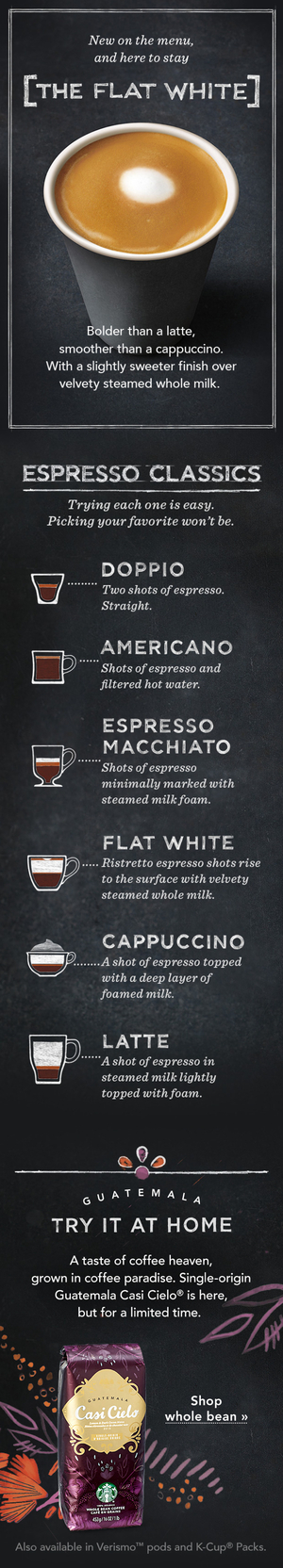
Starbucks sent this cool infographic as a content marketing piece in an email to all of their customers introducing The Flat White to their menu. The infographic visualizes the recipes for the 6 Espresso Classics. Currently available for view in most Starbucks stores around the country is an infographic that explains the differences between the styles of drinks on the menu.

The graphics in the email are actually the 3 separate images you see above, and I assume they could be changed for different people receiving the email. For example, someone else might receive an email about the Cappuccino or a different coffee flavor ad at the bottom. Good for flexibility in the emails, but bad for sharing in social media.

A product of simplicity, crafted into artistry, our baristas know that balance is key to the perfect Flat White. An extra ristretto shot ensures that it’s bolder than a latte, yet steamed milk keeps it smoother than a cappuccino. But perfection doesn’t end there—the technique for steaming and pouring the milk requires close attention as well. Steamed milk is folded into itself creating a velvety microfoam that gives the Flat White its silky texture and signature white dot.

Starbucks The Flat White

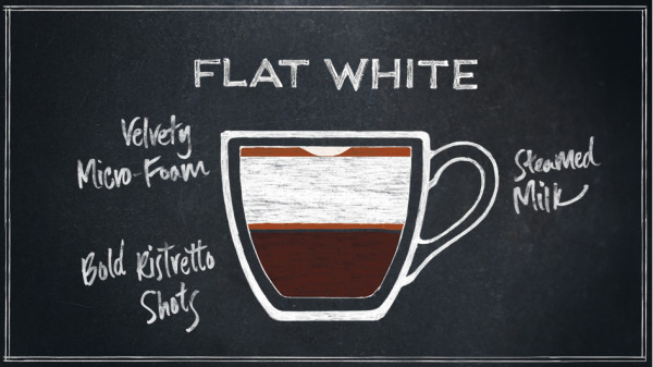
Love the cafe-style chalkboard look, and the layered drink r recipe visualization design!

Using this infographic in an email campaign is brilliant, but I wish it had been designed to also stand on its own so it could be shared online in social media easier.

Starbucks Espresso Spectrum

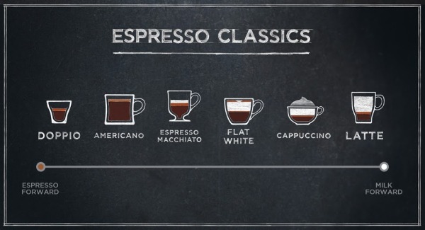
They use this design style throughout their entire espresso menu of drinks.

Thanks to Starbucks for sending the infographic to it’s customers! I put the separate pieces together below to make sharing easier!

Starbucks The Flat White Espresso Email Infographic

Tuesday
Sep162014

Beer Colors

Beer Colors Cans Visualization Infographic

Beer colors is a fun design idea that combines packaging design with beer label design, these beer label designs imitate Pantone® color chips.  Maybe more of a data visualization of colors than a true infographic, but I love it!

Concept and design based on the color of the beer. Each type of beer is associated with its corresponding Pantone color. The typeface chosen is HipstelveticaFontFamily in its bold version by José Gomes, thanks for sharing.

Designed by Spanish creative agency Txaber, this series of beer packaging labels show each brew type represented by its corresponding official color. 

Beer Colors Bottles Visualization Infographic

Found on creativebloq and BoingBoing


Friday
Sep052014

Alchemy of Tea

Alchemy of Tea Infographic Poster

The Alchemy of Tea infographic poster from SweeTooth Design Company maps out 15 traditional tea recipes from around the world, paying homage to the 4,000 year old beverage. Posters are available for $25 through the Kickstarter project, and will ship in November.  They have already exceeded their funding goal, so these will definitely go to print.

“Alchemy of Tea” is the first infographic illustration that depicts traditional tea recipes from around the world. It is not only a poster, but an informative recipe diagram of one of the most favorite drinks, tea.

There is a total of 15 tea recipes. Through mixing tea base with different ingredients, there are different results. What is more interesting is that simply by adding one or more ingredients, the entire recipe may becomes an entire different drink. 

Alchemy of Tea Infographic Poster Red Closeup

Posters will be printed in Red and Black:

Alchemy of Tea Infographic Poster Red Black

Found on http://www.fastcodesign.com

Monday
Oct142013

The Magnificent Multitude of Beer

The Magnificent Multitude of Beer infographic poster

The Magnificent Multitude of Beer is a cool new poster design from Pop Chart Lab.

This wall map is the most complete charting of beer ever, breaking down ales and lagers into over 100 delicious styles from hoppy IPAs to fruity lambics, and including over 500 individual beers as notable examples of each style as well as glassware recommendations. The Magnificent Multitude of Beer captures the proud work of hundreds of breweries around the world, clocks in at a staggering 60 inches by 40 inches, and is the perfect finishing touch for your man cave or lady lair.

SALE today only!  The team at Pop Chart Lab has a 15% OFF Everything sale for Columbus Day (October 14).  Use the code COLOMBO at checkout to get the discount.  The code is valid until 12:30pm EST tomorrow.

Friday
Sep272013

The Anatomy of Sangria

The Anatomy of Sangria infographic

A good way to start the weekend!  The Anatomy of Sangria from Wine Enthusiast Magazine is a nice visual explanation of what goes into making sangria, including different variations of ingredients.

It’s sometimes tough to know where to start when making sangria. In addition to selecting a red wine or white, there are several elements to consider: Which fruit will you use? What mixer will you add? Will you choose a savory or sweet garnish? Flavor combinations can make or break even the simplest of sangrias, so to make sure your next batch is stellar, use the guidelines below to create a version that promises to suit your palate—and your guests.

Bright, colorful design using photographs of the different ingredients is visually appealing and should get shared frequently.

This is also a great example of a long Online Lifespan topic for an infographic.  The ingredients for making sangria don’t change, so the infographic will be relevant for years to come; driving traffic and links to the website.

The footer should include a copyright statement, and the URL to the infographic landing page so readers that find this infographic on other sites can find the original full-size version.

Found on Foodista

Friday
Aug232013

The Periodic Table of Alcohol

The Periodic Table of Alcohol infographic

The Periodic Table of Alcohol infographic does a good job of organizing popular alcoholic drinks in the periodic table design format.  Posted on Visual.ly by designer Mayra Magalhães (mayra.artes), 

This infographic shows important information about the most famous alcoholic beverages.

It’s unclear who the infographic was designed for.  The footer of the infographic lists BestCollegesOnline.com, the landing page on Visual.ly lists the Consumer Media Network and the URL actually links to CarInsurance.org.  It looks like this design is a modification of a design from 2011 done for Best Colleges Online called the College Student’s Guide to Boozing.  I’m guessing Mayra uploaded this recently to be included as a part of her design portfolio.

The infographic has been heavily shared, and I found this version on Laughing SquidBusiness Insider, Popular Science, This is Happiness, Geekologie, and Gizmodo.