About
Randy Krum
President of InfoNewt.
Data Visualization and Infographic Design

Infographic Design

Infographics Design | Presentations
Consulting | Data Visualizations

DFW DataViz Meetup

Join the DFW Data Visualization and Infographics Meetup Group if you're in the Dallas/Fort Worth area!

Search the Cool Infographics site

Custom Search

Subscriptions:


Feedburner

The Cool Infographics® Gallery:

How to add the
Cool Infographics button to your:

Cool Infographics iOS icon

- iPhone
- iPad
- iPod Touch


Read on Flipboard for iPad and iPhone

Featured in the Tech & Science category

Flipboard icon

Twitter Feed
From the Bookstore

Caffeine Poster

The Caffeine Poster infographic

Entries in airplane (24)

Friday
May052017

Six Maps that Show America’s Infrastructure

Tim Meko, a graphic reported at the Washington Post, designs some fantastic data visualizations. Six Maps that Show the Anatomy of America’s Vast Infrastructure is a great visual exploration of what makes America run. Check out the original article for more explanation of each map and more visual details.

Found on FlowingData

Saturday
Mar042017

Planes, Trains & Automobiles of U.S. Presidents

Official Vehicles of the President of the United States – TitleMax.com – Infographic

Official Vehicles of the President of the United States is an infographic from TitleMax showing the evolution of the vehicles used by Presidents throughout our history.

When the POTUS (President of the Unite States) has to get around, he usually does it in style. And if he’s not in style, at least we know that he’s often surrounded by millions of dollars’ worth of security detail.

Yes, for the U.S. president, cars and vehicles have always been expensive, as has been Air Force One. History has put a spotlight on the presidents’ one-of-a-kind planes: mobile White Houses, with all of the protections therein.

This information is much better shown visually like this infographic than a text bullet list. I would like to see them placed on a timeline to better line them up and show where their use overlapped.

The infographic itself is missing a copyright statement, a citation of sources, and the URL for readers to be able to find the origial full-size infographic published by TitleMax.

Found on Infographic Journal

Wednesday
Jul132016

Global Connectivity Ranking

Global Connectivity Ranking interactive infographic world London

The Global Connectivity Ranking from Rome2rio includes a beautiful interactive data visualization showing how connected we are on a global scale. Above you can see the direct flight connections from London, the most connected city on Earth.

Just how connected are our cities?  How do we measure such connections?  How do these connections change over time?

To answer these questions, my research team at KPMG collaborated with Rome2rio to produce the Global Connectivity Ranking. We ranked all 1,212 cities on the planet which operate international airports.

The Rome2rio Global Connectivity Ranking reflects the number of international cities that a city is connected to through direct flights. It measures connections from city to city - not airport to airport. For example, the connection count for London reflects how many cities outside the UK that can be reached from any of London's 6 international airports. Rankings were computed using Rome2rio's global transit data from April 2014 and January 2016.

Choose any city on the list to animate to direct flight connections. The size of the bubbles over each city also represent the total number of connections from that city.

The default is the world view, but can also choose to focus on a single continent. Here you can see the connection from Chicago when zoomed in to only North America.

Global Connectivity Ranking interactive infographic North America Chicago


Wednesday
Jun292016

The U.S. MiseryMap of Flight Delays

The U.S. MiseryMap of Flight Delays Map Infographic

Stuck in an airport? The MiseryMap from FlightAware shows a real-time view of flight delays and cancelations at the top 30 airports in the U.S.

Doughnut charts highlight the totals for each major city (combining airports if there are multiple) and hovering or clicking a specific city will show the flight routes (sankey diagram style) that are experiencing delays and cancelations. The full details are shown in the barr chart sidebar.

Pressing the play button will animate the map for the last 48 hours showing the changes to the weather map overlay, and delays in 4-hour increments. The overall size of each doughnut also seems to represent the total number of flights from that city in each 4-hour increment.

The U.S. MiseryMap of Flight Delays Map Infographic DFW

Thanks to Mary Kaye for sharing the link!

Friday
Jun032016

The Global Air Transportation Network

The Transportation Clusters infographic is a force-directed map of the 3,275 global airports and all of the connecting flight routes. Designed by Martin Grandjean, each bubble represents an individual airport and the bubble sizes represents the number of flight routes (37,153 routes in total) based on OpenFlights.org data.

People travel not just more frequently, but increasingly far and quickly. Mapping the connections between all the airports worldwide is a fascinating network visualization exercise.

This post (which may be followed by further experimentations in this area) is an attempt to make explicit the network behind air transport. The structure of the relationships has an impact on the spatial distribution of nodes in a graph. Let’s see how this landscape is reorganized without geographical constraints.

This “map” is the result of the application of a force-directed layout algorithm on a graph of 3.275 airports (37.153 single routes – the weighted total is higher because many airlines take the same route), based on OpenFlights.org data. Naturally, network geography is not completely disrupted: the continents are mostly visible and regions are generally in their original position (with the exception of the Pacific islands that connect Asia and America – imagine this graph in three dimensions, with the Pacific Ocean behind). Major observations: India is more connected to the Middle East than to South and East Asia. The Russian cluster is very visible, connecting airports in Russia but also in many former Soviet republics. Latin america is clearly divided between a South cluster and a Central American cluster very connected with the U.S.

The force-directed layout spaces the bubbles apart so there are no overlapping bubbles. The color coding is a color spectrum based on longitude, and generally groups airports from the same continent together. The total number of flights is much higher than the number of routes because many airlines share the same routes. I would like to see a version that weights the connecting lines with the number of flights that share that same route.

Here you can see the original map with the bubbles accurately located geographically, but a lot of overlap based on close proximity of the airports:

Martin also published a cool animated GIF and YouTube video of the change from geographical to force-directed layout.


Found on FlowingData

Thursday
Oct082015

10 Ways to Fall Asleep on a Plane

10 Ways to Fall Asleep on a Plane infographic

Traveling can be exhausting, especially when you can't catch any sleep on the flight. However, Work the World has come up with not just one, but 10 Ways to Fall Asleep on a Plane! Whether you are traveling for business or for pleasure, you can be assured that your flight will be a restful one.

Trying to fall asleep on a plane can be one of the most frustrating experiences during your travels. After some serious research we decided to put an infographic together detailing the top ten ways to fall asleep on a plane. If you struggle to fall asleep in the air, read on for reassurance that it can be done.

Great informative infographic that uses a classic content marketing strategy of a Top 10 list, even if it's a little text heavy for a graphic. Icons and illustrations make each idea visual, which will help readers remember the information when they actually need it.

The footer properly included a Creative Common license, and detailed sources. The only thing missing is the URL to the infographic landing page so readers can find the original, full-size version on the Work The World site.

There's so much text in this one, I would make the additional recommendation to repeat the text on the infographic landing page below the infographic image itself. By also putting all of the text on the page, the search engines will be able to parse and index all of this good text data.

Found on Visual.ly

Monday
Nov032014

Filmography Print Series Posters

 Filmography Print Series Posters infographics

The Filmography Print Series was created by Cathryn and are all available for purchase at Calm The Ham. The Filmography of Guns (above), the Filmography of Cars, and the Filmography of Aircraft show a collection of popular icons from film and TV shows. Also available are book versions of the prints.

My name is Cathryn, and I’ve created the Filmography print series. Through the illustration of iconic items from film and television I wanted to create artwork for fans of popular culture, like myself. 


Each gun was sketched by hand with meticulous attention to every detail. It was then converted to a digital illustration. By drawing each gun at a large size (approx 12” x 18”) the detail of the weapon remains crisp when reduced in scale on the print.


The Filmography of Cars which illustrates popular cars from TV and film.


The Filmography of Aircraft, which illustrates 100 years of aviation in film.


Congratulation to Cathryn for her most recent project being funded on Kickstarter!

Wednesday
May142014

The Drone Survival Guide

Drone Survival Guide infographic poster

The Drone Survival Guide is a poster and online infographic that uses proportionally sized silhouettes of the most common UAVs (Unmanned Aerial Vehicles).  Designed by Ruben Pater, a self-employed artist/graphic designer from the Netherlands, the poster is available for download as a PDF.

Posters printed on aluminum reflective Chromolux ALU-E mirrored paper are available from the site for €10, which included worldwide shipping.

TWENTY-FIRST CENTURY BIRDWATCHING

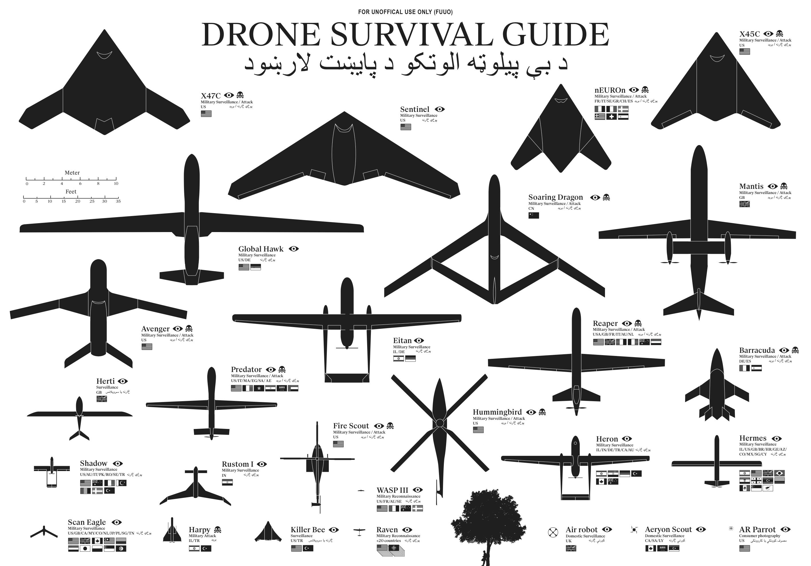
Our ancestors could spot natural predators from far by their silhouettes. Are we equally aware of the predators in the present-day? Drones are remote-controlled planes that can be used for anything from surveillance and deadly force, to rescue operations and scientific research. Most drones are used today by military powers for remote-controlled surveillance and attack, and their numbers are growing. The Federal Aviation Administration (FAA) predicted in 2012 that within 20 years there could be as many as 30.000 drones flying over U.S. Soil alone. As robotic birds will become commonplace in the near future, we should be prepared to identify them. This survival guide is an attempt to familiarise ourselves and future generations, with a changing technological environment.

This document contains the silhouettes of the most common drone species used today and in the near future. Each indicating nationality and whether they are used for surveillance only or for deadly force. All drones are drawn in scale for size indication. From the smallest consumer drones measuring less than 1 meter, up to the Global Hawk measuring 39,9 meter in length. 

Concept and design by Ruben Pater. Want to know more about the motivation behind this project? Read the FAQ.

The poster is also being publicized in conjunction with the Drone Salon seminar coming up on May 23, 2014.

The drone salon aims to provide a multidisciplinary overview of challenges, opportunities and speculations on future transitions caused by the use of drone technology both in the battlefield and in the civic realm. This seminar, punctuated by demonstrations and presentations, will consist of five conversations between Malkit Shoshan, Ethel Baraona Pohl and experts in the field: lawyers, activists, civic and military drone operators, artists, novelists and designers. The conversations will bring together multiple views, examples and projects on the spatial effects of the implementation of drones in war and in peace time. The seminar is part of the ‘Drones and Honeycombs’ project and one of a series of public events on the topic of drones organised in collaboration with Studio-X, Columbia University, DPR-Barcelona, The Center for the study of the Drone in NYC and Het Nieuwe Instituut in Rotterdam.

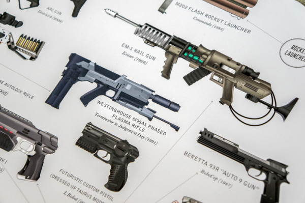
The design is actually very similar to the SciFi Starship Comparison Chart, but on a much smaller scale.  Many people in Ruben’s audience have sent in translations for the text included in the poster, so he has posted the text in at least 32 different languages.  I would like to see those translations offered as full versions of the poster, instead of the text only, but I understand that takes a lot of work.

I’m fascinated by drones, and I own and fly one of the AR Parrot Drones you see in the bottom right corner of the poster.

Thanks to Ethel Baraona Pohl for posting on Facebook!


Monday
Apr142014

The Depth of the Problem

The Depth of the Problem infographic

The Depth of the Problem infographic from The Washington Post illustrates just how difficult it is to find and retrieve the black boxes from aircrafts when they go into the ocean. This infographic uses visuals of the tallest buildings inverted to help illustrate the depth, as well as other well known objects that have sunk into the ocean.

After an Australian vessel, Ocean Shield, again detected deep-sea signals consistent with those from an airplane’s black box, the official leading a multination search expressed hope Wednesday that crews will begin to find wreckage of a missing Malaysian airliner “within a matter of days.”“I believe we’re searching in the right area,” Retired Air Chief Marshal Angus Houston said.

I know some people don’t like the really long infographics, but in this case the extra long design is the key message the design is trying to communicate to the readers.  I love this type of design, because it makes the challenge of the ocean depth so easily understood.

The JPG image file itself needs to be better treated as a stand-alone infographic.  This image was part of a text article, but will be shared in social media without the rest of the article text.  It should have it’s own title and footer information like data sources, copyright, the Washington Post logo and the URL to find the original article.

Tuesday
Jan282014

2013 Airline Scorecard Best to Worst

2013 Airline Scorecard; Ranking of Major Carriers in Key Operational Areas, Best to Worst infographic

Traveling by airplane can be a stressful situation. Choosing the correct airline can make all the difference. Check out how your favorite airline scores on the 2013 Airline Scorecard; Ranking of Major Carriers in Key Operational Areas, Best to Worst infographic and article from The Wall Street Journal

In the Middle Seat’s annual scorecard of airline service, tracking seven different key measures of airline performance, Alaska Airlines performed best in 2013 among major carriers. At the top with Alaska was Delta, which for the past two years has posted far better operational results than big competitors. Worst among big airlines? United Airlines and American Airlines, again. 

By assigning each airline a specific color, it allows the viewer to clearly distinguish each airline throughout the scorecard. The lines connecting the columns also gives the whole graphic a sense of connectivity and flow, causing the eye to follow each airline.

Even though this visualization is part of a larger article, they did a good job of including the relevant information in the image file itself.  This is a big help when the scorecard image gets shared online.  It has a clear title, data sources and credit to the WSJ.  The URL back to the article would be very helpful, but they didn’t include that in the image.

Found on http://ilovecharts.tumblr.com