About
Randy Krum
President of InfoNewt.
Data Visualization and Infographic Design

Infographic Design

Infographics Design | Presentations
Consulting | Data Visualizations

DFW DataViz Meetup

Join the DFW Data Visualization and Infographics Meetup Group if you're in the Dallas/Fort Worth area!

Search the Cool Infographics site

Custom Search

Subscriptions:


Feedburner

The Cool Infographics® Gallery:

How to add the
Cool Infographics button to your:

Cool Infographics iOS icon

- iPhone
- iPad
- iPod Touch


Read on Flipboard for iPad and iPhone

Featured in the Tech & Science category

Flipboard icon

Twitter Feed
From the Bookstore

Caffeine Poster

The Caffeine Poster infographic

Entries in information (8)

Thursday
Oct082015

10 Ways to Fall Asleep on a Plane

10 Ways to Fall Asleep on a Plane infographic

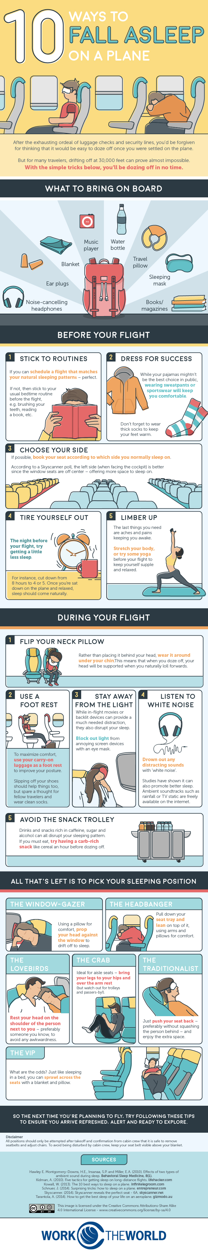
Traveling can be exhausting, especially when you can't catch any sleep on the flight. However, Work the World has come up with not just one, but 10 Ways to Fall Asleep on a Plane! Whether you are traveling for business or for pleasure, you can be assured that your flight will be a restful one.

Trying to fall asleep on a plane can be one of the most frustrating experiences during your travels. After some serious research we decided to put an infographic together detailing the top ten ways to fall asleep on a plane. If you struggle to fall asleep in the air, read on for reassurance that it can be done.

Great informative infographic that uses a classic content marketing strategy of a Top 10 list, even if it's a little text heavy for a graphic. Icons and illustrations make each idea visual, which will help readers remember the information when they actually need it.

The footer properly included a Creative Common license, and detailed sources. The only thing missing is the URL to the infographic landing page so readers can find the original, full-size version on the Work The World site.

There's so much text in this one, I would make the additional recommendation to repeat the text on the infographic landing page below the infographic image itself. By also putting all of the text on the page, the search engines will be able to parse and index all of this good text data.

Found on Visual.ly

Monday
Nov102014

When is Best Time of Day to Mow Your Lawn?

When Is Best Time of Day to Mow Your Lawn? infographic

Did you know that your lawn needs time after you cut it to “heal” before the sun goes down? When is Best Time of Day to Mow Your Lawn infographic from Your Green Pal gives you information about cutting your lawn at all times of the day.

People ask me all the time, “when is the best time of day to mow the lawn?”  So I wrote a blog post that outlines the best times of day and the worst times.   To date its our most shared and read article we have written for ur blog.  So I decided that the the question needed some more attention.

I created this handy illustration that shows you the pros and cons of mowing the lawn during the early morning, late morning, mid day, afternoon, and early evening.

You can mow the lawn any time of the day, but there is an optimal time to cut it.

Check out this illustration and plan your lawn care accordingly….

This is a great informative infographic that stays focused and only tells one story really well. It focuses on the best times of day to mow, and only that story. It’s also valuable information that people are likely to share.

In the footer, it would be nice to cite the source of their information. Why is this data about time of day credible? I realize that GreenPal is a lawn maintenance company, but I’ve never heard of them. Also, a copyright (or Creative Commons) license statement and a URL link directly to the infographic landing page would be helpful.

Thanks to Clayton for sending in the link!

Thursday
Aug292013

Comic Tribute to Bill Watterson (Calvin & Hobbes)

Comic Tribute to Bill Watterson

Calvin & Hobbes is easily my all-time favorite comic, and Bill Watterson was able to beautifully offer thousands of life lessons through the 10 years of C&H comic strips.  Freelance cartoonist Gavin Aung Than has designed this fantastic Comic Tribute to Bill Watterson, and posted it on his site, Zen Pencils.

The quote used in the comic is taken from a graduation speech Watterson gave at his alma mater, Kenyon College, in 1990. Brain Pickings has a nice article about it. The comic is basically the story of my life, except I’m a stay-at-home-dad to two dogs. My ex-boss even asked me if I wanted to return to my old job.

My style is already influenced by Watterson, but this is the first time I’ve intentionally tried to mimic his work. It’s been fun poring through Calvin and Hobbes strips the past week while working on this comic and it was a humbling reminder that I still have a long way to go.

The quotes I’ve used in the write-up above are taken from the introduction to The Complete Calvin and Hobbes collection, which sits proudly on my desk.

So, why am I posting this on Cool Infographics?  I want to pose the question: Should we consider this to be an infographic?

There’s no numeric data.  No charts.  No data visualizations.  No call to action.

However, there is information.  The information source is Bill Watterson’s speech from 1990, and the illustrations do a great job of communicating the message visually.  The image layout follows the tall infographic style that is easy to share online.

My own opinion is that “Yes” this is an infographic.  What do you think?

Found on LifeHacker


  I miss Calvin & Hobbes…

Monday
Apr222013

8 New Punctuation Marks We Need

8 New Punctuation Marks We Need infographic

Our punctuation choices could really use an update, and CollegeHumor.com is proposing we add these 8 New Punctuation Marks to our collective writing options.

A humorous look at some of the punctuation marks missing in the English language.

This is a borderline infographic.  Originally, all eight were designed as separate images, but then College Humor stacked them together into one image file so that it resembled a tall infographic .  There’s no data visualization or much in the way of illustration other than the symbols themselves.  However, it is informative, so like I said, I consider this to be a borderline infographic.

The response to the ideas was strong enough that they actually created the font, and you can download it from the College Humor site.  They created a separate infographic as the instructions on how to use the font in your desktop applications once you have it installed.  

UPDATE: Want to use these punctuation marks? Click here to download the CollegeHumor Punctuation font and get access to all of them.

The downloaded font won’t work on websites, just desktop applications, but I have seen a few people trying to make it available online as well.  For example, here’s a link to a Google Chrome extension that let’s you use the font on Facebook.

Found on Visual.ly

Thursday
Dec272012

Blood Pressure: Know Your Numbers


Blood Pressure: Know Your Numbers infographic

Being knowledgeable about your health is always helpful. Your blood pressure is no exception, 1/3 people who have strokes die because of high blood pressure. The Blood Pressure infographic created by westfieldhealth.com describes what blood pressure is, what it means, and then how to maintain a healthy blood pressure. The infographic was found on behance.net.

High blood pressure puts strain on your heart and increases your likelihood of developing health problems in the future. It is one of the most common causes of heart attacks and strokes, and is also a risk factor for heart disease, kidney disease and dementia. One in three people in the UK have high blood pressure even though just a few simple steps can help combat it. By checking your blood pressure, exercising regularly and reducing the amount of salt in your diet you can significantly lower your blood pressure and enjoy a healthier lifestyle.

The infographic provides some useful tips and advice about how you can keep your blood pressure in check.

This is a really good design with great information for people.  I wish it was a little bit easier to understand though.  A few of the data visualizations are not clearly explained.

In Blood pressure High Spots, I don’t understand what the size of each symbol on the UK map represents.  The implication is the amount of reports high blood pressure cases, but the values are not shown.  I don’t understand the right circle at all.  The percentage numbers seem to be spread on a map, but it’s not the UK, and I don’t recognize it.

In Looking After your Blood Pressure, I think this diagram is completely artistic, even though it seems to imply that it’s a data visualization.

In A Guide to Blood Pressure Levels, the area chart seems to be a visualization over time of some sort, but no x-axis values are shown, so the readers can’t tell what this chart means.

Thanks to Luke for sending in the link!

Friday
Aug242012

The Infographic Kitchen Cheat Sheet

Kitchen Cheat Sheet Infographic

They’re not kidding when they say cheat sheet! The infographic Kitchen Cheat Sheet from Everest covers anything from kitchen conversions, to how to store your food, to how to cook different parts of animals! I’d recommend posting this infographic on your fridge!

Whether you are new to cooking or an experienced chef, everyone can use a little help in the kitchen sometimes. That’s why we created a comprehensive kitchen cheat sheet for you to fall back on whenever you are in doubt. We find it useful and we hope you do too!

Love the retro design style!  Although I wish they had visualized more of the data, this comprehensive guide covers almost everything you can find on the inside covers of every cookbook!  

The bottom of the infographic should have included a copyright (or Creative Commons) and the URL to the original infographic landing page for readers to be able to find the high-resolution version.

Everest has also provided three, smaller cheat sheets to easily print and post in your kitchen.  These are PDFs sized to A4 paper for the UK, but print fine on Letter parper in the U.S.


Thanks to Shelli for sending in the link!

Friday
May112012

Backpacking Basics

How to choose and use a backpack infographic 

Everyone loves the great outdoors! Well… until something doesn’t go as planned… With the informative How to Choose & Use a Backpack infographic from REI, enjoying roughing it without having to, you know, rough it.

Need a break from the daily multitasking merry-go-round? Trade in your digital devices for boots and backpacks—they’re your ticket to off-the-grid adventures and the wonders of the backcountry! With the right pack and a little preparation, you can head out for a day hike or a through-hike and say “CUL8R” to the daily grind. 

Many consumer products have an educational piece to them, and the challenge for a retailer is to educate their customers without feeling like a hard-sell ad.  This infographic does a great job of educating and informing their audience without listing available products, brands or any pricing.  It’s just purely informative, and adds to REI’s brand credibility.

The design is a little text-heavy for my taste, but it’s packed with information.  Some of the data in the text of the design could also have been visualized to make it easier for the reader to comprehend.  Weight ranges, lengths and the number of items that fit in the backpack would have been great visuals.

I don’t mind the URL link to the REI Backpack products page, but there should also be the URL to the original infographic landing page.  When people share this online with their firends as an informative piece, they will want to share the infographic URL.  There should also be a copyright statement at the bottom.

Thanks to Ron for sending in the link!

Wednesday
May092012

TEDTalk Video: Information is Food

In March 2012, JP Rangaswami gave a short TEDTalk in Austin, TX, Information Is Food, about treating information similar to how we treat food.

How do we consume data? At TED@SXSWi, technologist JP Rangaswami muses on our relationship to information, and offers a surprising and sharp insight: we treat it like food.

With a background in economics and journalism, JP Rangaswami has been a technology innovator and chief information officer for many leading financial firms. As an advocate for open source and disruptive technologies, Rangaswami has been a leading force in the success of multiple startups, including School of Everything, Salesforce.com and Ribbit. He blogs (unmissably) at Confused of Calcutta.

This is an interesting concept, and was appealing to me because I talk about humans evolving into Informavores in my presentations about infographics and data visualization.

The analogy is that we have food consumption issues that cause health problems, and we can have information overload issues that can cause issues with understanding and our belief systems.  I loved the quote from the presentation posing the question: “Are we going to reach the stage where information has a percentage of fact associated with it?”

The video is also available on YouTube: