About
Randy Krum
President of InfoNewt.
Data Visualization and Infographic Design

Infographic Design

Infographics Design | Presentations
Consulting | Data Visualizations

DFW DataViz Meetup

Join the DFW Data Visualization and Infographics Meetup Group if you're in the Dallas/Fort Worth area!

Search the Cool Infographics site

Custom Search

Subscriptions:


Feedburner

The Cool Infographics® Gallery:

How to add the
Cool Infographics button to your:

Cool Infographics iOS icon

- iPhone
- iPad
- iPod Touch


Read on Flipboard for iPad and iPhone

Featured in the Tech & Science category

Flipboard icon

Twitter Feed
From the Bookstore

Caffeine Poster

The Caffeine Poster infographic

Entries in language (8)

Tuesday
May152018

Evolution of the English Alphabet

Evolution of the English Alphabet infographic

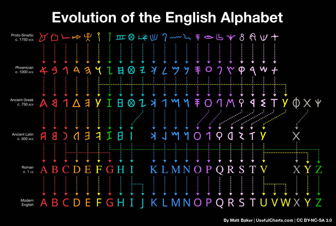
Matt Baker, the creater of the Evolution of the English Alphabet chart, traced the English alphabet all the way back to Proto-Sinaitic in 1750 BCE. This chart is a simplified version of his complete work called Writing Systems of the World and both can be found on UsefulCharts.com.

I made this chart last year as a bonus award on Kickstarter but am now making it available as a free download. Just right click on the above image (or long press on your mobile) and then select save.

UPDATE: I shared this on Twitter and it's my first tweet to reach over 10k RT's! Anyway, here's a few comments based on the feedback I've received:

  • If you want to print it, here's a high-res versionEnglish title | Latin title
  • You're free to use the chart however you like so long as you don't sell it and so long as you give credit to either me (Matt Baker) or this website (UsefulCharts.com). I'm releasing it under a Creative Commons license.
  • Fyi, the above chart was actually just a simplified promo for a much larger chart - a Writing Systems of the World poster. So, if you're concerned about the fact that thorn, wynn, or any other letters are missing, rest assured that they were indeed included on the main chart.
  • If you have questions about why certain letters evolved the way that they did, I actually did a YouTube video on the topic. As for why so many of the letters flipped, it's because they used to be written in both directions. But with the introduction of ink, left to right eventually became standard (less smudging if you're right-handed).
  • The fonts used include ProtoSinaitic (free), Alphabetum (commercial; used for the Ancient Greek/Latin lines) and Google Noto (free; used for Phoenician).
  • "Shouldn't you have titled this 'Evolution of the Latin Alphabet?'" Well, yes, that would have been correct as well. But it's also not incorrect to refer to an "English alphabet". Obviously, many European languages use the same Latin script. But some use a slightly different number of letters. When one is referring to the set of Latin letters used for a particular language, it's ok to refer to that set as the "[language name] alphabet". (Update: I've included a version above with the title "Latin Alphabet" for those who would prefer it.)
  • Many linguists provided feedback throughout the project, including Peter T. Daniels, one of the world's foremost experts on writing systems. You can find the full list of contributors here.
  • I support a charity that does great educational work in rural Sri Lanka. If you're looking for a way to say thanks, consider making a donation. Or, if you purchase any of my other charts (including the Writing Systems of the World poster), a $1 donation will automatically be made.


Found on UsefulCharts.com

Monday
Jul132015

A Brief History of Open Source Code

A Brief History of Open Source Code infographic

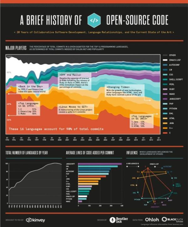
Learn about the last 20 years of collaborative software development, language relationships, and the current state of the art with A Brief History of Open Source Code infographic. Kinvey, a company that helps its clients create mobile apps, published the infographic designed by Beutler Ink back in 2013. For more in-depth reading, check out this article at Read Write.

We were able to visualize the percentage of total commits in a given quarter for the top 16 programming languages from 1993 until today. We hope you’ll find this image—a provocative pattern of dips and spikes—to be as interesting as we do. It truly shows how dynamic the world of programming is. We’ve also included a few graphs on other interesting data points: total number of languages by year, average lines of code per commit, and tracking which languages influenced the development of others.

There is good use of colors and charts to tell the story of the 16 different source code languages. No numbers were needed to show the popularity of each language, only distances between the colors. The colors are similar, but not to the point where we would have trouble telling them apart. I like the gradual color gradient in the infographic. Too many different colors would make the graphic look too busy.  

Found on http://readwrite.com

Monday
Jun012015

A World of Languages

A World of Languages infographic

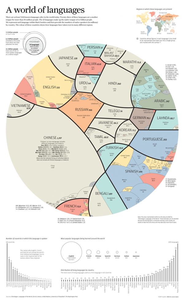
A World of Languages - and How Many Speak Them is a new infographic by Alberto Lucas López for the South China Morning Post that compares the number of people that speak the top 23 languages in the world as their primary language. High resolution image version available HERE.

There are at least 7,102 known languages alive in the world today. Twenty-three of these languages are a mother  tongue for more than 50 million people. The 23 languages make up the native tongue of 4.1 billion people. We represent each language within black borders and then provide the numbers of native speakers (in millions)  by country. The colour of these countries shows how languages have taken root in many different regions

The dominant visual centerpiece appears to be a combination of a voronoi diagram & circular treemap, where the area of each section is representative of the number of people that speak each language as their first language. I don’t know any any software that will create this specific visualization style, so I’m assuming the area of each section had to be calculated separately. With the different, organic shapes how were those areas calculated? Iteration?

The data is a little bit controversial. It’s an estimate of the number of people that speak each language as their first language. There’s no accounting for multi-lingual people or language families. I love the data visualization design, but the underlying data may cause some concern.

Tuesday
Nov182014

Old World Language Families

Old World Language Families infographic

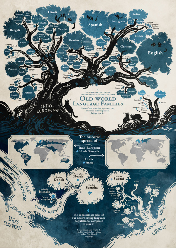
The Old World Language Families infographic from Stand Still Stay Silent Comic shows the “roots” of our modern languages. Follow each language’s path from bush to roots and discover how closely languages are related to each other.

Language trees for the language lovers! I’ve gathered pretty much all the data for this from ethnologue.com, which is an awesome well of information about language families. And if anyone finds some important language missing let me know! (Naturally most tiny languages didn’t make it on the graph, aww. There’s literally hundreds of them in the Indo-European family alone and I could only fit so many on this page, so most sub-1 mil. speaker languages that don’t have official status somewhere got the cut.)

Fantastic illustration that visualizes the evolution of all the modern languages! It’s a complex design that is intended for readers to dive deep and explore.

Knowing that the image itself will be shared as a stand-alone content piece, the image should include credits and links to the original site.

Found on http://mentalfloss.com

Monday
Apr222013

8 New Punctuation Marks We Need

8 New Punctuation Marks We Need infographic

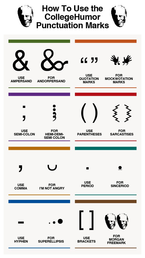
Our punctuation choices could really use an update, and CollegeHumor.com is proposing we add these 8 New Punctuation Marks to our collective writing options.

A humorous look at some of the punctuation marks missing in the English language.

This is a borderline infographic.  Originally, all eight were designed as separate images, but then College Humor stacked them together into one image file so that it resembled a tall infographic .  There’s no data visualization or much in the way of illustration other than the symbols themselves.  However, it is informative, so like I said, I consider this to be a borderline infographic.

The response to the ideas was strong enough that they actually created the font, and you can download it from the College Humor site.  They created a separate infographic as the instructions on how to use the font in your desktop applications once you have it installed.  

UPDATE: Want to use these punctuation marks? Click here to download the CollegeHumor Punctuation font and get access to all of them.

The downloaded font won’t work on websites, just desktop applications, but I have seen a few people trying to make it available online as well.  For example, here’s a link to a Google Chrome extension that let’s you use the font on Facebook.

Found on Visual.ly

Thursday
Feb142013

I Love You in 130 Languages

I Love You in 130 Languages infographic pink

Fun design for Valentine’s Day from GlobalNova.  The I Love You Map, shows the phrase “I Love You” translated into 130 different languages and positioned on the map based on the primary language spoken in that country or region of the world.

When setting out on any language-related project, one can count on unexpected discoveries and changing perspectives.  Our World Valentine project seemed simple to me at the outset – just map ‘I love you” in 100 or so languages onto a world map.  I thought of it pretty simply as a Valentine card for my wife.

But the real blow landed in choice of languages.  Setting out with no goal beyond rendering a selection of languages geographically, I quickly wandered into a thicket.  Where did Mongolian go? And many others?  Were we bounded by chance and limited space, or less forgivably prey to political naiveté? 

Here is the design also in Black:

I Love You in 130 Languages infographic black

Thanks to Matt for sending it the link!

Tuesday
Jun052012

Market and Competitive Intelligence Trends

Market and Competitive Intelligence Trends

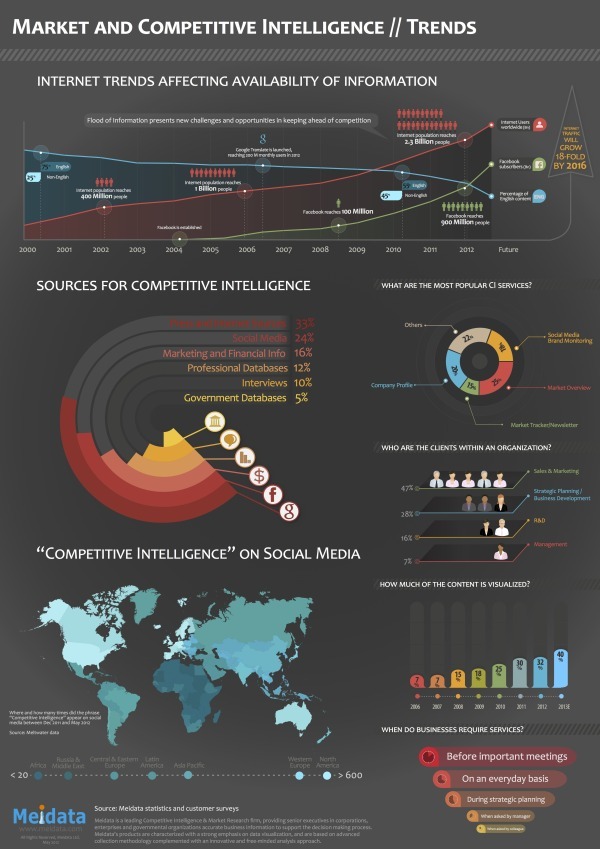
Meidata brings us the Market and Competitive Intelligence Trends infographic that covers the sources and uses of competitive intelligence online and related Internet trends that affect the availability of information.

Meidata is a company in Israel, but has clients from around the world.  The infographic is based on their own internal information from global customers and system statistics, so this information is not available anywhere else in the world.

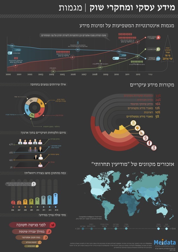
Designed by Robert Ungar at Meidata, the design is colorful and easy to follow.  A great design overall.  One of his best design accomplishments is the language translation.  More than merely pasting the translated text, the design has to account for the change in direction between Hebrew and English, and still tell a smooth story.

You can view the original design in Hebrew, and they just released an English language version (above) on their site, and you can download either the English PDF or the Hebrew PDF.


Thanks to Shaul from Meidata for sending in the link, providing the information and the English translated version.

Thursday
Feb232012

Hand Jive: Gestures That Can Get You in Trouble Abroad

The Hand Jive-Hand Gestures Infographic from Pimsleur Approach takes you on a world tour of what common hand gestures from America mean elsewhere (for better or worse).

Nearly everyone all over the globe know that flashing the middle finger is meant as a huge insult to the recipient. However, many common hand gestures which are perfectly innocent in the US are in fact quite dangerous in other parts of the world!

This is a great topic for an infographic because it’s so visual.  You have to show the actual gestures as illustrations in order to communicate effectively with the reader.  The pins in the globes are easy to read, and a refreshing visual that’s different from the standard flags on a map.

Simple message, focused topic, easy to understand.  Good design.  For an infographic, the URL at the bottom should link you directly to the original infographic posting instead of the company front page, and some type of coyright statement is missing.

Thanks to Sarah for sending in the link!