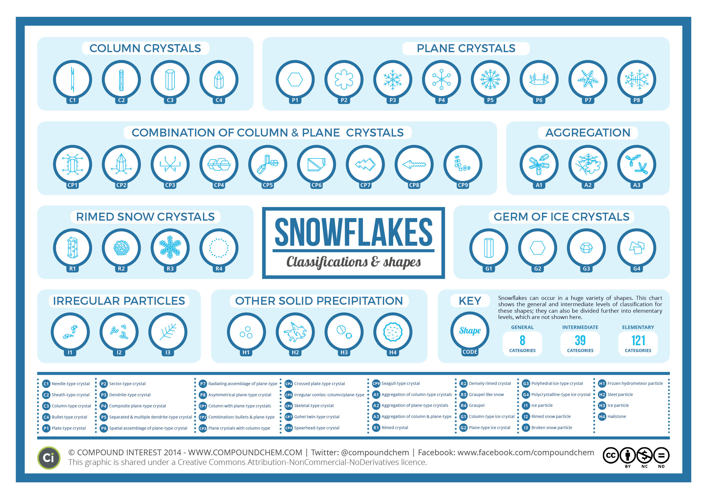
The Alternative Periodic Table
 Randy
Randy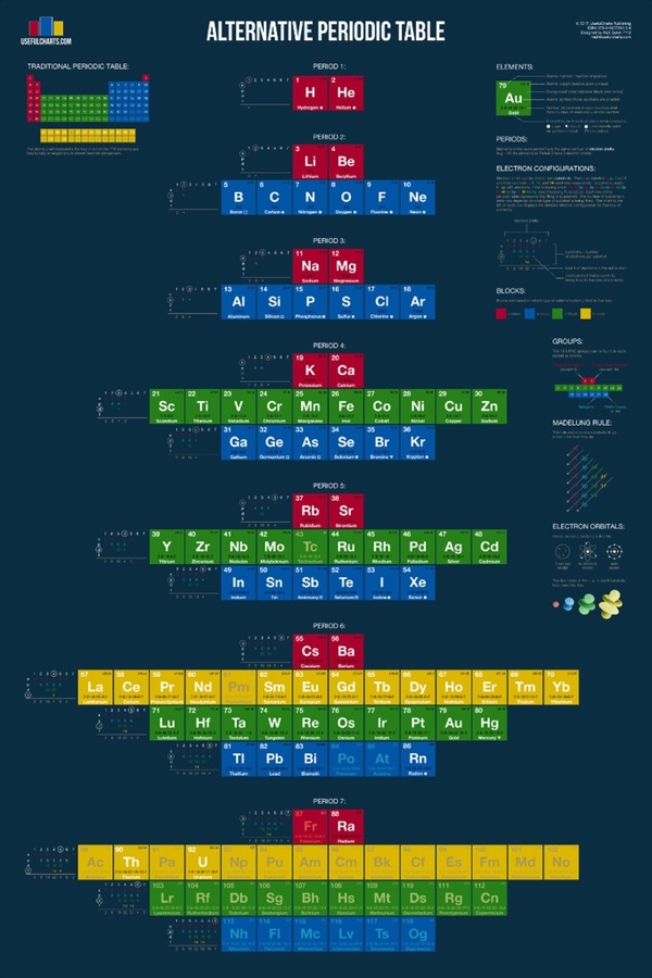
The Alternative Periodic Table is a new project from Matt Baker at UsefulCharts being funded through a Kickstarter campaign that ends on February 9, 2017. Act fast to get your copy and help support Matt!
From Matt:
Recently, I decided to tackle the most famous chart of all... the periodic table! Considering that they just added 4 new elements, the timing could not be better. Anyway, here's what my version looks like:
You'll notice that it looks quite a bit different from the one you're used to. The video at the top of the page explains why. In short, the traditional periodic table is designed to emphasize the concept of valence, which is important for knowing which elements can easily combine with others to form compounds. In contrast, my alternative periodic table is designed to simply emphasize the way in which atoms are "built" (specifically, how electrons group together into shells and subshells). It's based on a design proposed by Edward Mazurs in the 1960s.
Like the traditional table, this alternative version can be used to find an elements name, number, atomic weight, state of matter, period, group, and block. However, it also contains detailed information on electron configurations and the different types of electron subshells.