About
Randy Krum
President of InfoNewt.
Data Visualization and Infographic Design

Infographic Design

Infographics Design | Presentations
Consulting | Data Visualizations

DFW DataViz Meetup

Join the DFW Data Visualization and Infographics Meetup Group if you're in the Dallas/Fort Worth area!

Search the Cool Infographics site

Custom Search

Subscriptions:


Feedburner

The Cool Infographics® Gallery:

How to add the
Cool Infographics button to your:

Cool Infographics iOS icon

- iPhone
- iPad
- iPod Touch


Read on Flipboard for iPad and iPhone

Featured in the Tech & Science category

Flipboard icon

Twitter Feed
From the Bookstore

Caffeine Poster

The Caffeine Poster infographic

Entries in mind map (23)

Thursday
May022013

Connecting The Dots

Connecting The Dots infographic Habitat for Humanity

Connecting the Dots is a mind map design from Habitat for Humanity.  It was published in the May 2013 edition of their own magazine, Habitat World, and made available online as a PDF download.

Learn more about how Habitat builds homes, communities and hope.

I really like the combination of the Venn diagram in the center and the mind map nodes that extend outward.  The sizes of the circles doesn’t have any meaning, just sized to fit the text.  This is a really good way for Habitat for Humanity to tell their story with a visual explanation.


Tuesday
Feb082011

What Kind of Pasta is on Your Plate? #infographic

What kind of pasta is on my plate?
What kind of pasta is on your plate? by Charming Italy

Came across this great family tree/decision tree to help you identify the different kinds of pasta from CharmingItaly.com.  What Kind of Pasta is on Your Plate? breaks the pasta types down into shape families and uses some nice visuals to help you identify your pasta.

I’m an avid reader of Coolinfographics.com - some of the infographics you mentioned on your blog inspired me to create one for our blog as well. Unlike the usual chart- and fact filled graphics, we decided to create a somewhat educational infographic. It highlights the most common and/ or popular types of pasta, and helps you to identify the type of pasta on your plate.

I wish they would hang this up in the pasta aisle in the grocery store!

Thanks to Paolo for sending in the link!

Wednesday
Mar102010

What Do You Suggest? A Visual Search Interface

Using a mindmap-style visual interface, WhatDoYouSuggest.com shows you the search results from Google in an easy-to-use interface.  Created by Simon Elvery, the interface returns the top words that Google suggests based on your initial query.  By clicking on the relevant words, the search becomes more relevant, and more words are suggested to narrow your search.

Both the order of words and the thickness of the lines are meaningful.  More detailed information is available on the Simon’s blog.


What Do You Suggest takes a seed from you (or gives you something random) then guides you on a journey through language and the collective lives of Google users.

Using data from Google to make suggetions on where you might like to go next, What Do You Suggest is an experimental and interactive environment designed to explore how we use language and search on the internet.

  • The words that appear first in each set of options are the words Google thinks are most likely to be what people are looking for.
  • The words joined by the thickest lines are ones which will produce the most results if you searched for them on Google.


Of course, I had try see what “infographics” cam up with…

Found on Information Aesthetics and Gizmodo.


Monday
Feb152010

My Digital Life 2.0: A Consumer Gadget Map

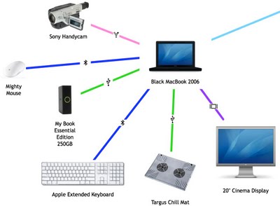
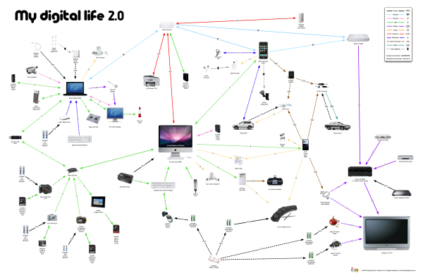
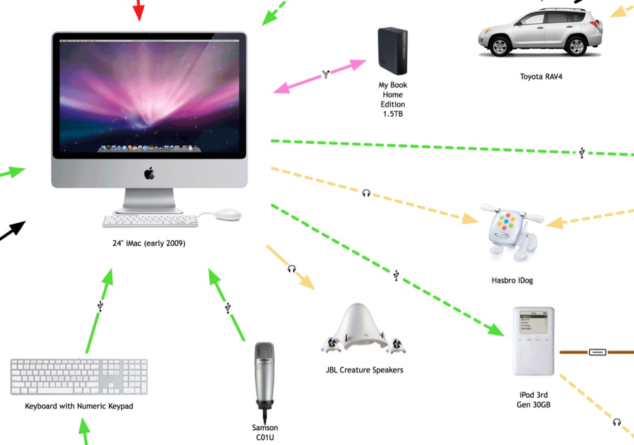
Presenting My Digital Life 2.0!  I’ve significantly updated the My Digital Life infographic I designed last year.  In addition to including many more gadgets and accessories in the graphic, I changed the connection lines to indicate either a constant or occasional connection.  The line arrows also indicate the direction of information flow (sometimes one-way, sometimes both ways).  You can see the high-resolution images on Flickr by clicking on the images.


The infographic highlights many of the decisions a consumer has to make with each new gadget they buy.

  • What kind of batteries should I use?
  • How much and what kind of memory will I need?
  • How do I connect to my existing gadgets and computers?
  • How will it work in my car?
  • Do I have an available connection?
  • Where can I add a new gadget (like a new hard drive)?

For the purpose of Product Development and Marketing, this is a fantastic way to map out the experiences a consumer faces and how new products will fit into their life.  For example, if you were at a company designing a new consumer electronic gadget how would your product fit into your target consumer’s life?  What decisions would they have to make about your product?  Is it easy for them to understand if your new product will work with their existing setup?

Even if you’re only a headphone manufacturer, it’s incredibly important to understand the whole consumer experience.


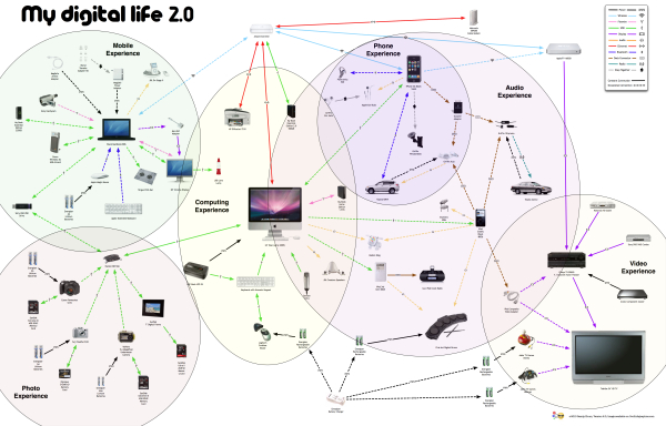
You’ll notice that the map began to form natural groupings that I call experience zones.  Here’s a modified version that highlights six specific areas of experience: video, audio, phone, photos, computing and mobile.  From an average consumer perspective, I know I’m missing two potential additional areas: Gaming and Reading.  I don’t own a gaming console (Xbox or Wii) and I don’t own an e-reader (Amazon Kindle or Sony Reader).

Since I’m a technology geek, I already understand how all of these connections work…in my head.  I’m the one who set them up and I use them every day.  However, imagine your parents or grandparents trying to understand all of these connections, and that doesn’t include the software communication between many of these gadgets.

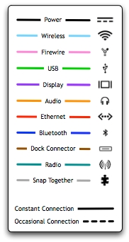
I’ve added a few new types of connections, and included the different line types in the legend.  I also took a few liberties with the connection types.  “Snap Together” indicates any type of physical connection, like the Ear Jams snapping onto my Apple Earbuds and also the iPhone snapping into the car mount.  I left the camera memory cards as USB connections without getting into any more detail of the inner connections in the cameras.  The legend is not truly necessary because in true Tufte form, I included the connection icons in each of the connection lines, but I decided to leave the legend in to identify any icons that people aren’t familiar with.

The biggest challenge in designing the infographic, was arranging everything so that none of the lines crossed.  To make this happen, I ultimately had to skip a couple connections.  I have used the Etymotics earbuds with the MacBook occasionally, but that connection line would have been horribly ugly, crossing the entire graphic.

Monday
Feb012010

Mindmap of Randy Pausch's Last Lecture

Mike Krsticevic has created a great mindmap based on Randy Pausch’s Last Lecture.  

At the age of only 45 (in Sept 2006), Professor Pausch was told that only 4% of pancreatic cancer sufferers (of which he was now diagnosed as one) lived for 5 years after their diagnosis. At the time of the “Last Lecture”, due to his deteriorating medical condition, Professor Pausch was told his odds had reduced to 3 to 6 months of good health left (at best). 

I have spent 3 hours preparing the mind map for you (including the time spent re-watching the video) and I have learnt so much more by being actively involved. For this reason I strongly recommend that you take the time to read and study the mind map after you watch the video. I believe it will be well worth your time

If you haven’t seen this video, I highly recommend watching this.  It’s about 1:15 long, so watch it over lunch or when you have enough time, but it is truly inspirational.

You can download the PDF from Mike’s site.

Saturday
Dec122009

My Digital Life - personal infographic


My Digital Life, is an quick infographic by me!  A mindmap or network map of the digital products in my life, and how they all interconnect. Each connection is color-coded by the connection type (USB, wireless, ethernet, etc.) including its respective standard icon.  High-res version is on Flickr.

This started as a simple sketch to help me determine how to add a new external hard drive I got on Black Friday, but it quickly became much more fun to see how far out I could push the network.  I already know of some more that I want to add, so someday there may be a 2.0 version.  Apparently, I could use an IT manager at home.


I did ignore some differences within the connection types to keep this fairly simple.  I don't distinguish between USB 1.1 and USB 2.0 connections.  I use "Display" as a connection type, but its a DVI connection for the MacBook, a HDMI connection from the AppleTV and a composite connection from the DVD player.  I also show only one "Wireless" connection, but I know that the iPhone only uses 802.11g and the laptop uses 802.11n.

I did this using OmniGraffle, with a little help from Pixelmator and Keynote to clean up the images.

Tuesday
Nov172009

Webpages As Graphs - Cool HTML visualizer applet


Marcel Salathe has created Webpages As Graphs, an interactive HTML DOM visualizer applet that will view any http:// website in a graphic form.  The image above is Cool Infographics, but the arrangement comes out a little different every time you run it.

Using Processing, Traer Physics and HTMLParser the site lets you enter the domain and then watch while it works its magic.  He has also made the source code available and instructions to print your graph as a poster.

HTML consists of so-called tags, like the A tag for links, IMG tag for images and so on. Since tags are nested in other tags, they are arranged in a hierarchical manner, and that hierarchy can be represented as a graph. I've written a little app that visualizes such a graph
I ran it for a number of other websites to see the differences, some were inspired by the examples on Marcel's site.

Amazon.com: Pretty complex site with lots of links, images and tables.


Apple.com: Simple design, as you expect from Apple.


Google.com:  Known for their clean front page.


LifeHacker.com:  Great blog with a very complex structure.


Friday
Oct232009

Collaborative, Online Mind Map about Mind Mapping Software


I know, that's a mouthful of a title.  MindMeister is an online, collaborative mind mapping tool that lets multiple users edit a common mind map.  Essentially, its a visual wiki, that allows anyone to makes changes to the data, but you need to be logged in so that it can track who makes the changes.

Andrew Wilcox has created a public mind map with the catchy title "The Strengths and Weaknesses of Mind Mapping Software Applications".  You can see all of the different mind mapping software packages, the pros and cons of each one, and add your own comments.


Your voice can still be heard, a few of the software applications don't have any comments at all yet.  They need people to help add information to the map.

Found on the Mind Mapping Software Blog, by Chuck Frey

Also, MindMeister has an iPhone app that allows you to view and edit online mind maps from your iphone.  It's $6.99US in the iTunes App Store.  MindMeister (mind mapping)

Tuesday
Aug042009

NEW Death and Taxes 2010 poster!!

First, Jess from WallStats.com has released the 2010 Death & Taxes poster.  This is one of the best infographic examples today.  It's extremely informative, and the topic has a very wide reach.  The Death & Taxes poster from 2007 was my initial post on Cool Infographics, so I'm very excited to see this update.   Now the 2010 version is available to purchase as a poster here. Great job Jess!

Second, I'm really impressed by the viewer code for the poster. It's from Zoomorama.com, and lets me embed the interactive viewer.  The built-in zoom is pretty nice, but the Quick Find index on the left side is the best part.

Monday
Jun222009

Market Visual (BETA) knowledge maps


I came across Market Visual Knowledge Maps this morning.  It claims to still be in BETA, and it maps business relationships based on companies or people that you enter.  It seems to build these mind maps on the fly, and saves any maps that you have build so you can retrieve them later.


It's a service you have to pay for, but if you're looking through annual reports and SEC filings to find people and connections, this will save you a bunch of time.  There's a fully interactive sample map, as well as an introductory video.