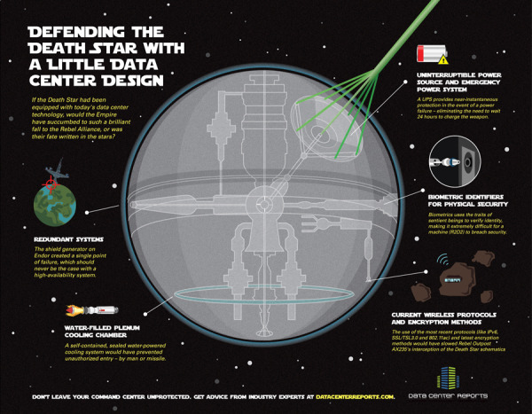
Electrocardiography Basics
 Randy
Randy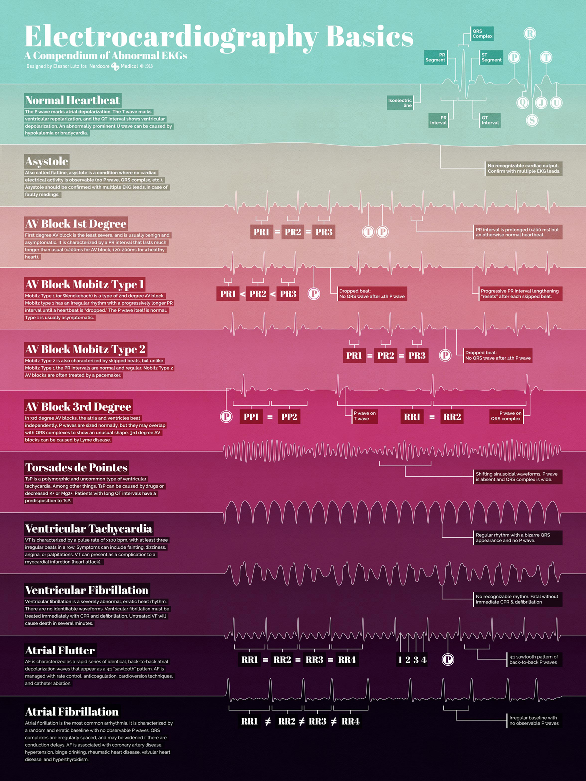
Electrocardiography Basics is a new infographic science illustration poster design by Eleanor Lutz at TabletopWhale.com for Nerdcore Medical. You can purchase the printed poster for $19.99 from Nerdcore Medical.
This week’s collaboration with Nerdcore Medical was a fun chance to try a more simple style than I usually use. For this poster I wanted to show 11 different kinds of heartbeat EKGs in a colorful design.
I wanted to highlight the unique shapes of each EKG wave as the focal point of the poster. After trying a few different things, I decided to try and make a digital heartbeat “sunrise,” where each of the EKG waves defined a specific colorful section of the poster. I thought it would show off the simple shape of the waves, and also work as a practical way to section off the different descriptions.
I ended up designing each line in Illustrator, and then importing the shapes to Photoshop to add textured shadows, color overlays, and text. More...
Eleanor followed up this design with a behind-the-scenes blog Rough Drafts and Sketches post about what went into her design process, and specifically the color palette selection process (a beautiful infographic design itself!).