About
Randy Krum
President of InfoNewt.
Data Visualization and Infographic Design

Infographic Design

Infographics Design | Presentations
Consulting | Data Visualizations

DFW DataViz Meetup

Join the DFW Data Visualization and Infographics Meetup Group if you're in the Dallas/Fort Worth area!

Search the Cool Infographics site

Custom Search

Subscriptions:


Feedburner

The Cool Infographics® Gallery:

How to add the
Cool Infographics button to your:

Cool Infographics iOS icon

- iPhone
- iPad
- iPod Touch


Read on Flipboard for iPad and iPhone

Featured in the Tech & Science category

Flipboard icon

Twitter Feed
From the Bookstore

Caffeine Poster

The Caffeine Poster infographic

Entries in security (8)

Tuesday
Jan022018

Securing Your CryptoCurrency Trading Account

Securing Your CryptoCurrency Trading Account infographic

There's a lot of hype and investor interest in cryptocurrencies right now. Binance.com is one of the major trading platforms that allows you to exchange one currency for another (like exchanging bitcoin for litecoin), but securing your account is very important. Like cash, if thieves get your cryptocurrency, it's gone forever. 

I love that they are sharing the best practices for Securing Your Trading Account in this simple, helpful infographic! This is a part of their site FAQ, and there's no separate explanation. Everything is included in the infographic. These are really good practices for any CryptoCurrency trading site, not just Binance!

The design is a little text heavy, because there's no numeric data to visualize, but the text description are short, direct to the point and easy to understand.

Monday
Oct062014

The Scary Truth About Your Passwords: An Analysis of the Gmail Leak

The Scary Truth About Your Passwords: An Analysis of the Gmail Leak infographic

Passwords can be troublesome to remember, so we tend to make them short and easy. The Scary Truth About Your Passwords: An Analysis of the Gmail Leak infographic from LastPass shows us that we are not alone in our password struggle. The number one most used password is 123456!  

A detailed analysis of last week’s leak of 5 million Gmail logins reveals some alarming statistics. The infographic takes a look at the reality of our bad password practices, highlighting the ongoing use of weak, dictionary-based passwords that are leaving us vulnerable. If you’re not using a password manager, now’s the time to download LastPass and get started today!

This is some great data, and I highly suggest everyone to use password manager like LastPass or 1Password. You need to use strong passwords, and you should have a different password for every site. Turn on 2-factor identification on any sites that support it!

The pie chart visualization in the “Your Passwords Are Too Short” section is messed up. Pie charts MUST add up to 100%! The values from the color key only add up to 88.74%, and they’re shown in a different order than the colors around the pie chart. The values in the color key are sorted by ascending number of characters, and the pie chart slices are sorted in descending order of value. The additional doughnut chart surrounding the pie chart, and the separate 92.96% statistic both confuse the section even more.

I appreciate the simple call-to-action “Learn more at LastPass.com” at the bottom, instead of a hard sales pitch to buy the app.  However, the URL should take readers to the original infographic landing page on the LastPass site.

Thanks to Eric for sending in the link!

Friday
Nov222013

EFF Encrypt The Web Report

EFF Encrypt The Web Report infographic

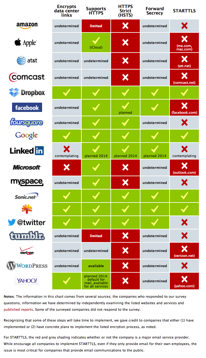
The EFF recently released their Encrypt The Web report and included the cool infographic above.  

We’ve asked the companies in our Who Has Your Back Program what they are doing to bolster encryption in light of the NSA’s unlawful surveillance of your communications. We’re pleased to see that four companies—Dropbox, Google, SpiderOak and Sonic.net—are implementing five out of five of our best practices for encryption. In addition, we appreciate that Yahoo! just announced several measures it plans to take to increase encryption, including the very critical encryption of data center links, and that Twitter has confirmed that it has encryption of data center links in progress. See the infographic.

By adopting these practices, described below, these service providers have taken a critical step towards protecting their users from warrantless seizure of their information off of fiber-optic cables. By enabling encryption across their networks, service providers can make backdoor surveillance more challenging, requiring the government to go to courts and use legal process. While Lavabit’s travails have shown how difficult that can be for service providers, at least there was the opportunity to fight back in court.

While not every company in our survey has implemented every recommendation, each step taken helps, and we appreciate those who have worked to strengthen their security. We hope that every online service provider adopts these best practices and continues to work to protect their networks and their users.

Crypto Survey Results

UPDATE, November 20, 2013: Facebook and Tumblr have provided further information to supplement the Encrypt the Web Report. We’re pleased to report that Tumblr is planning to upgrade its web connections to HTTPS this year and implement HSTS by 2014, and Facebook is working on encrypting data center links and implementing STARTTLS.

Great visual table array design that uses the company logos instead of text to make it easier for readers.  The color-coding in each cell is also super-easy for readers to follow.  It only takes seconds to skim through the design.  The data is clearly communicated to the audience!

However, as an infographic released on the web, it’s missing a number of key features.

  • No title.  The infographic image will be shared on other sites, so the image file itself needs to have a title and a short introduction to what readers are seeing.
  • No date.  This information will obviously change over time, and they have already added the update you see in the text above.  This infographic should clearly state that this information is current as of 11/20/13 so they can make future updates.
  • No logo.  Someone seeing this infographic posted anywhere else would have no idea that it comes from the EFF.  The EFF brand has a lot of positive equity and the infographic would be more believable if readers know if comes from the EFF
  • No copyright.  The EFF would probably release this under Creative Commons, but that needs to be explicitly stated in the infographic itself.
  • No original URL.  The URL link to the original landing page on the EFF site should be included in the footer of the design so readers can find the original full-size version when they see smaller thumbnails posted on other sites.

Thanks to Mervik Haums for posting it on Google+!


Thursday
Aug222013

Worldwide ATM Cyber Attack

World Wide ATM Cyber Attack infographic

The Worldwide ATM Cyber Attack infographic from 41st Parameter talks about the international internet heist that stole $45 Million in May 2013. The infographic centers around how they did it, what they took, and then how it could of been stopped.

Most people gasped at today’s headlines about the massive, $45 million ATM heist, which was engineered by a highly-organized gang of cybercriminals. Consumers and banking executives alike have the same worry today: Is their money and account information safe?

Here at 41st Parameter, the news simply highlighted what we already knew – financial institutions are extremely vulnerable to increasingly sophisticated cyber criminals who, as in this case, are able to steal data from pre-paid ATM cards and then quickly loot machines across the globe.

Most banking systems today are connected directly or in-directly to the Internet. This brings about a multitude of unintentional exposures, all of which allows criminals to exploit them to their advantage.

Given the scale of the global credit card networks, it is almost impossible to detect every kind of attack. Similar to fighting terrorism, you can be successful in preventing something 100 times, but the bad guys only need to be successful once.

Banks and financial institutions should use all of the available data and fraud detection solutions to fight fire with fire – and build better defenses for the 21st Century. Indeed, the shocking $45M price tag for banks should be a call to action to put better protections in place. This attack is NOT the last one, and if the modus operandi proves to be successful, crooks will exploit it time and again.

Good use of an infographic as a step-by-step visual explanation.  Good source listing with the URL directly to the detailed news article.  The footer should include a copyright statement and the URL to the original infographic landing page so people can find the full-size version after seeing the infographic on other sites. 

Thanks to Caroline for sending in the link!

Friday
Mar222013

460 Million Connected Internet Devices

Beautiful data visualizations of some very scary data!  

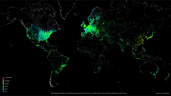
An anonymous hacker under the pseudonym of “Carna Botnet” has posted a comprehensive Internet Census 2012 report of over 460 million internet connected devices that responded to PING requests or were found to have open ports.  He was able to create a botnet using over 30,000 Internet devices that had remote administration available using the Telenet and still had the factory installed standard passwords.  He found several hundred thousand open devices, but didn’t need that many.

Abstract: While playing around with the Nmap Scripting Engine (NSE) we discovered an amazing number of open embedded devices on the Internet. Many of them are based on Linux and allow login to standard BusyBox with empty or default credentials. We used these devices to build a distributed port scanner to scan all IPv4 addresses. These scans include service probes for the most common ports, ICMP ping, reverse DNS and SYN scans. We analyzed some of the data to get an estimation of the IP address usage. 

All data gathered during our research is released into the public domain for further study. 

The visualizations he was able to create using the gathered data are fantastic.  Check out the IMAGES page of the report for beautiful, high-resolution images.

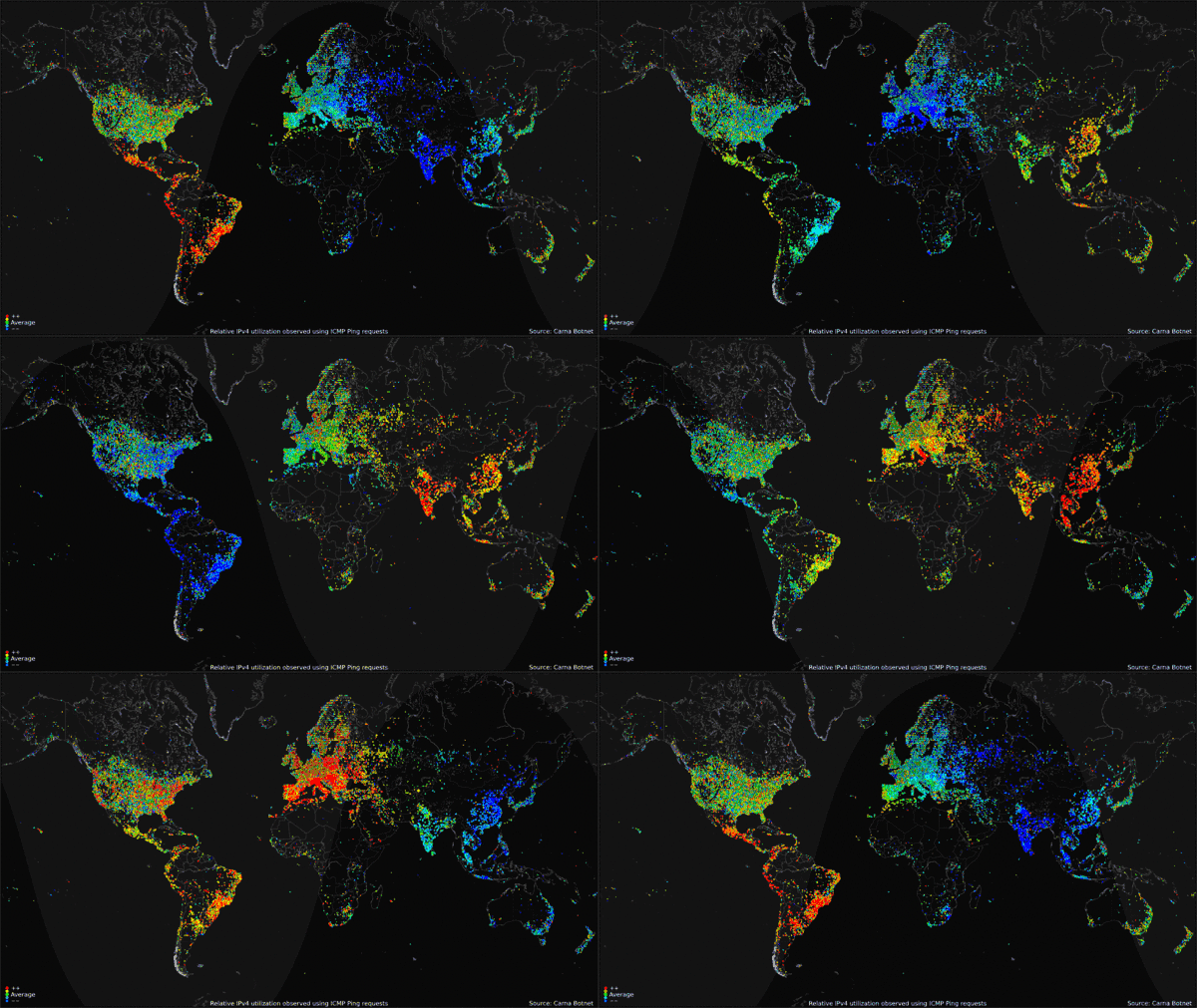
The map visualization above shows the geolocation data of all 460 million devices that responded to the queries from the botnet, clustered around population centers as you might expect.  The animated GIF below shows the geolocated devices that responded during the course of a day, showing that many devices are turned off overnight but many more are just left on constantly.
My favorite visualization from the data is the Hilbert Map, which uses the a 2-dimensional Hilbert Curve to map out the continuous sequence of IP4 addresses into a square area, and then color-codes the address blocks that responded to a PING request.  There’s even a cool zoomable viewer of the Hilbert Map that lets you drill into the details.
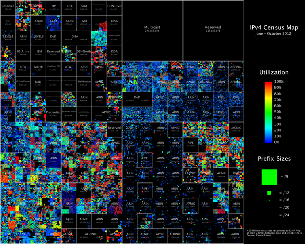
 

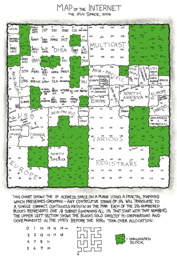
This form of mapping was inspired by the xkcd Map of the Internet, which shows the Internet addresses that were distributed to major corporations in the 1990s before the Regional Internet Registries took over the allocation.


Found on the Security Now podcast #396 and FlowingData

Monday
Jan072013

Can You Protect Yourself from Hackers at CES?

Can You Protect Yourself from Hackers at CES? infographic

Are you headed to CES in Las Vegas this week?  Do you know how to protect your electronic devices?  The Is Your Device Safe at CES? infographic from Novell shows us some heartbreaking stats.

The Numbers Don’t Lie

You don’t think it will ever happen to you, do you? Well, think again. With a laptop or tablet being stolen every 53 seconds you can literally lose your mobile device at any minute. Oh, and by the way, you’re losing a lot more than that precious device: sensitive company documents, passwords, credit card information, etc. So what are you doing to protect that phone/iPad/laptop? Apparently very little as only 4% of smartphones have Mobile Device Management security installed on them. Take a look at a few of the scary numbers and some ideas you could implement to protect your device and your precious content.

This design is long, but there’s a lot of information to share.  I like the simple color scheme, and there’s some really good data included in here.  However, most of the statistics are shown in text only, which is disappointing.

I’ve said it many times here on Cool Infographics.  Big fonts are not data visualizations.  You want your readers to comprehend and remember the numbers you are showing them in your infographic design.  To be successful at that you need to put the numbers into context for the reader, by visually comparing them to another value or showing them the scale of the value.

Thanks to Mat for sending in the link!


Monday
Dec242012

Defending the Death Star

Defending the Death Star with A little Data Center Design infographic

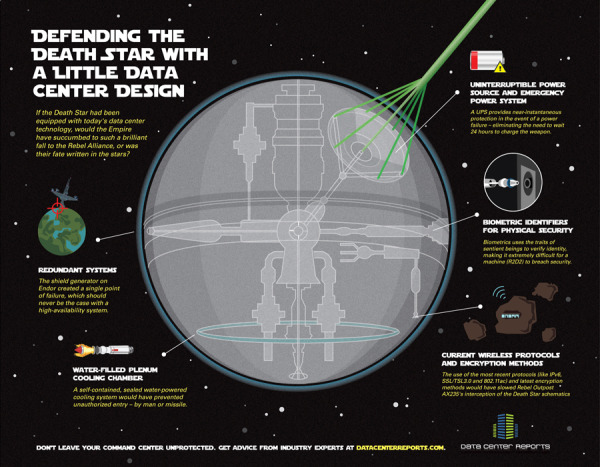
Old age meets new age. Defending the Death Star with A little Data Center Design takes a concept that people can relate to (Star Wars) and applies modern day data center technologies. Brought to you by Data Center Reports.

When Aristotle first explained the concept of “hamartia” in Poetics, he probably didn’t know just how many hero and villain stories would be driven forward by fatal flaws in character, judgment or planning. The Star Wars saga is an epic tale that is powered by fatal flaws – yet we couldn’t help but wonder how things might have turned out had the Empire used a little of today’s security insights to better protect the superweapon better known as the Death Star.

This infographic design tells a good story with illustrations.  No big data sets to visualize, but a simple story that’s incredibly easy for the reader to understand.  The Star Wars comparison puts the different technologies into context for the reader.

The footer should include a copyright and the URL link to the original infographic so readers can easily find the original high-resolution version.

Found on Data Center Reports

Thursday
Jun232011

Stuxnet: Anatomy of a Computer Virus [video]

Stuxnet: Anatomy of a Computer Virus from Patrick Clair on Vimeo.


Stuxnet: Anatomy of a Computer Virus is a video that claims to be a “motion infographic.”  Created by Patrick Clair, it explores some of the information that has emerged as people have been dissecting the Stuxnet computer virus.

An infographic dissecting the nature and ramifications of Stuxnet, the first weapon made entirely out of code.

I really like the idea of motion infographics, but I disagree that moving text and animation make this an infographic.  There is a lot of information, but there aren’t any data visualizations.  There were a couple of animations that looked like data visualizations, but they’re vague and don’t convey any data to the viewer.

I really like the video, the topic of weaponized software is fascinating and the Security Now podcast #291 has a really good explanation of what has been publicly learned about the virus.

Question for everyone reading: “Does informative = infographic?”

Direction and Motion Graphics: Patrick Clair patrickclair.com
Written by: Scott Mitchell

Found on Visual News

The video is now also available on YouTube: