About
Randy Krum
President of InfoNewt.
Data Visualization and Infographic Design

Infographic Design

Infographics Design | Presentations
Consulting | Data Visualizations

DFW DataViz Meetup

Join the DFW Data Visualization and Infographics Meetup Group if you're in the Dallas/Fort Worth area!

Search the Cool Infographics site

Custom Search

Subscriptions:


Feedburner

The Cool Infographics® Gallery:

How to add the
Cool Infographics button to your:

Cool Infographics iOS icon

- iPhone
- iPad
- iPod Touch


Read on Flipboard for iPad and iPhone

Featured in the Tech & Science category

Flipboard icon

Twitter Feed
From the Bookstore

Caffeine Poster

The Caffeine Poster infographic

Entries in education (65)

Thursday
Jun142018

Giveaway: Design Better Charts in PowerPoint

The giveaway for June is ONE FREE PASS to my complete class on Skillshare, 44 minutes for all 10 lessons! Students with a Free Access Link can watch the complete class for free without a Skillshare Premium Membership.

Register on the Giveaways Page by June 30, 2018 to be entered.

Skillshare is an online subscription learning community with thousands of classes on everything from business to graphic design to fashion – it’s the Netflix of learning. You can use THIS LINK to see my class and sign up and get two free months! That's plenty of time to take my class and try out a few others. Once you're a member, you have access to all of classes that Skillshare offers, and there are thousands of them.

If you're already a Skillshare member, then you already have access! Please check out my class, and share with your network of friends and co-workers. Follow me on Skillshare to catch any future class I post as well!

Here's a quick time lapse of the sample file I use for demonstration in the class. This will give you an idea of how the data visualization design principles are applied to a bar chart in PowerPoint:

Monday
Oct122015

Giveaway: Data Visualization Training Video Package

I have ONE Data Visualization - 5-Course Video Training package from O'Reilly to give away in October! This is a great giveaway! Regular price $309.99, Over 14 Hours of online training

Register HERE by 11:59pm on October 30, 2015 to be entered.

A winner will be randomly selected on Oct 31st.

Successful data visualizations allow you to impart meaning and emphasis to your data points. This Learning Path will teach you how to display trends, patterns, and outliers while you discover the power of letting your data to speak. Once you’ve finished, you’ll be able to efficiently communicate volumes of data with ease. The Data Visualization training package includes all five course videos:

  1. An Introduction to d3.js: From Scattered to Scatterplot, Presented by Scott Murray | 2 hours 52 minutes
  2. Learning to Visualize Data with D3.js, Presented by Rafael Hernandez | 3 hours 52 minutes
  3. Using Storytelling to Effectively Communicate Data, Presented by Michael Freeman | 1 hour 30 minutes
  4. Effective Data Visualization, Presented by Jeff Heer | 2 hours 52 minutes
  5. Intermediate D3.js, Presented by Scott Murray | 3 hours 38 minutes
Tuesday
Sep082015

DataViz & Infographics Fall Course at SMU CAPE

Cool Infographics Course at SMU

Infographics & Data Visualization Design

September 24-November 12, 2015 | 6pm-9pm Thursday Evenings | SMU CAPE Plano Campus | $595

$75 off discount code for Cool Infographics readers: RK215

This Fall, I will again be teaching a course as part of the CAPE program (Continuing and Professional Education). This time the course will be at a new location at the SMU Plano Campus. This is a very hands-on course where participants will start to develop better charts, infographics and your own infographic resume. Topics include:

  • The art and science of data visualization and infographics
  • The data visualization and infographics design process
  • Data analytics and basic statistics for the designer
  • Different chart types, dashboards and graphing options
  • How to use the various software and online tools readily available and when to use them
  • Strategies for publishing and promoting infographics online
  • Understanding IP, trademark and copyright issues and how they relate to infographics
  • And more...

Please share with anyone in the Dallas area, or join the class yourself. Enrollment is very limited, so register quickly!

Click Here to learn more: bit.ly/SMU-DataViz-Plano


Also check out the DFW Data Visualization & Infographics Meetup group with monthly speakers and events in the Dallas-Fort Worth area!

Sunday
Feb222015

Cool Infographics Course at SMU

Cool Infographics Course at SMU

Infographics & Data Visualization Design

April 7-May 19, 2015 | 6am-9pm Tuesday Evenings | SMU CAPE Dallas Campus | $495

$50 off discount code for Cool Infographics readers: VIP50

I will be teaching a new course at the SMU Dallas Campus this spring as part of the CAPE program (Continuing and Professional Education). In this course, working professionals will become familiar with the exciting and expanding field of data visualization and infographics. By attending this course you will start to develop your own portfolio and learn:

  • The art and science of data visualization and infographics
  • The data visualization and infographics design process
  • Data analytics and basic statistics for the designer
  • Different chart types, dashboards and graphing options
  • How to use the various software and online tools readily available and when to use them
  • Strategies for publishing and promoting infographics online
  • Understanding IP, trademark and copyright issues and how they relate to infographics
  • And more…

Please share with anyone in the Dallas area, or join the class yourself. Enrollment is very limited, so register quickly!

Click Here to learn more: bit.ly/SMU-DataViz


Also check out the DFW Data Visualization & Infographics Meetup group with monthly speakers and events in the Dallas-Fort Worth area!

Wednesday
Oct222014

2014 Higher Education Technology Landscape

2014 Higher Education Technology Landscape infographic

The 2014 Higher Education Technology Landscape infographic from EDUVENTURES is the effort to make sense of the higher education technology landscape for the decision-makers who are tasked with determining new ways to provide better learning outcomes, building and maintaining a modern technology infrastructure, and rationalizing investment decisions.

Leaders in higher education face mounting pressure to deliver and account for better learning outcomes, embrace digital disruption, and replace aging and ineffective infrastructure with newer, cloud-based solutions. To take advantage of this opportunity, new and established vendors have flooded the education technology market, making it one of the most dynamic segments of the high-tech landscape.

It’s estimated that colleges and universities will spend between $20B and $25B this year on technology and services, enabling institutions to support faculty, and administration, as well as effectively market, recruit, enroll, instruct, engage, and prepare students and alums. The solutions span many categories, including enrollment management specialists, adaptive learning platforms, retention solutions, online program managers, social engagement networks, crowdsourcing applications, software-defined networks, big data platforms, and enterprise resource planning (ERP).  The market is vast, confusing, and ill-defined. We hear from our clients regularly that while they want to take advantage of these new tools and solutions, they are perplexed by the ever-growing number of categories and technology vendors, and struggle with how to best to evaluate them.

To meet this growing need among our clients, Eduventures has initiated a new research focus to provide on-going analysis of the technology market to support higher education decision-makers. Our goal is to make the market more understandable, evaluate the strengths and weaknesses of technology and service offerings, and help leaders make informed decisions when selecting and implementing solutions that meet their unique institutional and learner needs.

Eduventures has developed a taxonomy to make sense of this technology landscape as a foundation for on-going research and analysis on this dynamic market:

  • A student lifecycle framework for understanding the overall market and segments
  • An initial categorization of hundreds of vendors serving the market

We have identified over 50 categories and hundreds of providers that market and sell technology and services to post-secondary institutions, which demonstrates how daunting this market can be for higher education leaders. Even with this preliminary analysis, we recognize that there are additional categories and companies to that can be added—our intention is to respond dynamically as new companies emerge and to update this landscape as it continues to mature, converge and evolve.

Complexity is the key message of this design. A lot of work went into identifying and categorizing all of these different services, but the message is clear that it’s a difficult job to setup the technology services any higher educational institution needs.

Any infographic design is going to be shared on it’s own, without the accompanying article, so designers should always include the URL address back to the original in the infographic image. Most people that share infographics don’t include the link back to the infographic landing page, and including that as text in the image file will help your readers find their way back to the full-size, original version you posted.

Thanks to Heather for posting on Linkedin

Friday
May302014

Reading Rainbow's Kickstarter Project

Reading Rainbow's Kickstarter Project infographic

Bring Reading Rainbow Back for Every Child, Everywhere.

LeVar Burton has a fantastic Kickstarter project running to bring back Reading Rainbow to make it available on multiple internet connected platforms and free to classrooms in need.  The team is using multiple infographics to help explain the project and the support the funding campaign goal of raising $5,000,000.

Hi. LeVar Burton here. You may know me as Kunta Kinte, from ROOTS, or Geordi La Forge, from Star Trek: The Next Generation. 

You also may have grown up with me on Reading Rainbow. 

It was my mother who taught me that, by picking up a book, I could “go anywhere” and “be anything.” Ever since Reading Rainbow began in 1983, I have dedicated myself to fostering a love of reading in children, just as my mother did for me. 

Over the past year, I have watched Kickstarter bring communities together to support artists and inventors. Again and again, I have been inspired by watching like-minded people team up to accomplish impossible dreams, and to change the world. 

Now, I am hoping you will join me on my mission: to bring Reading Rainbow back for every child, everywhere.

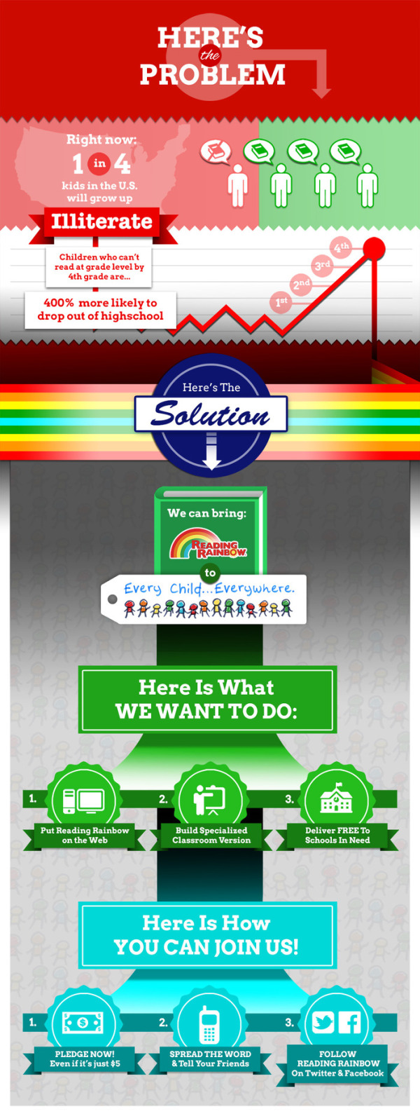
The infographic design above could be improved with the knowledge that people may share the infographic image without the rest of the text and information from the kickstarter page.  It should be able to stand alone as an independent asset with a title, and the URL for readers to find their way back to the original infographic on the Kickstarter campaign landing page. 

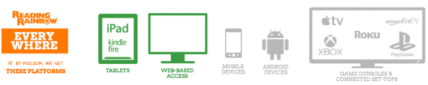
The visualizations help make a huge amount of information about the project easily accessible and understandable to the audience.  Take for example this simple illustration of the platforms they would like to reach.  Visualizing the multiple devices and operating systems makes the goal super easy to understand.

Reading Rainbow's Kickstarter Project platforms

I think this is an incredibly worthy project, and I hope you join me in contributing:

The way Kickstarter works, contributors at different gift amount levels can earn different types of swag merchandise and benefits.  This project is particularly complicated with 24 different funding levels with different swag.  Although mostly text, the visual lists of funding levels help potential contributors choose their amounts.  However, visualizing the swag and benefits with illustrations, icons or photos would have been more helpful.

Reading Rainbow's Kickstarter Project rewards

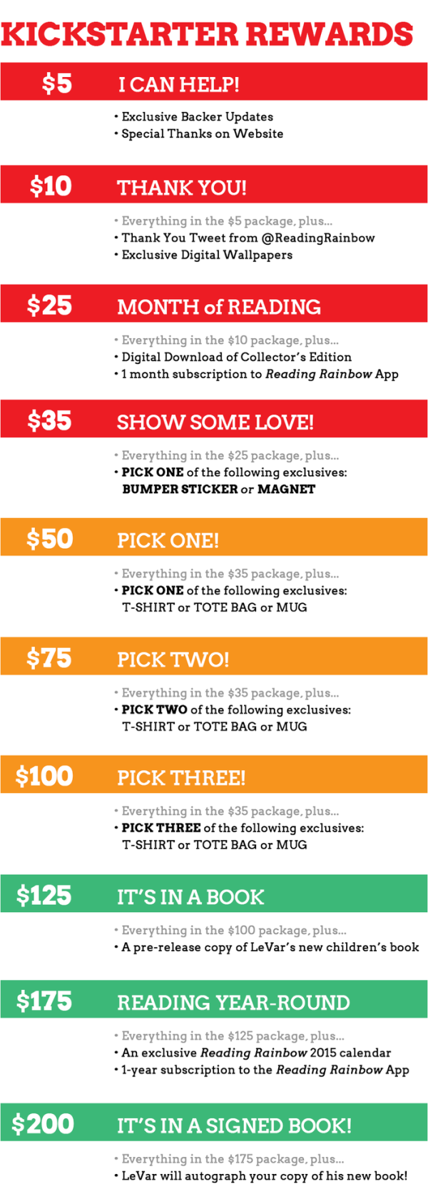
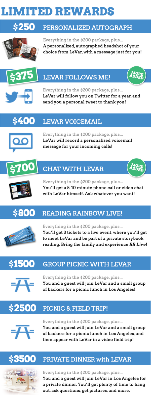
Infographics for the higher levels of contributions and rewards included images, but simple icons for bumper stickers and coffee mugs would make the first list easier to understand.

Reading Rainbow's Kickstarter Project Limited rewards

Infographics have helped make the campaign a huge success, and also made it easier for people to share through social media.

Tuesday
Feb182014

Education is Gold - 2014 Sochi Winter Olympics

Education is Gold - 2014 Sochi Winter Olympics infographic

The Olympics are in full swing. But how much does an athlete’s success depend on their education? In the Education is Gold - 2014 Sochi Winter Olympics infographic from College Atlas, they analyze the educational backgrounds of Olympic athletes.

The much-anticipated Sochi Winter Olympics Games are here, and soon the entire nation will be glued to their TVs cheering on Shaun White, Mikaela Shiffrin and the rest of Team USA. While watching these athletes compete is entertaining in and of itself, knowing the academics behind the games can be just as fascinating.

In this infographic, we analyze the educational backgrounds of the top medal-producing countries and our favorite Team USA athletes. We also outline the physics behind some of the most popular Winter Olympic sports.
 

Thanks to Alyssa for sending in the link!

Tuesday
May072013

Visualizing the School of Design

Visualizing the School of Design infographic

Visualizing the School of Design is a very data dense infographic poster that analyzes the School of Design at the Politecnico di Milano.

Politecnico di Milano, in order to present the School of Design in its own stand at Salone del Mobile 2013, asked DensityDesign to realize a 4 mt x 2 mt poster showing the structure and the efficiency of the School of Design system at Politecnico. The visualization is a picture of the 2010 / 2011 academic year.

Definitely take a look at the full-size version to appreciate the thought and effort put into the design.  This project was amazingly developed in one week by the team at DensityDesign.

Visualizing the School of Design close up

Found on Datavisualization.ch


Friday
Apr262013

The Importance of Childhood Education

A helpful infographic for soon-to-be parents. The Importance of Childhood Education infographic from SchoolTutoring Academy takes information about kids with early childhood education and attention and compares them to kids who did not. But it isn’t all bad news for moms, the infographic gives a few tips on how to survive being a stay-at-home mom as well as some positive job information. Then see how the United States matches up with other countries on early childhood education.

While there can be no denying the heavy importance of early education for a child, this education infographic delves much deeper by looking at how future success in life can often be predetermined by the quality of early eduction.

It also explores the often overlooked importance the role the parent plays, especially the Mother. How important is it for Moms to stay at home with their children during early learning? What steps can working Moms take to secure the best educational foundation for their child? All these topics are researched presented in the infographic. The last segment compares the different education paths taken by countries from around the world. From birth to age 7, we look at the different educational institutions that counties from Canada to Germany to Italy to the United States use to start their children’s educations.

If you have any comments or thoughts on the information included in this infographic or education in general, please use our comment section below. You can also see our previous infographic discussing the cost of rising education.

Although the information included in the design is great, this infographic has a lot of text.  Too much text.  That much text in a design will turn away potential readers even before they start.

Thanks to Shell for sending in the link!

Wednesday
Apr242013

The Digital Dorm

Digital Dorm infographic

College is expensive and it is not getting any cheaper. Lucky for us, the advancement in technology and the introduction of apps could actually lower costs! The Digital Dorm infographic from CourseSmart can tell you the details.

College is getting more expensive but going digital helps students keep more money in their pockets in more ways than one. Check out our infographic on how students can save not just money but also time by moving to a digital dorm.

Not only saving money.  The visual story here is also how to save space and clutter in a student’s dorm room, which will help them find that missing homework assignment!

Thanks to Temple for sending in the link!