About
Randy Krum
President of InfoNewt.
Data Visualization and Infographic Design

Infographic Design

Infographics Design | Presentations
Consulting | Data Visualizations

DFW DataViz Meetup

Join the DFW Data Visualization and Infographics Meetup Group if you're in the Dallas/Fort Worth area!

Search the Cool Infographics site

Custom Search

Subscriptions:


Feedburner

The Cool Infographics® Gallery:

How to add the
Cool Infographics button to your:

Cool Infographics iOS icon

- iPhone
- iPad
- iPod Touch


Read on Flipboard for iPad and iPhone

Featured in the Tech & Science category

Flipboard icon

Twitter Feed
From the Bookstore

Caffeine Poster

The Caffeine Poster infographic

Entries in circles (10)

Tuesday
Feb062018

The ICO Explosion of 2017

4 Years of ICO Activity infographic

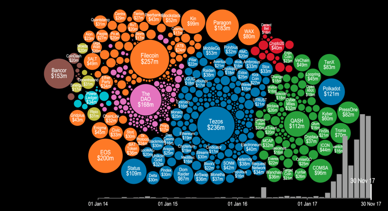
ICO, or Initial Coin Offering, is a method of fundraising that doesn't sell equity of the company, but selling things called "tokens" or new forms of cryptocurrency. The method has been around for years, but the actual boom didn't start until mid 2017.The 4 Years of ICO Activity infographic from The Next Web shows a summary of the investments made. The video version below gives a more detailed timeline of when and where the companies obtained their investments.


Token sales and initial coin offerings (ICO) were certainly the hottest buzzwords of the year for thousands of recreational cryptocurrency enthusiasts and seasoned investors alike. But have you ever wondered precisely how much money was poured into this trend this year? There’s a visualization that can give you an idea.

Cryptocurrency startup Elementus has compiled a nifty animated visualization that shows every token sale that has successfully raised at least $100,000 since 2014. The graph also displays the entire cashflow that went into these ICOs, with detailed month-by-month information for the past four years.

As you will notice in the video below, following some minor activity for the first three years, all hell breaks lose around May 2017. You can see tens of ICOs kick off around the same time, securing millions in financial backing from cryptocurrency enthusiasts and investors.

To put all of this data together, Elementus went straight to the source and collected this information first-hand, gleaning the figures directly from the Ethereum and Bitcoin blockchains.

We searched for every token, crowdsale, and multisig wallet we could find,” wrote Elementus founder and UPenn adjunct lecturer Max Galka. “We then identified the corresponding owners and added up the total amount of contributed funds – taken either from the blockchain itself or as reported by the fundraiser.”

Found on thenextweb.com

Tuesday
Sep262017

The Dark Web

The Dark Web infographic

We have heard of the dark web. But what is actually sold on it? The Dark Web infographic from Weforum.org reports the revenue totals from 3 categories; illegal drugs, prescription drugs, and non-drugs.

We often hear about the dark web being linked to terrorist plots, drug deals, knife sales and child pornography, but beyond this it can be hard to fully understand how the dark web works and what it looks like.

Just like the forest, the dark web hides things well – it hides actions and it hides identities. The dark web also prevents people from knowing who you are, what you are doing and where you are doing it. It is not surprising, then, that the dark web is often used for illegal activity and that it is hard to police.

Off the paths it is almost impossible to find anything – unless you know what you’re looking for – so it feels a bit like a treasure hunt. Because really the only way to find anything in this vast forest is to be told where to look. This is how the dark web works – and it is essentially the name given to all the hidden places on the internet.

So just for a minute imagine that the whole internet is a forest – a vast expanse of luscious green as far as the eye can see. And in the forest are well worn paths – to get from A to B. Think of these paths as popular search engines – like Google – allowing you as the user the option to essentially see the wood from the trees and be connected. But away from these paths – and away from Google – the trees of the forest mask your vision.

Good use of proportional circle sizes to represent the dollar values!

Found on Weforum.org

Tuesday
May172016

Even Major News Outlets Get DataViz Wrong


Data visualization can be the most powerful, inspiring, and effective tool of a storyteller—as long as it’s accurate. However, a visualization can go horribly wrong if the designer uses the design tool incorrectly or gets the math wrong.

All too often, the underlying data is correct, but the visualization doesn’t accurately represent the corresponding values. Most of the time, it’s safe to chalk up the false visualization to an honest mistake by the designer, because it’s actually easier than you think.

Take a bubble chart, for example. A great visualization method, but it’s a common source of flawed dataviz. The reason is that design software only allows scaling or width and height adjustments to size shapes. So designers, upon reviewing the data, will sometimes mistakenly scale a circle's diameter instead of the circle’s area. This, in turn, produces radically incorrect sizes. The approach has logic to it (to some degree), but it’s inherently wrong. What should instead be done takes a bit of geometry and a spreadsheet.

“Just think about it: if you tell a software tool to scale something 200 percent, it will make it twice as tall and twice as wide. Therefore, you aren’t doubling the size of your original circle. You’re making it four time larger.”

- The Truthful Art, Alberto Cairo (@albertocairo)

For a real-world example of this problem, take a look at CNN’s recent “ISIS goes global: 90 attacks in 21 countries have killed nearly 1,400 people,” an insightful article, serious topic, credible source with inaccurate data visualizations. Unsurprisingly, it’s a bubble chart at fault. Assuming the data gathered by CNN is accurate, the maps included in the article don’t match the data and are way off.

CNN ISIS Goes Global Incident Map Bad DataViz

Take a close look and the size key. The circle size for five incidents is clearly shown as five times the diameter of the circle for only one incident, which creates a circle for “5 incidents” that is actually 25 TIMES LARGER, not five times larger. This drastically over emphasizes the locations on the map for the Middle East! I’ve designed the correct sizes so you can see what the bubble sizes should be.

CNN ISIS Circles DataViz Key Corrected

“It’s key for data visualization designers to understand that we visually compare the sizes of objects based on the their area (not their height). Numerical values are one-dimensional, but objects on a page or screen are two-dimensional. This is where designers need to remember to use the math learned from high-school geometry class. If you didn’t do well in geometry, it’s time to take another look.”

- Cool Infographics, Randy Krum (@rtkrum)

Bubble charts are in no way the only kind of dataviz that lends itself to mishaps. In print, broadcast, and online, you’ll see a variety of charts incorrectly showing the data — pie charts not adding up to 100%, logo sizes that don’t match the data, lines of icons with a different quantity than the data, etc.

Inaccurate dataviz certainly doesn’t always happen by accident either. Creating deceptive visual context is an unethical tactic employed by researchers, companies and publications alike, typically to promote a persuasive argument. Differences can be blown out of proportion or hidden by changing the axis scale or ignoring relevant data.

Once you start looking at data visualizations as a critical thinking reader, you’ll start notice many charts that don’t match the data. Always look to make sure the designer accurately represented the information before you take any data visualization at face value.

Friday
May062016

The Mother of All Mother's Day Infographics

Your Guide to the Business of Mother's Day may be the reigning Mother of All Mother's Day infographics from TheShelf.com covering practically everything you'd ever want to know about the business of Mother's Day. However, the data visualization portions need some help.

Mother's Day is right around the corner, creeping up on both consumers and brands alike. And even though, year after year, the majority of presents are bought super last minute, our spending on Mom is off the charts! 

...And why shouldn't it be, the wonderful women in our lives are worth everything that we can throw at them (assuming it's good) on their special day, and that's why we've created this pretty huge rundown of all things Mother's Day.

This is a data-heavy infographic that breaks my 5-second rule. Instead of trying to tell one story really well, they threw in every bit of data they could get their hands on. They have so many sections, it's worth taking a closer look at a few to see what we can learn from the design choices.

The dedicated landing page is very well put together! Plenty of text for SEO and custom wording in the social sharing buttons and even custom social images to make sharing the infographic super-easy for readers! My only complaint is that they aren't sized for the social media sites. Twitter needs images with an aspect ratio of 2:1.

Let's take a closer look at one of the sections:

When you mix some data visualized and some data shown in text alone, the visualized data is perceived as more important to readers. These data points shown in just text is usually ignored by readers because it wasn't important enough to visualize.

If you follow me, you'll know that I have a specific pet peeve with designers getting the sizes of circles wrong when used to visualize data. [See False Visualizations: Sizing Circles in Infographics]

The circles is this design don't match any of the data. I'll demonstrate here. The total area of Greeting Cards at 80% should be exactly four times the area of the The Books circle at 20%. However, you can see here that I can easily fit seven of the Books circles in the Greeting Cards circle with much more room to spare!


The data may be good, but the visualization is all wrong. It looks like the designer was eye-balling the sizes instead of actually visualizing data. Things like this make me skeptical, and begin to question every other visualization in the whole design. 

Let's look at another section:

The flower is a pie chart, so it needs to follow the Golden Rule of Pie Charts! It MUST add up to 100%! However, this flower/pie chart adds up to 129%! What??? The 63% section by itself should be more than half of the flower, but it's shown as less than half.

One you start looking you'll find more problems. Why is 84% represented by 51 out of 56 people icons? That's 91%. Separately, why would you choose 56 icons to represent the total of 100%? Use 100 icons!

Lots of good data included in this infographic, but the design needs to go back to the drawing board.

Thanks to Sabrina for sending in the link!

Friday
Aug292014

False Visualizations: Sizing Circles in Infographics

Accuracy is the most important aspect of an infographic design!

Last week, the article The Truth about the Ice Bucket Challenge by Julia Belluz on Vox Media included the infographic, Where We Donate vs. Diseases That Kill Us, that used proportionally sized circles as its data visualization. The problem with this design is that the circle sizes don’t match the values shown. This is a false visualization and significantly over exaggerates the smaller amounts of money contributed to each charity and the deaths attributed to each cause.

This causes problems because readers often just look at the visuals without reading the actual numbers. They start with the assumption that a visualization accurately represents the data. The Vox Media story and infographic already have over 12,000 shares on Facebook, and this is a great case study for designers to understand how important it is to visualize data accurately.

As readers, we see the area of two-dimensional shapes on the page to represent the different values, but design software only allows width and height adjustments to size shapes. Designers make the mistake of adjusting the diameter of circles to match the data instead of the area, which incorrectly sizes the circles dramatically. It takes some geometry calculations in a spreadsheet to find the areas and then calculate the appropriate diameters for each circle. To demonstrate, I created this corrected version of the infographic.

False Visualizations: Sizing Circles in Infographics Revised

My Google Docs spreadsheet of the correct circle area and diameter calculations is available here.

Assuming this was a design mistake, and there was no intent to deceive the audience, this is a common mistake that many designers make.  So many designers, that I included an entire section on this topic in the Cool Infographics book to help designers understand how to size the area of circles.

I made one other improvement to the corrected design above by removing the color legend and listing the charities and causes of death right next to the appropriate circles. This makes the whole visualization easier for the audience to read by eliminating the need to look back-and-forth from the circles to the color legend to figure out what each circle represents.  Placing the text next to each circle keeps the information in the reader’s field of view which minimizes eye movement.

Sticking with the circles data visualization style, I wanted to take the design a little bit further. I would recommend one of two alternate improvements.  First, adding colored connecting lines is one way to make it easier for the audience to find the related circles in the columns sorted in descending order.

False Visualizations: Sizing Circles in Infographics Revised Lines

A second alternative would be to sort the lists to line up the related circles.  This makes it much easier for the audience to see the direct comparisons between charitable contributions and death rates related to the same cause.

False Visualizations: Sizing Circles in Infographics Revised Descending Sort

I’m passing over any discussion about whether using proportionally sized circles (a bubble chart) is the best visualization method for this data. If a designer makes the choice to use sized shapes, my point is that the data visualizations in the infographic must match the numbers using area.  David Mendoza published a good analysis worth reading and designed an alternative way to visualize the data in his article, This Bubble Chart Is Killing Me.

How else would you improve this design?

NOTE: I was able to contact the designer who created the infographic at Vox Media, and he had already realized his error after the infographic had been published. As I had guessed, he had mistakenly adjusted the diameter of the circles instead of the area. He told me that he’s working on updating the official infographic design in the article, but it hasn’t been published on the Vox Media site yet.


Monday
Dec022013

NFL Concussion Watch 2013

NFL Concussion Watch 2013 infographic visualization

PBS Frontline has published the interactive data visualization, NFL Concussion Watch 2013 to summarize all of the player concussions reported in the NFL.

Every week in the National Football League, a player is sidelined by a head injury. In some cases, their symptoms are clearly visible and they exit the game. Other times, less obvious warning signs can mean a missed diagnosis and a return to the field. Either way, research indicates that the long-term health effects of such injuries — including memory loss, depression and even dementia — can pose problems for players long after retirement.

Concussion Watch is an effort to monitor the NFL’s response to the persistent risk of head injury in professional football. To do so, FRONTLINE will track which players are being removed from games after a hit to the head — and which players are not — and keep score of how long they are kept from the field following a concussion.

I really like the idea of this data visualization, but they messed up the visuals.  The circle sizes are supposed to change relative to the values, but they’re not correct.  The designer chose to make the circles for 1-3 too large in order to fit the numbers inside the circles, and 4-5 are larger but the same size.  The choice of aesthetics over accuracy is a common mistake, and creates a false visual to the readers.  It’s the wrong choice.  Accuracy of the data visualization is more important than any other part of the design.

In visualizations, the design is supposed to visually compare values to create context and understand for the readers.  Because some of these circles are larger than their actual values, this creates the impression that most of the football positions have similar risk, instead of clearly highlighting how less risky some positions truly are.

I do like the design layout that places the circles into their correct player positions.  Readers can grasp this layout in a fraction of a second, and understand where the riskiest positions are.

Thanks to Melanie for sending in the link!

Tuesday
Jul302013

What Do 7 Billion People Do?

What Do 7 Billion People Do? infographic

This is a page out of Funders and Founders future book. It is a circle graph of the population of the world. The What Do 7 Billion People Do? infographic simplifies the worlds jobs into broad groups. Entrepreneurs are still the smallest group!

We explain entrepreneurship and startups visually through infographics. Here you can see draft notes from our future book.

Found on Funders and Founders!

Thursday
Aug252011

OUTBREAK: Deadliest Pandemics in History


OUTBREAK: Deadliest Pandemics in History is a cool collaboration between GOOD magazine and Column Five Media.

From the Black Death to the measles, rapidly spreading diseases have taken a toll on humanity for centuries. Here’s a look at the biggest and deadliest pandemics ever.

I like the circles for each disease sized to the death toll, and illustrated to look like a virus molecule.  I can’t tell if the extra design elements around the circumference of the circles are part of the circle size or not.  The readers’ eyes see the area of each circle to represent it’s relative death toll compared to the others, but looking at the Measles circle, which radius do you see as the size of the circle?  The solid black line or the outer reaches of the appendages?  I think arguments could be made both ways.

Although I personally don’t like legends, the hexagons to indicate all of the different symptoms of each disease work nicely.  The shape implies scientific information, and the designer spend some time designing icons for each symptom.

This design works very well as an informative piece, and is clear to the reader to understand.  This one will probably have a long online lifespan.

Found on Visual News.

Friday
Apr222011

The Tweet Topic Explorer


Jeff Clark at Neoformix has created a cool, interactive tool that visualizes word frequency in a specific Twitter stream called Tweet Topic Explorer.  You can enter anyone’s Twitter ID and it will generate an interactive visual on the fly.  Above is the visualization of my Twitter ID: @rtkrum.  According to Jeff (see note below), this works in most browsers but has trouble with Microsoft Internet Explorer.

Similar to a word cloud, the area of the circles is sized based on the frequency of that word in the Twitter stream.  Words are clustered together and color-coded if they are often found together in the same Tweets.  The actual text of the Tweets is displayed next to the visual, so you can click on any word and it’s highlighted in the text as well.  Clicking on any Twitter names in the text will generate a new visualization for that Twitter user.


One issue I have is that the font size of each word is adjusted to fit within it’s circle, so longer words are naturally smaller to fit on one line withing the circle.  So even if a long word has a higher frquency (and a larger circle area) it appears smaller to the reader’s eye because the font is so small. 

I have created a new tool to help see which topics a person tweets about most often. It also shows the other twitter users that are mentioned most frequently in their tweets. I call it the Tweet Topic Explorer. I’m using the recently described Word Cluster Diagrams to show the most frequently used words in their tweets and how they are grouped together. This example below is for my own account, @JeffClark, and shows one word cluster containing twitter,data,visualization,list,venn, and streamgraph. Another group has word,cloud,shaped,post etc. It’s a bit hard to see in this small image but there is a cluster about Toronto where I live and mentions of run, marathon, soccer. Also, there are bubbles for some of the people on Twitter I mention the most often: @flowingdata, @eagereyes, @blprnt, @moritz_stefaner, @dougpete.

This application was created with the wonderful tool Processing.js which is the javascript-based extension of the Processing tool I have used in the past. Performance is very good with the Chrome browser, and decent in Firefox and Safari. It will not work in Internet Explorer (except perhaps the new IE 9) and currently crashes on iOS devices.

Anyone out there still reading?  Generate a visualization using your Twitter ID and post a link in the comments!

Outstanding job Jeff!  

Found on FlowingData

Thursday
Apr142011

Eat, Drink and Be Thrifty: #infographic video

New infographic video from Mint.com,  Eat, Drink and Be Thrify uses their data to visualize the statistics behind monthly spending habits.
So how does your spending on food and dining compare to that of your peers? Using aggregate and anonymized data on Food & Dining spending from Mint.com, we created the video above to highlight some of the most interesting trends we found in Mint’s data, from average transaction at a variety of coffee shops, grocery stores and fast food restaurants, to the time of year when Mint users spend the most — or the least — in those categories.