When you have something important to say, the last thing you want to stress about is your camera set up. Filmora.io has created the 4 Ways to Set Up Your Talking Head Shots infographic as a tool for aspiring YouTubers. The infographic can be used to help determine which camera set-up to use and the equipment required for it.
A big part of being a YouTuber involves talking to the camera. How you set up your talking-head shot depends on many factors, including how much space you have, what kind of look you’re going for, and how many people you want to fit in one frame. Here are four ways to set up your talking-head shots for YouTube.
ICO, or Initial Coin Offering, is a method of fundraising that doesn't sell equity of the company, but selling things called "tokens" or new forms of cryptocurrency. The method has been around for years, but the actual boom didn't start until mid 2017.The 4 Years of ICO Activity infographic from The Next Web shows a summary of the investments made. The video version below gives a more detailed timeline of when and where the companies obtained their investments.
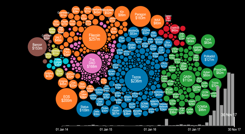
Token sales and initial coin offerings (ICO) were certainly the hottest buzzwords of the year for thousands of recreational cryptocurrency enthusiasts and seasoned investors alike. But have you ever wondered precisely how much money was poured into this trend this year? There’s a visualization that can give you an idea.
Cryptocurrency startup Elementus has compiled a nifty animated visualization that shows every token sale that has successfully raised at least $100,000 since 2014. The graph also displays the entire cashflow that went into these ICOs, with detailed month-by-month information for the past four years.
As you will notice in the video below, following some minor activity for the first three years, all hell breaks lose around May 2017. You can see tens of ICOs kick off around the same time, securing millions in financial backing from cryptocurrency enthusiasts and investors.
To put all of this data together, Elementus went straight to the source and collected this information first-hand, gleaning the figures directly from the Ethereum and Bitcoin blockchains.
“We searched for every token, crowdsale, and multisig wallet we could find,” wrote Elementus founder and UPenn adjunct lecturer Max Galka. “We then identified the corresponding owners and added up the total amount of contributed funds – taken either from the blockchain itself or as reported by the fundraiser.”
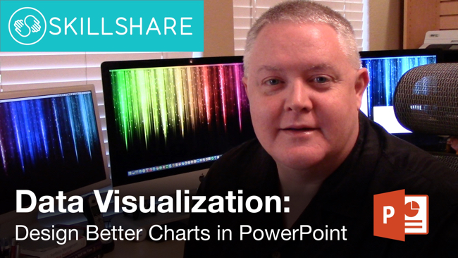
This week I launched my first class on the Skillshare platform. Data Visualization: Design Better Charts in PowerPoint is a 10-lesson class covering how to apply data visualization design principles specifically to the default charts created in Microsoft PowerPoint. Too many people click the chart button and think they're done!
If you know of anyone else that’d be interested to learn how to Design Better Charts in PowerPoint, I’d appreciate if you’d share the link with them too. Thanks!
Class Description:
Most PowerPoint charts suck! Your company spends a huge amount of time and resources on research and data analysis, but when it comes time to present your results, the default charts from PowerPoint are nothing special. Learn how to apply core data visualization design principles to create charts that clearly make your audience go “Ah-Ha!”
If you’re just using the default chart templates in PowerPoint, you’re making a big mistake. Your charts will look like the same default charts your audience sees in every other presentation, and it makes you and data look generic. Those default chart are only meant to be the starting point (you have to start somewhere), but you need to customize your charts to effectively communicate your own insights and key message to your audience in a unique, memorable way.
This course will focus applying data visualization design best practices to charts created in Microsoft PowerPoint.
Choose a Key Message
Write a Good Title
Remove the Chart Legend
Reduce Visual Noise
Use Color with Purpose
Add Chart Elements
If you’re not familiar, Skillshare is an online subscription learning community with thousands of classes on everything from business to graphic design to fashion – it’s the Netflix of learning. You can use THIS LINK to see my class and sign up and get two free months! That's plenty of time to take my class and try out a few others. Once you're a member, you have access to all of classes that Skillshare offers, and there are thousands of them.
If you're already a Skillshare member, then you already have access. Please check out my class, and share with your network of friends and co-workers. Follow me on Skillshare to catch any future class I post as well!
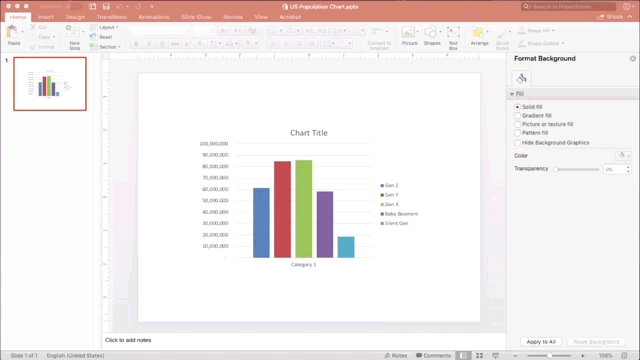
Here's a quick timelapse of the sample file I use for demostration in the class. This will give you an idea of how the data visualization design principles are applied to a bar chart in PowerPoint:
I want to thank Skillshare for inviting me to record the class, and the support they provided for planning, editing and promoting the class.
I have more video projects and big news to announce planned for this year, so stay tuned!
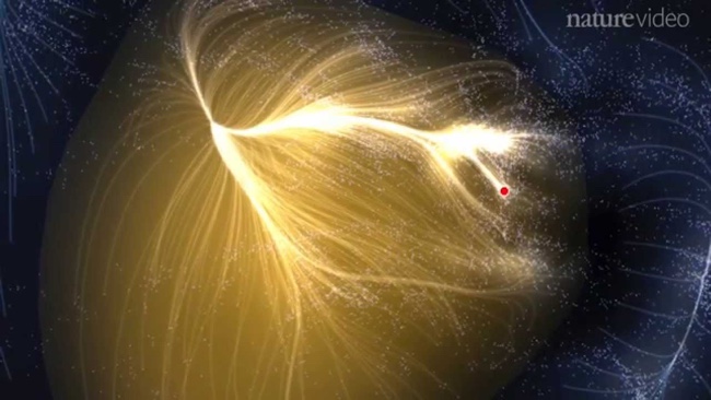
Very cool new visualization of Laniakea: Our Home Supercluster, which is the supercluster of galaxies that includes the Milky Way. Check out the video and article from Nature.com.
This is potentially the most detailed map of the universe to date, and spans more than 500 million light-years and contains more than 100,000 galaxies. The lines shown in the visualization the paths of motion of the individual galaxies.
DataViz is a broad term that has been trending for years, so what exactly is DataViz, and why does it matter? DataViz (or data visualization) is simply the visual representation of data or information. For example, charts, maps, diagrams, infographics, icons and illustrations are all forms of data visualization. It is commonly understood that humans are visual creatures. We understand visual information faster than reading text, and we are more likely to remember visual information later when it can impact a decision or behavior. As the amount of data we generate continues to increase, we need more efficient ways to understand and communicate insights from the data, and this is where DataViz is very effective.
The world is changing, and the world of DataViz is changing. In this ever evolving world, one thing is constant, TED’s ability to understand the pulse of what’s next. This is no more apparent than when TED talk influencers focus on the world of dataviz. From DataViz guru David McCandles talk on The Beauty of Visualization to medical doctor and statistician Hans Rosling talk on The Best Stats You’ve Ever Seen, you can experience the depth and breadth in the world of DataViz.
David McCandless - The Beauty of Visualization
“Design is about solving problems and providing elegant solutions, and information design is about solving information problems.”
McCandless' repertoire of visualized data has ranged from politics and climate to pop music trends. But it’s not the actual graphics that present McCandless’ true brilliance. Rather, it’s his ability to discover new ways to combine data in a fresh and interesting way. In his TED Talk, he discusses his process of turning complex data into simple yet engaging graphics.
“That's what I'm trying to do with my work, is to take these numbers… and to translate them into a more universal visual language, that can be felt. Because my belief is, if we can feel these issues… then they'll matter to us more than they do now.”
Artist and photographer Chris Jordan has a passion for American consumption. He strives for unique visualizations of some of Western culture’s most unimaginable statistics, solidifying the phrase, “a picture is worth a thousand words.” In his speech, Jordan invites the audience into the inspiration and process behind some of his best work- including his powerful visualization of America’s annual incarceration rate.
Aaron Koblin - Visualizing Ourselves… With Crowd-Sourced Data
“Our lives are being driven by data, and the presentation of that data is an opportunity for us to make some amazing interfaces that tell great stories.”
From Johnny Cash’s final music video to animating the paths of every North American airline flight, Aaron Koblin’s work is all about fun. As more and more social data becomes available, Koblin discusses how he feels it’s his obligation to tell stories through visualizations. Standing by his belief that data makes us more human, Koblin shares how interface can be used as a powerful narrative device.
“We want to see how the world is changing. Why are we not using the data we have? Because the data is hidden down in the databases. And the public is there, and the Internet is there, but we have still not used it effectively.”
It’s guaranteed that you've never seen data presented like Hans Rosling presents it. His genius stems from his ability to transform development statistics into animations that make the information clear, intuitive, and playful. In this legendary TED Talk (the first of many TED Talks he has given), Rosling discusses the idea that making information more accessible has the potential to change the quality of the information itself.
“I believe that this world of data is going to be transformative for society… By bringing the human element into this story, I think we can take it to tremendous places.”
Deeply inspired by science, Jer Thorp creates beautiful data visualizations to put abstract data into a human context. At TEDxVancouver, he shares some of his finest work, and delves deeper into why his art focuses on bringing big sets of data to life.
Are you choosing the right explainer video? Infographic from Yudle takes a close look at the different types of videos that can be used to explain your business or product to audiences.
We all love an explainer video whether we’re informing ourselves on the mechanics of black holes, looking for an easier way to recruit new staff, or finding out how to fix that leaky tap. The question is, if you’re looking at creating an explainer video for your global organisation or startup company, do you know what you’re looking for?
This helpful infographic from our team here at Yudle Animation provides a guide for anyone who wants to get an animated explainer video made.
Great information, but too much text in this design. A few stats are also only shown in text, and should have been visualized to make a bigger impact on the readers.
The URL directly to the infographic landing page should be included in the footer of the infographic itself so readers can find the original, full-size version when people share smaller images of the infographic without linking back to the original.
Kung Fu Motion Visualization is a fabulous visualization project by Tobias Gremmler. Using motion capture data from Chinese Kung Fu, Tobias is able to create various 3D models showing shape and volume. Designed for an exhibition hosted by the International Guoshu Association in Hong Kong.
When working on this project, I was deeply inspired by the dynamics of motion and philosophy of Kung Fu. The work was commissioned by International Guoshu Association for an Kung Fu exhibition, initiated by Hing Chao. The exhibition focuses on the legacy of Hakka martial arts in Hong Kong and will launch in Hong Kong in September. The Kung Fu Masters whose motions has been captured are: Master Wong Yiu Kau (Variation 1-3) and Master Li Shek Lin (Variation 3,4).
Visualizing the invisible is always fascinating, and motion visualizations have been created even in pre-digital times with light, photography, costumes or paintings. I have described some of the methods that I applied in this work in my book "Grids for the Dynamic Images", published 2003.
Also published on YouTube (in case you have trouble viewing the video from Vimeo):
Thanks to Jan for sharing. Also found on Colossal and Ignant.
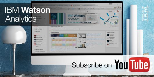
IBM Watson Analytics is a data discovery service that guides data exploration, automates predictive analytics and enables dashboard and data visualization creation. Through their Expert Series videos, Watson Analytics explores the future trends of data analytics. I had the pleasure of participating in this series, along with other prominent figures in the field.
Watch these interviews to learn about today’s trends in data visualization, data analysis, and which trends we think will have the most significant impact on the future of analytics.
What trends in data visualization are you seeing today and what are the opportunities for the future? (2:24)
What Happens on YouTube in 24 Hours? is an infographic that Pexeso created after taking an in-depth look into daily uploads on YouTube during the month of October 2015. Pexeso is a company that is designed to help you find your videos from multiple platforms across the web so you can better understand your virality.
It’s no secret that video is quickly becoming the #1 priority for both social media platforms and marketers alike. As consumers, we spend more and more time glued to our smartphones watching one video after another. By 2017, it is estimated that video will account for 74% of all internet traffic in the world, making the upcoming year make or break time for any company that’s betting on video.
As competition heats up, some of the most well-known platforms have rushed to report impressive statistics. While they may be staggering, such numbers tend to be cherry-picked and don’t necessarily show the full picture.
We at Pexeso are committed not only to delivering the best possible service to our customers, but also bring more transparency to this inherently non-transparent market. As we independently crawl many popular sites, we've been able to uncover some remarkably interesting, in-depth insights that we want to share.
I appreciate seeing most of the statistics visualized, but a couple of the visuals do not accurately represent the data.
The Video Uploads by Category took a creative spin on what should have been a quarter pie chart. By taking the slices out of a triangle instead, the area of the slices at the ends is oversized and is misleading to viewers.
The Languages visual of sections on the tongue, under represent the size of the values by only using the height in an odd shape. The lowest section where the tongue is narrower don't have enough area to accurately show the data.
The 3D stacked bar in the shape of a cake, way over emphasizes the 5% Taken Down by Users by also showing the area of the top of the cake.
The clock visual doesn't represent the data at all. It's confusing for readers to have evenly spaced ticks around the clock, but widely varying times in the text.
The citations for the data sources are missing from the infographic. They're listed on the landing page in text, but infographics are usually shared without the original text from the publisher.
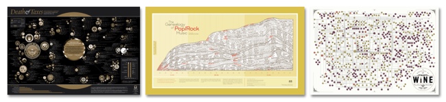
Timeplots.com - 20% OFF all infographic posters, Discount Code “coolinfo”
HistoryShots - Check out PopWaves, the updated History of Pop/Rock Music poster!
Pop Chart Lab - Running a 12-Days of Christmas sale in December
TOOLS
Visme.co - Free trial, 40% OFF first payment (monthly or yearly subscription), Discount Code “COOL40”
The Noun Project - Free with attribution or $9.99/month unlimited. Creating, Sharing and Celebrating the World’s Visual Language
IBM Watson Analytics - Free & Paid editions. Predictive analytics and data visualization. Analyze your data in minutes on your own without downloading software.
TRAINING
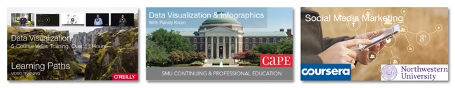
Data Visualization, Learning Paths Video Training Courses, O’Reilly Media
Data Visualization & Infographics Design Course at SMU CAPE, Dallas, TX, taught by Randy Krum. April 5 - May 10, 2016 - Use discount code VIP316 for $50 off registration cost


 Randy
Randy


;)