About
Randy Krum
President of InfoNewt.
Data Visualization and Infographic Design

Infographic Design

Infographics Design | Presentations
Consulting | Data Visualizations

DFW DataViz Meetup

Join the DFW Data Visualization and Infographics Meetup Group if you're in the Dallas/Fort Worth area!

Search the Cool Infographics site

Custom Search

Subscriptions:


Feedburner

The Cool Infographics® Gallery:

How to add the
Cool Infographics button to your:

Cool Infographics iOS icon

- iPhone
- iPad
- iPod Touch


Read on Flipboard for iPad and iPhone

Featured in the Tech & Science category

Flipboard icon

Twitter Feed
From the Bookstore

Caffeine Poster

The Caffeine Poster infographic

Entries in humor (57)

Friday
Oct312014

How to Make Your Shed Zombie Proof

How to Make Your Shed Zombie Proof infographic

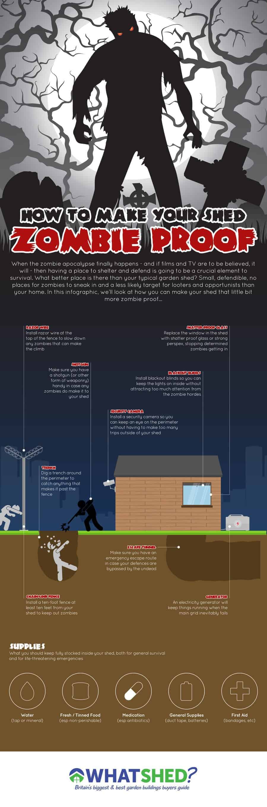
How to Make Your Shed Zombie Proof from What Shed? is a fun, sharable infographic that ties their business (garden sheds) to the current obsession with zombies and Halloween!

Zombies seem to have become ever more popular in recent years, despite the fact that they are almost entirely fictional (unless you’re one of the small group of people that actually really believe they are real).

Anyway as its coming up to Halloween we thought we would do a small guide to help you protect yourself just in case you happen to be part of a Zombie Apocalypse this Halloween.

Good example of telling one story well in an infographic, and making the topic relevant to your business. There’s nothing wrong with choosing a fun topic, but it’s important to tie it back to your industry.

The footer should include the URL back to the infographic landing page so readers can find the original.

Thanks to David for sending in the link!

Friday
Oct112013

Zombies vs. Mobile Storage Containers

Zombies VS Door to Door Storage infographic

The Walking Dead return this weekend! Why should you buy a mobile storage unit? Because in the event of a zombie apocalypse, you’d be prepared! With this comical visual, Door to Door uses zombie apocalypse scenarios in it’s 10 Ways to Use a Door to Door Storage Mobile Storage Container in the Event of a Zombie Apocalypse (long title!) infographic to point out the strengths of their storage units.

Bottom Line: If you’re prepping for the zombie apocalypse or, you know, looking to move somewhere new or store your belongings, visit us at www.DoorToDoor.com.

Definitely a fun way to use an infographic to raise your brand awareness!

Thanks to Jayson for sending in the link!

Friday
Oct112013

xkcd - Tall Infographics

xkcd - Tall Infographics

The Tall Infographics design from Randall Munroe at xkcd literally made me laugh out loud.  As he mentions in the text:

“‘Big Data’ doesn’t just mean increasing the font size.”

Very similar to something I repeat here on Cool Infographics all the time.  “Big fonts are not data visualizations!”

However, the format of the Tall Infographic is here to stay.  The tall format fits nicely in the content area of most websites and blogs, and the user experience of scrolling vertically is much easier than scrolling horizontally.

Found on Gizmodo and Stats Chat

Thursday
Jul252013

Inside the Courtroom

Inside the Courtroom infographic

Going to court is no laughing matter. But the Inside the Courtroom infographic from Livesay & Meyers balances seriousness with humor as it lays out the blueprint of a courtroom, then tells some funny stories about actual things said in court.

Going to court for the first time can be an intimidating experience. Whether you are facing criminal charges or find yourself in court in a divorce or custody case, remaining calm in court can really help you make your most effective case. We put together the infographic below to help you understand all the different parts of the courtroom, so you can feel at ease on your day in court. This infographic explains who people are, what they do, and where they sit. We’ve also included some interesting facts about courtrooms, and funny quotes from actual court cases.

Our experienced attorneys feel right at home in the courtroom– hopefully this information will allow you to also be at ease in front of the judge or jury.

Thanks to James for sending in the link!

Monday
Apr222013

8 New Punctuation Marks We Need

8 New Punctuation Marks We Need infographic

Our punctuation choices could really use an update, and CollegeHumor.com is proposing we add these 8 New Punctuation Marks to our collective writing options.

A humorous look at some of the punctuation marks missing in the English language.

This is a borderline infographic.  Originally, all eight were designed as separate images, but then College Humor stacked them together into one image file so that it resembled a tall infographic .  There’s no data visualization or much in the way of illustration other than the symbols themselves.  However, it is informative, so like I said, I consider this to be a borderline infographic.

The response to the ideas was strong enough that they actually created the font, and you can download it from the College Humor site.  They created a separate infographic as the instructions on how to use the font in your desktop applications once you have it installed.  

UPDATE: Want to use these punctuation marks? Click here to download the CollegeHumor Punctuation font and get access to all of them.

The downloaded font won’t work on websites, just desktop applications, but I have seen a few people trying to make it available online as well.  For example, here’s a link to a Google Chrome extension that let’s you use the font on Facebook.

Found on Visual.ly

Friday
Apr132012

Lakes & Oceans: A Deep Infographic


Another great infographic from Randall Munroe’s xkcd online comic.  Lakes & Oceans visualizes the various depths of the worlds water, and even includes…a mysterious door that James Cameron built his deep-sea submersible to reach at the bottom of the Marianas Trench and open?


Found on FlowingData.com

Thursday
Apr122012

IT Infirmity: What's Ailing Your IT Department on 2012?

Is your IT department feeling a little under the weather? Send it to the IT Infirmity! The What’s Ailing Your IT Department infographic from ViaWest is their first infographic!

What do CIOs rank as their biggest IT aches and pains? What are the average salaries of employees within IT departments? What is the impact of ITtention Deficit - the inability to focus on your core business?  Find out in this infographic from ViaWest.

I really like this design, but the data visualizations need help.  It’s obviously a promotional piece for ViaWest, but there’s nothing wrong with using an infographic that way.  They have also made a high-resolution PDF available.

The story reads very easily from top-to-bottom with clearly separated sections. The icons for each sections are also amusing and keep the overall tone light-hearted.

The only issues I have with the design are the data visualizations. 

  • Don’t put 51% on top of a bunch of people icons, and not highlight 51% of the icons to go along with the numerical value. 
  • The two bars showing the data created before and after 2009 are actually two parts of the whole 100%, so this should be shown as a stacked bar.  Why is this shown as two separate bars?
  • Both of the office tower icon visuals in ITrauma would be easier to understand if they were a single row of building icons.  The 93% is hard to understand visually since you can’t visually tell that 13% of the last building is shaded.  In fact, it doesn’t look to me like the last building is shaded properly.
  • At the bottom, there should be a copyright statement
  • The design should also include the URL to find the original, high-resolution image on the ViaWest site so when people see this infographic shared on other sites, they can find the original.

Thanks to Todd for sending in the link!

Wednesday
Feb292012

The Startup Ecosystem: Predator vs. Prey

The Startup Ecosystem: Predator vs. Prey is a fun but informative infographic from udemy.  It looks at the different roles related to tech startup companies in an amusing way by personifying them as fish in the sea.

The startup waters are murky and full of hidden dangers. Below the surface, the ecosystem rests in a delicate balance between predators and prey.

To help you navigate these stormy seas, we’ve created the infographic below. Read on to find out where you stand in the startup food chain.

This one is light on data, but does convey valuable information to the reader.  The visual scale of Ubiquitous to Endangered is easy to understand, and the color coding is consistent throughout the design.

Found on Best Infographics

Friday
Jan202012

Geek vs. Nerd: Which Are You?


The Geeks vs. Nerds head-to-head smack-down comes to us from MastersInIT.org

In the ongoing battle between geek and nerd, one must take sides, but how can this be done without a solid argument for both personas? We here at Masters In IT (a mix of nerds and geeks) decided that it’s time to lay all the cards on the table to determine which is better and answer the question some fear to know: Are you a geek, or a nerd?

A little text-heavy and lighter fare than I normally post, but this one is just fun to read through.  There are a handful of stats included, and the doughnut charts and bar charts are easy to understand.

Like many of the infographics I’ve posted lately, it’s missing a URL at the bottom for readers to find the original post, a copyright statement and listing the designer!

Thanks to Gerri for sending in the link!  Also found on Infographic Journal, Daily Infographic.

Monday
Jan092012

An Intimate Look at Infographics

An Intimate Look at Infographics is a fun, satirical look at infographics from Think Brilliant that comes in the form of an infographic!

A well done infographic has the power to capture one’s acute attention span and convey information that would have taken longer to simply read (oh no, not reading!). However, for every brilliantly thought out and well executed mashup of art and data, there now seems to be an influx of mundane and formulaic counterparts infesting the very internet that we hold so near and dear.

Here we have an infographic that explores commonalities between the seemingly vast expanse of contrived infographics that appear to have spawned in mass over the past year. If you’re an infographic purest, view at your own risk.

This one is not new, but it did make me smile!

Thanks to David for sending in the link!