About
Randy Krum
President of InfoNewt.
Data Visualization and Infographic Design

Infographic Design

Infographics Design | Presentations
Consulting | Data Visualizations

DFW DataViz Meetup

Join the DFW Data Visualization and Infographics Meetup Group if you're in the Dallas/Fort Worth area!

Search the Cool Infographics site

Custom Search

Subscriptions:


Feedburner

The Cool Infographics® Gallery:

How to add the
Cool Infographics button to your:

Cool Infographics iOS icon

- iPhone
- iPad
- iPod Touch


Read on Flipboard for iPad and iPhone

Featured in the Tech & Science category

Flipboard icon

Twitter Feed
From the Bookstore

Caffeine Poster

The Caffeine Poster infographic

Entries in humor (57)

Wednesday
Oct262011

The Anatomy of an Agency

The Anatomy of an Agency from Grip Limited is a tongue-in-cheek cool infographic about the roles within an advertising agency.

Agencies are famously diverse.  We have examined a few of their species and have drawn some arbitrary conclusions.

Designed by Grip’s own Julia Morra and Trevor Gourley.

Thursday
Jun302011

Humor: Corporate Organizational Charts

From Bonkers World, Organizational Charts is a very funny look at the corporate cultures and structures for some very high-profile tech companies using hand-drawn organization charts as the visual language.

Found on Daring Fireball.

Thursday
Apr282011

Self-Described Mac vs. PC People infographic

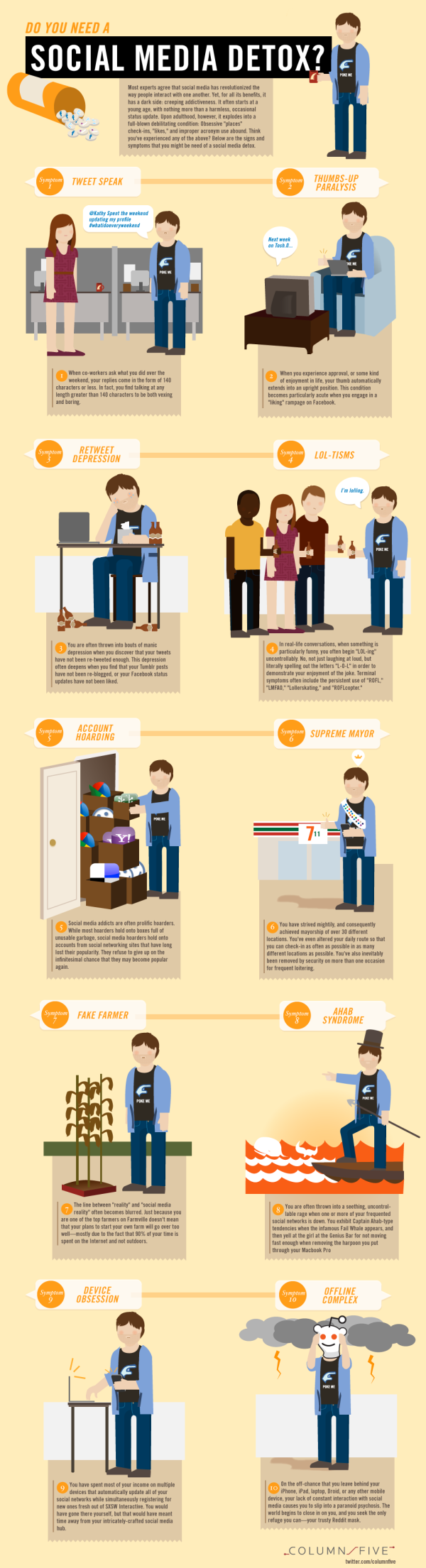
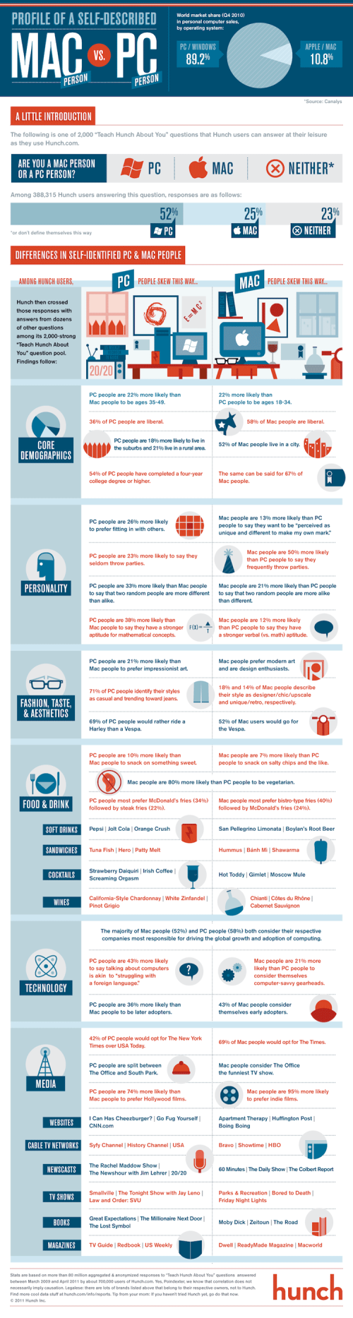
Profile of a Self-Described Mac Person vs. PC Person is a fun infographic looking at personality and preference differences.  Based on 388,315 survey respondents from Hunch.com, it illustrates topics like who throws parties, math aptitude, taste in art, cocktail drinks of choice and would they ride a Vespa or a Harley.

Our latest data project was to analyze how self-described Mac and PC people are different. The infographic below, designed by the talented folks at Column Five Media, breaks it down.

Back in ye olden days of Hunch — November 2009 — we explored the differences in personality, aesthetic tastes, and media preferences between Mac and PC users. Since then, the Hunch user base and question pool have grown many times over. The 2009 report started with more than 76,000 responses to its base “Mac or PC?” question. The same question now has nearly 400,000 responses. This is all in the context of the more than 80 million “Teach Hunch About You” questions which have been answered on Hunch to date.

From a research standpoint, even though the number of respondents is high, these are voluntary survey participants that haven’t gone through a screening process.  So while the results are fun, I don’t think they can be considered a statistically accurate representation of the population as a whole.

Very funny, and a great job by the design team at Column Five Media!  Found on FlowingData and Visual News

Thursday
Apr212011

Easter by the Numbers #infographic


A fun infographic from DegreeSearch.org, Easter by the Numbers takes an amusing look at chocolate Easter bunnies and other candy during the Easter holidy.

Here in the United States, we eat soooo much candy at Easter. Delicious chocolate eggs, chocolate bunnies, Peeps, jelly beans and more. It doesn’t take a healthcare degree to figure out what all that candy means for our bodies. If you want to keep the pounds off, stay away from the basket. But if you don’t care about the pounds, try the Cadbury Mini Eggs. Mmmm, delicious.

Can you find all 18 chocolate Easter bunnies in the infographic?

Thanks to Matt for sending in the link!

Friday
Apr012011

April Fools 2011 On The Web infographic


The teams at KillerInfographics and ZippyCart stayed up late last night (past midnight) to get the April Fools 2011: Pranks Around The Web infographic published today with the current online pranks.  Amazing job to get this design up the same day!

Believe it or not, April Fools 2011 is finally here and pranksters around the world have already been playing practical jokes on their friends and co-workers. Over the past decade, April Fools has started to become a bigger deal online, with businesses like Google, YouTube, and ThinkGeek becoming go-to sites for those looking for the coolest pranks online. Because so many are tirelessly surfing the net for the best pranks, we decided to publish the infographic below so you can quickly get your April Fools 2011 fix. 

Over the last few days we have been working on an infographic entitled, April Fools 2011: Pranks Around The Web. We stayed up late so we could get first peek at 2011 pranks online this morning, which allowed us to quickly add them to our infographic. Needless to say were a bit tired, but very happy with the infographic we created.

Thanks Nick for sending in the link!

Thursday
Mar312011

Do You Need a Social Media Detox? [infographic]

From Column Five Media, Do You Need a Social Media Detox? is a lighthearted infographic look at what can happen when you get sucked into the social media hype.  Light on data, it’s a fun, infographic poke at those of us that believe being a Foursquare Mayor of the local grocery store actually means something.

If you find yourself tweeting from the shower and updating Facebook while doing 85 on the freeway, we created this graphic to save your life. Click below or go here to view the full-size version.

Thanks Jarred for sending in the link!

Monday
Mar072011

Comparing Apples to Oranges #infographic


Apples versus Oranges.


Designer Jess Bachman, in partnership with Smarter.org, has accomplished the seemingly impossible.  It’s common knowledge that comparing Apples to Oranges is so hard, it just isn’t done.  I’m thinking there’s a Nobel prize candidate here…  ;)

I’ve done it!  Apples to Oranges.  They say it shouldn’t be done, that it can’t be done.  But using the science and magic if infographics, I have done just that, compared apples to oranges.  The results are unsurprisingly surprising.  Little did I know that such botanical and culinary inequality existed in this modern age.  Prepare to be infographicalized.


Apples to Oranges.


Wednesday
Dec082010

Could You Be a Failure?

Who says an infographic can’t be fun or humorous?  Could You Be a Failure? is an infographic with 10 line charts looking at different traits by age.  NOT based on any hard-core research, these just show the designer’s perceptions by age.

Designed by Jess Bachman and published by Smarter.org.

Here is some light but insightful infographic fare.  Obviously based on no real data but my own wit, but hopefully it will make people think/smile/laugh.

One cool thing is that they included a blank chart for you to create your own.  Go ahead and make one for yourself and hang it up at work.  People will definitely notice and probably laugh or comment.


Thursday
Oct142010

Map of Online Communities 2


This is one of my favorites.  xkcd has updated their Map of Online Communities for 2010!  This is an update from the original 2007 Map of Online Communities, and has changed quite a bit.

Communities rise and fall, and total membership numbers are no longer a good measure of a community’s current size and health.  This updated map uses sizes to represent total social activity in a community - that is, how much talking, playing, sharing or other socializing happens there.  This meant some comparing of apples and oranges, but I did my best and tried to be consistent.

You can also view the LARGE version, or pre-order the poster.

Friday
Sep032010

The 2010 Social Networking Map


The team at Flowtown.com designed the 2010 Social Networking Map as an update to the Map of Online Communities by xkcd.com in early 2007.  Social networking has certainly advanced in the last three years (even in the last three days!), so the update shows a lot of changes in geography.

It does seem a little premature to claim this is the map of social media for 2010 with five months left to go.  A lot can happen in five months (like the Apple PING service announced this week).