About
Randy Krum
President of InfoNewt.
Data Visualization and Infographic Design

Infographic Design

Infographics Design | Presentations
Consulting | Data Visualizations

DFW DataViz Meetup

Join the DFW Data Visualization and Infographics Meetup Group if you're in the Dallas/Fort Worth area!

Search the Cool Infographics site

Custom Search

Subscriptions:


Feedburner

The Cool Infographics® Gallery:

How to add the
Cool Infographics button to your:

Cool Infographics iOS icon

- iPhone
- iPad
- iPod Touch


Read on Flipboard for iPad and iPhone

Featured in the Tech & Science category

Flipboard icon

Twitter Feed
From the Bookstore

Caffeine Poster

The Caffeine Poster infographic

Entries in holiday (42)

Tuesday
Nov202018

Top 10 Tips for Cooking the Perfect Thanksgiving Turkey

Food Network Kitchen's Top 10 Tips for Cooking the Perfect Thanksgiving Turkey infographic

The Food Network is using infographics to help highlight some of their most popular cooking help articles. The Food Network Kitchen's Top 10 Tips for Cooking the Perfect Thanksgiving Turkey Infographic is a great summary infographic for the holidays!

Armed with our top 10 turkey tips, you'll come out looking like a pro on Thanksgiving Day. Whether you're hosting your first Thanksgiving dinner or your fiftieth, these indispensable tips will help you turn out a terrific turkey.

You'll notice the infographic is very brief and light on the details. It's a short, easy-to-read summary that leads to a much more detailed, full-length article 10 Tips for Cooking the Perfect Thanksgiving Turkey that goes into detail for every one of these tips.

From a marketing point of view, this is a great use of infographics. The infographic doesn't have to go into exhaustive details. Just a quick summary that leads people to more information on the website.

Thursday
Dec012016

Thanksgiving Flight Patterns

Thanksgiving Flight Patterns is a cool animated, interactive data visualization from the NY Times TheUpshot that looks at where people traveled to for the Thanksgiving holiday last week. On the interactive version on the NY Times site, you can hover over any included city to see only those connections. There was a huge surge of people headed to Florida!

Thanksgiving is known as a time to return home to family, with the holiday calling to mind images of grandmother’s house. But for many Americans, it’s also now a chance to go on vacation.

This week, Florida will see a surge in the number of people arriving by plane. Las Vegas is another popular destination. Much more than is commonly realized, Thanksgiving is a time to seek out sun (and gambling), in addition to (or possibly instead of) catching up with loved ones.

These conclusions emerge from The Upshot’s analysis of search data from Google Flights. In all, more than 3.6 million Americans — or slightly more than 1 percent of the country’s population — are expected to take a flight for Thanksgiving.

I really like the design choice to change the colors at both ends of each line. It really helps to see the traffic departing a city in comparison to the traffic arriving. 

I think the animation of the dots moving along the flight paths in the interactive version was unnecessary.

Tuesday
Nov222016

Sites Will Lose 1/3 of Sales If Not Mobile-Friendly During the Thanksgiving Weekend

You’re Going to Lose 1/3 of Your Sales If Your Website Isn’t Mobile-friendly During the Thanksgiving Weekend

Interesting analysis and data in the You’re Going to Lose 1/3 of Your Sales If Your Website Isn’t Mobile-friendly During the Thanksgiving Weekend infographic from Skilled.co

During the 2015 Thanksgiving Weekend, online stores made 43% more on average than in 2014. Almost 50% of traffic came from mobile devices while one third of sales was made on smartphones. This year, the mobile traffic is predicted to grow to 57% and the smartphones are going to cut even bigger portion of online sales.

The infographic does a good job of walking the reader through a sequential series of data points and predictions for the 2016 Black Friday weekend sales. Clean visuals, except for the doughnut charts that show sections in random order. Pir charts and doughnut charts should start at 12 o'clock or 0° and sequence the data in descending order in a clockwise direction.

I think the title is too long, and misleading as well. It implies that a company's sales will drop by 33% if their site isn't mobile-friendly, but based on the data they share, you can see that sales through desktop computers continues to rise as well. It might be better to say that a company may miss out on additional sales without a solid mobile purchasing experience. The prediction also ignores that sales through a company's mobile app may offset the risk of having a non-mobile-friendly website.

Friday
May062016

The Mother of All Mother's Day Infographics

Your Guide to the Business of Mother's Day may be the reigning Mother of All Mother's Day infographics from TheShelf.com covering practically everything you'd ever want to know about the business of Mother's Day. However, the data visualization portions need some help.

Mother's Day is right around the corner, creeping up on both consumers and brands alike. And even though, year after year, the majority of presents are bought super last minute, our spending on Mom is off the charts! 

...And why shouldn't it be, the wonderful women in our lives are worth everything that we can throw at them (assuming it's good) on their special day, and that's why we've created this pretty huge rundown of all things Mother's Day.

This is a data-heavy infographic that breaks my 5-second rule. Instead of trying to tell one story really well, they threw in every bit of data they could get their hands on. They have so many sections, it's worth taking a closer look at a few to see what we can learn from the design choices.

The dedicated landing page is very well put together! Plenty of text for SEO and custom wording in the social sharing buttons and even custom social images to make sharing the infographic super-easy for readers! My only complaint is that they aren't sized for the social media sites. Twitter needs images with an aspect ratio of 2:1.

Let's take a closer look at one of the sections:

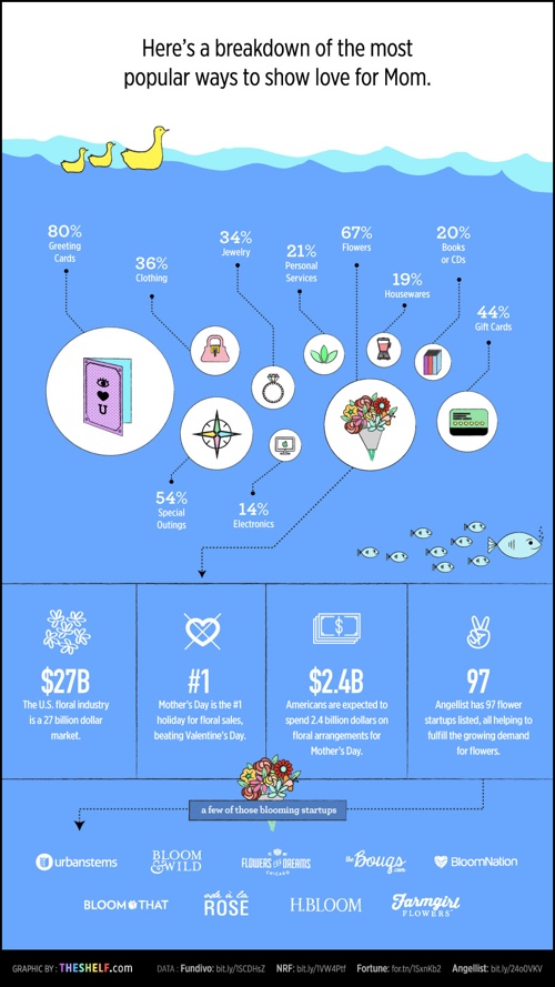
When you mix some data visualized and some data shown in text alone, the visualized data is perceived as more important to readers. These data points shown in just text is usually ignored by readers because it wasn't important enough to visualize.

If you follow me, you'll know that I have a specific pet peeve with designers getting the sizes of circles wrong when used to visualize data. [See False Visualizations: Sizing Circles in Infographics]

The circles is this design don't match any of the data. I'll demonstrate here. The total area of Greeting Cards at 80% should be exactly four times the area of the The Books circle at 20%. However, you can see here that I can easily fit seven of the Books circles in the Greeting Cards circle with much more room to spare!


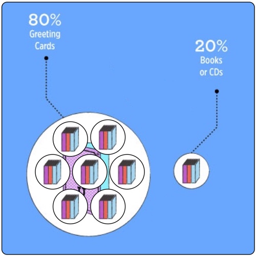
The data may be good, but the visualization is all wrong. It looks like the designer was eye-balling the sizes instead of actually visualizing data. Things like this make me skeptical, and begin to question every other visualization in the whole design. 

Let's look at another section:

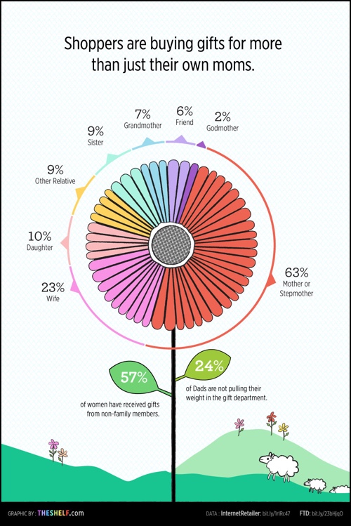
The flower is a pie chart, so it needs to follow the Golden Rule of Pie Charts! It MUST add up to 100%! However, this flower/pie chart adds up to 129%! What??? The 63% section by itself should be more than half of the flower, but it's shown as less than half.

One you start looking you'll find more problems. Why is 84% represented by 51 out of 56 people icons? That's 91%. Separately, why would you choose 56 icons to represent the total of 100%? Use 100 icons!

Lots of good data included in this infographic, but the design needs to go back to the drawing board.

Thanks to Sabrina for sending in the link!

Wednesday
Jan062016

Christmas Quiz: 10 Most Popular Stories

Christmas Quiz: 10 Most Popular Stories infographic

How well do you think you know your Christmas stories? Especially now immediately after the holidays?  Take the Christmas Quiz: 10 Most Popular Stories by Unplag and see how many you can guess right! 

Have you ever resorted to the Internet for Christmas must-do lists? Obviously, this thing can stand you in good stead to timely cope with holiday chores. Aside from stocking stuffers and holiday menus, you need to take care of leisure time activities too. So, why not add a quiz with the most popular Christmas stories to your list? Unplag created the one especially for you! It’s high time to remember the admired plots and characters and find out if you can guess all of them.

The creators of this infographic were quite creative. They told 10 of the most popular Christmas stories with a minimal amount of icons and illustrations! Do you think they choose the right ones? Would you have told the stories differently? Either way, this infographic is a fun holiday quiz to play with family and friends. 

Thanks to Anastasia for sending in the link!

Thursday
Dec242015

The Logistics of Santa Claus

The Logistics of Santa Claus infographic

The Logistics of Santa Claus infographic from Go Supply Chain takes a fun look at what it would take for a modern shipping company to achieve the magic deliveries that Santa makes every year.

Ever wondered how Santa Claus does it all?  In the festive spirit our logistics consultants decided to investigate.  This fun infographic explores the options (besides Santa's sleigh) that could be used. We hope that you enjoy this infographic.

A good content strategy is to tie your business in with a holiday or major event. This keep the topic relevant to your business and entertaining to your audience.

However, this design has a few major flaws! First, the pie charts are both bad. They add up to 173% and 167%, which is just bad data visualization design. Pie charts MUST always add up to a grand total of 100%. If we assume the data is correct, this type of data should never have been visualized as a pie chart.

Second, a number of the statistics are shown in text only. This misses the biggest advantage of infographics, which is an opportunity to visualize data for your audience. If you're not going to visualize the data, you might as well just post a text article instead.

Third, where are the data sources? Where is the copyright or Creative Commons license? Where is the URL to the company website and the infographic landing page?

Fourth, I can't find the full-size original online anywhere. It was posted on their blog at a smaller size which makes some of the text very hard to read. Their post should have linked to the full-size version.

This is a fun, engaging topic, but the infographic execution fall short.

Thanks to David for sending in the link.


Friday
Oct302015

Fun Facts About Candy Corn

Fun Facts About Candy Corn infographic

Happy National Candy Corn Day! The Fun Facts About Candy Corn infographic from Trillion Creative gives some interesting details about Halloween's most iconic candy.

Candy corn has become inextricably linked to Halloween. As the holiday approaches, you will be tempted by bags upon bags of candy corn available at all different kinds of retailers. Candy corn has been a part of the Halloween “brand” since 1880, originally developed to resemble a corn kernel to appeal to America’s farmers and their families. What is it about this little kernel of sugar that has made such a lasting impact on America’s celebration of Halloween?

Thanks to Larissa for sending in the link!

Tuesday
Dec232014

The Shapes of Snowflakes

The Shapes of Snowflakes infographic

The Shapes of Snowflakes is a fascinating categorization of crystal structures from Compound Interest, a chemistry site run by Andy Brunning in the UK. The site has a huge selection of chemistry and science related infographics.

In the Northern Hemisphere at least, the idealised vision of Christmas involves snow. Whilst no one snowflake is exactly the same as another, at least on a molecular level, scientists have none-the-less devised a system of classification for the many types of crystals that snow can form. This graphic shows the shapes and names of some of the groups of this classification.

The number of categories snow crystals can be categorised into has been steadily increasing over the years. In early studies in the 1930s, they were classified into 21 different shape-based categories; in the 1950s, this was expanded into 42 categories, in the 1960s to 80 categories, and most recently in 2013 to a staggering 121 categories.

Science meets Christmas!

You can also download a high-resolution PDF version.

Thursday
Dec112014

How to Take Better Holiday Photographs

How to Take Better Holiday Photographs infographic

There are many moments in life that we love to capture with a photograph. The How to Take Better Holiday Photographs infographic from Sykes Cottages is a cheat sheet to help you get the most out of each photo you take. 

Holidays mean different things to different people. For some, they’re about discovering new cultures, unearthing ancient history and indulging in fine local cuisine; whilst for others, they’re a chance to lounge on the beach, read a few chapters from a book, and do very little. But whatever you get up to on holiday, one thing’s for sure: you’re bound to take at least a few holiday photographs.

Whether you’re a snap-happy amateur or a kitted-out professional, capturing your holiday is important. To help you rookies take holiday pictures you’ll be proud of, we’ve created a handy guide on how to take better holiday photographs- check it out below.

Great “How-To” infographic that’s easy to read and understand. The hand-drawn, watercolor look also helps visually imply that the complex information will be easy to understand.

Thanks to Leanne for sending in the link!

Friday
Dec052014

Top Ten Christmas Life Hacks

Top Ten Christmas Life Hacks infographic

The Top Ten Christmas Life Hacks article and infographic from Kid Rated shares some great tips & tricks for the holiday season! Use condiment bottles for icing! Brilliant!

Here at KidRated we have plenty of suggestions of where to go with kids during the holidays. But there will always be those days around Christmas when the weather is awful, you have so much to do, or even you have eaten too much that even the idea of leaving the house would never cross your mind.

So, because at KidRated we really do like to help our brilliant readers and viewers, we have come up with our top ten Christmas life hacks to help you through the holidays. Kids will love doing them so much that you might as well put your feet up and enjoy the few minutes of peace and quiet. It won’t last long.

Clear design that’s easy to follow! I would have cut back on some of the text, but they needed to include enough of the directions for people to be able to follow on their own.

The infographic isn’t currently part of the article page, and that seems like a major mistake. The infographic should be helping to drive traffic and links to the article page.

Thanks to David for sending in the link!