About
Randy Krum
President of InfoNewt.
Data Visualization and Infographic Design

Infographic Design

Infographics Design | Presentations
Consulting | Data Visualizations

DFW DataViz Meetup

Join the DFW Data Visualization and Infographics Meetup Group if you're in the Dallas/Fort Worth area!

Search the Cool Infographics site

Custom Search

Subscriptions:


Feedburner

The Cool Infographics® Gallery:

How to add the
Cool Infographics button to your:

Cool Infographics iOS icon

- iPhone
- iPad
- iPod Touch


Read on Flipboard for iPad and iPhone

Featured in the Tech & Science category

Flipboard icon

Twitter Feed
From the Bookstore

Caffeine Poster

The Caffeine Poster infographic

Entries in treemap (14)

Monday
Jun012015

A World of Languages

A World of Languages infographic

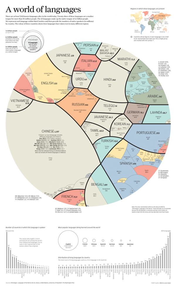
A World of Languages - and How Many Speak Them is a new infographic by Alberto Lucas López for the South China Morning Post that compares the number of people that speak the top 23 languages in the world as their primary language. High resolution image version available HERE.

There are at least 7,102 known languages alive in the world today. Twenty-three of these languages are a mother  tongue for more than 50 million people. The 23 languages make up the native tongue of 4.1 billion people. We represent each language within black borders and then provide the numbers of native speakers (in millions)  by country. The colour of these countries shows how languages have taken root in many different regions

The dominant visual centerpiece appears to be a combination of a voronoi diagram & circular treemap, where the area of each section is representative of the number of people that speak each language as their first language. I don’t know any any software that will create this specific visualization style, so I’m assuming the area of each section had to be calculated separately. With the different, organic shapes how were those areas calculated? Iteration?

The data is a little bit controversial. It’s an estimate of the number of people that speak each language as their first language. There’s no accounting for multi-lingual people or language families. I love the data visualization design, but the underlying data may cause some concern.

Tuesday
Nov182014

Old World Language Families

Old World Language Families infographic

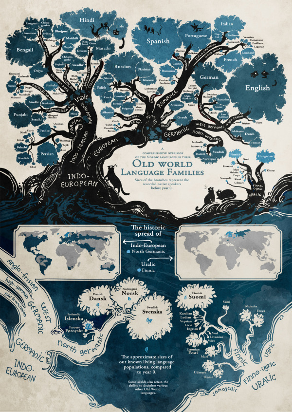
The Old World Language Families infographic from Stand Still Stay Silent Comic shows the “roots” of our modern languages. Follow each language’s path from bush to roots and discover how closely languages are related to each other.

Language trees for the language lovers! I’ve gathered pretty much all the data for this from ethnologue.com, which is an awesome well of information about language families. And if anyone finds some important language missing let me know! (Naturally most tiny languages didn’t make it on the graph, aww. There’s literally hundreds of them in the Indo-European family alone and I could only fit so many on this page, so most sub-1 mil. speaker languages that don’t have official status somewhere got the cut.)

Fantastic illustration that visualizes the evolution of all the modern languages! It’s a complex design that is intended for readers to dive deep and explore.

Knowing that the image itself will be shared as a stand-alone content piece, the image should include credits and links to the original site.

Found on http://mentalfloss.com

Friday
Apr252014

Every Job In America

Every Job In America infographic

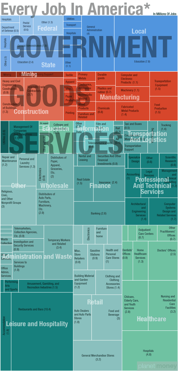
Every Job In America is a treemap data visualization design from Quoctrung Bui at NPR based on the data that the U.S. government collects for the monthly Jobs Report.  I think I probably fit somewhere in the Services-Professional and Technical Services-Specialized Design section.

Whatever Friday’s monthly jobs report says, it won’t change the big picture. There are roughly 137 million jobs in this country. About two-thirds of those jobs are in private-sector services; the remaining third are split between goods-producing jobs (mainly manufacturing and construction) and government work (mostly at the state and local level).

Here’s a closer look, drawn from the same data that the government collects for the monthly jobs report.

Notes: 
*The data come from the government’s non-farm payroll report — which, as the name suggests, does not include farm jobs. Update: The report also excludes military personnel, government intelligence employees and some self-employed workers.

There isn’t much I would change about this design.  The treemap visualization is well done, and carefully organized to allow for the color coding rectangles.  Titles are missing from any rectangle that was too small to hold the text, but a smaller font could have been used, or a reference to a list at the bottom.

Even though this is part of an article posting, the infographic image itself has a title for easy sharing without the rest of the article.  Including a few other elements in the image file like the data sources and the URL to the landing page would be very helpful.

This is the type of project where I think a link to a public spreadsheet with the numbers used would be helpful.  The article links to the U.S. Bureau of Labor Statistics press releases, but then someone would have to dig through the reports.

Wednesday
Aug312011

Who Owns The Beer Brands?

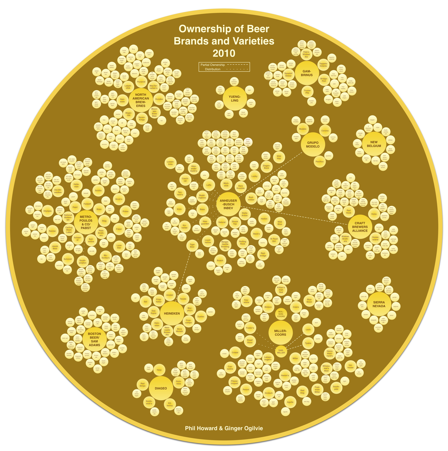
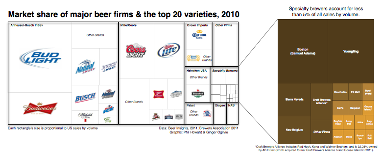
That beer you’re drinking from that cool independent brewery may not be what you think.  Another very cool data visualization from Philip H. Howard and Ginger Ogilvie at Michigan State University called Concentration in the US Beer Industry.  Similar to their last project visualizing the soft drink industry in The Illusion of Diversity, this new project shows the breweries and individual beers owned by the top 13 companies.

There is an appearance of great diversity in the number of brands and varieties of beer sold in the United States. The beer industry, however, is dominated by a relatively small number of firms.

AB InBev owns, co-owns or distributes more than 36 brands, for example, while MillerCoors controls at least 24 more. MillerCoors also brews Metropoulos & Company’s products under contract (thus the company that controls Pabst and 21 other brands is a “virtual” beer company).

Only meant to show which companies own which beer brands, the three bubble sizes are used to show parent companies, brewery brands and individual beer brands.  They designed a separate treemap visualization to show market share.

Because these are large visualizations, they have posted them within zooming viewers on the Michigan State University site.

Found on Flowing Data.

Tuesday
Jan182011

The X-Men Family Tree #infographic


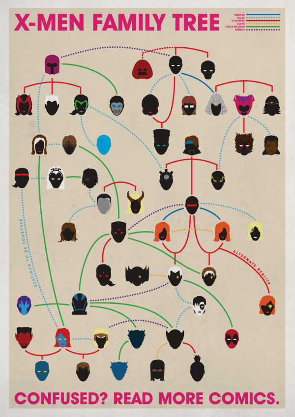
Joe Stone just posted his design of the X-Men Family Tree.  Connection lines styles and colors reveal the type of relationship.  Silhouettes or minimal illustrations give the reader just enough visual cues to identify each of the mutants.  How many can you identify?

A little Illustrator-drawn infographic I’ve been playing around with. I probably could have included more characters, but I had to draw the line somewhere.

Joe has also made a high-resolution version available for anyone that wants to print it out!  Thanks Joe!

Wednesday
Apr072010

Visualizing the Internet - infographic treemap

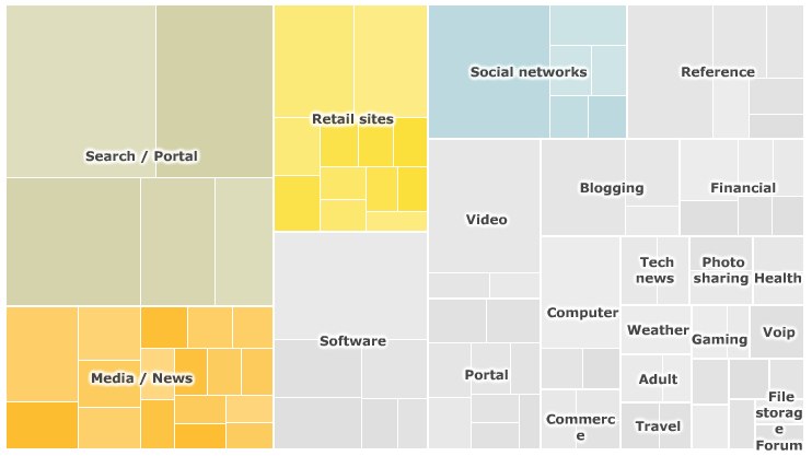
For their article, SuperPower: Visualising the Internet, the BBC created a treemap of the top 100 websites on the Internet based on unique visitors during the month of January 2010.

On the interactive version on the BBC site, you can mouse-over any of the site squares to see a pop-up of the numbers behind that site and choose to view each category individually.  The spreadsheet of the raw data from Nielsen is also available for download.


The data used to generate the interactive treemap visualisation were collected by the Nielsen company and covers the UK, France, Germany, Italy, Spain, Switzerland, Brazil, US and Australia. The figures represent unique users for the month of January 2010.

The categories - such as retail, social networks, search/portal - were defined by the BBC. Because some websites have more than one use, they could fall within more than one category (e.g. Yahoo). However, the treemap only classifies them once.

The maps were produced using the Prefuse Flare software, developed by the University of California Berkeley.


Tuesday
Mar092010

BBC Budget Treemap Infographic

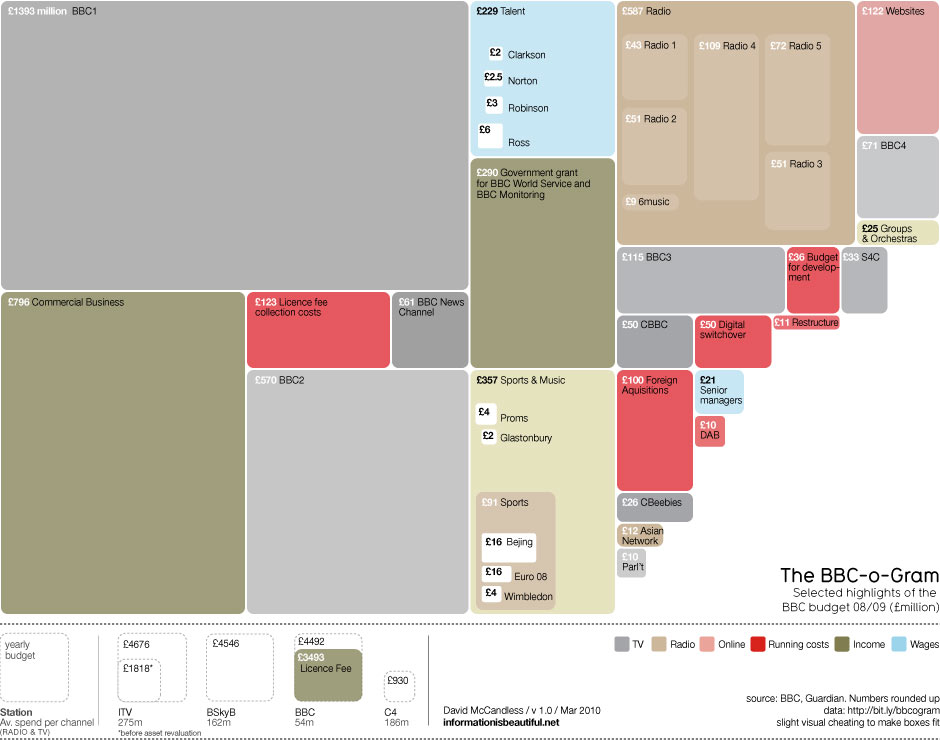
David McCandless, from Information Is Beautiful created this treemap of selected highlights from the BBC budget for the Guardian Datablog.

Recent controversy about the budget of the BBC here in the UK made me curious about its spending. Here’s the BBC-o-Gram, a visualization I created for the Guardian Datablog, exploring the costs of running one of the biggest broadcasters in the world.

David has also posted the underlying data in a GoogleDocs spreadsheet.

Monday
Feb082010

Obama's 2011 Budget Proposal Infographic

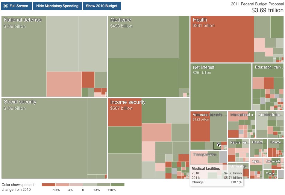
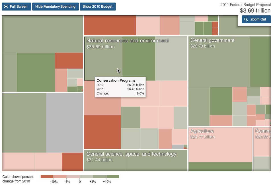
From NYTines.com, a treemap of Obama’s Budget Proposal color coded for increases and decreases from the prior year.

Rectangles in the chart are sized according to the amount of spending for that category. Color shows the change in spending from 2010.

Red indicates budget cuts, and green indicates increases in spending.  It’s a little bit interactive, allowing you to zoom into specific parts of the budget, and see detials by hovering the mouse over squares.

Designed by Shan Carter and Amanda Cox.

Found on FlowingData.

Monday
Oct052009

The Billion Dollar Gram


This is one of those simple, but great infographics.  Once the news starts talking about "billions" of dollars, the brain goes numb and it all runs together because the numbers are too big for us to comprehend.

David McCandless, from Information Is Beautiful, created this tree map to show the relative size of the different billion dollar spending and budgets in the news.

Great job David, keep them coming!


Tuesday
Sep302008

A Year of Heavy Loses


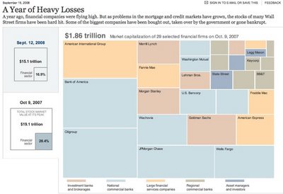
Over at Nytimes.com, they have a good treemap showing the drop in market capitalization over the past year of most of the big financial firms on Wall Street.  It's a little bit interactive, in that when you hover your mouse over any box, you will see more details.

Found on infosthetics.com