


Visualizing the Internet - infographic treemap
 Randy
Randy 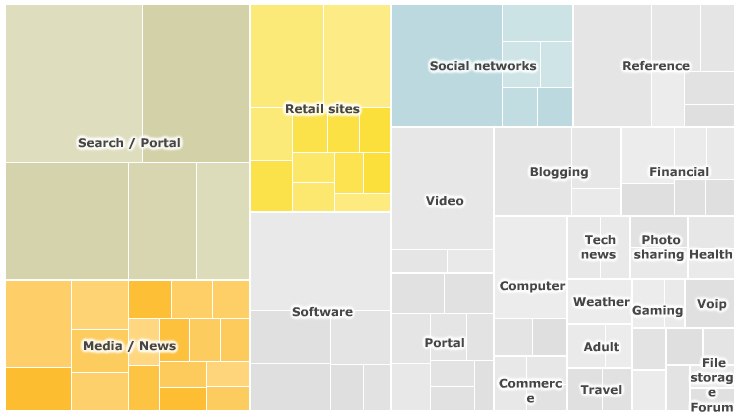
For their article, SuperPower: Visualising the Internet, the BBC created a treemap of the top 100 websites on the Internet based on unique visitors during the month of January 2010.
On the interactive version on the BBC site, you can mouse-over any of the site squares to see a pop-up of the numbers behind that site and choose to view each category individually. The spreadsheet of the raw data from Nielsen is also available for download.
The data used to generate the interactive treemap visualisation were collected by the Nielsen company and covers the UK, France, Germany, Italy, Spain, Switzerland, Brazil, US and Australia. The figures represent unique users for the month of January 2010.
The categories - such as retail, social networks, search/portal - were defined by the BBC. Because some websites have more than one use, they could fall within more than one category (e.g. Yahoo). However, the treemap only classifies them once.
The maps were produced using the Prefuse Flare software, developed by the University of California Berkeley.

Reader Comments (2)
Dear Sir,
I have the pleasure to brief on our Data Visualization software
"Trend Compass".
TC is a new concept in viewing statistics and trends in an animated
way by displaying in one chart 5 axis (X, Y, Time, Bubble size &
Bubble color) instead of just the traditional X and Y axis. It could
be used in analysis, research, presentation etc. In the banking
sector, we have Deutsche Bank New York as our client.
Link on Chile's Earthquake (27/02/2010):
http://www.epicsyst.com/test/v2/EarthQuakeinChile/
This a link on weather data :
http://www.epicsyst.com/test/v2/aims/
This is a bank link to compare Deposits, Withdrawals and numbers of
Customers for different branches over time ( all in 1 Chart) :
http://www.epicsyst.com/test/v2/bank-trx/
Misc Examples :
http://www.epicsyst.com/test/v2/airline/
http://www.epicsyst.com/test/v2/stockmarket1/
http://www.epicsyst.com/test/v2/tax/
http://www.epicsyst.com/test/v2/football/
http://www.epicsyst.com/test/v2/swinefludaily/
http://www.epicsyst.com/test/v2/flu/
http://www.epicsyst.com/test/v2/babyboomers/
http://www.epicsyst.com/test/v2/bank-trx/
http://www.epicsyst.com/test/v2/advertising/
This is a project we did with Princeton University on US unemployment :
http://www.epicsyst.com/main3.swf
A 3 minutes video presentation of above by Professor Alan Krueger
Bendheim Professor of Economics and Public Affairs at Princeton
University and currently Chief Economist at the US Treasury using
Trend Compass :
http://epicsyst.com/trendcompass/princeton.aspx?home=1
Latest financial links on the Central Bank of Egypt:
http://www.epicsyst.com/trendcompass/samples/Aggregate-balance-sheet/
http://www.epicsyst.com/trendcompass/samples/balance-sheet
http://www.epicsyst.com/trendcompass/samples/banks-deposits-by-maturity/
http://www.epicsyst.com/trendcompass/samples/egyptian-banks/
http://www.epicsyst.com/trendcompass/samples/currency-by-denomination/
I hope you could evaluate it and give me your comments. So many ideas
are there.
You can download a trial version. It has a feature to export
EXE,PPS,HTML and AVI files. The most impressive is the AVI since you
can record Audio/Video for the charts you create.
http://epicsyst.com/trendcompass/FreeVersion/TrendCompassv1.2_DotNet.zip
All the best.
Epic Systems
www.epicsyst.com