About
Randy Krum
President of InfoNewt.
Data Visualization and Infographic Design

Infographic Design

Infographics Design | Presentations
Consulting | Data Visualizations

DFW DataViz Meetup

Join the DFW Data Visualization and Infographics Meetup Group if you're in the Dallas/Fort Worth area!

Search the Cool Infographics site

Custom Search

Subscriptions:


Feedburner

The Cool Infographics® Gallery:

How to add the
Cool Infographics button to your:

Cool Infographics iOS icon

- iPhone
- iPad
- iPod Touch


Read on Flipboard for iPad and iPhone

Featured in the Tech & Science category

Flipboard icon

Twitter Feed
From the Bookstore

Caffeine Poster

The Caffeine Poster infographic

Entries in planets (25)

Wednesday
Oct162013

The Ultimate Loss

The Ultimate Loss infographic

The Ultimate Loss infographic from Confused highlights some of the most famous SciFi characters that are the last survivors of their home worlds destruction.

Sci-Fi characters who survived their planets’ destruction.

It’s a popular theme laced throughout science fiction movies and television shows: characters who survive the loss and utter destruction of their home worlds.  Here’s a look at some of the most notable sci-fi survivors.

Knowing the infographic image will be shared on other sites, this design is missing some crucial information in the footer.  The biggest omission is a mention or logo from the company that published it, Confused.com.  The footer should also include a copyright statement, and the URL to the infographic landing page where readers can find the original full-size version.

Found on visualnews.com

Tuesday
Jun252013

Planets in Orbit Around Earth!

What if we had a planet instead of a Moon? Saturn

What if we had a planet instead of a Moon?  Photographer, space artist, illustrator and former art director for the National Air & Space Museum’s Albert Einstein Planetarium, Ron Miller, created a series of very cool images that visualize how the rest of the planets in our solar system would appear if they orbited Earth at the same distance as the Moon.  

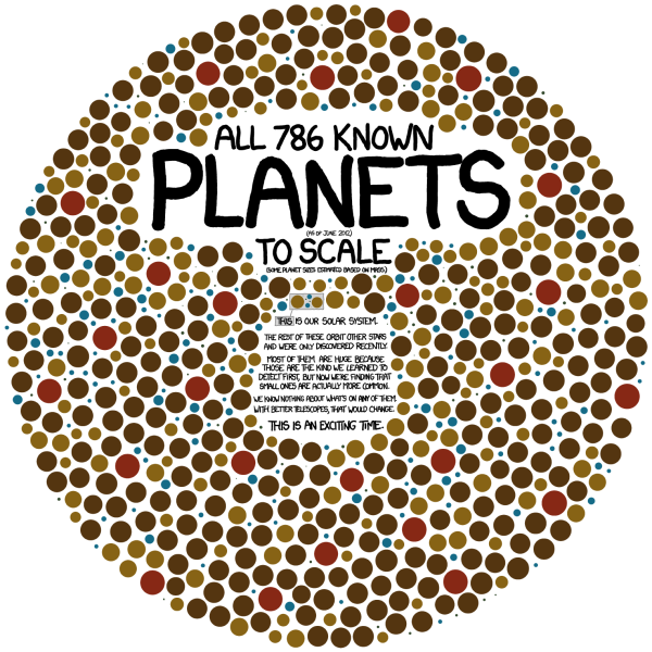
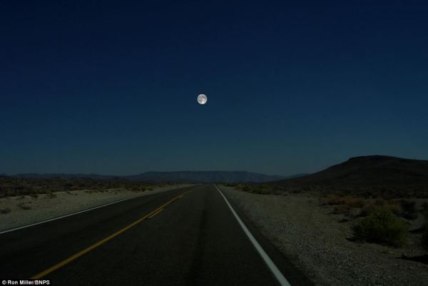
I’ve posted a number of different data visualizations and infographics that help visualize the sizes of the different planets, and this is a very cool approach that might make the relative sizes more relevant and understandable to a bigger audience that is already used to seeing the Moon in our sky.  For comparison, here is the original photo of the Moon:

What if we had a planet instead of a Moon?

From Ron’s description:

At a distance of about 240,000 miles, the Moon occupies a space in the night sky about half a degree wide. By sheer coincidence, this is almost exactly the same size the sun appears, which is why we occasionally get total solar eclipses.

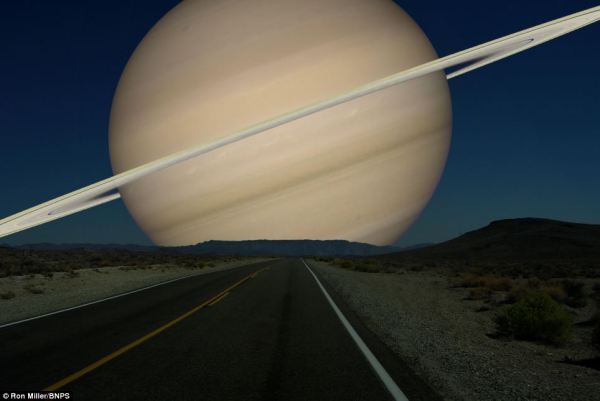
But it’s interesting to imagine what the night sky might look like if one of the Solar System’s planets were to replace our moon. (We’d have to ignore things like tides and gravitation, but that’s the advantage of doing things in the mind’s eye.)  Saturn would be an astonishing sight. Almost 35 times larger than the Moon, this golden globe would cover nearly 18 degrees of the sky. We’d be a little further away from Saturn than its satellite Dione. In fact, we’d be more likely to be a satellite of Saturn ourselves than the other way around. The rings would stretch nearly from horizon to horizon.

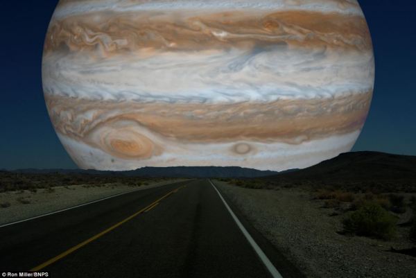
Of course, the gas giant Jupiter is downright scary!

What if we had a planet instead of a Moon? Jupiter

View all of the full size images in Ron’s post on io9!

Found on My Modern Met and The Daily Mail

Wednesday
Nov142012

Total Solar Eclipse 2012

Total Solar Eclipse 2012 infographic

Today (Nov 14th) will be a total eclipse of the Sun, and the Solar Eclipses infographic from turu does a great job with visually explaining eclipses and sharing the statistics from prior eclipses.

The total solar eclipse of 2012 is set to be a spectacular event. Occurring just after sunrise on November 14 (local time), the eclipse will be best viewed from Cairns in Australia. Already a popular tourist destination, the 2012 eclipse is expected to flood the coastal city with thousands of domestic and international visitors.

The infographic provides a definition of a solar eclipse as well as information on the Australia 2012 eclipse. It offers an insight into past solar eclipses, noting duration of totality and effects on local tourism.

With a number of events scheduled such as the Solar Eclipse Marathon and the Eclipse 2012 Festival, Cairns aims to cater to this expected influx of tourists. Renowned for its sunshine, Cairns is expected to be a prime location to view the 2012 eclipse. The next opportunity to view a total eclipse in Australia will be in the year 2028, making this year’s event truly special.

A good design that tells a good story.  In the footer should be a Copyright statement, and the URL to the infographic landing page so readers can find the origial full-size version.

Friday
Jul132012

Exoplanets: 786 Known Planets

Exoplanets infographic

Exoplanets is a great infographic that tells one story really well by focusing on one data visualization for the whole story.  Randall Munroe at xkcd.com occasionally mixes in some great data visualizations and infographic designs with his comics.

All 786 known planets (as of June 2012) to scale (some planet sizes estimated based on mass).  

[Our solar system planets are shown in the middle]

The rest of these orbit other stars and were only discovered recently.  Most of them are huge because those are the kind we learned to detect first, but now we’re finding that small ones are actually more common.  We know nothing about what’s on any of them.  With better telescopes, that would change.  This is an exciting time.

This visual is so powerful.  You could write in text that we have found 786 extra-solar planet, but the visual helps the reader wrap their head around the scale of that large number and adds the size of the planets as a second level of information.

It’s also a clean design that focuses on communicating the scale of how many planets we have found, and doesn’t try to add all of the other information we know like which stars they orbit, what are their names, when were they discovered, which telescope found them, and who was the team or individual that discovered each one.  Just because we have more information doesn’t mean it should all be included in the infographic.  The story is cleaner and easier to understand without the clutter of too much information.

Cudos to Randall!

Wednesday
Jun092010

Our Amazing Planet: Top to Bottom infographic


Designed by Karl Tate, Our Amazing Planet: Top to Bottom is a cool infographic that looks at the scale of things from the upper atmosphere to the deepest ocean depths.


The infographic is HUGE (14,677 pixels tall), and that keeps it accurate to the scale.  It’s unreadable when the entire infographic is viewed on the screen, and that adds to the readers grasp of how big this scale really is.


It’s also timely with recent events, showing the depth of the Deepwater Horizon oil rig spill, and drilling depth.  You can view the entire image on OurAmazingPlanet.com.


Tuesday
Dec292009

Visualizing Gravity Wells - infographic comic


Another great new infographic comic from xkcd.com.  A mix of real science and humor, this one plays on the words “gravity well” by visualizing the strength of each planets gravity as the depth of a crater scaled to Earth’s surface gravity.

The chart shows the “depth” of various solar system gravity wells.
Each well is scaled such that rising out of a physical well of that depth - in constant Earth surface gravity - would take the same energy as escaping that planet’s gravity in reality.

Click on the image to go to the xkcd.com site to see the high-resolution version.


Thanks for sending in the link Ruben!


Wednesday
Dec092009

Bill Nye Videos on the Scale of the Solar System

Two videos from Bill Nye the Science Guy showing the size and scale of the planets and the Sun.  He may have done similar examples, but these are the two I know about.  The one above (Planets & Moon) starts at about 4:00 into the video, and the one below (Outer Space) starts at about 2:00.  "Outer Space is HUGE!"

Thanks to @DannyDougherty on Twitter for sharing!

Monday
Dec072009

Scale Model of the Solar System


The Scale Model of the Solar System (from phrenopolis.com) shows both the relative sizes of the planets and the Sun as well as representing the distances from the Sun on the same scale.  This image is huge (just over half a mile wide), and as you can imagine mostly black.
This page shows a scale model of the solar system, shrunken down to the point where the Sun, normally more than eight hundred thousand miles across, is the size you see it here. The planets are shown in corresponding scale. Unlike most models, which are compressed for viewing convenience, the planets here are also shown at their true-to-scale average distances from the Sun. That makes this page rather large - on an ordinary 72 dpi monitor it's just over half a mile wide, making it possibly one of the largest pages on the web. This means you'll have to do a bit of scrolling if you want to find the planets, but don't despair. They are reasonably bright and labeled, so you can probably catch them flashing by in the blackness even if you are scrolling fairly fast.
Found on Information Aesthetics.

Monday
Nov232009

Probes in the Universe - cool interactive infographic


Space Probes is a very well-done interactive graphic about all of the space probes we have launched, visually placing the probes in orbit around the object they are observing.  You can move around the 3-D space with the keyboard controls, change the date range with the sliders on the bottom or go directly to a particular probe from the list on the right that is group by planet or object they are around.  When you mouse-over a particular probe you get more details and an image.


The article and the infographic are in Portuguese from Brazil, so I took the liberty of using the Google Translator for a little help.
The infographic "Space Probes" Super, produced by the team of Internet Editora Abril Jovem, took the silver medal in the category Online Malofiej, top prize in the world of computer graphics.
Thanks to Daniel for the link and a little more information:
It won Malofiej's silver medal (first place, no gold medal) this year. 
It's an infographic about all space probes launched until the date it was published (except Earth probes, which are too many). The info has information about each probe, including the organization(s) that sent it, the target planet(s) (or moons, asteroids, comets and the sun), launch date and mission details, as well as pictures for most of them. User can navigate through our Solar System using the mouse and/or keyboard. It's also possible to know the details of Mars Science Laboratory, the next NASA probe to visit the red planet. The info is in Portuguese, but anyone can understand it's features and learn a little bit about space exploration so far.

Tuesday
Oct132009

50 Years of Space Exploration - Visual Flight Map


National Geographic published this amazing flight map that shows the flight paths of all 200 space missions in the last 50 years.  A zoomable map is on the NG website, and a high-res image is available from Adam Crowe on Flickr.

Art by Sean McNaughton, National Geographic Staff, Samuel Velasco, 5W Infographics.

Found on Fast Company.