About
Randy Krum
President of InfoNewt.
Data Visualization and Infographic Design

Infographic Design

Infographics Design | Presentations
Consulting | Data Visualizations

DFW DataViz Meetup

Join the DFW Data Visualization and Infographics Meetup Group if you're in the Dallas/Fort Worth area!

Search the Cool Infographics site

Custom Search

Subscriptions:


Feedburner

The Cool Infographics® Gallery:

How to add the
Cool Infographics button to your:

Cool Infographics iOS icon

- iPhone
- iPad
- iPod Touch


Read on Flipboard for iPad and iPhone

Featured in the Tech & Science category

Flipboard icon

Twitter Feed
From the Bookstore

Caffeine Poster

The Caffeine Poster infographic

« HTML5: Past, Present, Future | Main | Strata Conference NY Oct 23-25 - 20% Discount Code »
Friday
Jul132012

Exoplanets: 786 Known Planets

Exoplanets infographic

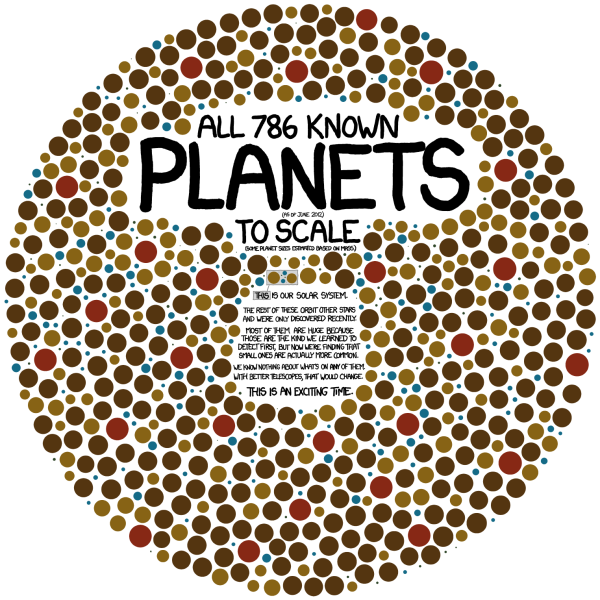
Exoplanets is a great infographic that tells one story really well by focusing on one data visualization for the whole story.  Randall Munroe at xkcd.com occasionally mixes in some great data visualizations and infographic designs with his comics.

All 786 known planets (as of June 2012) to scale (some planet sizes estimated based on mass).  

[Our solar system planets are shown in the middle]

The rest of these orbit other stars and were only discovered recently.  Most of them are huge because those are the kind we learned to detect first, but now we’re finding that small ones are actually more common.  We know nothing about what’s on any of them.  With better telescopes, that would change.  This is an exciting time.

This visual is so powerful.  You could write in text that we have found 786 extra-solar planet, but the visual helps the reader wrap their head around the scale of that large number and adds the size of the planets as a second level of information.

It’s also a clean design that focuses on communicating the scale of how many planets we have found, and doesn’t try to add all of the other information we know like which stars they orbit, what are their names, when were they discovered, which telescope found them, and who was the team or individual that discovered each one.  Just because we have more information doesn’t mean it should all be included in the infographic.  The story is cleaner and easier to understand without the clutter of too much information.

Cudos to Randall!

PrintView Printer Friendly Version

EmailEmail Article to Friend

References (1)

References allow you to track sources for this article, as well as articles that were written in response to this article.
  • Response
    Response: Google
    But I do not understand how the mass of the planet can tell us about its size. The planet might just be a cloud of dust. Or am I mistaken? Sorry for my bad English.

Reader Comments (2)

I'm sure this is one of those color blind tests. I'm color blind so I have no idea.
July 13, 2012 | Unregistered CommenterAlex
Hello, very interesting and informative infographics. But I do not understand how the mass of the planet can tell us about its size. The planet might just be a cloud of dust. Or am I mistaken? Sorry for my bad English.
July 16, 2012 | Unregistered CommenterВсе-о-Seo
Editor Permission Required
While we are migrating to a new site design, you must have editing permission for this entry in order to post comments.