About
Randy Krum
President of InfoNewt.
Data Visualization and Infographic Design

Infographic Design

Infographics Design | Presentations
Consulting | Data Visualizations

DFW DataViz Meetup

Join the DFW Data Visualization and Infographics Meetup Group if you're in the Dallas/Fort Worth area!

Search the Cool Infographics site

Custom Search

Subscriptions:


Feedburner

The Cool Infographics® Gallery:

How to add the
Cool Infographics button to your:

Cool Infographics iOS icon

- iPhone
- iPad
- iPod Touch


Read on Flipboard for iPad and iPhone

Featured in the Tech & Science category

Flipboard icon

Twitter Feed
From the Bookstore

Caffeine Poster

The Caffeine Poster infographic

Entries in Visualization (49)

Wednesday
Nov232016

Better Presentations by Jon Schwabish: Interview & Giveaway

Better Presentations by Jon Schwabish: Interview & Giveaway

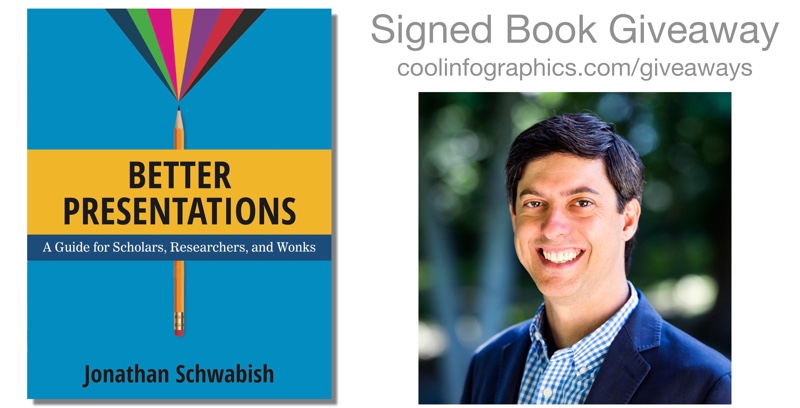
Better Presentations: A Guide for Scholars, Researchers, and Wonks is a great new book by Jon Schwabish from the newly redesigned PolicyViz! I'm especially excited about the chapter all about data visualization in presentations!

This December, I am giving away one signed copy of Better Presentations! Register on the Giveaways Page by December 31st to be entered.

 Whether you are a university professor, researcher at a think tank, graduate student, or analyst at a private firm, chances are that at some point you have presented your work in front of an audience. Most of us approach this task by converting a written document into slides, but the result is often a text-heavy presentation saddled with bullet points, stock images, and graphs too complex for an audience to decipher―much less understand. Presenting is fundamentally different from writing, and with only a little more time, a little more effort, and a little more planning, you can communicate your work with force and clarity.

Designed for presenters of scholarly or data-intensive content, Better Presentations details essential strategies for developing clear, sophisticated, and visually captivating presentations. Following three core principles―visualize, unify, and focus―Better Presentations describes how to visualize data effectively, find and use images appropriately, choose sensible fonts and colors, edit text for powerful delivery, and restructure a written argument for maximum engagement and persuasion. With a range of clear examples for what to do (and what not to do), the practical package offered in Better Presentations shares the best techniques to display work and the best tactics for winning over audiences. It pushes presenters past the frustration and intimidation of the process to more effective, memorable, and persuasive presentations.

Everyone should follow Jon Schwabish on Twitter (@jschwabish) and check out all the great resources on PolicyViz!


Jon answered a bunch of questions I sent him about visualizing data and the new book:

Who is the book intended for?

Jon Schwabish: I wrote the book for people who deliver data-rich content—researchers, scholars, analysts—anyone who works with data and who needs to present it to an audience. In my experience, many people who work with data and conduct research simply take their written reports and convert them to presentations—they copy their graphs and tables and paste them into a slide, and turn their text into bullet points. But there is a better way and it starts with recognizing that a written report and a presentation are two fundamentally different forms of communication. The goal of this book is to help presenters all the way through the process: From presentation construction and design, to building the presentation, to ultimately delivering the presentation.

What makes presenting so different from writing?

Jon Schwabish: The differences between writing and presenting are clearest when you think carefully about the audience. When your reader sits down with your paper, she has the opportunity to read the notes and footnotes, decipher the labels on your charts, even perhaps work through your equations. When you present, however, your audience does not have that opportunity: They are bound to your pace and content. If you fill your slides with text and bullet points, equations, and complex, detailed graphs, your audience will strain to follow you and understand your message.

There are also (or at least there should be) similarities between the two—at least when it comes to your preparation. We are all taught in grade school to set out an outline when we write a book report. Yet, we rarely do this when it comes to presentations. In the book, I propose that presenters develop their presentation before they start making slides. I walk through this outlining process and provide a worksheet that readers can use to help them outline and develop their presentation.

What should readers expect to learn and apply to their own presentations?

Jon Schwabish: The book takes you through the entire process of planning, designing, and delivering your presentation by following three guiding principles:

  • Visualize your content. We are better able to grasp and retain information through pictures than through just words, so visualize your content when you can; this includes text, statistics, and numbers whenever possible.
  • Unify the elements of your presentation. This means consistency in your use of colors and fonts, format of your slides, and integrating what you say with what you show.
  • Focus your audience’s attention where you want it at all times. Instead of putting up as much information as possible on every slide, keep your slides simple and free of clutter so that you can direct your audience’s attention. Here, I demonstrate a technique I call Layering—presenting each piece of information on its own. Together, the points come back to the original, but are now presented in more effective way for the audience. 

These three guidelines are applied to different slide elements such as text, images, and data visualizations. in the latter sections of the book, I talk about tools and technologies to create and deliver presentations.

What are the key mistakes people make in their presentations?

Jon Schwabish: I think many people view their presentation as a simple translation of their written report to slides, but again, a presentation is a fundamentally different form of communication than a report. Presenters need to put their audience first—think about how difficult it’s going to be for them to absorb your content and buy into your message as you zip through bullet after bullet, slide after slide, dense table after table.

The other big mistake people make is to not practice their presentation before they deliver it. You can practice your 15-minute conference presentation four times in an hour, which is probably four more times than anyone else at the conference. And it will show! The more you practice—actually, rehearse is probably a better term—the more familiar you will be with your content, which will reduce the need for text- and bullet-point heavy presentation. Practicing moves you away from the natural inclination to include lots of text on your slides. 

 Why is visualizing data and information in a presentation so important?

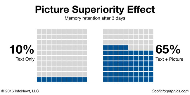
Jon Schwabish: There is a long research history that demonstrates we are more likely to grasp and retain information through pictures than just through words (typically known as the “Picture Superiority Effect”). By visualizing information, you make it easier for your audience to grasp your content and remember it. Visualizing data may be even more important in a presentation because, again, your audience is bound to your pace and how you present your data through graph choice, color, and layout.

There is a long chapter in the book on how to create effective data visualizations for presentations. I walk through basic data visualization principles and outline ways to effective communicate those data in a presentation. I demonstrate ways you can apply the Layering technique to graphs, by showing one data series at a time. But you don’t need to just Layer data—if you’re showing a more complex graph (or perhaps a graph type that is new for your audience), for example, you can start by just showing and defining the axes, and then sequentially add your data. In this way, you have defined the graphic space for the audience so they are prepared for what comes next.

What are your thoughts on animated slide transitions and/or clicking to reveal different pieces of information on a slide? 

Jon Schwabish: I’m generally not a big fan of animated slide transitions, especially the good ol’ Blinds and Checkerboard in PowerPoint and other tools. They tend to look cheesy and immature. That being said, I have found some of the “morphing” animations—Magic Move in Keynote and Morph in the newest versions of PowerPoint—to be quite useful. Say, for example, you want to walk your audience through an infographic. With these morphing animations, you can show the entire infographic and then seamlessly zoom in and scroll through the infographic on the screen. These sorts of techniques can be especially useful when you need to show the audience the full visual and then zoom in so they can see the details.

You also recently gave your presentation at a TED event. Can you share your experience?

Jon Schwabish: I spoke at the TEDxJNJ (Johnson & Johnson) event in Philadelphia. I was invited months earlier and even though I basically knew what I wanted to present right off the bat, it was a long haul to get the message just right and get the slides in great shape. I spent countless hours refining my message (especially the beginning and end), tweaking the slides, and practicing the talk.

When you’re invited to give a TEDx talk, you’re assigned a ‘coach’ who helps you develop your talk and design your visuals. We had weekly calls as I kept tweaking my message, content, and slides; I would send her audio recordings of my practice runs; and we would walk through slide design options. Just having someone who knew my content, my slides, and my struggles was invaluable. I typically try to rehearse my presentations in front of a live audience (and many of my co-workers at the Urban Institute sat in as I practiced the TEDx talk), but this experience really made me realize how valuable it is to have someone to help bounce ideas, concepts, and design off of.

Standing on that big red circle with the TEDx sign behind me was an incredible experience, and I’m thankful that people find my message value and of interest, and that I can communicate that to them in an engaging way.

Is there a website to go along with the book?

Jon Schwabish: Yes, my newly-redesigned website PolicyViz, has a whole section dedicated to the book (http://policyviz.com/better-presentations/).In that section of the site, you will find presentation, design, and data visualization resources including blogs, books, and tools. I’ve also included a section of Book Materials that you can download for your own use. In that section, I’ve included a Better Presentations Supplies Checklist that includes the technical things you may need when you go out and present. I’ve also included a Better Presentations Worksheet (the focus of Chapter 1), which will help guide your outline and organization. I’ve also included downloadable slides, icons, color palettes, and more.

Where’s the best place to follow you online?

Jon Schwabish: You can follow me on my newly-redesigned website, PolicyViz.com, which now hosts my blog, podcast, shop, and HelpMeViz project. I’m also active on the Urban Institute blog, Urban Wire, and have a researcher page there as well. I’m most active on Twitter, and you can easily find me there @jschwabish.


Jon's Bio

Jon Schwabish is an economist, writer, teacher, and creator of policy-relevant data visualizations. He is considered a leading voice for clarity and accessibility in how researchers communicate their findings. His new book Better Presentations: A Guide for Scholars, Researchers, and Wonks helps people improve the way they prepare, design, and deliver data-rich content. He is on Twitter @jschwabish


Monday
Aug082016

23 Reasons to Get Excited About Data (Free eBook)

23 Reasons to Get Excited About Data IBM eBook

The team at IBM Watson Analytics has released a free, new eBook 23 Reasons to Get Excited About Data that explores the latest trends, practical applications and predictions about big data. I'm honored to have been included in the book as an expert on data visualization, along with all of the other IBM Watson Analytics applications!

These days, everyone’s tossing around the term “big data.” The term is nothing new – businesses have been collecting and analyzing data since the 1950s, before the two words were ever even uttered. Take a look back in time and you’re likely to see someone laboriously poring over a sheaf of spreadsheets, manually going through row after row to identify trends and gain insights.

More people are doing more things – personally and professionally – with data, and best practices will continue to develop. Self-serve, more democratized data analytics will Get Bigger, Get Faster and Get Cloudier!

I participated in an IBM video series about big data and visualization that you can see HERE. Data visualization is such an important conponent for humans to the analyze data, discover insights and communicate our findings to others! I'm very passionate about helping people understand how important data visualization truly is! Here are a couple of the thoughts I contributed to the ebook:

Humans are visual creatures. We can process visual information extremely fast, and are 6.5 times more likely to remember visual information than text. These are incredibly important facts when you are trying to communicate data to others. Use data visualizations to help your audience understand your information, and remember it later when it could influence their decisions or behavior. - Randy Krum

Data visualization is a language of context. You dramatically improve comprehension of your data when you design a visualization that puts your data into context for the audience. This can be a series of data points over time, or comparing your data to reference data to give the audience the perspective of how your data fits into a bigger picture. Storytelling with data is more than designing a chart, it’s the art of communicating specific insights from your data. - Randy Krum

Are you doing everything you could with your data? The future of data, along with predictive analytics and data visualization, is very exciting! Grab the free ebook now!

23 Reasons to Get Excited About Data IBM eBook Randy Krum Quote

Saturday
Feb272016

Using Visuals to Enhance Your Credibility

Infographics and visuals have become the lifeblood of storytellers, be it marketers, professors, presenters, etc. They are constantly battling short attention spans, information overload, and little vested interest from their audience. The smart marketer knows their target, and comes with a battle plan to defend against all of these things. This is where visuals come in.

Reasons to Use Visuals

We’ve relied on visuals for everything from street signs and movie banners to websites and presentations. Using visuals to express information has long been a part of our history. Here are just a few more reasons to use them in your presentations and marketing efforts:

1.     Getting Attention

A visual makes information stand out more than just text alone. Studies estimate that between 50-80% of the human brain is dedicated to forms of visual processing.

On social media, they simply take up more real estate than their text only counterparts. A post with some type of visual content has 94% more total views on average than content without images, according to MDG advertising.

2.     Simplicity

As humans, we’re simply wired to receive rich visual information, and can understand more complex information when it is presented visually. Infographics are a great way to provide your audience with context when displaying statistics that are otherwise meaningless.

3.     Credibility

Credibility is one of the biggest reasons to use visuals. Put a statistic in an article and it is questioned. Put a statistic in a visual and it is fact.

In fact, every form of visual information lends credibility to what is presented. 46.1% of people say a website’s design is the number one way to determine the credibility of a company, according to the Stanford Persuasive Technology Lab.

This works the same way in presentations. In 1986, a 3M-sponsored study at the University of Minnesota School of Management found that presenters who use visual aids are 43% more effective in persuading audience members to take a desired course of action.

Use This Power Responsibly

In light of this information, it is important to use this responsibly. Providing accurate information is the most important thing content marketers and visual storytellers will do. No matter how beautifully crafted your infographic or visual is, it can be destroyed by one misrepresented fact, or out-of-context statistic.


Wednesday
Feb172016

Great DataViz Design: Justice Scalia's Ideology

Great DataViz Design: Justice Scalia's Ideology visualization infographic

The Upshot at the New York Times consistently does a great job visualizing data. How Scalia Compared With Other Justices is a fantastic example of clean, effective storytelling with chart design!

The death of Justice Antonin Scalia will leave the Supreme Court with equal numbers of conservative and liberal justices. Justice Anthony M. Kennedy is likely to be the swing vote in most cases.

For social media, they published a simplified version that just shows the current Justices:

Justice Scalia's Ideology infographic

Why is this design so good? Here are my thoughts on why this chart design is great:

  • Minimal chart legend. The color key shows only 2 colors to designate the party of the nominating President. The names of all the Justices are built into the chart itself, which keeps that important information tied to the data in the reader's field of view. Default charts in MS Office would have created a different color for every Justice, and made this chart confusing and visually noisy.
  • Minimal axis labels. Notice the x-axis only shows a label for each decade. You don't need to know where 2004 is specifically. I think they could have minimized further to just the first and last years.
  • Use of opacity. Justice Scalia is the main story of the visual, so his line is heavier weight and bright color. This is a great use of preattentive attributes! All of the other Justices are shown is lighter colors for reference, and the main story stands out.
  • Minimal grid lines. There are a lot of lines on this chart, so only a few gridlines are included to keep the chart as simple as possible.
  • Minimal Text on the page. The chart is connected to a full article, but on this landing page the data visualization tells the story all by itself. The description text on the page is only two sentences long, leaving the visual as the visual centerpiece. 
Monday
Jan252016

Building Responsive Data Visualization for the Web

Building Responsive Data Visualization for the Web book cover

Building Responsive Data Visualization for the Web by Bill Hinderman is a new book that just came out in November. I had the pleasure of helping Bill as the Technical Editor on the book last year, and I can say it's a fantastic guide to structuring your data and building your code for interactive data visualizations that work perfectly on every screen size.

January Giveaway! This month I am giving away one signed copy to a randomly chosen winner. Register on the GIVEAWAYS page by 11:59pm CT on January 31, 2016 to be entered. A winner will be randomly selected on February 1st.

Data is growing exponentially, and the need to visualize it in any context has become crucial. Traditional visualizations allow important data to become lost when viewed on a small screen, and the web traffic speaks for itself – viewers repeatedly demonstrate their preference for responsive design. If you're ready to create more accessible, take-anywhere visualizations, Building Responsive Data Visualization for the Web is your tailor-made solution.

Building Responsive Data Visualization for the Web is a handbook for any front-end development team needing a framework for integrating responsive web design into the current workflow. Written by a leading industry expert and design lead at Starbase Go, this book provides a wealth of information and practical guidance from the perspective of a real-world designer. You'll walk through the process of building data visualizations responsively as you learn best practices that build upon responsive web design principles, and get the hands-on practice you need with exercises, examples, and source code provided in every chapter. These strategies are designed to be implemented by teams large and small, with varying skill sets, so you can apply these concepts and skills to your project right away.

Responsive web design is the practice of building a website to suit base browser capability, then adding features that enhance the experience based on the user's device's capabilities. Applying these ideas to data produces visualizations that always look as if they were designed specifically for the device through which they are viewed. This book shows you how to incorporate these principles into your current practices, with highly practical hands-on training.

  • Examine the hard data surrounding responsive design
  • Master best practices with hands-on exercises
  • Learn data-based document manipulation using D3.js
  • Adapt your current strategies to responsive workflows


I asked Bill to answer a few questions about his book:

Who is the book intended for?

The book is for a development and design team that is looking to shift toward responsive, mobile-first practices.  While it's certainly geared most toward data visualization projects, the book spends a hefty amount of time building responsive design tenets before then getting specifically into visualization.


What’s the most important thing to make a great data visualization?

In my mind, the most important thing in making a great data visualization is the output being actionable.  The goal of a visualization is always to make something more clear, right?  All of the data is already...there, in its raw form.  So the initial goal, the more achievable goal, is clarity. But making something clear, and then also making it actionable - that is - pushing the reader/viewer/user toward actually doing something with the data, is where greatness shows up.


Do you see everyone moving towards responsive data visualization, or are a lot of companies holding back?

No, I actually don't.  I see a huge amount of people holding back, really with the same reasoning that plagued responsive design in its early stages.  That being: "People don't want to do that on mobile."  Which is, quite frankly, ridiculous.  Every study Pew has put out (I reference plenty of them in the book) shows that as soon as someone is given the opportunity to do something on mobile, they do it.  Moreover, there's an increasing amount of mobile-only users, rather than simply mobile-first.  Very soon, desktop users are going to be seen as an antiquated, legacy type of use case, rather than the default.


What's the difference between Responsive Data Visualization and Responsible Data Visualization?

Responsive data visualization is the practice of building data visualizations in such a way that they adapt, respond to, and feel natural regardless of whatever device type a user is accessing them with, and whatever the data set looks like.  In this way, it is the responsible way to visualize data.  So...there isn't one, I suppose.


What do you mean in the book by “Think Small”?

So a concept that's very closely tied to responsive design is thinking mobile-first.  That is: designing first for your most limited use case: a small screen, a bad network, sloppy, finger-based gestures.  In data visualization, we actually have an even more limited use case: no screen at all.  That's where building a good API comes into play.  Thinking of the smallest, most limited use case, say, an external call to your API from a different website, and building toward that first.  That way, as you gain real estate, features, bandwidth, you are simply enhancing something that already has a great foundation.


What are your thoughts on D3.js and its future?

It's the best, and I love it and if I could, I would shower it with chocolates.  D3.js is, if you're able to devote a development resource to learning it, the absolute best way to create a visualization on the web, because it uses all the languages of the web.  Because it isn't some applet, or some plugin, or some...image, I suppose, it just works intuitively like you are building normally for the web.  Because of this, I think the future is bright.  Even if it were never to be updated again (which isn't the case), it would still implicitly grow in functionality as web languages evolve and grow around it.


What’s available for readers on the book website: http://responsivedatavisualization.com/?

The website has snippets from every chapter of the book, along with exercises and code samples that go along with the practice sections in the chapters.  All of the code links to GitHub, and can be forked, built locally, and compared with solutions.


Are you speaking at any upcoming presentations or webinars?

I am!  I'll be speaking at Strata + Hadoop World San Jose in March (http://conferences.oreilly.com/strata/hadoop-big-data-ca).


Where’s the best place to follow you online?

The best places to follow me online are my own website (billhinderman.com), LinkedIn (linkedin.com/in/williamHinderman), or Twitter (twitter.com/billHinderman).


Thursday
Jan072016

Three Simple Resolutions to Design Better DataViz

Welcome back to the office! You’re back to work in the new year with energy and ambitions of doing better work than you’ve ever done before. Very quickly though, you fall back into the old routine and find yourself making the same charts and the same presentation slides as always. There are tight deadlines, pressure from your boss, and it’s just easier to use the templates.

Let me offer a few simple resolutions that can make your content and business communication significantly better this year.

Visualize Your Data

Visuals are so much more powerful than text and numbers. I can’t tell you how many presentations and infographics I see from lazy designers that just make the numbers really big.

“Big fonts are NOT data visualizations!”

Picture Superiority Effect infographic

Our brains process visual information faster and more easily than text, and visual information is 650% more likely to be remembered by your audience than text alone (Brain Rules, John Medina, 2009). If you want to communicate a clear message, and you want your audience to remember that message, make it visual.

Visualize Your Data infographic

Look at these two statistics. They could be on a presentation slide, in a report, or included in an infographic. Your eye is drawn to the visualized number on the left, with both a doughnut chart and an illustration of the concept of GPS location. You as the reader are more likely to remember that statistic on the left than the number on the right, which just shows the stat in a big font size.

Remove Chart Legends

It’s frustrating that the most popular charting software in the world, Microsoft Office, always includes a chart legend by default. The “tyranny of the default” is that most designers will just accept it, and not improve their charts. It’s your responsibility as the dataviz designer to make your charts as easy as possible to understand.

Legends that are separate from the visualization of the data make your readers work much harder, looking back and forth between the data and the legend, to understand your visualization. Make understanding your data visualization much faster and easier by moving the data descriptions into the chart itself, and connected to the actual data.

Remove Chart Legends infographic

Here you can see the default column chart created by PowerPoint on the left, and an improved version on the right. In this example, I removed the chart legend and added the data descriptions below each column. To add a visual element, I also added stock icons to visually represent the age groups as images on top of the chart. These chart improvements only took 10 minutes to create, and the chart is much easier to read.

Try New Ways to Visualize Your Data

You do want your audience to remember your data, right? You’re trying to help them make better decisions based on your information, and for that to be successful they have to be able to remember your data. Purchase decisions, voting decisions, health decisions, financial decisions, business decisions, and many more are all impacted by the information people have, and can remember.

Breaking out of the Big 3 charts is tough. Bar charts, line charts and pie charts (the Big 3) make up most of the dataviz in the world. However, they can also make your data look like everyone else’s. In order for visuals to be memorable to your audience the visuals need to be unique and different.

Visualizing Percentages infographic

Consider a single percentage statistic: 36%. A percentage is actually two numbers in comparison. Your data value as it compares to 100%. Pie charts are the most common way to visualize a percentage, but there are easily more than 25 different ways to visualize this statistic.

Visit sites these sites to discover new ways to visualize your data:

Design Better DataViz This Year

I ask you to make your own resolution to improve your charts and dataviz designs this year. Start with the three resolutions above, and start communicating data more effectively.

Monday
Dec142015

DataViz Gift Guide 2015

Some of the best DataViz themed gifts for the holiday season, with some great deals and discounts as well.

BOOKS

DataViz Gift Guide 2015 Books


POSTERS

DataViz Gift Guide 2015 Posters

  • Timeplots.com - 20% OFF all infographic posters, Discount Code “coolinfo”
  • HistoryShots - Check out PopWaves, the updated History of Pop/Rock Music poster!
  • Pop Chart Lab - Running a 12-Days of Christmas sale in December


TOOLS

DataViz Gift Guide 2015 Tools

  • Visme.co - Free trial, 40% OFF first payment (monthly or yearly subscription), Discount Code “COOL40”
  • The Noun Project - Free with attribution or $9.99/month unlimited. Creating, Sharing and Celebrating the World’s Visual Language
  • IBM Watson Analytics - Free & Paid editions. Predictive analytics and data visualization. Analyze your data in minutes on your own without downloading software.


TRAINING

DataViz Gift Guide 2015 Training


CONFERENCES

DataViz Gift Guide 2015 Conferences

What else would you add to your DataViz wish list?

Thursday
Oct152015

iOS Version Release Date History

iOS Version Release Date History

iOS Version Release Date History is a data visualization that shows how long each version of iOS has gone through beta versions. I really like this visualization by Will Hains and posted on his site Thinky Bits.

The design is still a work-in-progress, and it still requires me to go in and edit it every time a new beta is released, but it’s much less work than it used to be. And now, with the magic of Google’s Charts API, it’s interactive as well. The chart is 100% generated by Javascript in the browser, producing slick SVG images on-the-fly.

The stacked bar style clearly shows how long each version spend in the development process, and specifically shows how fast iOS 9.1 is being pushed through the system.

You can also see how long each version was the official current version in the wild, and the general trend to update iOS more frequently in Will's 2nd chart.

iOS Final Version Release Date History

Monday
Oct122015

Giveaway: Data Visualization Training Video Package

I have ONE Data Visualization - 5-Course Video Training package from O'Reilly to give away in October! This is a great giveaway! Regular price $309.99, Over 14 Hours of online training

Register HERE by 11:59pm on October 30, 2015 to be entered.

A winner will be randomly selected on Oct 31st.

Successful data visualizations allow you to impart meaning and emphasis to your data points. This Learning Path will teach you how to display trends, patterns, and outliers while you discover the power of letting your data to speak. Once you’ve finished, you’ll be able to efficiently communicate volumes of data with ease. The Data Visualization training package includes all five course videos:

  1. An Introduction to d3.js: From Scattered to Scatterplot, Presented by Scott Murray | 2 hours 52 minutes
  2. Learning to Visualize Data with D3.js, Presented by Rafael Hernandez | 3 hours 52 minutes
  3. Using Storytelling to Effectively Communicate Data, Presented by Michael Freeman | 1 hour 30 minutes
  4. Effective Data Visualization, Presented by Jeff Heer | 2 hours 52 minutes
  5. Intermediate D3.js, Presented by Scott Murray | 3 hours 38 minutes
Tuesday
Sep082015

DataViz & Infographics Fall Course at SMU CAPE

Cool Infographics Course at SMU

Infographics & Data Visualization Design

September 24-November 12, 2015 | 6pm-9pm Thursday Evenings | SMU CAPE Plano Campus | $595

$75 off discount code for Cool Infographics readers: RK215

This Fall, I will again be teaching a course as part of the CAPE program (Continuing and Professional Education). This time the course will be at a new location at the SMU Plano Campus. This is a very hands-on course where participants will start to develop better charts, infographics and your own infographic resume. Topics include:

  • The art and science of data visualization and infographics
  • The data visualization and infographics design process
  • Data analytics and basic statistics for the designer
  • Different chart types, dashboards and graphing options
  • How to use the various software and online tools readily available and when to use them
  • Strategies for publishing and promoting infographics online
  • Understanding IP, trademark and copyright issues and how they relate to infographics
  • And more...

Please share with anyone in the Dallas area, or join the class yourself. Enrollment is very limited, so register quickly!

Click Here to learn more: bit.ly/SMU-DataViz-Plano


Also check out the DFW Data Visualization & Infographics Meetup group with monthly speakers and events in the Dallas-Fort Worth area!