About
Randy Krum
President of InfoNewt.
Data Visualization and Infographic Design

Infographic Design

Infographics Design | Presentations
Consulting | Data Visualizations

DFW DataViz Meetup

Join the DFW Data Visualization and Infographics Meetup Group if you're in the Dallas/Fort Worth area!

Search the Cool Infographics site

Custom Search

Subscriptions:


Feedburner

The Cool Infographics® Gallery:

How to add the
Cool Infographics button to your:

Cool Infographics iOS icon

- iPhone
- iPad
- iPod Touch


Read on Flipboard for iPad and iPhone

Featured in the Tech & Science category

Flipboard icon

Twitter Feed
From the Bookstore

Caffeine Poster

The Caffeine Poster infographic

Entries in death (20)

Wednesday
Nov282018

What Will Kill You in 2040

What Will Kill You in 2040 infographic

What Will Kill You in 2040 infographic takes the top 20 reasons for death in 2016 and compares them to the predicted top 20 reasons for death in 2040. The top 3 aren't predicted to change, however the rest are all over the board!

The infographic was created by Radio Free Europe Radio Liberty. Their source of information came from an article published in The Lancet (a peer-reviewed general medical journal) called Forecasting life expectancy, years of life lost, and all-cause and cause-specific mortality for 250 causes of death: reference and alternative scenarios for 2016-40 for 195 countries and territories. That's a mouth-full for a title!

The orthogonal lines are hard to follow. Straight lines would have turned this into a slope graph, and made it easier to see which causes of death were increasing or decreasing. Categorizing the causes of death into 3 different categories and color coding them really helps break up the text and makes it a little easier to follow the arrows.

Found on Radio Free Europe

Thursday
Oct222015

Murderers of Marvel


Morph Costumes has created the Murderers of Marvel infographic to show who is the deadliest comic character of Marvel.

Who is the deadliest character in the Marvel Universe? Wolverine? The Hulk? Deadpool?

We’ve had furious debates over this in the MorphCostumes office, pitting characters against one another in imaginary fights to the death.

This month, we decided to settle the argument once and for all. We combed our comic archives and ranked the deadliest Marvel characters, based on the number of people they’ve killed. From dangerous and deadly to downright lethal, here are the biggest killers in the main Marvel universe!

I'm actually surprised by the number of kills based on how easily comic book characters seem to survive or come back to life.

I like the color coding, and the consistent use of the grid of squares to visualize the data. The footer should include a copyright (or Creative Commons) license statement, and the URL to the infographic landing page so readers can find the original, full-size version.

Thanks to PJ from Big Apple Comics for sending in the link!

Friday
Jun122015

Death By Boating Under the Influence

Death By Boating Under the Influence Infographic

The Never BUI (Boating Under the Influence) infographic helps share some of the grim statistics about the boating deaths caused by alcohol. This is a perfect topic for an infographic by Boat Ed, a source for Official Boater Safety Courses and Boat Safety Education Materials.

Before the thought of drinking on a boat crosses your mind, consider the physical and legal consequences of boating under the influence of alcohol. Not only is operating a boat while intoxicated illegal in all 50 states, it’s also dangerous and can have deadly consequences.

Alcohol use is the leading known contributing factor in fatal boating accidents; where the primary cause was known, it was listed as the leading factor in 21% of deaths. Safe boating means never boating under the influence (BUI).

Safe boating means sober boating. While it may be tempting to crack open a can of beer while cruising, keep in mind that your record, license, and life may be at stake!

I really like this design. Simple, clean design that focuses on telling one story really well. Easy to read. Easy to Understand the data. Easy to share. 

Thanks to Joe for sending in the link!

Wednesday
May272015

The Fallen of World War II

The Fallen of World War II from Neil Halloran on Vimeo.

The Fallen of World War II is an animated infographic video by Neil Halloran showing the scale of deaths in the U.S. and other countries involved in the war. He also has an experiemental interactive version at fallen.io

An animated data-driven documentary about war and peace, The Fallen of World War II looks at the human cost of the second world war and sizes up the numbers to other wars in history, including trends in recent conflicts.

Visit fallen.io for more information.

Love this! Very well done animated infographic video.

The stacks of icons shown for each country are 20 across, which is hard for most people to comprehend. We live in a Base-10 society, and showing the icons in rows of 10 would be much easier for audiences to understand.

There are a couple discrepancies as well. For example, the narration mentions that France lost 92,000 in the Battle of France, but the visualization only shows 86,000.

Also available on YouTube:

Tuesday
Oct142014

20th Century Death

20th Century Death infographic

20th Century Death infographic from Information is Beautiful, visualizes the main causes of death during the 20th century by grouping each cause into general categories and then branching off more specifically.

Visualizing the major causes of death in the 20th Century.

Originally a 6m x 2m commission by the Wellcome Collection as a companion piece to the London exhibition: ‘Death: A Self-Portrait – The Richard Harris Collection’ (Nov 2012).

Appropriate choice of color scheme since red has a negative association like death, and red, orange, and yellow are an analogous color scheme due to their proximity on the color wheel. I would have loved to see more graphic pictures like the ones used in the infectious disease group and the animal subgroup.

I think this is a great application of a bubble chart. The audience isn’t trying to make specific value comparisons, but instead should get a general feel for the large differences in the causes of death.

I love that David McCandless and his team has made his data transparent and available to anyone. The data values are posted in a public Google Spreadsheet available at http://bit.ly/20thdeath

Found on Information is Beautiful

Friday
Aug292014

False Visualizations: Sizing Circles in Infographics

Accuracy is the most important aspect of an infographic design!

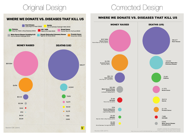
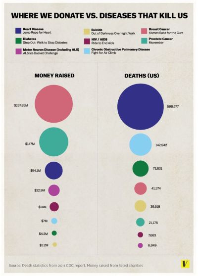
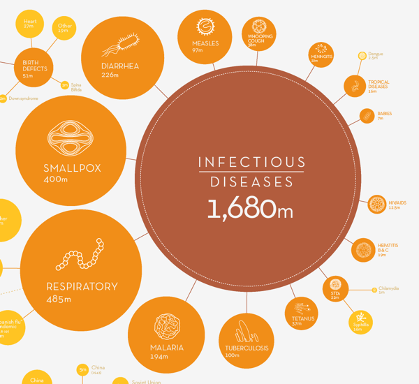
Last week, the article The Truth about the Ice Bucket Challenge by Julia Belluz on Vox Media included the infographic, Where We Donate vs. Diseases That Kill Us, that used proportionally sized circles as its data visualization. The problem with this design is that the circle sizes don’t match the values shown. This is a false visualization and significantly over exaggerates the smaller amounts of money contributed to each charity and the deaths attributed to each cause.

This causes problems because readers often just look at the visuals without reading the actual numbers. They start with the assumption that a visualization accurately represents the data. The Vox Media story and infographic already have over 12,000 shares on Facebook, and this is a great case study for designers to understand how important it is to visualize data accurately.

As readers, we see the area of two-dimensional shapes on the page to represent the different values, but design software only allows width and height adjustments to size shapes. Designers make the mistake of adjusting the diameter of circles to match the data instead of the area, which incorrectly sizes the circles dramatically. It takes some geometry calculations in a spreadsheet to find the areas and then calculate the appropriate diameters for each circle. To demonstrate, I created this corrected version of the infographic.

False Visualizations: Sizing Circles in Infographics Revised

My Google Docs spreadsheet of the correct circle area and diameter calculations is available here.

Assuming this was a design mistake, and there was no intent to deceive the audience, this is a common mistake that many designers make.  So many designers, that I included an entire section on this topic in the Cool Infographics book to help designers understand how to size the area of circles.

I made one other improvement to the corrected design above by removing the color legend and listing the charities and causes of death right next to the appropriate circles. This makes the whole visualization easier for the audience to read by eliminating the need to look back-and-forth from the circles to the color legend to figure out what each circle represents.  Placing the text next to each circle keeps the information in the reader’s field of view which minimizes eye movement.

Sticking with the circles data visualization style, I wanted to take the design a little bit further. I would recommend one of two alternate improvements.  First, adding colored connecting lines is one way to make it easier for the audience to find the related circles in the columns sorted in descending order.

False Visualizations: Sizing Circles in Infographics Revised Lines

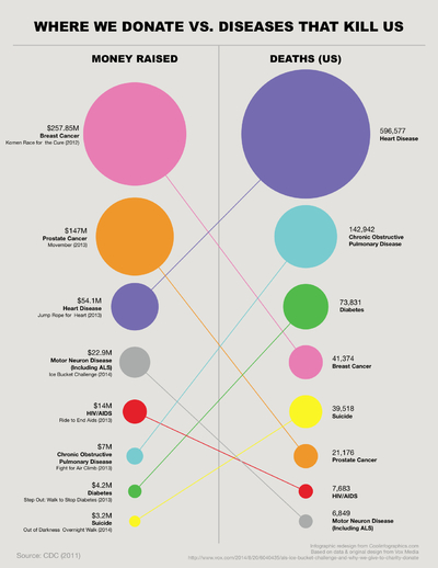
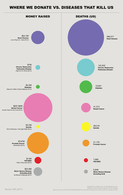
A second alternative would be to sort the lists to line up the related circles.  This makes it much easier for the audience to see the direct comparisons between charitable contributions and death rates related to the same cause.

False Visualizations: Sizing Circles in Infographics Revised Descending Sort

I’m passing over any discussion about whether using proportionally sized circles (a bubble chart) is the best visualization method for this data. If a designer makes the choice to use sized shapes, my point is that the data visualizations in the infographic must match the numbers using area.  David Mendoza published a good analysis worth reading and designed an alternative way to visualize the data in his article, This Bubble Chart Is Killing Me.

How else would you improve this design?

NOTE: I was able to contact the designer who created the infographic at Vox Media, and he had already realized his error after the infographic had been published. As I had guessed, he had mistakenly adjusted the diameter of the circles instead of the area. He told me that he’s working on updating the official infographic design in the article, but it hasn’t been published on the Vox Media site yet.


Friday
May022014

The Deadliest Animal in the World

The Deadliest Animal in the World is an infographic posted by Bill Gates on his blog as part of Mosquito Week.

What would you say is the most dangerous animal on Earth? Sharks? Snakes? Humans?

Of course the answer depends on how you define dangerous. Personally I’ve had a thing about sharks since the first time I saw Jaws. But if you’re judging by how many people are killed by an animal every year, then the answer isn’t any of the above. It’s mosquitoes.

When it comes to killing humans, no other animal even comes close. Take a look:

Considering their impact, you might expect mosquitoes to get more attention than they do. Sharks kill fewer than a dozen people every year and in the U.S. they get a week dedicated to them on TV every year. Mosquitoes kill 50,000 times as many people, but if there’s a TV channel that features Mosquito Week, I haven’t heard about it.

This infographic does a number of things right from a design perspective, but the major point is that as humans we see the two-dimensional area of objects as representing the values.  This design uses both the width and height of the rectangles to visualize the scale of deaths caused by the various animals.

Sometimes it might be too subtle.  For example, the width is the same for the rectangles for tapeworms and crocodiles, but the height of the tapeworm box has twice the height to represent the value correctly.

The other thing it does well is to tell one story really well.  There’s isn’t any extraneous information like geographic locations or animal populations.  The infographic focuses on communicating one set of data.

Because the infographic will be shared online without the rest of the article, there are three piece of information that are missing from this design:

  1. The Gates Notes logo, or some type of identification of who published the infographic
  2. A copyright or Creative Commons license state to clearly identify the rights for people sharing the infographic
  3. The URL of the article where readers can find the original, full-size infographic and the associated text.

Thanks to Peter for recommending the link!

Tuesday
Apr082014

Where Does Your Money Go When You Die?

Where Does Your Money Go When You Die? infographic

Do you know what happens to your assets once you die? Gorman & Jones has created a flow chart infographic to answer the question, Where Does Your Money Go When You Die? If you have a Will, no worries! If you don’t, maybe this flow chart will convince you to write one once you see who will inherit your things!

For many people, the concept of death and the consequences for those we leave behind is scary. While dwelling on this subject can be unpleasant, it’s important to know that your family is going to be taken care of when you die. Do you know where your money is going? To get a better idea of what happens to our assets when we pass on, here is a guide to help answer the question, “Where Does Your Money Go When You Die?”.

What a great, informative topic for a law firm that covers estate law.  I wish the different splits of the estate were visualized, but overall a good topic and design.

I like that the design company is given credit in the footer, but it’s missing the URL to the infographic landing page.  The link to the Gorman & Jones home page is fine, but there aren’t any links to the infographic there, so it doesn’t help readers find the original, full-size infographic.

Thanks to Andrew for sending in the link!

Thursday
May302013

Drones Kill - Animated, Interactive Visualization

Drones Kill - Animated, Interactive Visualization

Great data visualization design from Pitch Interactive.  Out of Site, Out of Mind is an animated data visualization of every U.S. drone strike in Pakistan since 2004 and the associated kills reported in the news.  There is also an interactive element is that the readers can hover their pointer over the visualization an more details appear in a popup window.  Visit the original site to see the animation.

Since 2004, the US has been practicing in a new kind of clandestine military operation. The justification for using drones to take out enemy targets is appealing because it removes the risk of losing American military, it’s much cheaper than deploying soldiers, it’s politically much easier to maneuver (i.e. flying a drone within Pakistan vs. sending troops) and it keeps the world in the dark about what is actually happening. It takes the conflict out of sight, out of mind. The success rate is extremely low and the cost on civilian lives and the general well-being of the population is very high. This project helps to bring light on the topic of drones. Not to speak for or against, but to inform and to allow you to see for yourself whether you can support drone usage or not.

The visualization is created in HTML5 and JavaScript. We recommend Chrome for the best viewing experience.

The challenge with gathering the data and how drone attacks are represented in the news is shown by the large OTHER category of victims.  Also, it’s the largest category of victims.  A data visualization like this is a tremendously effective way to bring this issue to light.

The category of victims we call “OTHER” is classified differently depending on the source. The Obama administration classifies any able-bodied male a military combatant unless evidence is brought forward to prove otherwise. This is a very grey area for us. These could be neighbors of a target killed. They may all be militants and a threat. What we do know for sure is that they are targeted without being given any representation or voice to defend themselves.

The visualization was created by Wesley Grubbs, and there is a video interview of him about the data visualziation process by The Huffington Post.

Thanks to Ray for sending in the link!

Friday
May102013

Shark Attack!

Shark Attack! infographic

Shark Attack! is a great infographic design collaboration between Ripetungi and Joe Chernov.  Based on data from a Huffington Post article, 100 Million Sharks are Killed Annually.

Recently received a Facebook message from content marketing wizard Joe Chernov linking to the Huffington Post article 100 million sharks are killed annually.  This was an astonishing fact and the enormity of the number made it difficult to wrap your head around.  Joe also shared an idea for a graphic to add context to this fact making it easier to comprehend, while exposing the outrageous ratio of the number of people sharks kill to the number of sharks people kill.

Great data visualization that shows readers the magnitude and scale of how many sharks are killed by humans every hour.  It also puts the 11,417 sharks killed value into context by comparing it against the 12 humans killed by sharks every year.  [EDITED]

Don’t get me wrong.  I’m convinced that death by shark attack would be a horrible way to go, but some days it’s good to be at the top of the food chain on Earth.