About
Randy Krum
President of InfoNewt.
Data Visualization and Infographic Design

Infographic Design

Infographics Design | Presentations
Consulting | Data Visualizations

DFW DataViz Meetup

Join the DFW Data Visualization and Infographics Meetup Group if you're in the Dallas/Fort Worth area!

Search the Cool Infographics site

Custom Search

Subscriptions:


Feedburner

The Cool Infographics® Gallery:

How to add the
Cool Infographics button to your:

Cool Infographics iOS icon

- iPhone
- iPad
- iPod Touch


Read on Flipboard for iPad and iPhone

Featured in the Tech & Science category

Flipboard icon

Twitter Feed
From the Bookstore

Caffeine Poster

The Caffeine Poster infographic

Entries in science (23)

Monday
Jan302017

The Alternative Periodic Table

The Alternative Periodic Table infographic poster

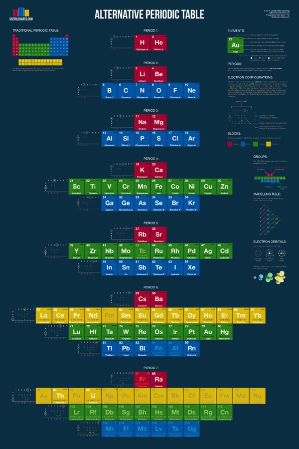
The Alternative Periodic Table is a new project from Matt Baker at UsefulCharts being funded through a Kickstarter campaign that ends on February 9, 2017. Act fast to get your copy and help support Matt!

From Matt:

Recently, I decided to tackle the most famous chart of all... the periodic table!  Considering that they just added 4 new elements, the timing could not be better. Anyway, here's what my version looks like:

You'll notice that it looks quite a bit different from the one you're used to. The video at the top of the page explains why. In short, the traditional periodic table is designed to emphasize the concept of valence, which is important for knowing which elements can easily combine with others to form compounds. In contrast, my alternative periodic table is designed to simply emphasize the way in which atoms are "built" (specifically, how electrons group together into shells and subshells). It's based on a design proposed by Edward Mazurs in the 1960s.

Like the traditional table, this alternative version can be used to find an elements name, number, atomic weight, state of matter, period, group, and block.  However, it also contains detailed information on electron configurations and the different types of electron subshells.

Thursday
May052016

Next Generation Interactive Scientific Poster

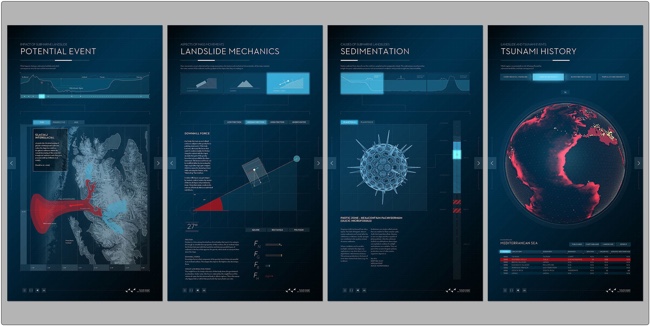
The Next Generation Scientific Poster project by The Muthesius Academy of Fine Arts and Design in Kiel, Germany takes scientific data visualization and designed a physical, interactive interface for audiences. As a result, they founded The Science Communication Lab as a spin-off from the academy so they could offer this expertise to researchers in the scientific community all over the world.

Check out this video demonstration on YouTube:

From their description:

The classical poster does often not offer enough space for the sheer complexity of the contents – texts, pictures, graphs and tables – used to convey scientific research today which causes inability to communicate contents and statements concisely. The classical poster also lacks an appropriate possibility for continuous updates which are necessary to include newer research results and would do justice to today‘s constant changes of information. 

The interactive poster is a a new method of presenting scientific topics in an attractive way, offering the user an easier access to the contents and a clearly improved possibility of comprehension. The illustrated topics are supposed to function self-explanatory and long-lasting which means that the viewer can decide on the depth and duration of the information process.

The interactive poster can be used for various purposes: For the internal demonstration of the research projects (poster sessions), on expert conferences and conventions in an international context. The newly developed technology -LED displays with a touch frame- can be used in a more reliable and long-lasting way than conventional projection technologies.

Thanks to Pieter Torrez from Scigrades for the link and his interview article with Professor Tom Duscher

Wednesday
Apr202016

How Much Would Darth Vader's Suit Cost?

How Much Would Darth Vader's Suit Cost? infographic

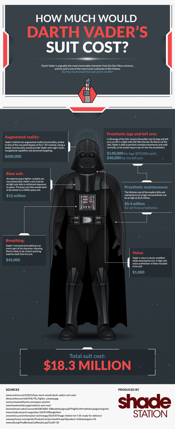
How Much Would Darth Vader's Suit Cost? After Shade Station added up all the state of the art equipment like augmented reality in his helmet, his suit being on par with a NASA space suit, as well as all the medical bills from his prosthetic limbs. The total cost was around $18.3 Million! No worries though, the dark side always seems to have enough money to spend.

Darth Vader is arguably the most memorable character from the Star Wars universe, and his suit is one of the most iconic costumes in film history. But how much would that suit cost in real life?

Quick and easy infographic that does a good job of telling one story really well. I would have visualized the different expenses to show show where most of the money goes.

Thanks to Dave for sending in the link! 

Monday
Dec212015

The Data Science Industry: Who Does What?

The Data Science Industry: Who Does What? infographic

Where's the "Data Visualizer"?!? The data science occupation is a very popular new career field that many companies are hiring; however, many of these titles are mistakenly used interchangeably. The Data Science Industry: Who Does What? infographic from The Data Camp Blog introduces some of the positions in this upcoming field.

In this infographic we compare the roles of data scientists, data analysts, data architects, data engineers, statisticians and many more. We have a look at their roles within companies and the data science process, what technologies they have mastered, and what the typical skill set and mindset is for each role. Furthermore, we look at the top employers that are currently hiring these different data science roles and how the average national salaries of these roles map out against each other.

Good, thorough source reference links. Needs a copyright statement and the URL to the infographic landing page on the DataCamp site so readers can find the original full-size version.

Found on MarketingProf

Tuesday
Jan202015

The Key to Infographic Marketing: The Psychology of the Picture Superiority Effect

In Ancient times, Cicero considered memory training to not just be a method, but a form of art. He felt strongly that training your memory was one of the most valuable things you could do to improve your capabilities as a speaker, and a citizen.  Even in ancient times, Cicero knew that remembering images was superior to remembering text alone.

People remember pictures better than words, especially over longer periods of time. This phenomenon as we know it today, is called the Picture Superiority Effect*. It refers to the notion that concepts that are learned by viewing pictures are more easily and frequently recalled than are concepts that are learned by reading their written word form counterparts.

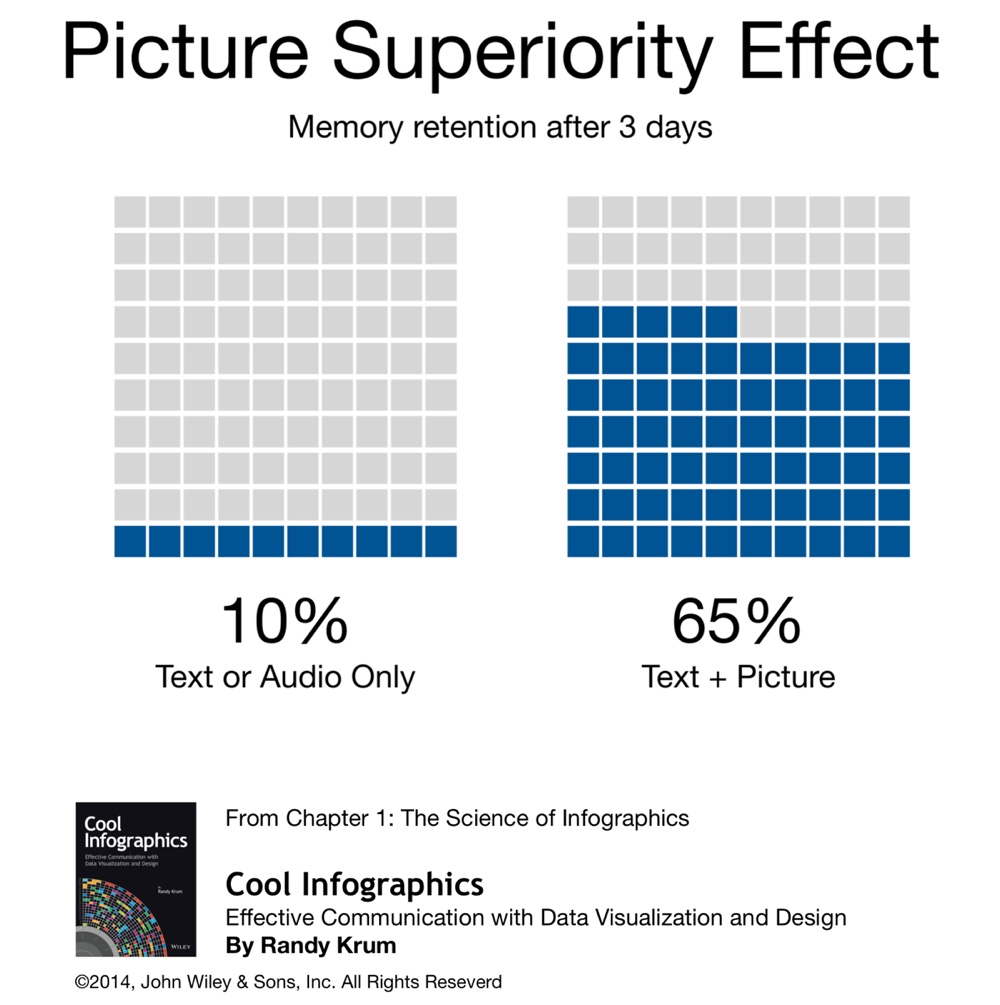
What had been known to the Ancients throughout the centuries, has been quantified scientifically in our modern times. In my book, I included this quote from John Medina’s Brain Rules, to help explain the value of the Picture Superiority Effect. However, to make it visual I created this simple data visualization to help readers remember the power of visual information.

“Based on research into the Picture Superiority Effect, when we read text alone, we are likely to remember only 10 percent of the information 3 days later. If that information is presented to us as text combined with a relevant image, we are likely to remember 65 percent of the information 3 days later.” - John Medina, Brain Rules, 2008

Cool Infographics Picture Superiority Effect

via: coolinfographics.com/book

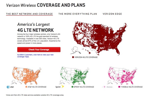
Advertisers have known this for years. Whether it’s been a simple application like the Yellow Pages (ads with pictures got more business) or giant billboards in New York’s Times Square. To see a real world example of how the Picture Superiority Effect works, check out this excellent coverage area map ad campaign from Verizon:

Verizon Coverage Map Infographic Ad

These maps show Verizon’s 4G LTE network coverage area, compared to the coverage area of their competitors. If you were only to get the text version, imagine how much of this paragraph explaining their coverage area you would remember 3 days after reading it:

“Among the four major wireless carriers, only Verizon’s 4G network is 100% 4G LTE the gold standard of wireless technology. Available in over 500 cities, Verizon 4G LTE covers almost 97% of the U.S. population. Experience the speed and power in more places.”

Now, take a look at the maps again. How much easier it is to see how the four major wireless carriers stack up against each other? It’s obvious Verizon covers the most area. Verizon takes it a step further, and has a link to a PDF highlighting their coverage in Alaska and an interactive map to view different parts of the country. All complete with map visualizations, of course.

However, there is another very important aspect of the Picture Superiority Effect that must be understood: It’s not just any image. It needs to be an image relevant to the content, which reinforces the message from your data. This works across all mediums of advertising, and of course, infographics.

In infographic design, the Picture Superiority Effect is extended to include charts, graphs, and data visualizations. Infographic designers use data visualizations and illustrations as the visual component of a design to trigger the Picture Superiority Effect, which can have incredible success getting the audience to remember the information presented.

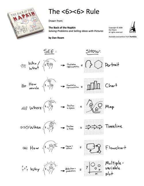
Here is an great example from Dan Roam, author of the book, The Back of the Napkin, Solving Problems and Selling Ideas With Pictures, of how using images and text can help a designer understand which type of visualization is appropriate to use when communicating different types of information. Easy to understand, easy to remember.

Dan Roam Back of the Napkin <6><6> Rule

via: DanRoam.com

Infographics work so well because using text and images together helps people to retain the information. Remember, if it’s just words, people will only remember 10% of the information they read. But, if you combine the text with a relevant image, they are likely remember 65% of the information! While others may choose to work harder by crafting a perfectly written article or advertisement, it would be a smarter choice to use text and relevant images together.

Remember to “Make It Visual” if you want your audience to remember the information about your company’s products or services. You don’t have to be a professional designer either. You can make your content visual using a wide range of tools like the Adobe Creative Cloud suite, Microsoft PowerPoint, OmniGraffle, or online design tools like Visme.co or Tableau Public.


Sources:
*Nelson, D.L., Reed, U.S., & Walling, J.R. (1976). Pictorial superiority effect. Journal of Experimental Psychology: Human Learning & Memory, 2, 523-528.
Monday
Jan192015

The Future of Rare Earth Elements

Rare Earth Elements infographic

Rare Earth Elements make up a large portion of our high tech equipment and the demand for the elements is only increasing. This infographic, published by Buy Metal Online, has that examines the situation and the troubling shortages in our future.

Here we have an infographic that takes a look at rare earth elements (REE) including information about what they are, what we use them for, who’s producing the World’s REEs and more.

Good topic with clear visualizations and attractive illustrations.  They have a lot of valuable information packed into this design. However, in my opinion, there’s way too much text included, with multiple paragraphs explaining each section. In my experience, if readers see this much text in an infographic, they are likely to perceive it as too complicated and detailed. They’ll probably move on without ever reading it. Infographics are supposed to be simple explanations that are quick and easy to understand.

Thanks to Dave for sending in the link!

Tuesday
Dec232014

The Shapes of Snowflakes

The Shapes of Snowflakes infographic

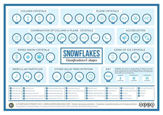
The Shapes of Snowflakes is a fascinating categorization of crystal structures from Compound Interest, a chemistry site run by Andy Brunning in the UK. The site has a huge selection of chemistry and science related infographics.

In the Northern Hemisphere at least, the idealised vision of Christmas involves snow. Whilst no one snowflake is exactly the same as another, at least on a molecular level, scientists have none-the-less devised a system of classification for the many types of crystals that snow can form. This graphic shows the shapes and names of some of the groups of this classification.

The number of categories snow crystals can be categorised into has been steadily increasing over the years. In early studies in the 1930s, they were classified into 21 different shape-based categories; in the 1950s, this was expanded into 42 categories, in the 1960s to 80 categories, and most recently in 2013 to a staggering 121 categories.

Science meets Christmas!

You can also download a high-resolution PDF version.

Monday
Aug112014

12 Reasons Your Business Needs to Get Visual

12 Reasons Your Business Needs to Get Visual infographic

If we’ve said it once, we’ve said it a million times… but once more wont hurt! Visuals are important!!! This infographic from re:DESIGN attempts to summarize the reasons why in 12 Reasons Your Business Needs to Get Visual.

The shift to the visual is evident everywhere we look, in all media — the infographic explains why.

A good, strong visual married to a good concept — with the right strategy and the right words — wins every time, especially in today’s busy, noisy media world. One thing is clear: visuals and all that traditional creative expertise brings to the table has never been more important for capturing eyeballs, expanding brand influence, and getting people to act.

Love the message and most of the points included.  Good choice of images for each section. However, big fonts are not data visualizations and the infographic looks like it’s pushing the use of bigger fonts instead of visuals. Data shown in a big font does not provide the audience with any context, not do they make the data easier to understand.

I also noticed the popular false statistic included in the design: “Visual data is processed by the brain 60,000 times faster than text.”  It’s a statistic often quoted in presentations and infographics about the value of visual information, but it’s not true.  I’d love for this statistic to be real, but no one has been able to track down the original research.  It was used decades ago in some 3M marketing materials for transparencies used with overhead projectors (yes, that long ago).  It’s quoted so often now that everyone believes it.

If this topic interestes you, check out Chapter 1 of my book, Cool Infographics, called The Science of Infographics.  There I cover the research and data behind why visual information is more effective and why infographics are so popular.  You can download a free sample PDF of the chapter on the BOOK page.

Found on re:DESIGN

Monday
Jun302014

The Periodic Table of Fictional Minerals

The Periodic Table of Fictional Minerals infographic

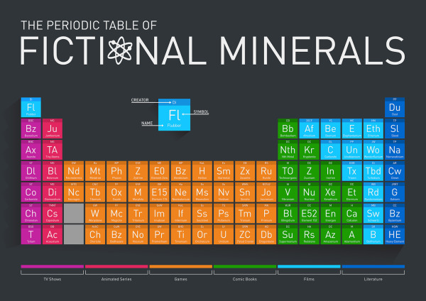
Periodic tables are always helpful whether your in chemistry class, or reading an infographic that uses the idea! The Periodic Table of Fictional Minerals infographic from Buy Metal Online is about the many different fictional materials made up for tv shows, animated series, games, comic books, films, and literature.

This infographic we have made is a periodic table of metals, minerals and other elements that don’t exist, except in popular culture (notably films, TV shows, animated series, games, comic books and literature). The table is a fun play on the real-life periodic table and demonstrates just how many fictional elements there are.

Infographic images need to be able to be shared on their own, so the design should include the publisher’s logo, a copyright and the uRL to the original infographic landing page.

Thanks to David for sending in the link! 

Thursday
Jun122014

The Evolution of Life Poster

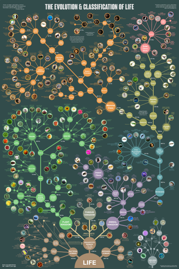
The Evolution & Classification of Life poster

This beautiful “tree of life” poster does two things at once:

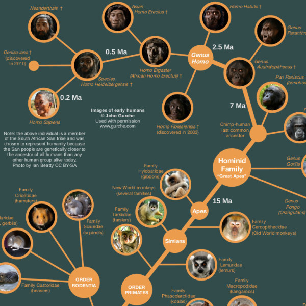
First, it shows how over 250 common plants, animals, and microbes are classified by biologists into domains, kingdoms, phyla, orders, families, and genera.

Second, it shows where each group fits into the evolutionary history of life according to the most up-to-date genetic research.

It also includes several extinct groups, featuring artwork by paleo-artists John Gurche and Nobu Tamura.


A “Tree of Life” in a 24” X 36” poster form, The Evolution & Classification of Life poster was designed by Matt Baker from Useful Charts, and and can be purchased on Amazon for $24.95.

There is good use of color to help organize the tree and allow the reader to understand the major section breaks.  Having the pictures of the animals as the main focus of the tree, rather than their names keeps the poster clean and not too cluttered.

Great job Matt!