Comics That Ask "What If?"
 Randy
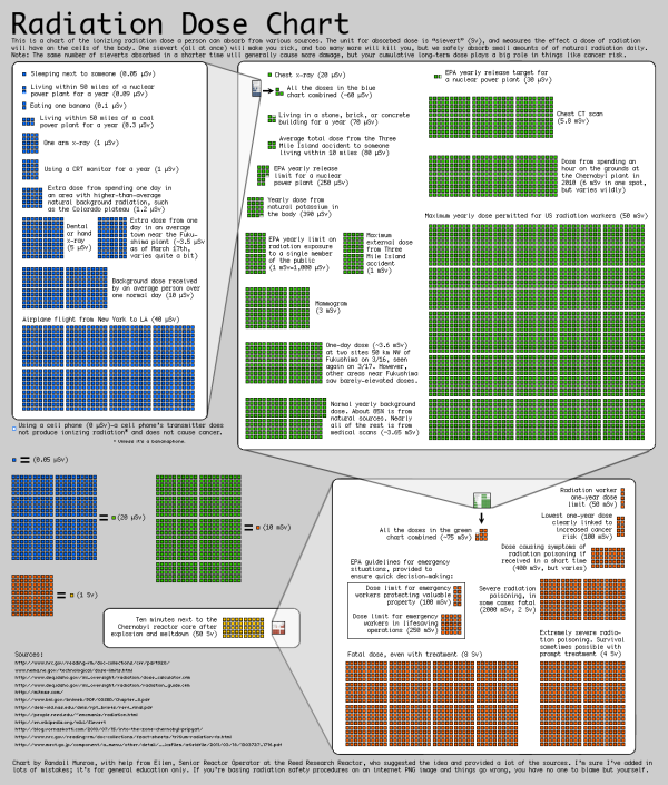
RandyRandall Monroe, author of my favorite web comic XKCD, gave a great TEDTalk about answering science and math questions with his comics. One of the best parts of this video, and the web comic series in general, is that he uses hand-drawn data visualizations and illustrations to answer them, which makes them easier to understand.
Web cartoonist Randall Munroe answers simple what-if questions (“what if you hit a baseball moving at the speed of light?”) using math, physics, logic and deadpan humor. In this charming talk, a reader’s question about Google’s data warehouse leads Munroe down a circuitous path to a hilariously over-detailed answer — in which, shhh, you might actually learn something.
Pre-order or watch for his new book, “What If?” to be released in September 2014!