About
Randy Krum
President of InfoNewt.
Data Visualization and Infographic Design

Infographic Design

Infographics Design | Presentations
Consulting | Data Visualizations

DFW DataViz Meetup

Join the DFW Data Visualization and Infographics Meetup Group if you're in the Dallas/Fort Worth area!

Search the Cool Infographics site

Custom Search

Subscriptions:


Feedburner

The Cool Infographics® Gallery:

How to add the
Cool Infographics button to your:

Cool Infographics iOS icon

- iPhone
- iPad
- iPod Touch


Read on Flipboard for iPad and iPhone

Featured in the Tech & Science category

Flipboard icon

Twitter Feed
From the Bookstore

Caffeine Poster

The Caffeine Poster infographic

Entries in future (15)

Wednesday
Nov282018

What Will Kill You in 2040

What Will Kill You in 2040 infographic

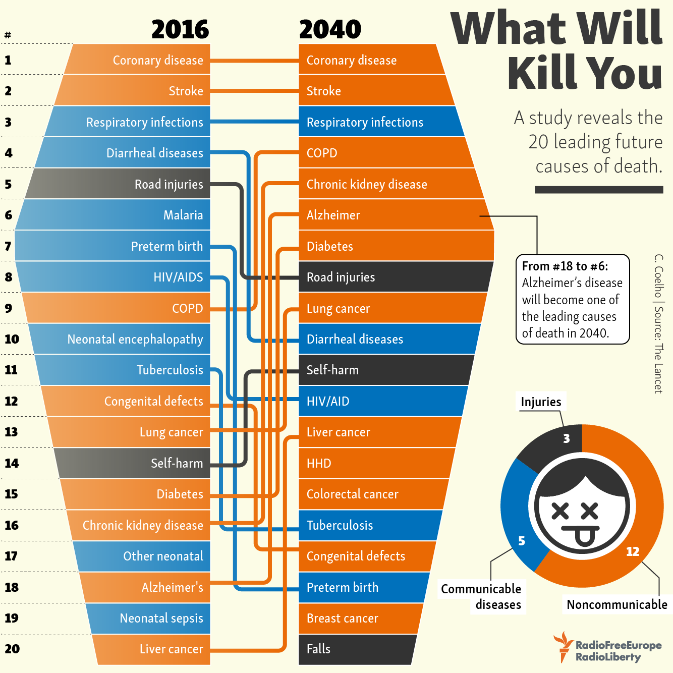
What Will Kill You in 2040 infographic takes the top 20 reasons for death in 2016 and compares them to the predicted top 20 reasons for death in 2040. The top 3 aren't predicted to change, however the rest are all over the board!

The infographic was created by Radio Free Europe Radio Liberty. Their source of information came from an article published in The Lancet (a peer-reviewed general medical journal) called Forecasting life expectancy, years of life lost, and all-cause and cause-specific mortality for 250 causes of death: reference and alternative scenarios for 2016-40 for 195 countries and territories. That's a mouth-full for a title!

The orthogonal lines are hard to follow. Straight lines would have turned this into a slope graph, and made it easier to see which causes of death were increasing or decreasing. Categorizing the causes of death into 3 different categories and color coding them really helps break up the text and makes it a little easier to follow the arrows.

Found on Radio Free Europe

Wednesday
May112016

The Growth of the Internet of Things

Growth in the Internet of Things Infographic

The current projection data from Cisco is that the IoT (Internet of Things) will reach 50 Billion devices by the year 2020! Visualized by the NCTA (National Cable & Telecommunications Association) as the Growth in the Internet of Things.

Today’s Internet is driven by wired and wireless networks, keeping us connected throughout our daily lives. With the advent of new digital devices that constantly link us to the Internet, these networks have become much more than just a simple vehicle for information and communications. They now enable us to track our daily habits, monitor our health, manage home energy use and track nearly any other data we can imagine. These devices make up what we call the Internet of Things – a web of connected objects that are linked via networks that can interact with each other and with us.

The Internet isn’t merely developing, it’s exploding, and the numbers prove it. Take a look at our graphic below — it shows the advancing surge of connected devices using the Internet.

Today, there are more connected devices than there are human beings on the planet. This expansion isn’t just from cell phones, tablets and computers – it’s thanks to toothbrushes, stovetops and millions of other devices that now have IP addresses. Estimates show that there will be over 50 billion connected devices by 2020.

Fast, ubiquitous Wi-Fi and increasing home broadband speeds will drive the Internet of Things and the ever-expanding web.

A clean and simple line chart tells this story very well. Notice that the chart was designed with many of the principles for storytelling in data visualization we discuss every day.

  • No chart legend. The data is shown directly in the chart
  • Minimal gridlines to simplify reading the chart and clean up the visual noise gridlines create
  • No separate data table. The relevant numbers are shown directly in the chart
  • Minimal axis labels (you don't need to show every year)
  • Use of visual icons to help communicate each milestone. 

Suggestion: I would move the icons and data much closer to the actual data points on the chart. There are too many connecting lines.

Thanks to Heather for sharing on Linkedin!

Monday
Apr182016

Experts Predict the Future of Data Analytics and Visualization

IBM Watson Analytics is a data discovery service that guides data exploration, automates predictive analytics and enables dashboard and data visualization creation. Through their Expert Series videos, Watson Analytics explores the future trends of data analytics. I had the pleasure of participating in this series, along with other prominent figures in the field.

Watch these interviews to learn about today’s trends in data visualization, data analysis, and which trends we think will have the most significant impact on the future of analytics.


What trends in data visualization are you seeing today and what are the opportunities for the future? (2:24)

Cathy Harrison (@VirtualMRX), Randy Krum (@rtkrum), William McKnight (@williammcknight), Tony Adams (@tonyadam)


Which trend do you think will have the most significant impact on the future of Analytics and why? (1:52) (1:44)

Deborah Berebichez (@debbiebere), Randy Krum (@rtkrum), Anil Batra (@AnilBatra), Valdis Krebs (@OrgNet), Christopher Penn (@cspenn)


What is your #1 tip for anyone who is asked to use data to inform business decisions? (2:22)

Deborah Berebichez (@debbiebere), Miles Austin (@milesaustin), Juntae DeLane (@JuntaeDeLane), Anil Batra (@AnilBatra), Tony Adams (@tonyadam)


What trends in data analysis are you seeing today, and what are the opportunities for the future? (2:19) (1:37)

Emilio Ferrara (@jabawack), Bob E. Hayes (@bobehayes), John D. Cook (@JohnDCook), Juntae DeLane (@JuntaeDeLane), Miles Austin (@milesaustin)


You can also subscribe and follow all of the IBM Watson Analytics videos on YouTube:


Tuesday
Oct132015

The Future, as Foretold in the Past

The Future, as Foretold in the Past infographic

The Future, as Foretold in the Past is a timeline of future events based on the stories of famous works of fiction. The article that released the infographic was from Brain Pickings; however, the creation story of the graphic is an interesting one. Giorgia Lupi saw the information just on a normal timeline on The Awl and turned it into what you see above.

There is a lot of information on the infographic, the legend above helps explain how it is organized.

Giorgia Lupi explains:

The visualization is built on a main horizontal axis depicting a distorted time-line of events (in fact we put them regularly, in sequence), starting our future-timeline in 2012. The y-axis is dedicated to the year the novel / book foretelling the event was published.

On the lower half of the visualization you can find the original quotes (shortened)

We then wanted to add further layers of analysis to our piece:

– finding out main typologies of foretold events (are they mainly social, scientific, technological, political?)
– discovering and depicting the genre of the book,
– and most of all, dividing them into positive, neutral or negative events.

Finally, good news, in 802,701 the world will still exist!


Thanks to Mike for sharing on Facebook: https://www.facebook.com/mikewirth/posts/10153557417821133

Wednesday
Aug132014

50 Years of Visionary Sci-Fi Computer Interfaces

50 Years of Visionary Sci-Fi Computer Interfaces infographic

The 50 Years of Visionary Sci-Fi Computer Interfaces infographics from Glow New Media does a great job of visually showing you how sci-fi movies and tv shows predict we will interact with computers.

Science fiction imagines the future. This amazing infographic brings together 50 years of SciFi in movies and shows us how our imagination leads us into the future of computer interface design. Enjoy!

This infographic isn’t visualizing any data, it’s just showing the visual shots of how we might interface with computers.  So have already happened, like mobile devices from Quantum Leap, and others are still very speculative, like Tron’s Human Computer Convergence.

Thanks to David for sending in the link!

Wednesday
Jan152014

Timeline of the Far Future

Timeline of the Far Future infographic

What’s the future of the human race and our beloved planet Earth?  The Timeline of the Far Future from the BBC plots out predicted events for the next 1,000, 1,000,000 and up to 100 Quintillion years into the future!

As it is the beginning of the year we at BBC Future think it’s the perfect time to look ahead.

First, we brought you a prediction of the forthcoming year. Then we brought you a timeline of the near future, revealing what could happen up to around 100 years time. But here’s our most ambitious set of predictions yet – from what could happen in one thousand years time to one hundred quintillion years (that’s 100,000,000,000,000,000,000 years). As the song says, there may be trouble ahead…

They had to use an exponential scale, so each inflection point represents a jump in the timeline scale by a factor of 10.  The icons are small, and some are hard to figure out.  They had enough space they could have made those larger.  The circles are also sized by the magnitude of each event, but these seem to be arbitrary.

It’s worth noting one of the sources in the footer lists Out of Thin Air as a source.  This not a claim that they made up the information.  It’s actually a book titled Out of Thin Air that some of the information was pulled from.  I had to look it up, but it’s a valid reference.

Nice to know that MacBook will still be around for 100,000 years!  Definitely looks like we’re in for a rocky ride though…

Thanks to Digital Information World post on Google+


Wednesday
Mar062013

3D Printing: How Long Till The Revolution?

I can’t wait!  3D Printing: How Long till the Revolution? from the Farnell/Newark Group and designed by Neo Mammalian Studios takes a stab at predicting the rise of 3D printing.  Seriously, I want the day when I can print out my own coffee cup design, custom LEGO shapes and a new iPhone case!  Download the model, and print!  That flimsy plastic piece from the vacuum broke again?!?  Just print a new one!

3D printing has slowly started to get popular in use in the industry, by the hobbyists and ordinary individuals in their homes. If you can design it, the 3D printer can build it. However, we are still in the early stage of owning and using 3D printer. So, what is the length of time before it will become mainstream like the PC? The infographic will show when will every American own a 3D printer and how it affects the profit of those who are selling consumer objects and more.

The doughnut charts are colorful and unique in that hexagon shape.  The use of Roger’s Diffusion of Innovations line charts is actually very easy to understand.  The comparisons to the PC market and to music sales online are great analogies.

“3D printing is only gonna get more awesome.”

Found on Visual Loop!

Friday
Feb012013

America's New Minority

America's New Minority infographic

The demographics of America are changing, and America’s New Minority from 59 Liberty shows us how far we have come and predicts the next 40 years.  

With the country’s changing demographics, whites will drop under 50% of the population in the 2040s. Every Republican Presidential candidate since 1968 has won the white vote, but with the population shift can the GOP compete?

This graphic simply presents the data of a changing electorate. We went through numerous iterations attempting to find something appealing that presented the data accurately.

We worked with Projects by Chi/Donahoe on concepts, Ripetungi on design, and Hustle Labs for PR support.

For direct access to the data used, please view the spreadsheet here.

I really like how simple and strong the message is with this design.  The data will be surprising to many people, so it should be popular with social sharing.

I LOVE that they include a link to the raw data in a Google Docs spreadsheet for anyone to get their hands on the raw numbers from the data sources.  The link is in the additional text on the infographic landing page.  It would be more effective if the URL of the infographic landing page and the Google Docs spreadsheet were both included in the infographic so they would be readily available to readers who see the infographic posted on other sites.

They also share some of the early drafts and other versions of the design they considered on the infographic landing page.  You can see a couple here, but there are more on the page at 59 liberty.

America's New Minority infographic

America's New Minority infographic

Monday
Jan072013

Tomorrow's World

Tomorrow's World infographic

Tomorrow’s World infographic from the BBC maps out many of the future predictions from experts onto a timeline of the next 100 years, and lays out odds on how likely each prediction may come true.

As we begin a new year, BBC Future has compiled 40 intriguing predictions made by scientists, politicians, journalists, bloggers and other assorted pundits in recent years about the shape of the world from 2013 to 2150.

They range from the serious to the fanciful, from the exciting to the petrifying.

And to get a gauge on how likely they are to happen, we asked the special bets department at British betting firm Ladbrokes to give us their odds on each prediction coming true.

The predictions are color-coded by category, placed along the timeline and finally shown in the horizontal direction based on the odds.  This is a really good design, and I like the custom icons for each prediction.

Found on CNET thanks to a Tweet from Dave (@Drodgerson)!

Tuesday
Jul172012

HTML5: Past, Present, Future

HTML5: Past, Present, Future infographic

The future is now! HTML5: Past, Present, Future infographic from Dot Com Infoway takes a trip trough time to explain how evolutionary HTML5 is.

HTML5 is the next evolutionary step for the Web world. With HTML5, the possibilities for Web usage are endless. At DCI, we are proud to be ahead of the game in offering HTML5 development for our many clients.

The published HTML5 infographic elucidates the history of HTML through an appealing timeline from its inception in 1990 to HTML5 in 2009. It also lists out the key features, uses and the role of HTML5 in Web applications in a captivating manner. The infographic also illustrates the compatibility of Web applications with various web browsers. It is interesting to note that Chrome and Safari maintain a higher compatibility rating than that of Opera and Internet Explorer.

Mobile applications are what we excel at. We understand how to create the most advanced apps through our development and work with our clients. Research indicates that by 2016, HTML5 usage with mobile browsers will surge to 2.1 billion. And by this year alone, the use of HTML5 in mobile application development has increased to 78%.

It is evident from the research data that HTML5′s trajectory will continue to grow to unbelievable heights in the near future.

This is a beautiful, clear infographic design.  The color palette is kept simple, and the use of icons is fantastic.

From a data visualization perspective, there are a couple of things that would make the design even better:

  • It might be just my own taste, but I think the timeline should be laid out to match the correct spacing of the years.  Visually it looks like some something happened every year on the timeline, when in reality each step jumps a different number of years.
  • Most of the data sources are cited in among the the visualizations, but no source is cited for the Browser Compatibility numbers.  Where do these values come from?  Are they believable?
  • Also in the Browser Compatibility, the shaded portion visualizations are wrong, and don’t match the values they are supposed to represent.  First, because the icons are circles, you have to shaded the AREA of each shape to be true to the data.  If you shade the height of a circle based on the data, the visual doesn’t match the values.  Second, even shading them by height was done incorrectly.  For example, Opera compatibility on Mobile is listed as 60%, but the visualization shows some number under 50%.

Found on Infographics Archive