About
Randy Krum
President of InfoNewt.
Data Visualization and Infographic Design

Infographic Design

Infographics Design | Presentations
Consulting | Data Visualizations

DFW DataViz Meetup

Join the DFW Data Visualization and Infographics Meetup Group if you're in the Dallas/Fort Worth area!

Search the Cool Infographics site

Custom Search

Subscriptions:


Feedburner

The Cool Infographics® Gallery:

How to add the
Cool Infographics button to your:

Cool Infographics iOS icon

- iPhone
- iPad
- iPod Touch


Read on Flipboard for iPad and iPhone

Featured in the Tech & Science category

Flipboard icon

Twitter Feed
From the Bookstore

Caffeine Poster

The Caffeine Poster infographic

Entries in relative (157)

Wednesday
May242017

Interactive Cocktail Shaker

Interactive Cocktail Shaker interactive infographic

David McCandless and the team at Information Is Beautiful have created this impressive Guide to Cocktails in both interactive and static versions.

75+ classic cocktail recipes from the International Bartender’s Association’s list of drinks every bartender should know.

Forget old-school measures like ml and oz. We’ve calculated our own universal metric. One of any ingredient represents one part of any measuring vessel you choose: cup, spoon, lid, shoe, whatever – it’s your party! These universal recipes scale up for any level of mayhem. Enjoy! Um…responsibly of course.

Select the booze in your cabinet: our 'measurement agnostic' interactive will conjure the rest.

All of their designs are very Data Transparent, and they have made all of the data from this design available in this Google Spreadsheet listed in the footer for anyone to see.

Monday
Feb202017

Millions of Lines of Code

Codebases: Millions of Lines of Code infographic

Codebases: Millions of Lines of Code is another great infographic from David McCandless and Information Is Beautiful showing the massive complexity of today's modern apps and programs.

Is a million lines of code a lot? How many lines are there in Windows? Facebook? iPhone apps?

Great use of the matrix of squares to represent scale. I do think the users can lose their perception of scale when the section changes jump different values. If it was always a factor of 10, that would be clearer.

Thursday
May192016

Sizing Up Sharks

Sizing Up Sharks infographic National Geographic

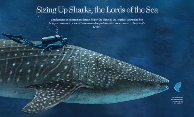
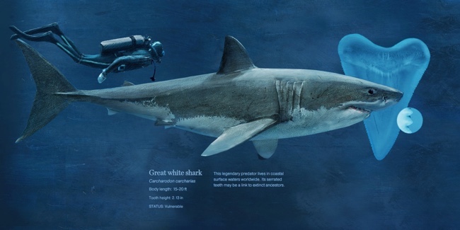
The design team at National Geographic has published a beautiful size comparison infographic: Sizing Up Sharks, the Lords of the Sea. The parallax scrolling keeps you, the reference deep sea diver, in frame as a comparison to provide perspective for each of the various types of sharks.

Sharks range in size from largest fish on the planet to the length of your palm. See how you compare to some of these vulnerable predators that are so crucial to the ocean's health.

The tooth Illustrations are not in scale with the fish, but all the teeth are in scale to each other to show relative tooth sizes. For some reason, only a few of the smaller sharks species are shown with both the small end and high end of their size ranges.

Sizing Up Sharks infographic Great White

This engaging infographic tells one story really, really well without adding too much other data that would have cluttered the design. The diver animation and underwater sounds are a nice touch.

Thanks to Chiqui Esteban (@chiquiesteban) for posting the link!

The massive Megalodon!

Sizing Up Sharks infographic Megalodon

Thursday
Jan282016

The Snowzilla Snowball

The Snowzilla Snowball DC Infographic

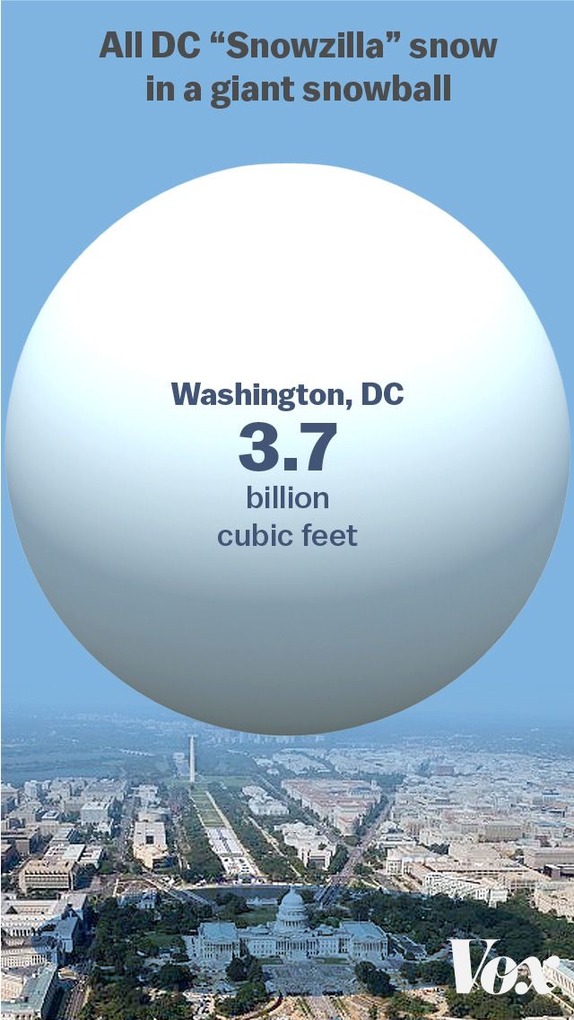
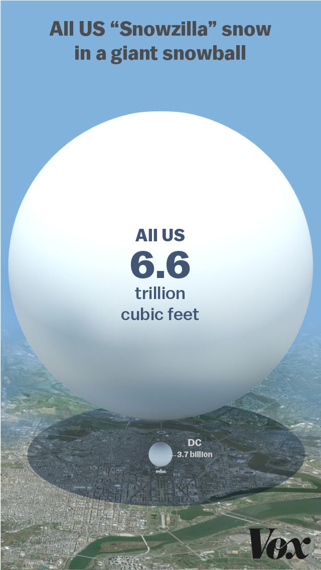
Winter Storm Jonas hit the East coast of the U.S. last weekend, and dropped an estimated 6.6 trillion cubic feet of snow, with 2.7 billion cubic feet on the nation's capital alone. (Data estimated by Ryan Maue, a digital meteorologist for Models WeatherbellJavier Zarracina at Vox Media visualized that immense amount of snow as the Snowzilla Snowball.

These are absurd numbers, too big to really comprehend. To make them more understandable, I used a 3D modeling program to show what all that snow would look like in one snowball.

I started with just Washington's snowfall — this is what it looks like compared with the US Capitol building.

The results get even more mind-boggling when you look at all the snow that fell across the United States over this past weekend.

The Snowzilla Snowball World infographic

As a general rule, I don't like 3D visualizations. However, I like this use of 3D modeling to visualize the volume of the sphere of snow. It gives the real-world perspective of space and size.

The design concept is very reminiscent of the Big Blue Marble of Water

Thanks to Michael Stoll for posting a link on Facebook!

Monday
Jun012015

A World of Languages

A World of Languages infographic

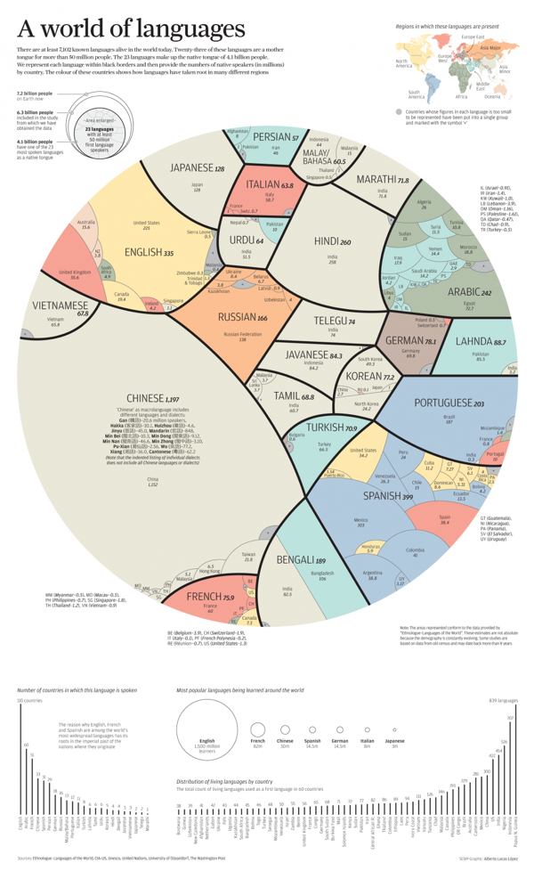
A World of Languages - and How Many Speak Them is a new infographic by Alberto Lucas López for the South China Morning Post that compares the number of people that speak the top 23 languages in the world as their primary language. High resolution image version available HERE.

There are at least 7,102 known languages alive in the world today. Twenty-three of these languages are a mother  tongue for more than 50 million people. The 23 languages make up the native tongue of 4.1 billion people. We represent each language within black borders and then provide the numbers of native speakers (in millions)  by country. The colour of these countries shows how languages have taken root in many different regions

The dominant visual centerpiece appears to be a combination of a voronoi diagram & circular treemap, where the area of each section is representative of the number of people that speak each language as their first language. I don’t know any any software that will create this specific visualization style, so I’m assuming the area of each section had to be calculated separately. With the different, organic shapes how were those areas calculated? Iteration?

The data is a little bit controversial. It’s an estimate of the number of people that speak each language as their first language. There’s no accounting for multi-lingual people or language families. I love the data visualization design, but the underlying data may cause some concern.

Tuesday
Mar102015

Baking Units Demystified

Baking Units Demystified infographic

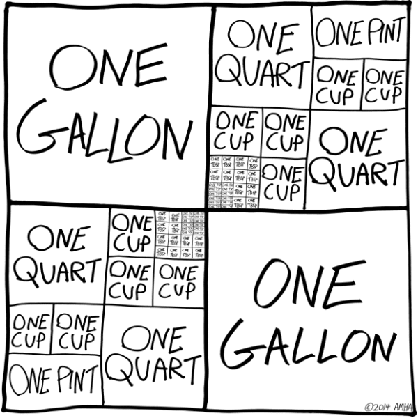
Memorizing cooking unit conversions can be frustrating. Most of us just have a cheat sheet on the refrigerator that tells us that 1 Gallon= 4 Quarts. Well thanks to Andrew M.H. Alexander you might want to replace those boring magnets with the Baking Units Demystified infographic!

Infographics should simplify information and make it easier to understand without “dumbing it down.” This is a perfect example of showing the measuring relationships to make them easy to understand and even remember.

Found on Flowing Data.

Wednesday
May142014

The Drone Survival Guide

Drone Survival Guide infographic poster

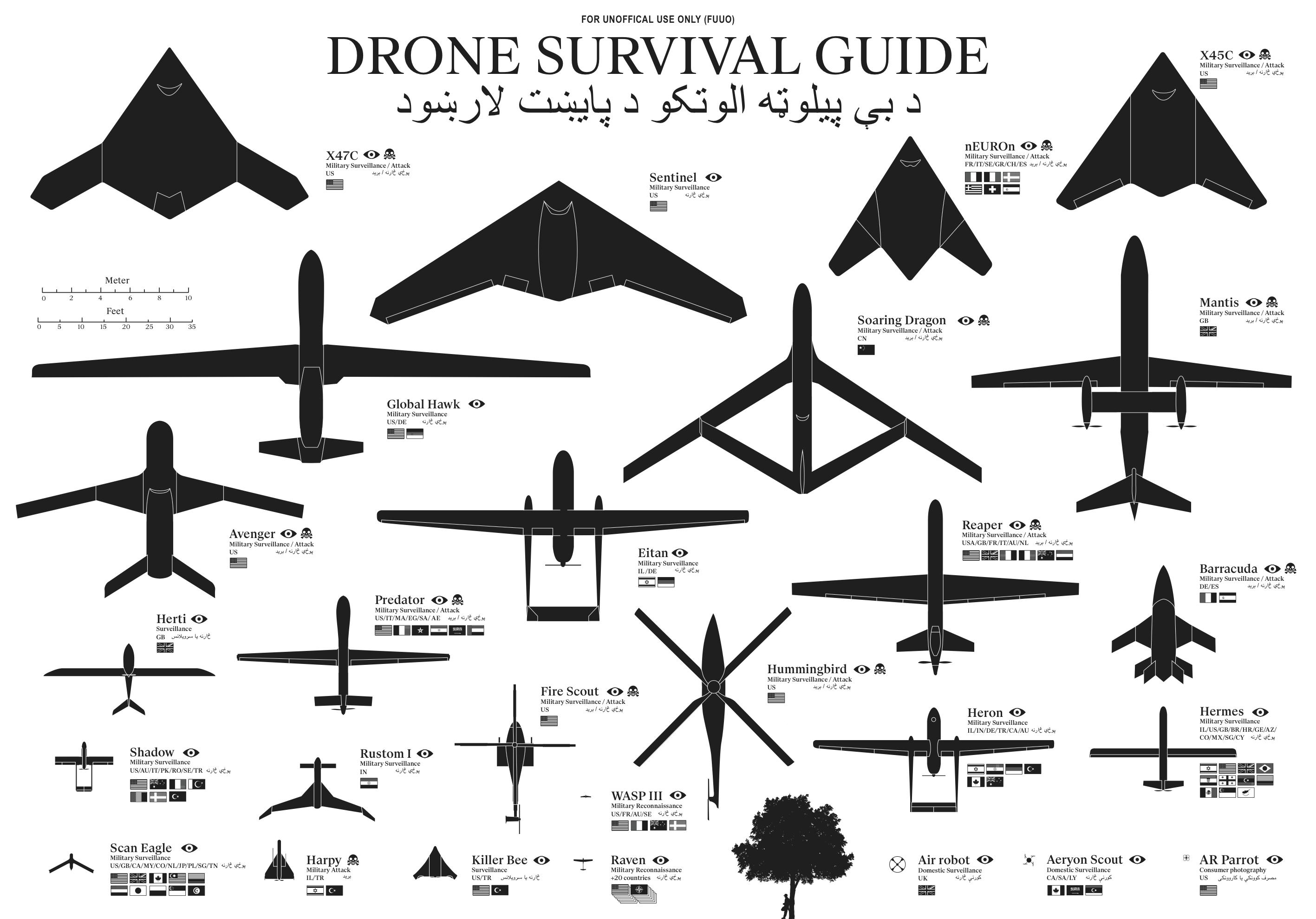
The Drone Survival Guide is a poster and online infographic that uses proportionally sized silhouettes of the most common UAVs (Unmanned Aerial Vehicles).  Designed by Ruben Pater, a self-employed artist/graphic designer from the Netherlands, the poster is available for download as a PDF.

Posters printed on aluminum reflective Chromolux ALU-E mirrored paper are available from the site for €10, which included worldwide shipping.

TWENTY-FIRST CENTURY BIRDWATCHING

Our ancestors could spot natural predators from far by their silhouettes. Are we equally aware of the predators in the present-day? Drones are remote-controlled planes that can be used for anything from surveillance and deadly force, to rescue operations and scientific research. Most drones are used today by military powers for remote-controlled surveillance and attack, and their numbers are growing. The Federal Aviation Administration (FAA) predicted in 2012 that within 20 years there could be as many as 30.000 drones flying over U.S. Soil alone. As robotic birds will become commonplace in the near future, we should be prepared to identify them. This survival guide is an attempt to familiarise ourselves and future generations, with a changing technological environment.

This document contains the silhouettes of the most common drone species used today and in the near future. Each indicating nationality and whether they are used for surveillance only or for deadly force. All drones are drawn in scale for size indication. From the smallest consumer drones measuring less than 1 meter, up to the Global Hawk measuring 39,9 meter in length. 

Concept and design by Ruben Pater. Want to know more about the motivation behind this project? Read the FAQ.

The poster is also being publicized in conjunction with the Drone Salon seminar coming up on May 23, 2014.

The drone salon aims to provide a multidisciplinary overview of challenges, opportunities and speculations on future transitions caused by the use of drone technology both in the battlefield and in the civic realm. This seminar, punctuated by demonstrations and presentations, will consist of five conversations between Malkit Shoshan, Ethel Baraona Pohl and experts in the field: lawyers, activists, civic and military drone operators, artists, novelists and designers. The conversations will bring together multiple views, examples and projects on the spatial effects of the implementation of drones in war and in peace time. The seminar is part of the ‘Drones and Honeycombs’ project and one of a series of public events on the topic of drones organised in collaboration with Studio-X, Columbia University, DPR-Barcelona, The Center for the study of the Drone in NYC and Het Nieuwe Instituut in Rotterdam.

The design is actually very similar to the SciFi Starship Comparison Chart, but on a much smaller scale.  Many people in Ruben’s audience have sent in translations for the text included in the poster, so he has posted the text in at least 32 different languages.  I would like to see those translations offered as full versions of the poster, instead of the text only, but I understand that takes a lot of work.

I’m fascinated by drones, and I own and fly one of the AR Parrot Drones you see in the bottom right corner of the poster.

Thanks to Ethel Baraona Pohl for posting on Facebook!


Tuesday
May062014

An Illustrated Guide to the Biggest Dragons

An Illustrated Guide to the Biggest Dragons infographic

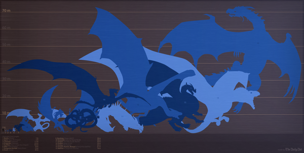
A fantastic size comparison chart, An Illustrated Guide to the Biggest Dragons infographic was published by The Daily Dot, and designed by Max Fleishman and Fernando Alfonso III.

George R.R. Martin, whose A Song of Ice and Fire novels are the basis for Game of Thrones, is currently writing a companion guide to the books, called A World of Ice and Fire. He’s recently published an extract of this guide on his blog, chronicling the history of the Targaryen invasion of Westeros, which took place several hundred years before the events of the books and the show. 

It’s got some badass dragon art, too. You can see Aegon the Conqueror standing astride his dragon mount, Balerion, the “Black Dread.” Turns out these dragons get really freaking big.

But seeing this picture got us thinking. Just how big is this dragon, and how does this bode for Daenerys’s own dragons? And how does it measure up to other famous fictional fire-breathers?

A great data visualization, but it’s missing some elements of a good sharable infographic.  Where it comes up short is that the infographic will be often shared without the rest of the text article originally published on The Daily Dot.  It needs to be able to stand independently, so the infographic image file itself should include the following:

  • A title
  • A short description of information included
  • Credit the designers
  • The URL back to the original article
  • Data sources?
  • A copyright?

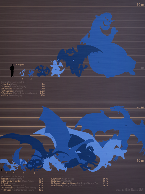
I love that they also published a revised version that fits in vertical blog layouts better:

An Illustrated Guide to the Biggest Dragons vertical infographic

Found on Geekologie and Flowing Data

Monday
Mar312014

Map of the Internet 2.0 Poster

Map of the Internet 2.0 Poster

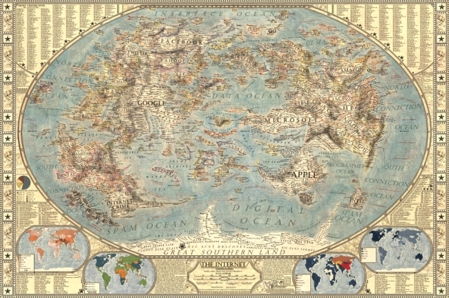
Designer Martin Vargic has released an updated version of his Map of the Internet 2.0 that creates what looks like a vintage-style map.  However, this version plots out the major websites and technology companies, with related sites grouped together on the same continent.  The sizes of the websites on the map are scaled relative to their number of visitors, so bigger sites show as bigger geographic regions.

Second version of our flagship project, the Map of the Internet.

This conceptual work of cartography treats major internet sites and enterprises such as Google, Yahoo, Microsoft, HP, and Apple like sovereign states, on a classic map of the world. To explain the dominance and relationships of these entities, they were all given a visual hierarchy that gives prominent treatment to companies with the most users (or sites with the most visitors), surrounding them with smaller countries representing related websites and services.

This poster includes one full map of the internet, 4 minimaps showcasing NSA surveillance, most used social networks, most used internet browser, and worldwide internet penetration, list of Alexa Top 500 websites, quick timeline of the Internet History, top software companies and much more!

The map includes more than 250 separate websites/enterprises as sovereign states, and more than 2000 separate labels.

A high-resolution version is available online, and you can also order 24” x 36” printed posters on Zazzle.

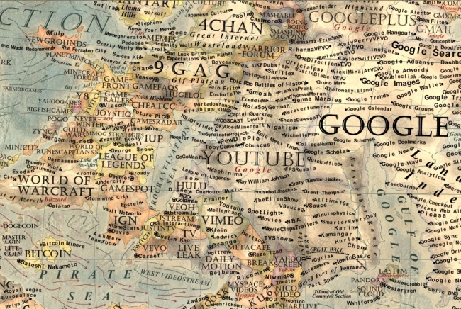
This what I call a 2nd level design, which means it’s a highly detailed design that is meant to present a ton of information to the audience.  This type of design isn’t trying to communicate a key message in a few seconds, but is intended for readers to zoom-in and explore.

Map of the Internet 2.0 Poster Zoom


Found on Business Insider

Thursday
Mar272014

Visualizing NBA Passing Frequency Data

Visualizing NBA Passing Frequency Data infographic

NBA Passing by Andrew Bergmann was designed for NBA.com.  By analyzing data gathered by SportVU technology cameras installed in NBA arenas, the line thickness represents the average number of passes per game between specific players.

Here’s a look at how starters on all 30 NBA teams share the basketball.

The thickness of the gray lines on the accompanying chart represents the average number of passes per game between two players.

A very clear picture emerges on which teams distribute the ball more evenly between players, such as the Nets, Bulls and Cavaliers. On the flip side, Chris Paul and Blake Griffin dominate passing for the Clippers, and likewise for Kevin Love and Ricky Rubio of the Timberwolves.

This is a great way to visualize this data set.  The visualization method is unique, memorable, and really makes the connections between players easy to understand.

The infographic vaguely lists the data sources at “Stats”, and the original post explains that the data is gathered from the newly installed SportsVU camera systems.  However, the actual data is still unavailable for readers to investigate on their own.  This design would have been a great opportunity for the data set spreadsheet to be shared with the audience through a public spreadsheet in Google Docs.

Knowing the infographic is going to be shared online, the image file should include the URL back to the original post on NBA.com.  Don’t make it hard for readers to fit find the original, full-size version of your infographic.

Found on Flowing Data and Fast Company