About
Randy Krum
President of InfoNewt.
Data Visualization and Infographic Design

Infographic Design

Infographics Design | Presentations
Consulting | Data Visualizations

DFW DataViz Meetup

Join the DFW Data Visualization and Infographics Meetup Group if you're in the Dallas/Fort Worth area!

Search the Cool Infographics site

Custom Search

Subscriptions:


Feedburner

The Cool Infographics® Gallery:

How to add the
Cool Infographics button to your:

Cool Infographics iOS icon

- iPhone
- iPad
- iPod Touch


Read on Flipboard for iPad and iPhone

Featured in the Tech & Science category

Flipboard icon

Twitter Feed
From the Bookstore

Caffeine Poster

The Caffeine Poster infographic

Entries in relative (157)

Monday
Feb102014

The Internet Map

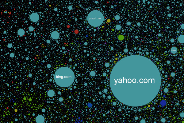
The Internet Map is an interactive, zoomable design that uses a combination of algorithms and the Google Earth API to display 350,000 websites as sized circles representing their overall traffic.

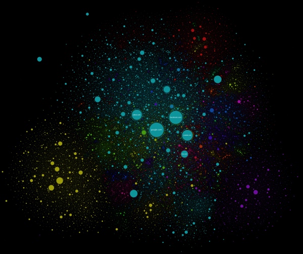
Designed by Ruslan Enikeev, the color-coding shows the country affiliations.

Like any other map, The Internet map is a scheme displaying objects’ relative position; but unlike real maps (e.g. the map of the Earth) or virtual maps (e.g. the map of Mordor), the objects shown on it are not aligned on a surface. Mathematically speaking, The Internet map is a bi-dimensional presentation of links between websites on the Internet. Every site is a circle on the map, and its size is determined by website traffic, the larger the amount of traffic, the bigger the circle. Users’ switching between websites forms links, and the stronger the link, the closer the websites tend to arrange themselves to each other.

Semantic web

The map of the Internet is a photo shot of the global network as of end of 2011 (however, baloons show actual statistics from Alexa). It encompasses over 350 thousand websites from 196 countries and all domain zones. Information about more than 2 million links between the websites has joined some of them together into topical clusters. As one might have expected, the largest clusters are formed by national websites, i.e. sites belonging to one country. For the sake of convenience, all websites relative to a certain country carry the same color. For instance, the red zone at the top corresponds to Russian segment of the net, the yellow one on the left stands for the Chinese segment, the purple one on the right is Japanese, the large light-blue central one is the American segment, etc.

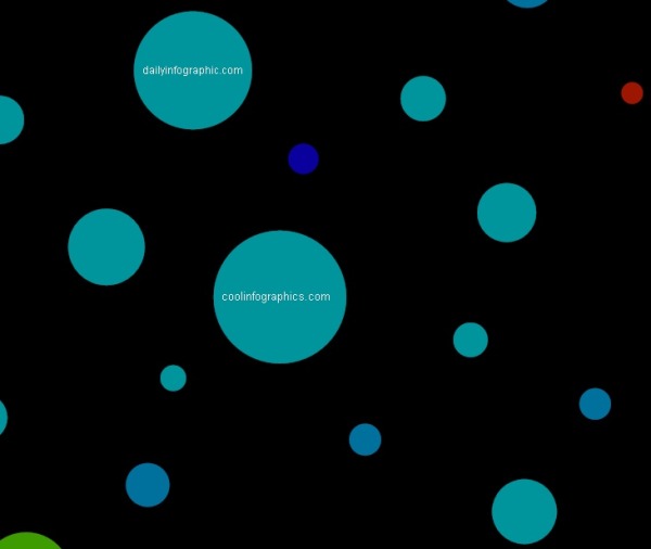
I even found Cool Infographics on the map!

Found on Fast Company

Friday
Dec202013

Icons of the Web 2013

Icons of the Web 2013 infographic poster

Icons of the Web from the open source Nmap Security Scanner Project (http://nmap.orgis an update to the hugely popular project from 2010.  This update brings all new data, a n updated interactive viewer and printed posters available for sale through Kickstarter for a limited time (until January 17th!)

The Nmap Project is pleased to release our new and improved Icons of the Web project! Since our free and open source Nmap Security Scanner software is all about exploring networks at massive scale, we started by scanning the top million web sites for 2013 (as ranked by the analytics company Alexa). We then downloaded each site’s favicon—the small icon displayed next to a site title in browser bookmarks and tabs.

We scaled the icons in proportion to each site’s monthly reach (popularity) and placed them in a giant collage. The smallest icons—for sites visited by only 0.00004% of the Internet population each month—are 256 pixels square (16x16). The largest icon (Google) is 394 million pixels. The whole collage is 5 gigapixels.

This is an update to a similar project we performed in 2010. That edition proved very popular. It was written up in the New York Times and other sites, exhibited at the Newseum in Washington D.C., and even found its way into the Guinness Book of World Records (see the press section for more). It is interesting to compare the new data with the old to see how the Internet has evolved in recent years.

Since your web browser would likely choke on a 5 gigapixel image, we’ve created the interactive viewer below. It’s divided into 813,200 small files which are only loaded as needed based on your location and zoom level. Click and drag to pan and use the mouse wheel (or toolbar) to zoom. For mouse wheel zoom, you may need to interact with the viewer first (e.g. drag something). A new feature this year allows you to hover your mouse over an icon to see the site name. You can also click on icons to visit the actual sites, but be careful with that! Even even sites with cute icons (like the cartoon Hamster) can be pornographic or worse. We have also added a fullscreen viewing option.

To find your favorite site (or your own site), type in the domain name (example: reddit.com) and hit search.

Our most common request in 2010 was for a physical poster version. We only printed them for Nmap developers last time, but now we’re making them available to anyone who orders by January 17.

An update to a very cool design.  I ordered a poster!

Check out the comparison to the 2010 poster!

Icons of the Web 2013 poster comparison

Cool Infographics is in there too!  See if you can find it.

Thanks to Fyodor for sending in the link!

Friday
Oct182013

A Perspective on Time

A Perspective on Time infographic

A Perspective on Time is an infographic that puts large time scales into perspective using a series of stacked bar charts.  Starting with 24 hours, and building up to the life of the universe, each horizontal bar represents a new, larger time scale that incorporates the prior bar for context.

Humans are good at a lot of things, but putting time in perspective is not one of them. It’s not our fault - the span of time in human history, and even more so in natural history, are so vast compared to the span of our life and recent history that it’s almost impossible to get a handle on it.

Designed by Mayra Magalhães as a collaboration project between Visually and wait but why.  I love the building use of color throughout the design.  One bar’s color is then carried into the next bar for context.  The icons and minimal text for events also help make the design easy to read.

The footer should include the URL back to the original so readers can find the full-size version.  The scale of this design needs to be enlarged in order to read.

Friday
Sep272013

SciFi Starship Comparison Chart

SciFi Starship Comparison Chart infographic

This is a massive Starship Size Comparison Chart, created by designer Dirk Loechel and posted on DeviantArt.

The design gathers ships from many different science fiction movies, tv shows and games, and sizes them down to a common scale so viewers can grasp the relative size of how large and small the ships they recognize are.

As this get shared heavily online, it would be nice to have the URL back to the original, full-size version included in the design.

I love this size comparison design!  The subtitle mentions that Dirk's design is "based on the work of others"  A much smaller Starship Size Comparison Chart was one of the first posts on Cool Infographics back in July of 2007, and that version is no longer available online.

Thanks to Mary Kaye for sending me the link!

Tuesday
Jun252013

Planets in Orbit Around Earth!

What if we had a planet instead of a Moon? Saturn

What if we had a planet instead of a Moon?  Photographer, space artist, illustrator and former art director for the National Air & Space Museum’s Albert Einstein Planetarium, Ron Miller, created a series of very cool images that visualize how the rest of the planets in our solar system would appear if they orbited Earth at the same distance as the Moon.  

I’ve posted a number of different data visualizations and infographics that help visualize the sizes of the different planets, and this is a very cool approach that might make the relative sizes more relevant and understandable to a bigger audience that is already used to seeing the Moon in our sky.  For comparison, here is the original photo of the Moon:

What if we had a planet instead of a Moon?

From Ron’s description:

At a distance of about 240,000 miles, the Moon occupies a space in the night sky about half a degree wide. By sheer coincidence, this is almost exactly the same size the sun appears, which is why we occasionally get total solar eclipses.

But it’s interesting to imagine what the night sky might look like if one of the Solar System’s planets were to replace our moon. (We’d have to ignore things like tides and gravitation, but that’s the advantage of doing things in the mind’s eye.)  Saturn would be an astonishing sight. Almost 35 times larger than the Moon, this golden globe would cover nearly 18 degrees of the sky. We’d be a little further away from Saturn than its satellite Dione. In fact, we’d be more likely to be a satellite of Saturn ourselves than the other way around. The rings would stretch nearly from horizon to horizon.

Of course, the gas giant Jupiter is downright scary!

What if we had a planet instead of a Moon? Jupiter

View all of the full size images in Ron’s post on io9!

Found on My Modern Met and The Daily Mail

Thursday
Apr042013

How Far is it to Mars?

How Far is it to Mars? motion infographic

How Far is it to Mars? by David Paliwoda is a fantastic animated, interactive infographic website that shows the viewer the scale of the distance to the Moon and to Mars as measured in pixels.  David calls this a motion-infographic.

Click the image above to see the animated site.  Very cool! 

Found on Daring Fireball

Thursday
Mar282013

Asteroids!

Asteroids Close Encounters infographic

Simon Scarr is doing some great work as the Graphics Director at the South China Morning Post in Hong Kong.  Last month he designed Close Encounters, the full-page visualization of the Near-Earth-Objects that have passed within the Moon’s orbit (or will pass by) from 1910-2189.

A 45-metre-wide asteroid came remarkably close to Earth on Friday, even closer than communication and weather satellites. It was be the nearest known close miss for an object of its size.   

When this story was first mentioned in the newsroom, a few days before the incident, it sparked debate. People were intrigued as to how close these objects come to Earth. How many pass by? And how fast or large are they? A perfect opportunity for an interesting graphic.    

As usual, NASA had every piece of information we needed. Their Near-Earth Object Program was established in 1998 to help coordinate, and provide a focal point for the study of comets and asteroids that can approach the Earth’s orbit. They have data sets on all close approaches to Earth since 1900 and projected forward to 2200.    

This is a beautiful design that shows the distances to scale by placing them in between the Earth and the Moon, and the horizontal lines show the relative speeds of all the objects.  Orange lines are future, predicted passes.

Simon has posted more behind the scenes information about putting this infographic design together on his own blog.  I highly recommend the post, and you can check out his other work.

Found on Visual Loop.


Tuesday
Feb262013

Manhattan Building Heights as Land Value

Manhattan Building Heights infographic

Manhattan Building Hieghts by radicalcartography.net is an indirect measure of land value based on building height. The infographic is shaped like Manhattan itself, and the actual building’s color darkness shows their heights in their correct locations.

You can also see an alternate design using assessed tax value as the data set, and how that maps out land value differently.  

Found on http://visual.ly


Wednesday
Feb132013

The Geosocial Universe 3.0

The Geosocial Universe 3.0 infographic

Last week design firm JESS3 released The Geosocial Universe 3.0, an update to their prior infographics about the size of the major social media networks.

In a time not so long ago, in a galaxy not so far away, a little phenomenon was born that united the people of cyberspace through geographic services and social networking.

With changes to the social landscape occurring at lightspeed, JESS3 presents its third iteration of The Geosocial Universe, charting the latest monthly active user data for various social networks, along with the percentage of users who access each network via mobile devices.

Take a look below to discover more about the ever-expanding geosocial universe and the course of its objects.

I really like the changes to this version of the design.  They kept the same philosophy of relatively sized circles to represent each of the main social networks.  However, I’m confused by the placement of the Black Hole on the vertical scale meant to represent the percentage of mobile users.  Why does more mobile users place a network closer to the Black Hole of Obscurity?  It’s placement around the 80% mark visually implies that has meaning, but I don’t think that was the intention of the design.  Is Facebook close to obscurity?

Both a copyright (or Creative Commons) license and the URL to the infographic landing page are missing from the design.  You want readers to be able to find their way back to the original when they find the infographic posted on other sites.

This is an update to the original design from 2010:

And version 2.0 in 2012:

Friday
Nov092012

Car Sizes Through the Years

Car Sizes Through the Years infographic

It has been a gradual change, however it is definitely there. Our cars have gotten bigger. Automotive.com walks us through some of our favorite car’s growth spurts in the Car Sizes Through the Years infographic.

One of the great joys of living in Los Angeles is the wide variety of cars you see on the road. It provides a great contrast, especially when comparing between generations.

For example: a while back, news director Keith Buglewicz was driving down the freeway when he found himself behind a 2013 Ford Mustang, and its 1967 fastback equivalent. The modern Mustang dwarfed its predecessor in every dimension; comparatively speaking, it was mammoth.

When did cars get so big?

I really like this design.  It’s very focused on telling one story about the growing size of cars, and the design style is superb.  By using images and outlines of the actual cars, it tells the story much better than a bar chart would have because the images are recognizable to the reader which improves comprehension.

The design is missing some form of copyright statement and the URL link to the original infographic landing page so readers can find the high-resolution version when they see this posted on other sites.

Thanks to Chris for sending in the link