


The Geosocial Universe 3.0
 Randy
Randy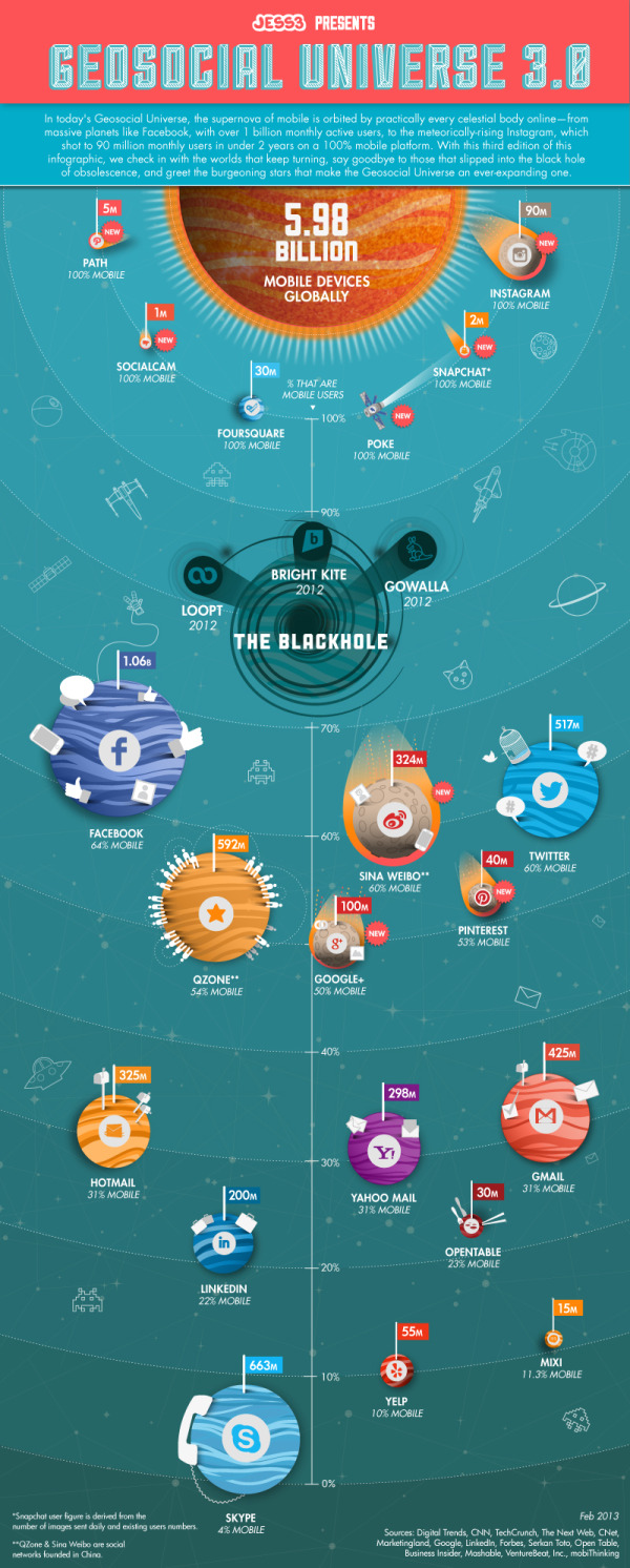
Last week design firm JESS3 released The Geosocial Universe 3.0, an update to their prior infographics about the size of the major social media networks.
In a time not so long ago, in a galaxy not so far away, a little phenomenon was born that united the people of cyberspace through geographic services and social networking.
With changes to the social landscape occurring at lightspeed, JESS3 presents its third iteration of The Geosocial Universe, charting the latest monthly active user data for various social networks, along with the percentage of users who access each network via mobile devices.
Take a look below to discover more about the ever-expanding geosocial universe and the course of its objects.
I really like the changes to this version of the design. They kept the same philosophy of relatively sized circles to represent each of the main social networks. However, I’m confused by the placement of the Black Hole on the vertical scale meant to represent the percentage of mobile users. Why does more mobile users place a network closer to the Black Hole of Obscurity? It’s placement around the 80% mark visually implies that has meaning, but I don’t think that was the intention of the design. Is Facebook close to obscurity?
Both a copyright (or Creative Commons) license and the URL to the infographic landing page are missing from the design. You want readers to be able to find their way back to the original when they find the infographic posted on other sites.
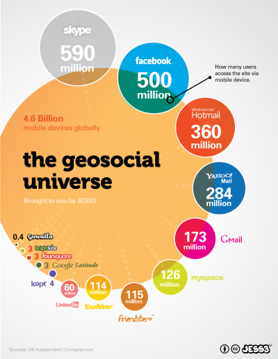
This is an update to the original design from 2010:
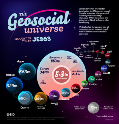
And version 2.0 in 2012:

Reader Comments (2)