About
Randy Krum
President of InfoNewt.
Data Visualization and Infographic Design

Infographic Design

Infographics Design | Presentations
Consulting | Data Visualizations

DFW DataViz Meetup

Join the DFW Data Visualization and Infographics Meetup Group if you're in the Dallas/Fort Worth area!

Search the Cool Infographics site

Custom Search

Subscriptions:


Feedburner

The Cool Infographics® Gallery:

How to add the
Cool Infographics button to your:

Cool Infographics iOS icon

- iPhone
- iPad
- iPod Touch


Read on Flipboard for iPad and iPhone

Featured in the Tech & Science category

Flipboard icon

Twitter Feed
From the Bookstore

Caffeine Poster

The Caffeine Poster infographic

Entries in earth (63)

Monday
Jul312017

EARTH, a visualization project

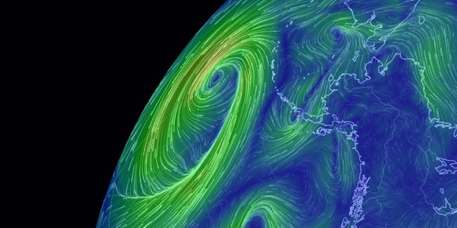
EARTH, by Cameron Beccario, is a beautiful interactive, animated visualization of a few different weather features across the entire globe.

EARTH, by Cameron Beccario, is a near real-time visualization of global weather conditions forecast by supercomputers. This vivid capture depicts intricate, dramatic swirling patterns of wind streamlines reminiscent of oil paintings of the Impressionists.

CAMERON BECCARIO'S creation, Earth. depicts wind patterns on a global scale. The artist began with a wind map of Tokyo, where he lives, and then he took on the world. You can see his animated creation at earth.nullschool.net.

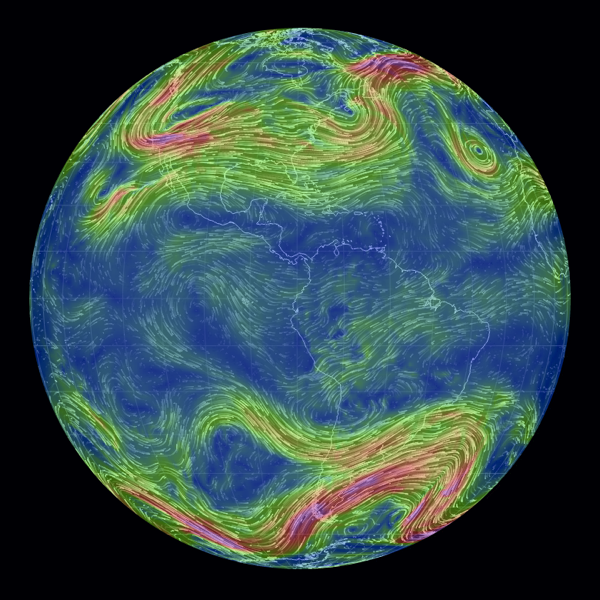
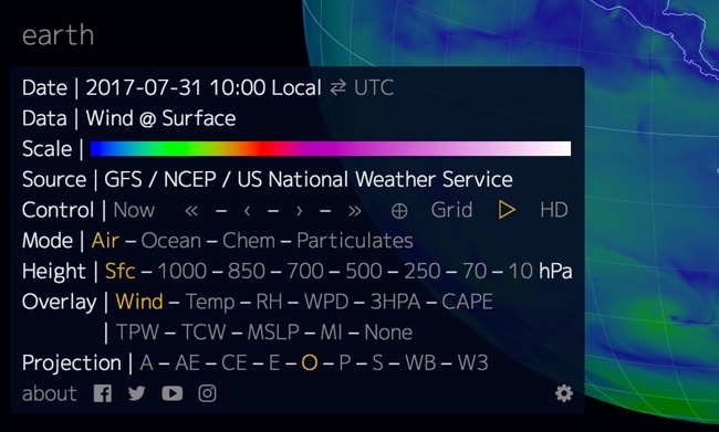
You can spin the globe and zoom in on any area in the World. Opening the setting panel lets you change the data that is being displayed; from wind to ocean waves to particulates in the atmosphere.


To support his project, you can purchase prints of some of the high-resolution images from Point.B Studio 

Designed in D3, all of the source code is also available at https://github.com/cambecc/earth. Of course the project was inspired by the Wind Maps visualization by Fernanda Viégas and Martin Wattenberg, that I have posted about before.

Wednesday
Apr262017

Visualizing Climate Change

Climate Change is Rewriting the History Books is an infographic from Climate Central that uses a heatmap design style to show how average temperatures have changed over the last 137 years.

This March clocked in as the second warmest March on record when compared to the 20th century average, according to newly released data from the National Oceanic and Atmospheric Administration. NASA data published last week came to the same conclusion, comparing temperatures to a 1951-1980 baseline.

The NOAA data shows the planet was 1.9°F (1.05°C) above the 20th century average for March, the first time any month has breached the 1°C threshold in the absence of El Niño. This March is the latest freakishly hot month following three years in a row of record heat.

NOAA and NASA baselines don’t really tell the whole story. How much the world has warmed since pre-industrial times is a crucial measuring stick for international climate talks and a more accurate representation of how much climate change is altering the planet.

Using the baseline of 1881-1910, a new, more dire picture of global warming emerges. This March was 2.4°F (1.3°C) above the pre-industrial average by that measure. More notably, this March marks a whopping 627 months in a row of warmer than normal temperatures. If you were born after December 1964, you’ve never experienced a month cooler than average on this planet.

To understand what that looks like, take a peek at the global temperature chart below. Each month is represented by a box. Cool blues have been disappearing, replaced by a wave of unending heat. Climate change is likely to continue the streak of warmer than normal months into the foreseeable future as temperatures keep marching upward.

There are a few things about this design worth commenting on:

  • I'm accepting the data from NASA and NOAA at face value, because this blog discusses the visual communication and design of data. However, I can't find the data they used. It would be helpful if they provided the final data they used to build the visualization. Provide a spreadsheet with the data as an act of data transparency.
  • This looks like a great use of the Conditional Formatting capability in Microsoft Excel. If it wasn't designed in Excel, it easily could be.
  • Heatmaps or choropleth maps (ie. using color hue, density, shading, opacity, or saturation) are impossible for the reader to differentiate the exact difference between the values. You can get a general impression, but this is at the bottom of the Scale of Graphical Perception
  • In a heatmap, the designer chooses the minimum and maximum values, and the data dictates all of the actual color saturations shown for each month. The minimum would be solid blue, the midpoint would be white and the maximum value would be solid red.
  • In this case, the chart colors start near the average, not the minimum value. So, all of the months from 1881-1910 are very close to white because these are the values that were used to calculate the midpoint
  • The maximum temperature value is 1.9° higher than the average, and that value is shown as the fully saturated red color. This is a choice by the designer, and makes the average temperatures in the highest months visually appear as very dramatic.
  • This is the default setting for a function like Conditional Formatting. It takes the maximum value in a given dataset, and correlates that to the maximum color saturation. It's up to the designer to decide if this default setting is correct for visualizing the data.


  • The article suggests that the trend will continue with warmer temperatures in the future, so an alternate choice the designer could make is to set the maximum color saturation to something like 10°F over the Baseline. The current temperatures would look much less dramatic, but it would allow for future higher temperatures to be displayed on the same scale.


The choices a data visualization designer makes has a huge impact on how the data is perceived by the audience!

Tuesday
Oct252016

Earth's Temperature Timeline

A Timeline of Earth's Average Temperature infographic

A Timeline of Earth's Average Temperature is another great data visualization design by Randall Monroe at XKCD.com! Real data and a humorous take on historical events!

A Timeline of Earth's Average Temperature since the last ice age glaciation. When people say "The climate has changed before," these are the kinds of changes they're talking about.

It's a long design on purpose. That's what drives the context of the data so strongly. 22,000 years of small changes and major historical events and then "Oh shoot..."

Found on FlowingData

Monday
Jan192015

The Future of Rare Earth Elements

Rare Earth Elements infographic

Rare Earth Elements make up a large portion of our high tech equipment and the demand for the elements is only increasing. This infographic, published by Buy Metal Online, has that examines the situation and the troubling shortages in our future.

Here we have an infographic that takes a look at rare earth elements (REE) including information about what they are, what we use them for, who’s producing the World’s REEs and more.

Good topic with clear visualizations and attractive illustrations.  They have a lot of valuable information packed into this design. However, in my opinion, there’s way too much text included, with multiple paragraphs explaining each section. In my experience, if readers see this much text in an infographic, they are likely to perceive it as too complicated and detailed. They’ll probably move on without ever reading it. Infographics are supposed to be simple explanations that are quick and easy to understand.

Thanks to Dave for sending in the link!

Wednesday
Jan152014

Timeline of the Far Future

Timeline of the Far Future infographic

What’s the future of the human race and our beloved planet Earth?  The Timeline of the Far Future from the BBC plots out predicted events for the next 1,000, 1,000,000 and up to 100 Quintillion years into the future!

As it is the beginning of the year we at BBC Future think it’s the perfect time to look ahead.

First, we brought you a prediction of the forthcoming year. Then we brought you a timeline of the near future, revealing what could happen up to around 100 years time. But here’s our most ambitious set of predictions yet – from what could happen in one thousand years time to one hundred quintillion years (that’s 100,000,000,000,000,000,000 years). As the song says, there may be trouble ahead…

They had to use an exponential scale, so each inflection point represents a jump in the timeline scale by a factor of 10.  The icons are small, and some are hard to figure out.  They had enough space they could have made those larger.  The circles are also sized by the magnitude of each event, but these seem to be arbitrary.

It’s worth noting one of the sources in the footer lists Out of Thin Air as a source.  This not a claim that they made up the information.  It’s actually a book titled Out of Thin Air that some of the information was pulled from.  I had to look it up, but it’s a valid reference.

Nice to know that MacBook will still be around for 100,000 years!  Definitely looks like we’re in for a rocky ride though…

Thanks to Digital Information World post on Google+


Friday
Apr262013

2,000 Years of Continental Climate Changes

2,000 Years of Continental Climate Changes

Climate change is a complicated, and sometimes controversial, global topic.  I really like this data visualization of 2,000 Years of Continental Climate Changes that was included as part of the report published by the “2K Network” of the International Geosphere Biosphere Program (IGBP) Past Global Changes (PAGES) project.

Thirty-year mean temperatures for the seven PAGES 2k continental-scale regions arranged vertically from north to south. Colors indicate the relative temperature. The most prominent feature of nearly all of the regional temperature reconstructions is the long-term cooling, which ended late in the19th century. North America includes a shorter tree-ring-based and a longer pollen-based reconstruction. Modified from: PAGES 2k Consortium, 2013, Continental-scale temperature variability during the past two millennia, Nature Geoscience, DOI:10.1038/NGEO1797.

Each color band represents a 30-year mean temperature found on each continent.  Their choice of data visualization method is very compelling, and visualizes a huge amount of data in a small space.

I also love that a good data visualization can attract attention and build awareness all by itself.

Found on the post by Andrew Revkin on the NY Times Dot Earth blog.

Thursday
Apr042013

How Far is it to Mars?

How Far is it to Mars? motion infographic

How Far is it to Mars? by David Paliwoda is a fantastic animated, interactive infographic website that shows the viewer the scale of the distance to the Moon and to Mars as measured in pixels.  David calls this a motion-infographic.

Click the image above to see the animated site.  Very cool! 

Found on Daring Fireball

Thursday
Mar282013

Asteroids!

Asteroids Close Encounters infographic

Simon Scarr is doing some great work as the Graphics Director at the South China Morning Post in Hong Kong.  Last month he designed Close Encounters, the full-page visualization of the Near-Earth-Objects that have passed within the Moon’s orbit (or will pass by) from 1910-2189.

A 45-metre-wide asteroid came remarkably close to Earth on Friday, even closer than communication and weather satellites. It was be the nearest known close miss for an object of its size.   

When this story was first mentioned in the newsroom, a few days before the incident, it sparked debate. People were intrigued as to how close these objects come to Earth. How many pass by? And how fast or large are they? A perfect opportunity for an interesting graphic.    

As usual, NASA had every piece of information we needed. Their Near-Earth Object Program was established in 1998 to help coordinate, and provide a focal point for the study of comets and asteroids that can approach the Earth’s orbit. They have data sets on all close approaches to Earth since 1900 and projected forward to 2200.    

This is a beautiful design that shows the distances to scale by placing them in between the Earth and the Moon, and the horizontal lines show the relative speeds of all the objects.  Orange lines are future, predicted passes.

Simon has posted more behind the scenes information about putting this infographic design together on his own blog.  I highly recommend the post, and you can check out his other work.

Found on Visual Loop.


Monday
Feb042013

The Periodic Table of iPhones

The Periodic Table of iPhones infographic

The Periodic Table of iPhones infographic from scientificamerican.com (credit to Mark Hobbs at CNET) is an infographic about the materials it takes to create an iPhone.  A PDF version is available for download here.

Key ingredients in the iPhone include so-called rare-earth minerals, elements whose properties make it light, bright and loud.

The key message in this design is obviously a wanring to readers that their iPhones (let’s be honest, this applies to any modern smartphone) are using rare materials that may be hazardous and cause environmental problems when they are mined.  

The design ends abruptly, without an ending.  At the end should be a few key things that are missing:

  • What’s the conclusion or call-to-action?  What should readers do now that they understand the key message?  Is the desired action recycling, participating in protests or choosing a different phone?
  • Data sources?  This design accompanied a full-text article, but because infographics are shared independently they need to list the data sources for transparency and credibility.
  • URL to the infographic landing page so readers can find the original story and full-size infographic?
  • Copyright statement.

Found on visualoop!

Wednesday
Nov142012

Total Solar Eclipse 2012

Total Solar Eclipse 2012 infographic

Today (Nov 14th) will be a total eclipse of the Sun, and the Solar Eclipses infographic from turu does a great job with visually explaining eclipses and sharing the statistics from prior eclipses.

The total solar eclipse of 2012 is set to be a spectacular event. Occurring just after sunrise on November 14 (local time), the eclipse will be best viewed from Cairns in Australia. Already a popular tourist destination, the 2012 eclipse is expected to flood the coastal city with thousands of domestic and international visitors.

The infographic provides a definition of a solar eclipse as well as information on the Australia 2012 eclipse. It offers an insight into past solar eclipses, noting duration of totality and effects on local tourism.

With a number of events scheduled such as the Solar Eclipse Marathon and the Eclipse 2012 Festival, Cairns aims to cater to this expected influx of tourists. Renowned for its sunshine, Cairns is expected to be a prime location to view the 2012 eclipse. The next opportunity to view a total eclipse in Australia will be in the year 2028, making this year’s event truly special.

A good design that tells a good story.  In the footer should be a Copyright statement, and the URL to the infographic landing page so readers can find the origial full-size version.