About
Randy Krum
President of InfoNewt.
Data Visualization and Infographic Design

Infographic Design

Infographics Design | Presentations
Consulting | Data Visualizations

DFW DataViz Meetup

Join the DFW Data Visualization and Infographics Meetup Group if you're in the Dallas/Fort Worth area!

Search the Cool Infographics site

Custom Search

Subscriptions:


Feedburner

The Cool Infographics® Gallery:

How to add the
Cool Infographics button to your:

Cool Infographics iOS icon

- iPhone
- iPad
- iPod Touch


Read on Flipboard for iPad and iPhone

Featured in the Tech & Science category

Flipboard icon

Twitter Feed
From the Bookstore

Caffeine Poster

The Caffeine Poster infographic

Entries in earth (63)

Thursday
Apr242008

Visualizing Carbon Dioxide Emissions

This is a great way to visualize gas emissions which are normally invisible. That's why most people don't have any real sense how much is produced by the things you do in everyday life like running your washing machine or refrigerator.

The black balloons really work, with the black color implying "bad" and they're actually filled with a lighter than air gas that rises into the atmosphere. I'm assuming that the size of the balloons actually represents the 50 grams of greenhouse gas discussed in the ad.

Found on infosthetics.com and radar.oreilly.com and the original is at www.saveenergy.vic.gov.au from the Australian government.

Saturday
Apr192008

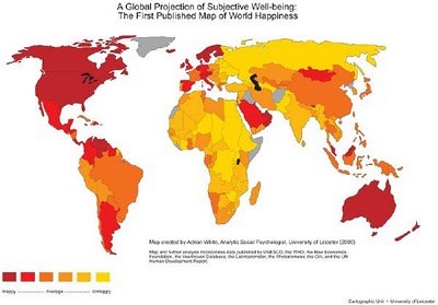
Map of World Happiness


From geostrategis.com, the world's first map of world happiness.

This world map on happiness was distributed through a Globe and Mail article by Sheryl Ubelacker (28/07/06). It is an interesting perspective, but primarily focused on the social side of well being. It provides a strong visualization but lacks the substance to become a strategic or policy significant map. This map was prepared by Adrian White, University of Leicester

Tuesday
Mar182008

New York Talk Exchange


Currently on exhibition at MOMA, The Museum of Modern Art, from Feb 24th - May 12th is an exhibit called "Design and Elastic Mind". New York Talk Exchange is included as part of the exhibition.

New York Talk Exchange illustrates the global exchange of information in real time by visualizing volumes of long distance telephone and IP (Internet Protocol) data flowing between New York and cities around the world.
Thanks Oliver!

Sunday
Feb242008

Conquest of Mount Everest


Cool infographic poster from historyshots.com showing the many expeditions leading up to the 1953 successful team to make it to the top of My. Everest.

Every major expedition before the successful climb of Mount Everest is detailed on the left side of the print. The circles provide an easy to view key into the history of each expedition including expedition length, type and height achieved. The flow of climbers from one expedition to another is tracked with graceful lines.

The right side of the print is devoted to the successful 1953 assault. The entire expedition is mapped showing the exact climbing history by altitude of each of the main phases of the assault. In addition, the weather for each day is provided.


Tuesday
Feb192008

Meet The World, Infographic Flags


Meet The World is an infographic project that uses the colors of eight national flags to represent some of the current issues in the world.

Icaro Doria is Brazilian, 25 and has been working for the magazine Grande Reportagem, in Lisbon, Portugal, for the last 3 years. He is part of the team (with Luis Silva Dias, João Roque, Andrea Vallenti and João Roque) that produced the flags campaign which has been circulating the Earth in chain letters via e-mail.
I found the link to this on rc3.org.

Monday
Feb182008

GE Ecomagination Blueprint Ads

GE is running The Blueprint Series of five print ads combining photos with an overlay of infographics. This works really nicely because they kept the infographics relatively simple.

Found on notcot.com.

Friday
Feb152008

5,000 years of Faith


From mapsofwar.com, this is a 90-second flash video showing when the major religions formed and where they spread across the globe. Great combination of a map with a timeline.

Found on digg.com

Saturday
Feb092008

Concentric Circle Disaster


Breaking News: Series Of Concentric Circles Emanating From Glowing Red Dot

This had one had me laughing out loud. From theonion.com, a news parody of how disasters are covered on TV using infographics. Watch out for those circles!

Found on Infosthetics.

Monday
Feb042008

Who has the Nuclear Weapons?

An infographic video from GOOD Magazine, a quick 3-minute video that shows who has the nukes, how many they have, and how much damage would one nuke hitting the Empire State Building cause.

Found on tunequest.org

Sunday
Jan202008

Race to the Moon


Cool poster I found over at historyshots.com shows the altitudes reached by all of the U.S. and Russian launches leading up to the 1969 moon landing.

From 1961 to 1969 the USSR and the United States were locked in a history-making race to land the first person on the moon. This detailed map explains the story of this titanic contest in a clear and informative manner.

Page 1 ... 2 3 4 5 6 ... 7 Next 10 Entries »