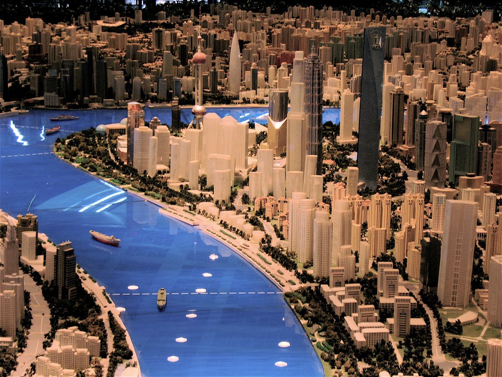
About
Randy Krum
President of InfoNewt.
Data Visualization and Infographic Design

Infographic Design

Infographics Design | Presentations
Consulting | Data Visualizations

DFW DataViz Meetup

Join the DFW Data Visualization and Infographics Meetup Group if you're in the Dallas/Fort Worth area!

Search the Cool Infographics site

Custom Search

Subscriptions:


Feedburner

The Cool Infographics® Gallery:

How to add the
Cool Infographics button to your:

Cool Infographics iOS icon

- iPhone
- iPad
- iPod Touch


Read on Flipboard for iPad and iPhone

Featured in the Tech & Science category

Flipboard icon

Twitter Feed
From the Bookstore

Caffeine Poster

The Caffeine Poster infographic

Entries in earth (63)

Thursday
Oct042007

Breathing Earth


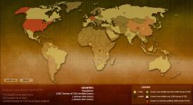
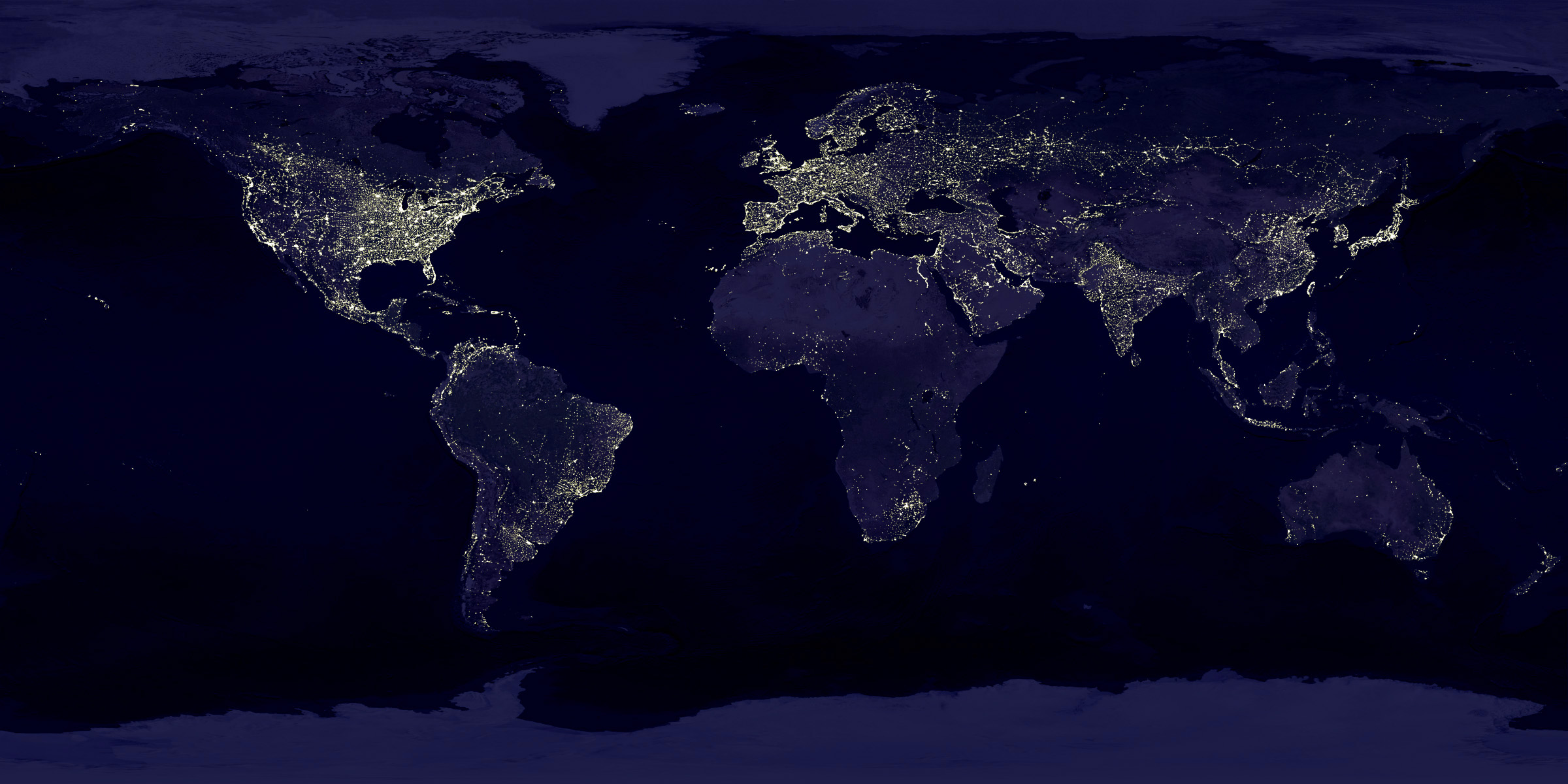
Breathing Earth is a cool website that displays international statistics in real-time, similar in concept to Poodwaddle.com's World Counter. Breathing Earth focuses on carbon dioxide emissions by country and adds population, births and deaths.

Welcome to Breathing Earth. This presentation displays the carbon dioxide emission levels of every country in the world, as well as their birth and death rates - all in real-time. Though considerable effort has been taken to ensure that the presentation uses the most accurate and up-to-date data available, please remember that this is just a simulation.
Breathing Earth was created by David Bleja (aka Stillwater), whose home website is stillwater-microcosm.net

Found on SimpleComplexity.net

Thursday
Sep272007

Shanghai Urban Planning


Last year I was in Shanghai, China on business. A friend suggested we visit the Shanghai Urban Planning building, and the first thing I thought was "ohhh, I bet that's exciting...not". But, he convinced us to give it a try, and here are a few photos I took.

On the top floor of this building is the largest model of urban planning in the world. For an American, seeing Shanghai is a shock at how large the city is, and how many skyscrapers there are. For reference, Shanghai's population is about 22 million people, compared to about 8 million in New York. Most U.S. cities have a "downtown" type area where the most skyscrapers are clustered, but Shanghai is a city of skyscrapers everywhere.

The World Population Map is one way to understand the scale difference between the U.S. and China, but this model city is astounding. Even better than riding around town (you definitely don't want to be the one driving), the model city really drives home the scale of Shanghai, and what has been accomplished in urban development. The model is built at 1:2000 scale.


Those are the building support columns in the middle of the model, NOT some new super skyscraper!

Saturday
Sep222007

Earth At Night


This satellite photo from NASA spans a 24-hour period showing the entire surface of the Earth in darkness. The lights obviously show the highest areas of concentration of civilization.

Note the Nile River delta, the Siberian Express railway route, the Australian coastal cities, and Africa, literally "the dark continent".
From Princeton's International Networks Archive, the old project of Jonathan Harris.

Monday
Sep172007

Human Trafficking

Found on VisualComplexity.com, this disturbing poster examines global human trafficking.

"It depicts each country's level of involvement (from Very High to Very Low) as either a country of destination or origin. The project concentrates on the smuggling of people from one country to another - mainly illegally. In many cases these people are forced to do work that is illegal, such as prostitution or child labor."
The poster was created by Taulant Bushi, and the original image is here.

Friday
Sep072007

The Cosmic Calendar


This last December was the 10th anniversary of Carl Sagan's death. One of his most popular episodes of Cosmos was titled The Dragons of Eden where he first described his Cosmic Calendar. This website from discovery.com has a simple image showing the Cosmic Calendar as Carl described it. A few websites are selling posters of the Cosmic Calendar, like AllPosters.com.

The premise is that if you compress the entire history of the universe into a calendar year, homo sapiens only exist in the last 6 minutes, and the last second represents the last 400+ years of human history.

You can see Cosmos, and hear Carl describe it on YouTube here:

Sunday
Sep022007

World Population Density


This is a prime example of how seeing the data visually is better than reading numbers. Here is a population density map from Wikipedia.

We have heard that China and India have most of the human population in the world, but here you can really see and understand how much. Reading that China's population is four times that of the U.S. is much harder than really seeing it on a map.

The Wikipedia page on World Population has some other great information too.

Sunday
Sep022007

World Clock Counter


You've seen these counters on highway billboards and other websites before. The World Clock from poodwaddle.com combines many of these counters together into one dashboard.

I've added a smaller version to the bottom of the right pane here on on the blog.

Sunday
Aug262007

Bodies in the Solar System


Another great infographic on kokogiak.com showing the relative size of large objects (88 of them, at least over 200 miles in diameter) in our solar system. The largest (of course) being the sun down to the smallest, which is Davida, an asteroid 203 miles in diameter.

Monday
Aug132007

World Drinking Map


From drinkingmap.com, this map shows the legal drinking age by country. For the vast majority of the world 18 is the legal age. There are only a few countries like the U.S. that have a drinking age as high as 21.

Sunday
Aug052007

The Coming Water Wars


Another graphic from Jonathan Harris from his time at Princeton with the International Networks Archive. It's a couple years old, but absolutely still relevant. I believe this is from around 2003.

Added: Recently popular on Digg.com