About
Randy Krum
President of InfoNewt.
Data Visualization and Infographic Design

Infographic Design

Infographics Design | Presentations
Consulting | Data Visualizations

DFW DataViz Meetup

Join the DFW Data Visualization and Infographics Meetup Group if you're in the Dallas/Fort Worth area!

Search the Cool Infographics site

Custom Search

Subscriptions:


Feedburner

The Cool Infographics® Gallery:

How to add the
Cool Infographics button to your:

Cool Infographics iOS icon

- iPhone
- iPad
- iPod Touch


Read on Flipboard for iPad and iPhone

Featured in the Tech & Science category

Flipboard icon

Twitter Feed
From the Bookstore

Caffeine Poster

The Caffeine Poster infographic

Entries in earth (63)

Wednesday
Dec032008

The "Super" Family Tree of Dinosaurs


Recently published in the Proceedings of The Royal Society, Biological Sciences, Volume 275 Number 1650 on November 7, 2008.

This is over my head, but this radial family tree shows the diversity of dinosaur species.  It's used in the article to help challenge the theory that dinosaurs went through a rapid decline during the Cretaceous period.  A brief summary is online over at The New Scientist.

Furthermore, we conclude that dinosaurs did not experience a progressive decline at the end of the Cretaceous, nor was their evolution driven directly by the Cretaceous Terrestrial Revolution (KTR).
Thanks for the link Michael!

Monday
Dec012008

Voyager Infographic video


Voyager from Jaime Arvizu on Vimeo.

Jaime Arvizu, a student at the Vancouver Film School, sent me a link to this infographic video that he and his team mates (Tyler Lemermeyer and Leo Aguiar) created for their Motion Design class.  You can find a high resolution version at Jaime's blog.

Thanks for sending this in Jaime, I love it!

Thursday
Oct302008

The Future of Food


Wired magazine has a great series of nine infographics from the November issue about the world's food supply problems.
Forty years ago, advances in fertilizers and pesticides boosted crop yield and fed a growing planet. Today, demand for food fueled by rises in worldwide consumption of meat and protein is again outpacing farmers ability to keep up. It's time for the next Green Revolution.
Thanks for the link Ethel!  Here are a few more.  Check them all out on Wired.com.


Wednesday
Oct292008

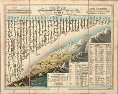
Classic infographic from 1823!


Here's a classic from 1823!  It a hand drawn infographic titled "Comparative Heights of the Principal Mountains and Lengths of the Principal Rivers of The World" by WR Gardner.  The high resolution image is on Flickr, but the post about the image is on bibliodyssey.blogspot.com.

This one makes a great poster!  Thanks Roi for sharing in the comments.

Monday
Oct132008

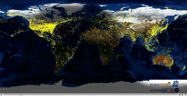
Air Traffic Worldwide movie

Very similar to the Flight Patterns video I posted back in October 2007, this is a video showing all commercial flight in the world over a 24-hour period.  The previous video was only the U.S., but this one shows the entire world.  It also shows the day/night areas and you can see the increase in air traffic as dawn rises around the world.  Its from the Zhaw School of Engineering in Zurich.

Found via FlowingData.com

Tuesday
Jul152008

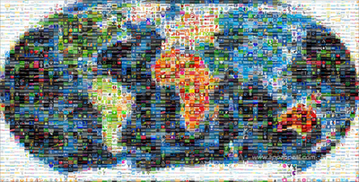
Map of the World 2.0


This world mosaic is created from 1,001 Web 2.0 icons/logos and each one is a clickable link to its respective site.  It was created using AndreaMosaic photo software, by the team at AppAppeal.

Thanks Jelle for sending in the link!

Tuesday
Jul082008

The Internet's Undersea World

An infographic map from the The Guardian in the UK, a map showing the few underwater cables that connect the world.

Found on digg.com

Friday
Jun272008

Big Blue Marble: Water and Air

Found on infosthetics.com, phiffer.com and boingboing.net

Global water and air volume. Conceptual computer artwork of the total volume of water on Earth (left) and of air in the Earth's atmosphere (right) shown as spheres (blue and pink). The spheres show how finite water and air supplies are. The water sphere measures 1390 kilometers across and has a volume of 1.4 billion cubic kilometers. This includes all the water in the oceans, seas, ice caps, lakes and rivers as well as ground water, and that in the atmosphere. The air sphere measures 1999 kilometers across and weighs 5140 trillion tonnes. As the atmosphere extends from Earth it becomes less dense. Half of the air lies within the first 5 kilometers of the atmosphere.

Credit: Adam Nieman / Photo Researchers, Inc

I'd love to see one more showing all of the oil in the world.

The original appears to be here at PhotoResearchers.com

Wednesday
May282008

The world as you've never seen it before


Check out WorldMapper! Above is a map of the world based on true Land Mass, but with WorldMapper, you can adjust the size of the countries based on whatever data you are trying to convey.

This is the world map based on Total Population:


This is the world map based on Total Computer Exports:


Alisa Miller, head of Public Radio International, talks about why -- though we want to know more about the world than ever -- the US news media is actually showing less. She uses WorldMapper to communicate her point about the state of today's news in the US.

Friday
May162008

Global Distribution of Water


From the United Nations Environment Programme website, the Global Distribution of Water specifically highlights the scarcity of freshwater.

Found on digg.com