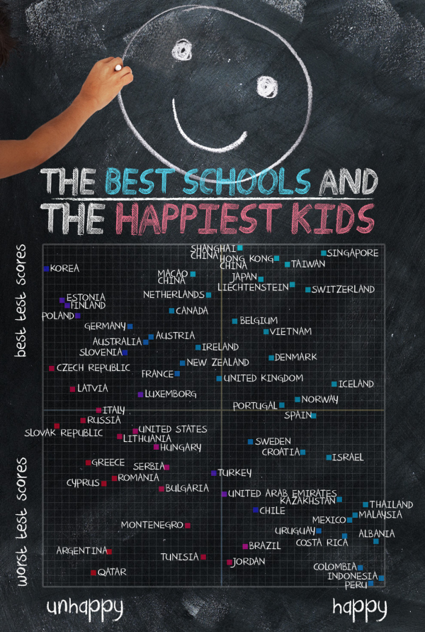
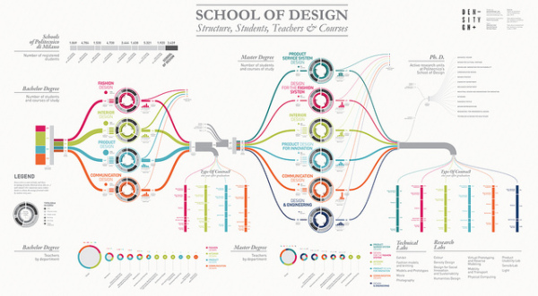
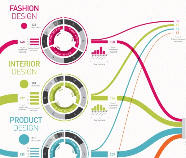
2014 Higher Education Technology Landscape
 Randy
Randy
The 2014 Higher Education Technology Landscape infographic from EDUVENTURES is the effort to make sense of the higher education technology landscape for the decision-makers who are tasked with determining new ways to provide better learning outcomes, building and maintaining a modern technology infrastructure, and rationalizing investment decisions.
Leaders in higher education face mounting pressure to deliver and account for better learning outcomes, embrace digital disruption, and replace aging and ineffective infrastructure with newer, cloud-based solutions. To take advantage of this opportunity, new and established vendors have flooded the education technology market, making it one of the most dynamic segments of the high-tech landscape.
It’s estimated that colleges and universities will spend between $20B and $25B this year on technology and services, enabling institutions to support faculty, and administration, as well as effectively market, recruit, enroll, instruct, engage, and prepare students and alums. The solutions span many categories, including enrollment management specialists, adaptive learning platforms, retention solutions, online program managers, social engagement networks, crowdsourcing applications, software-defined networks, big data platforms, and enterprise resource planning (ERP). The market is vast, confusing, and ill-defined. We hear from our clients regularly that while they want to take advantage of these new tools and solutions, they are perplexed by the ever-growing number of categories and technology vendors, and struggle with how to best to evaluate them.
To meet this growing need among our clients, Eduventures has initiated a new research focus to provide on-going analysis of the technology market to support higher education decision-makers. Our goal is to make the market more understandable, evaluate the strengths and weaknesses of technology and service offerings, and help leaders make informed decisions when selecting and implementing solutions that meet their unique institutional and learner needs.
Eduventures has developed a taxonomy to make sense of this technology landscape as a foundation for on-going research and analysis on this dynamic market:
- A student lifecycle framework for understanding the overall market and segments
- An initial categorization of hundreds of vendors serving the market
We have identified over 50 categories and hundreds of providers that market and sell technology and services to post-secondary institutions, which demonstrates how daunting this market can be for higher education leaders. Even with this preliminary analysis, we recognize that there are additional categories and companies to that can be added—our intention is to respond dynamically as new companies emerge and to update this landscape as it continues to mature, converge and evolve.
Complexity is the key message of this design. A lot of work went into identifying and categorizing all of these different services, but the message is clear that it’s a difficult job to setup the technology services any higher educational institution needs.
Any infographic design is going to be shared on it’s own, without the accompanying article, so designers should always include the URL address back to the original in the infographic image. Most people that share infographics don’t include the link back to the infographic landing page, and including that as text in the image file will help your readers find their way back to the full-size, original version you posted.
Thanks to Heather for posting on Linkedin