About
Randy Krum
President of InfoNewt.
Data Visualization and Infographic Design

Infographic Design

Infographics Design | Presentations
Consulting | Data Visualizations

DFW DataViz Meetup

Join the DFW Data Visualization and Infographics Meetup Group if you're in the Dallas/Fort Worth area!

Search the Cool Infographics site

Custom Search

Subscriptions:


Feedburner

The Cool Infographics® Gallery:

How to add the
Cool Infographics button to your:

Cool Infographics iOS icon

- iPhone
- iPad
- iPod Touch


Read on Flipboard for iPad and iPhone

Featured in the Tech & Science category

Flipboard icon

Twitter Feed
From the Bookstore

Caffeine Poster

The Caffeine Poster infographic

Entries in network (12)

Friday
Jun032016

The Global Air Transportation Network

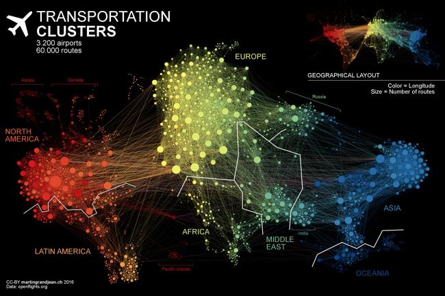
The Transportation Clusters infographic is a force-directed map of the 3,275 global airports and all of the connecting flight routes. Designed by Martin Grandjean, each bubble represents an individual airport and the bubble sizes represents the number of flight routes (37,153 routes in total) based on OpenFlights.org data.

People travel not just more frequently, but increasingly far and quickly. Mapping the connections between all the airports worldwide is a fascinating network visualization exercise.

This post (which may be followed by further experimentations in this area) is an attempt to make explicit the network behind air transport. The structure of the relationships has an impact on the spatial distribution of nodes in a graph. Let’s see how this landscape is reorganized without geographical constraints.

This “map” is the result of the application of a force-directed layout algorithm on a graph of 3.275 airports (37.153 single routes – the weighted total is higher because many airlines take the same route), based on OpenFlights.org data. Naturally, network geography is not completely disrupted: the continents are mostly visible and regions are generally in their original position (with the exception of the Pacific islands that connect Asia and America – imagine this graph in three dimensions, with the Pacific Ocean behind). Major observations: India is more connected to the Middle East than to South and East Asia. The Russian cluster is very visible, connecting airports in Russia but also in many former Soviet republics. Latin america is clearly divided between a South cluster and a Central American cluster very connected with the U.S.

The force-directed layout spaces the bubbles apart so there are no overlapping bubbles. The color coding is a color spectrum based on longitude, and generally groups airports from the same continent together. The total number of flights is much higher than the number of routes because many airlines share the same routes. I would like to see a version that weights the connecting lines with the number of flights that share that same route.

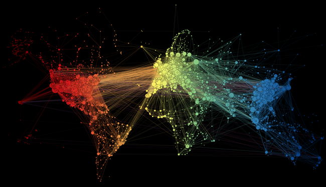
Here you can see the original map with the bubbles accurately located geographically, but a lot of overlap based on close proximity of the airports:

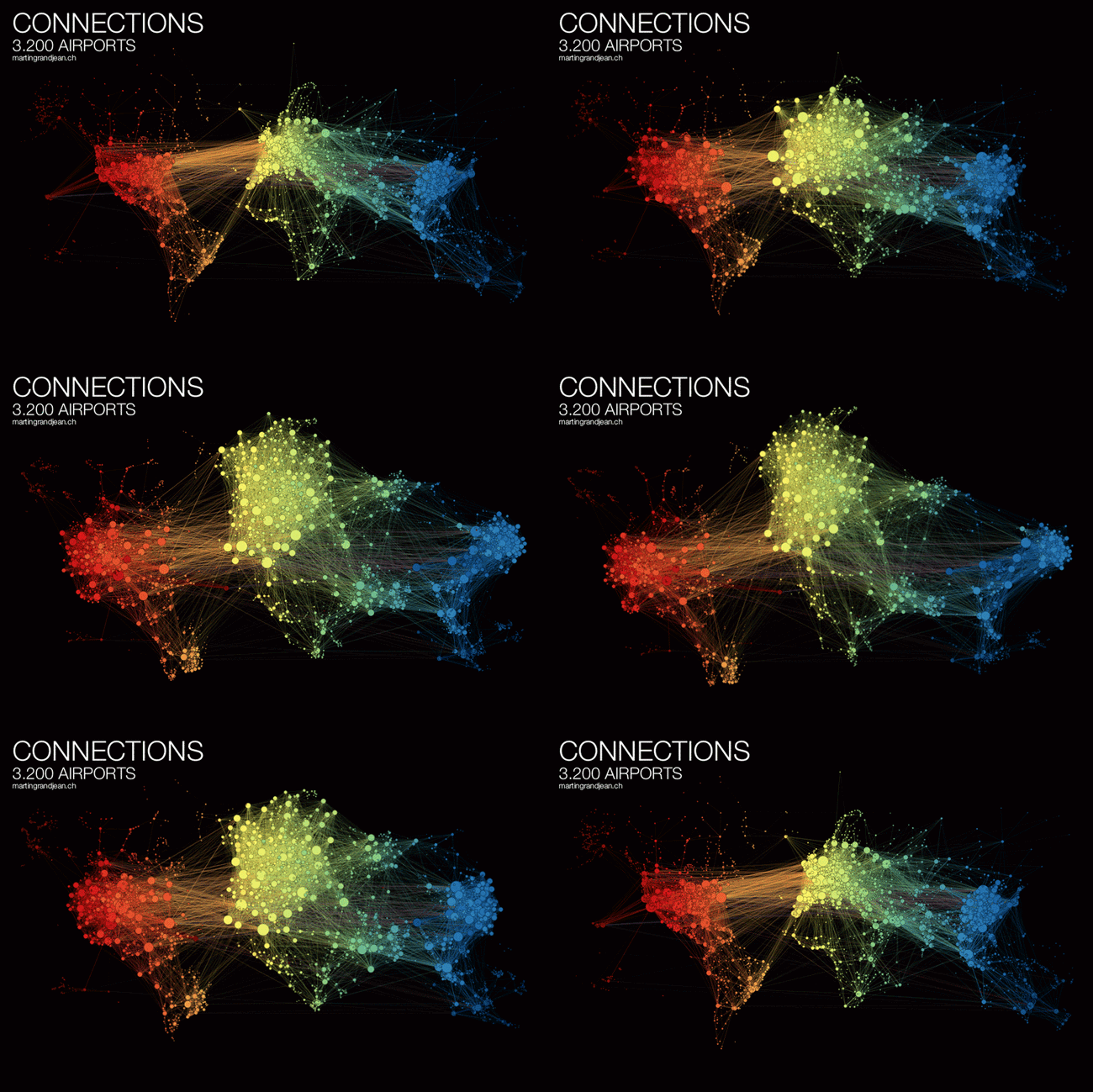
Martin also published a cool animated GIF and YouTube video of the change from geographical to force-directed layout.


Found on FlowingData

Tuesday
Oct212014

Where Do Designer Dogs Come From?

Where Do Designer Dogs Come From? infographic

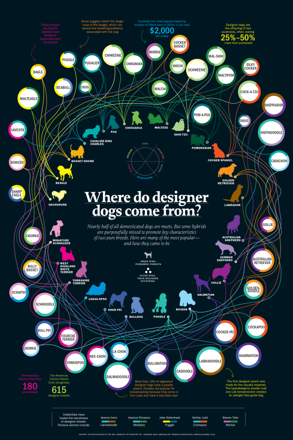
Where do Cocker Bassets come from? The answer is from a Cocker Spaniel and a Basset Hound! Where Do Designer Dogs Come From? infographic from Time explains the breeding patterns behind the multiple breeds of dogs.

Morkies. Cockapoos. Chiweenies. These dogs may not have serious names, but they’re a serious business. Known as ‘hybrid’ or ‘designer’ dogs, these canines are bred with a purpose – to optimize the best qualities of each parent.

Unlike some mixed breeds, designer dogs are generally born from two purebred parents. Depending on the qualities of the offspring, one puppy can be like having two dogs in one. Labradoodles, for instance, were first bred from labradors (which are common guide dogs) and poodles (with a low-shed coat) to be hypoallergenic service dogs. Puggles – a cross between a pug and a beagle – usually have a muzzle of a beagle, which can eliminate breathing problems often associated with the short-nosed pug.

Not all hybrids are desirable. Designer-dog critics says genetic experimentations are exacerbating the problem of puppy mills. For instance, when a puggle inherits a short snout from a pug and the hunting instincts from the beagle, it may not have a respiratory system that’s equipped to handle all the exercise it needs. These unwanted dogs often end up in shelters.

Despite the controversy, designer breeds have made a mark on the $60 billion pet market by commanding high prices that often exceed their purebred counterparts. And so long as the market continues to demand them, cavachons, pekeapoos and schnoodles are here to stay.

Bright, colorful network connections between breeds makes for a good infographic. curved, winding connections draw in readers to follow their favorite breeds.

The circle sizes have no meaning, just sized to fit the text within, which is misleading.  Disappointingly, the stats they do have are not visualized at all. The URL to the infographic landing page should be included in the footer so readers can find the full-size original version when they find this posted on other sites that don’t include a link.

Thanks to Sue for sending in the link!

Tuesday
Jul152014

House of Cards: Power Connections

House of Cards: Power of Connections infographic

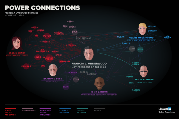
We’ve all have heard the saying, “It’s not what you know, it’s who you know.”  The House of Cards: Power Connections infographic from Linkedin brilliantly uses the House of Cards show to show a good example of being connected. How powerful is your connection network?

Relationships Matter

From college internships to becoming President of the United States, who you are connected to and how you leverage those connections matters.

We wrote the post 4 sales strategy lessons from Frank Underwood to take some learnings from the show and how they can apply to your professional growth. It was an amazing use of social media that we got a response from the House of Cards Twitter profile and felt we should lean-in on some of the content.

The best way for us to illustrate the valuable connections of a character like Frank Underwood is to create a LinkedIn InMap infographic with Frank at the center.

I love the idea of using a famous fictional person to show the “Power of Connections” instead of a real person that people might not be familiar with. Color-coding is always a helpful tool to minimize words on an infographic, and it’s used well here. Also, the use of faces for the key people on the graphic break up the names to keep it interesting. However, the reasoning behind the use of different sizes of circles around the names is unclear. Always make sure to include the URL of the infographic landing page at the bottom so that viewers can find the original.

This is based on the same network map visualization tool that you can use to automatically visualize your own connections on Linkedin.  Login with your Linkedin account on the Linkedin Labs page: http://inmaps.linkedinlabs.com/

Found posted on Google+ by Jason Lankow

Wednesday
Apr022014

The Enterprise Mobility Ecosystem Map

The Enterprise Mobility Ecosystem Map infographic

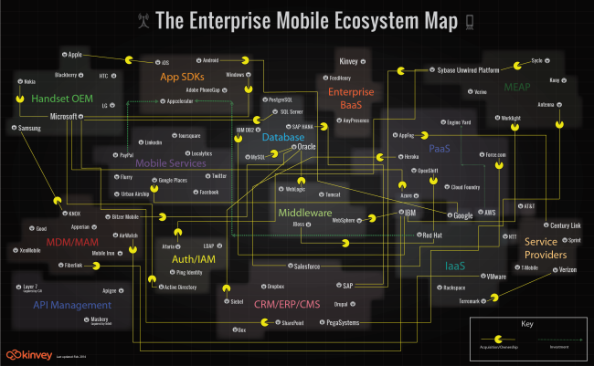
The Enterprise Mobility Ecosystem Map published by Kinvey attempts to make sense of the ownership and acquisitions rapidly taking place within the mobile backend providers.  Platforms for authorization, payments, location services and software development kits (SDKs).

Enterprise mobility is a classic IT disruptor. It’s the kind of disruptor that companies like IBM, Oracle and VMware, SAP, Salesforce, etc. were built on. It may look like a peripheral part of IT infrastructure now, but since mobile will be the primary access point to apps and data for many enterprises, many — if not most — new apps are going to be “mobile first.” Thus, the entire IT infrastructure is going to have to become very mobile friendly, very quickly, or else risk becoming a legacy platform.

As a consequence, major IT vendors are partnering with or acquiring companies throughout the mobile stack. Market consolidation and investments have taken place in MDM, API Management, cloud and handset markets. To visualize this activity, we’ve produced the Enterprise Mobile Ecosystem map below.

A network map visualization like this can help companies figure out where their business plays, and how other company acquisitions around them may impact their business.  I like that the design is purely informational, and doesn’t add a lot of extra data or information to the design.  The message is all about the connections, and doesn’t include things like the size of the companies or the value of the acquisitions.  This keeps the infographic focused on telling one story really well.

I would recommend using the company logos in the subway map style design to make it faster and easier for the audience to recognize the companies involved.  It’s much harder for the readers to read all of the company names in text to find the companies they recognize.

The Pac-man icons are a nice touch to indicate the direction of ownership or acquisition.

Monday
Oct142013

The Magnificent Multitude of Beer

The Magnificent Multitude of Beer infographic poster

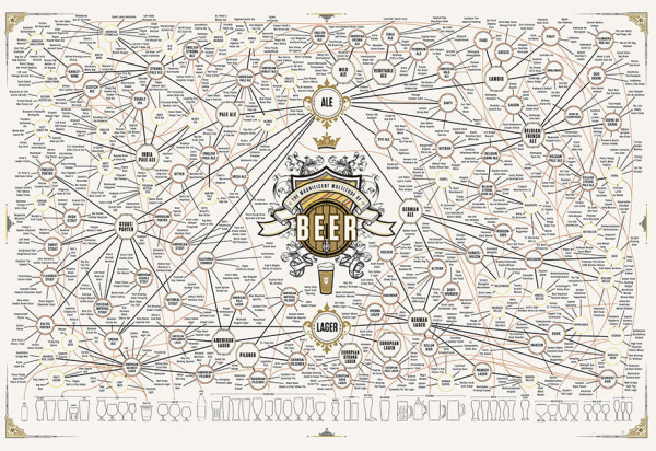
The Magnificent Multitude of Beer is a cool new poster design from Pop Chart Lab.

This wall map is the most complete charting of beer ever, breaking down ales and lagers into over 100 delicious styles from hoppy IPAs to fruity lambics, and including over 500 individual beers as notable examples of each style as well as glassware recommendations. The Magnificent Multitude of Beer captures the proud work of hundreds of breweries around the world, clocks in at a staggering 60 inches by 40 inches, and is the perfect finishing touch for your man cave or lady lair.

SALE today only!  The team at Pop Chart Lab has a 15% OFF Everything sale for Columbus Day (October 14).  Use the code COLOMBO at checkout to get the discount.  The code is valid until 12:30pm EST tomorrow.

Tuesday
Aug272013

World's Biggest Data Breaches Visualization

World's Biggest Data Breaches Visualization

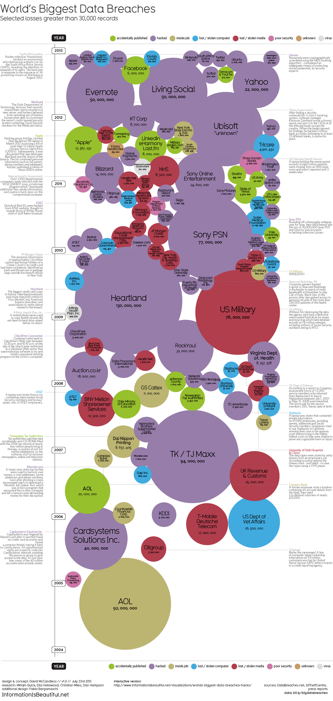
David McCandless and the team from Information Is Beautiful recently released both static (seen above) and interactive versions of the new World’s Biggest Data Breaches visualization.

This weekend, Apple’s developer site was hacked. 275,000 logins, passwords and other records potentially compromised. Two days before that, popular open-source operating system Ubuntu had its forums hacked. 1.82 million records stolen.

Are those big data breaches? Or just pin-points in the big data universe?

We’ve pulled out the interesting and funny stories out of the data. Click on the bubbles to read.

A fantastic design, the interactive version allows you to adjust the sorting, circle size and color-coding parameters.  It’s very easy for the reader to understand how one data breach fits into the overall history of stolen data.

In a move for transparency, the entire data set gathered and used in the design is available publicly to anyone through a Google Docs Spreadsheet.  Anyone can access the source data to verify the visualization or to create their own.

Found on Fast Company

Monday
Mar042013

2012 SEO Tactics

2012 SEO Tactics infographic

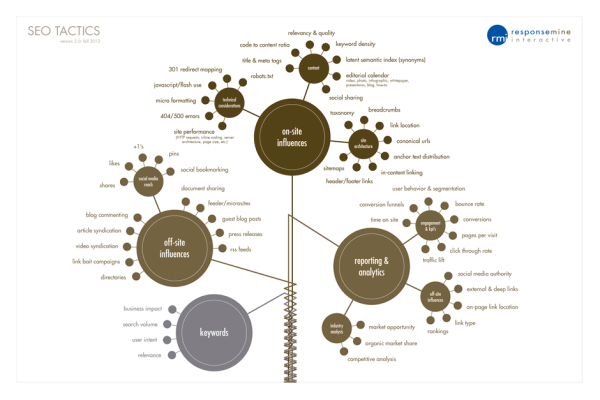
The 2012 SEO Tactics infographic from Response Mine Interactive breaks down the tactics they use to get the highest rankings for their clients in 2012, and expect them to stay the same for the majority of 2013. The four main tactics are on-site influences, off-site influences, reporting & analytics, and keywords.  

These are the components of a dominating SEO campaign. It’s a simple infographic listing and weighting every tactic we employ to gain top rankings for our clients and make them millions of dollars. Expect this chart to stay current through most of 2013.

A Little History

Since 2001, RMI has managed direct response digital marketing campaigns for world class companies like Rooms to Go, The Home Depot, Staples, Travelzoo and Hallmark. 

But does it come in a poster?!

Yes! If you would like a FREE 36x24 color poster simply email your name and address to deborah.fisher@responsemine.com and we will send it to you. 

Free Downloads

The poster and large format graphic was such a huge hit last year we’ve decided to take it a step further, Desktop Wallpaper. Simply choose the size that fits your monitor resolution. It should open in another tab/window then just right-click and save the file locally. Enjoy: 1024x7681280x8001280x10241366x7681440x9001680x10501920x10801920x12002560x1440.

Found on http://visualoop.tumblr.com

Monday
Dec172012

Facebook’s Network of Worldwide Affiliates

Facebook's Network of Worldwide Affiliates infographic

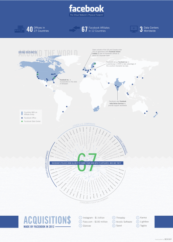
From BusinessProfiles.com, this Facebook infographic takes a look at the complex virtual network of affiliates behind Facebook.

Earlier this week, Facebook’s proposed revisions to its legal agreements with users went into effect following a vote by the social network’s users. One of the changes means that Facebook can now share your data with its affiliates. But who exactly are Facebook’s affiliates? Most of the media coverage has focused on Instagram. But Business Profiles research can now reveal that Facebook has at least 67 Facebook affiliate companies worldwide. The results are summarized in today’s infographic.

I like this design, and it has some great information about what Facebook’s legal agreements really mean to members.  It’s a focused story that isn’t trying to tell the reader too much information.  The color scheme is so close to the official Facebook brand colors and design that it could easily be misunderstood as an official publication, which it isn’t.

The lack of clear title makes this infographic design hard to share.  Anyone that posts a link has to make up a related title, which will be very inconsistent.  The lack of clear title, also makes it more challenging for a reader to know why they should take the time to read the infographic.  The risk is being considered “just another infographic about Facebook” and ignored by readers.

The map data is clear and easy to read.  The affiliate connects are the most interesting part of this design.  When the privacy policy says they can share you personal information with Facebook Affiliates, this is who they actually mean.

We sourced this information from our own extensive corporate registration directory as well as from other public and subscription sources. Please note that not every jurisdiction makes comprehensive business registration readily available. As a result, there are likely even more Facebook affiliates than those listed above. However, we hope that this gives some sense of the extensive and rapidly expanding physical footprint of the social network.

Information sources were obviously a challenge, and the statement above is included under the design on the infographic landing page.  However, there is no Sources statement in the footer of the design itself, so when the infographic is shared on other sites there is no mention of where the data came from.  Infographic designs really need to have the data sources listing in the image file so they go with the infographic when shared online.

Found on Infographic Journal

Thursday
Sep202012

Is Google+ a Ghost Town?

Is Google+ a Ghost Town? infographic

Google+, The newest trend? Or the newest flop? Umpf gets to the bottom of this mystery with a little research and reports it’s results with an infographic! The Google+, Ghost Town? infographic does more than just report the Google+ statistics, it compares them to other key social networks.

There’s been many articles written about how good, bad and indifferent Google+ is.  But our favourite debate is the ongoing It’s Really Popular Vs It’s A Ghost Town one.

So what’s the truth?  Our findings and infographic (see below) appear to suggest the latter: despite its large number of accounts, G+ is bottom of the list of social network users’ favoured channels.

Google, of course, claims it is fast-growing and really popular.  Why wouldn’t they? And, of course, there is research to support that argument. But does this chart, left, for example, which shows the rise in G+ unique visitors, tell the whole truth?

So, we decided to do our own research.  It is by no means exhaustive and is only meant as a snapshot view, so judge for yourself.

Certainly a trending topic lately, but also a really good infographic design.  Of course it’s framed in a Google+ news feed style layout.  Easy to read and colorful.  I like the color coding related to the different social network logos, even though some of those blue colors are hard to differentiate.

In the Users bar chart, I love the use of color, putting the data right in the bars and using the logos on the axis to eliminate any need for a legend.  Good data visualizations design!

In the “Users Likely to Share” I would have liked to see some sizing of the icons to match the data. Instead, they put the icon illustrations into rank order, continued the consistent color coding and clearly identified 1st, 2nd, 3rd, etc.

The section with all of the doughnut charts (reminiscent of the Google+ Circles icon) also continues the consistent color coding.  I’m sure it a rounding issue, but many of the charts only add up to 99.9% instead of 100%.

At the bottom, the two things missing are some type of copyright license as well as the URL linking back to the original infographic landing page.

Thanks to Jon for sending in the link!

Friday
Apr272012

Mapping Popular Story Plot Lines

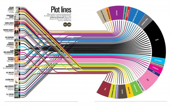
Finally! The secret ingredient to writing a good book has been revealed. Plot Lines, the infographic from Delayed Gratification, the slow journalism magazine, shows the dominant themes in last year’s books nominated for the Man Booker Prize for Fiction.  An interactive, zooming viewer available on the original landing page.

What makes a prize-winning novel?  As Julian Barnes wins the Booker Prize, Johanna Kamradt charts the themes of this year’s longlisters.  (Illustration by Christian Tate)

If you want to write a hit novel, it pays to stick with the tried-and-true plot lines.  DEATH of your characters is clearly the overall winning theme, with every one of the novels listed from 2011 including death as a theme.  Other classics like WAR, LOVE, BETRAYAL and CORRUPTION followed closely.  Obscure plot points like AN ESCAPED TIGER and HOMICIDAL COWBOY BROTHERS are certainly much more of a risk.

I love this design, and how it takes the multiple, complex story plots from the complicated mix on the left, and converts the chaos into order on the right.  Even with all of the crossover lines, you can still pretty easily follow a line across the diagram.  It’s fun and engaging for readers to follow the connections, and draws the readers in to look more closely. 

Found on visualnews.com