About
Randy Krum
President of InfoNewt.
Data Visualization and Infographic Design

Infographic Design

Infographics Design | Presentations
Consulting | Data Visualizations

DFW DataViz Meetup

Join the DFW Data Visualization and Infographics Meetup Group if you're in the Dallas/Fort Worth area!

Search the Cool Infographics site

Custom Search

Subscriptions:


Feedburner

The Cool Infographics® Gallery:

How to add the
Cool Infographics button to your:

Cool Infographics iOS icon

- iPhone
- iPad
- iPod Touch


Read on Flipboard for iPad and iPhone

Featured in the Tech & Science category

Flipboard icon

Twitter Feed
From the Bookstore

Caffeine Poster

The Caffeine Poster infographic

Entries in acquisition (3)

Wednesday
Apr022014

The Enterprise Mobility Ecosystem Map

The Enterprise Mobility Ecosystem Map infographic

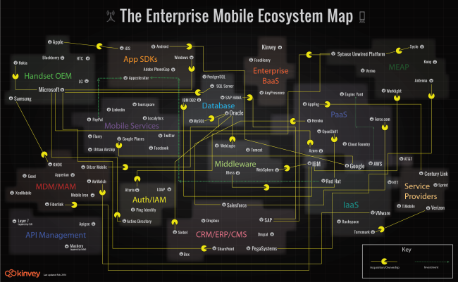
The Enterprise Mobility Ecosystem Map published by Kinvey attempts to make sense of the ownership and acquisitions rapidly taking place within the mobile backend providers.  Platforms for authorization, payments, location services and software development kits (SDKs).

Enterprise mobility is a classic IT disruptor. It’s the kind of disruptor that companies like IBM, Oracle and VMware, SAP, Salesforce, etc. were built on. It may look like a peripheral part of IT infrastructure now, but since mobile will be the primary access point to apps and data for many enterprises, many — if not most — new apps are going to be “mobile first.” Thus, the entire IT infrastructure is going to have to become very mobile friendly, very quickly, or else risk becoming a legacy platform.

As a consequence, major IT vendors are partnering with or acquiring companies throughout the mobile stack. Market consolidation and investments have taken place in MDM, API Management, cloud and handset markets. To visualize this activity, we’ve produced the Enterprise Mobile Ecosystem map below.

A network map visualization like this can help companies figure out where their business plays, and how other company acquisitions around them may impact their business.  I like that the design is purely informational, and doesn’t add a lot of extra data or information to the design.  The message is all about the connections, and doesn’t include things like the size of the companies or the value of the acquisitions.  This keeps the infographic focused on telling one story really well.

I would recommend using the company logos in the subway map style design to make it faster and easier for the audience to recognize the companies involved.  It’s much harder for the readers to read all of the company names in text to find the companies they recognize.

The Pac-man icons are a nice touch to indicate the direction of ownership or acquisition.

Wednesday
Mar052014

Hungry Tech Giants

Hungry Tech Giants Interactive Infographic

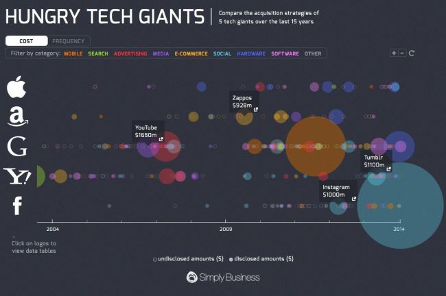
Hungry Tech Giants is a cool infographic from Simply Business that is both zoomable and interactive!  To put them into context, the design visualizes 15 years of tech company acquisitions by Apple, Google, Yahoo, Amazon, And Facebook.

2013 was a busy year for tech acquisitions.

With competition in the tech space heating up, Apple, Amazon, Google, Yahoo, and Facebook collectively executed 65 acquisitions in 2013 alone.

Yahoo was the biggest acquirer of 2013, buying a total of 25 companies following the hiring of its new CEO, Marissa Meyer.

Although Meyer is best known for her acquisition of Tumblr, the majority of her deals have bought engineering talent in an effort to build Yahoo as a serious challenger to Google.

Apple also had their biggest ever year for acquisitions in 2013, with ten purchases in total.

To see all of the acquisitions in detail, please visit our interactive microsite.

Each acquisition is appropriately placed on the timeline, and shown as a circle sized to match the total acquisition price.  Solid circles shown known prices, and open circles are not sized because the acquisition amount was never released publicly.  The circles are also color-coded to represent the different categories.

The interactivity allows you to select which categories to show, and when you hover over any particular acquisition, the acquired company name is shown with a link to the press release or news story announcing the acquisition.

The zooming controls allow you to adjust the date range shown, which helps identify many of the overlapping circles.  Clicking on the company logos on the left also brings up the data table which shows all of the known values, dates and includes the links to the press releases.  A very good way to establish credibility and make your data sources transparent.

The overall design is meant to be very detailed and allow the audience to dig in and explore the data.  At the macro level, the infographic clearly puts Facebook’s $19B acquisition of WhatsApp into context as the largest tech acquisition of all time!

Found on TechCrunch and Cult of Mac!

Wednesday
Sep142011

Google in 2011: Courtroom & Boardroom

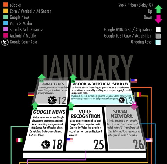
Google in 2011: Courtroom & Boardroom is a new infographic from Search Influence.  At it’s heart, this is a timeline history of acquisition and courtroom events through the first nine months of 2011, but there is a lot going on here.

Events are laid out in a psuedo-calendar format for each month, flagged by country and shaded to indicate win or loss.  The change in stock price is also shown for the actual day of each event, but even though this implies the event’s impact to stock price, there are always many more factors driving price changes.  Events are connected by colored lines to indicate on-going events and the related division of Google’s business.

I hope they keep evolving this design.  In it’s current state, it’s a little hard to follow, but I love the multiple layers of data represented.  This design could evolve to be more easily readable, and even be applied to other companies as well.

Thanks to Matt for sending in the link!