About
Randy Krum
President of InfoNewt.
Data Visualization and Infographic Design

Infographic Design

Infographics Design | Presentations
Consulting | Data Visualizations

DFW DataViz Meetup

Join the DFW Data Visualization and Infographics Meetup Group if you're in the Dallas/Fort Worth area!

Search the Cool Infographics site

Custom Search

Subscriptions:


Feedburner

The Cool Infographics® Gallery:

How to add the
Cool Infographics button to your:

Cool Infographics iOS icon

- iPhone
- iPad
- iPod Touch


Read on Flipboard for iPad and iPhone

Featured in the Tech & Science category

Flipboard icon

Twitter Feed
From the Bookstore

Caffeine Poster

The Caffeine Poster infographic

Entries in size (39)

Thursday
May192016

Sizing Up Sharks

Sizing Up Sharks infographic National Geographic

The design team at National Geographic has published a beautiful size comparison infographic: Sizing Up Sharks, the Lords of the Sea. The parallax scrolling keeps you, the reference deep sea diver, in frame as a comparison to provide perspective for each of the various types of sharks.

Sharks range in size from largest fish on the planet to the length of your palm. See how you compare to some of these vulnerable predators that are so crucial to the ocean's health.

The tooth Illustrations are not in scale with the fish, but all the teeth are in scale to each other to show relative tooth sizes. For some reason, only a few of the smaller sharks species are shown with both the small end and high end of their size ranges.

Sizing Up Sharks infographic Great White

This engaging infographic tells one story really, really well without adding too much other data that would have cluttered the design. The diver animation and underwater sounds are a nice touch.

Thanks to Chiqui Esteban (@chiquiesteban) for posting the link!

The massive Megalodon!

Sizing Up Sharks infographic Megalodon

Tuesday
May172016

Even Major News Outlets Get DataViz Wrong


Data visualization can be the most powerful, inspiring, and effective tool of a storyteller—as long as it’s accurate. However, a visualization can go horribly wrong if the designer uses the design tool incorrectly or gets the math wrong.

All too often, the underlying data is correct, but the visualization doesn’t accurately represent the corresponding values. Most of the time, it’s safe to chalk up the false visualization to an honest mistake by the designer, because it’s actually easier than you think.

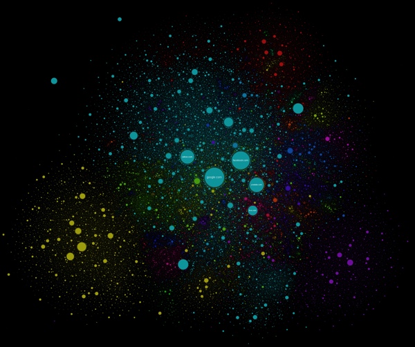
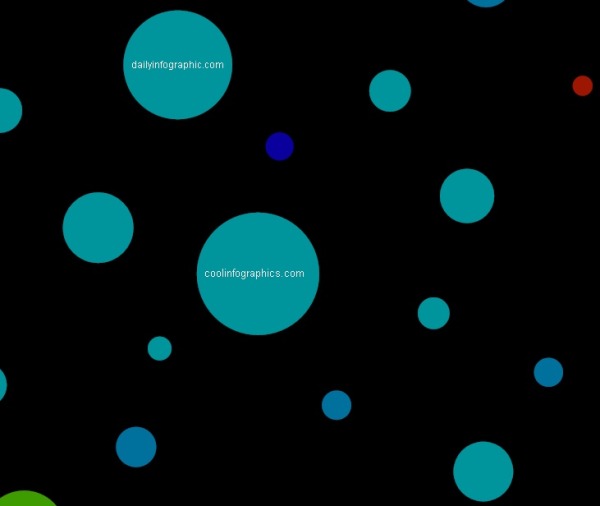
Take a bubble chart, for example. A great visualization method, but it’s a common source of flawed dataviz. The reason is that design software only allows scaling or width and height adjustments to size shapes. So designers, upon reviewing the data, will sometimes mistakenly scale a circle's diameter instead of the circle’s area. This, in turn, produces radically incorrect sizes. The approach has logic to it (to some degree), but it’s inherently wrong. What should instead be done takes a bit of geometry and a spreadsheet.

“Just think about it: if you tell a software tool to scale something 200 percent, it will make it twice as tall and twice as wide. Therefore, you aren’t doubling the size of your original circle. You’re making it four time larger.”

- The Truthful Art, Alberto Cairo (@albertocairo)

For a real-world example of this problem, take a look at CNN’s recent “ISIS goes global: 90 attacks in 21 countries have killed nearly 1,400 people,” an insightful article, serious topic, credible source with inaccurate data visualizations. Unsurprisingly, it’s a bubble chart at fault. Assuming the data gathered by CNN is accurate, the maps included in the article don’t match the data and are way off.

CNN ISIS Goes Global Incident Map Bad DataViz

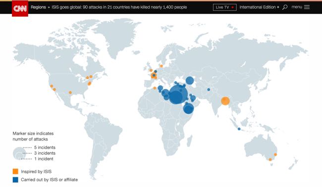
Take a close look and the size key. The circle size for five incidents is clearly shown as five times the diameter of the circle for only one incident, which creates a circle for “5 incidents” that is actually 25 TIMES LARGER, not five times larger. This drastically over emphasizes the locations on the map for the Middle East! I’ve designed the correct sizes so you can see what the bubble sizes should be.

CNN ISIS Circles DataViz Key Corrected

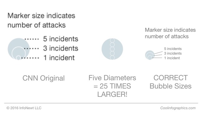
“It’s key for data visualization designers to understand that we visually compare the sizes of objects based on the their area (not their height). Numerical values are one-dimensional, but objects on a page or screen are two-dimensional. This is where designers need to remember to use the math learned from high-school geometry class. If you didn’t do well in geometry, it’s time to take another look.”

- Cool Infographics, Randy Krum (@rtkrum)

Bubble charts are in no way the only kind of dataviz that lends itself to mishaps. In print, broadcast, and online, you’ll see a variety of charts incorrectly showing the data — pie charts not adding up to 100%, logo sizes that don’t match the data, lines of icons with a different quantity than the data, etc.

Inaccurate dataviz certainly doesn’t always happen by accident either. Creating deceptive visual context is an unethical tactic employed by researchers, companies and publications alike, typically to promote a persuasive argument. Differences can be blown out of proportion or hidden by changing the axis scale or ignoring relevant data.

Once you start looking at data visualizations as a critical thinking reader, you’ll start notice many charts that don’t match the data. Always look to make sure the designer accurately represented the information before you take any data visualization at face value.

Thursday
Jan282016

The Snowzilla Snowball

The Snowzilla Snowball DC Infographic

Winter Storm Jonas hit the East coast of the U.S. last weekend, and dropped an estimated 6.6 trillion cubic feet of snow, with 2.7 billion cubic feet on the nation's capital alone. (Data estimated by Ryan Maue, a digital meteorologist for Models WeatherbellJavier Zarracina at Vox Media visualized that immense amount of snow as the Snowzilla Snowball.

These are absurd numbers, too big to really comprehend. To make them more understandable, I used a 3D modeling program to show what all that snow would look like in one snowball.

I started with just Washington's snowfall — this is what it looks like compared with the US Capitol building.

The results get even more mind-boggling when you look at all the snow that fell across the United States over this past weekend.

The Snowzilla Snowball World infographic

As a general rule, I don't like 3D visualizations. However, I like this use of 3D modeling to visualize the volume of the sphere of snow. It gives the real-world perspective of space and size.

The design concept is very reminiscent of the Big Blue Marble of Water

Thanks to Michael Stoll for posting a link on Facebook!

Tuesday
Oct272015

Asteroid โ€˜Spookyโ€™ Will Flyby Earth on Halloween

National Geographic has published a great data visualization that compares the estimated size of the asteroid "Spooky" discovered only a few weeks ago with the well-known skyscrapers in New York City, Asteroid Called ‘Spooky’ Will Buzz Earth on Halloween

Astronomers from NASA's Near Earth Object Program first spotted the incoming asteroid on October 10, just three weeks before its closest approach. It was too small and faint to detect until it came within the range of large survey telescopes.

Nicknamed Spooky, the asteroid (officially called 2015 TB145) is estimated to be about 950 to 2,100 feet wide (290 to 650 meters). Scientists won't be sure of its exact size until they can do radar measurements—and the most accurate will be on Halloween, when it passes the closest.

This is a perfect way to use data visualization to put the information into perspective for the audience. It would be nice to have more of the building identified.

Wednesday
May142014

The Drone Survival Guide

Drone Survival Guide infographic poster

The Drone Survival Guide is a poster and online infographic that uses proportionally sized silhouettes of the most common UAVs (Unmanned Aerial Vehicles).  Designed by Ruben Pater, a self-employed artist/graphic designer from the Netherlands, the poster is available for download as a PDF.

Posters printed on aluminum reflective Chromolux ALU-E mirrored paper are available from the site for €10, which included worldwide shipping.

TWENTY-FIRST CENTURY BIRDWATCHING

Our ancestors could spot natural predators from far by their silhouettes. Are we equally aware of the predators in the present-day? Drones are remote-controlled planes that can be used for anything from surveillance and deadly force, to rescue operations and scientific research. Most drones are used today by military powers for remote-controlled surveillance and attack, and their numbers are growing. The Federal Aviation Administration (FAA) predicted in 2012 that within 20 years there could be as many as 30.000 drones flying over U.S. Soil alone. As robotic birds will become commonplace in the near future, we should be prepared to identify them. This survival guide is an attempt to familiarise ourselves and future generations, with a changing technological environment.

This document contains the silhouettes of the most common drone species used today and in the near future. Each indicating nationality and whether they are used for surveillance only or for deadly force. All drones are drawn in scale for size indication. From the smallest consumer drones measuring less than 1 meter, up to the Global Hawk measuring 39,9 meter in length. 

Concept and design by Ruben Pater. Want to know more about the motivation behind this project? Read the FAQ.

The poster is also being publicized in conjunction with the Drone Salon seminar coming up on May 23, 2014.

The drone salon aims to provide a multidisciplinary overview of challenges, opportunities and speculations on future transitions caused by the use of drone technology both in the battlefield and in the civic realm. This seminar, punctuated by demonstrations and presentations, will consist of five conversations between Malkit Shoshan, Ethel Baraona Pohl and experts in the field: lawyers, activists, civic and military drone operators, artists, novelists and designers. The conversations will bring together multiple views, examples and projects on the spatial effects of the implementation of drones in war and in peace time. The seminar is part of the ‘Drones and Honeycombs’ project and one of a series of public events on the topic of drones organised in collaboration with Studio-X, Columbia University, DPR-Barcelona, The Center for the study of the Drone in NYC and Het Nieuwe Instituut in Rotterdam.

The design is actually very similar to the SciFi Starship Comparison Chart, but on a much smaller scale.  Many people in Ruben’s audience have sent in translations for the text included in the poster, so he has posted the text in at least 32 different languages.  I would like to see those translations offered as full versions of the poster, instead of the text only, but I understand that takes a lot of work.

I’m fascinated by drones, and I own and fly one of the AR Parrot Drones you see in the bottom right corner of the poster.

Thanks to Ethel Baraona Pohl for posting on Facebook!


Tuesday
May062014

An Illustrated Guide to the Biggest Dragons

An Illustrated Guide to the Biggest Dragons infographic

A fantastic size comparison chart, An Illustrated Guide to the Biggest Dragons infographic was published by The Daily Dot, and designed by Max Fleishman and Fernando Alfonso III.

George R.R. Martin, whose A Song of Ice and Fire novels are the basis for Game of Thrones, is currently writing a companion guide to the books, called A World of Ice and Fire. He’s recently published an extract of this guide on his blog, chronicling the history of the Targaryen invasion of Westeros, which took place several hundred years before the events of the books and the show. 

It’s got some badass dragon art, too. You can see Aegon the Conqueror standing astride his dragon mount, Balerion, the “Black Dread.” Turns out these dragons get really freaking big.

But seeing this picture got us thinking. Just how big is this dragon, and how does this bode for Daenerys’s own dragons? And how does it measure up to other famous fictional fire-breathers?

A great data visualization, but it’s missing some elements of a good sharable infographic.  Where it comes up short is that the infographic will be often shared without the rest of the text article originally published on The Daily Dot.  It needs to be able to stand independently, so the infographic image file itself should include the following:

  • A title
  • A short description of information included
  • Credit the designers
  • The URL back to the original article
  • Data sources?
  • A copyright?

I love that they also published a revised version that fits in vertical blog layouts better:

An Illustrated Guide to the Biggest Dragons vertical infographic

Found on Geekologie and Flowing Data

Monday
Mar312014

Map of the Internet 2.0 Poster

Map of the Internet 2.0 Poster

Designer Martin Vargic has released an updated version of his Map of the Internet 2.0 that creates what looks like a vintage-style map.  However, this version plots out the major websites and technology companies, with related sites grouped together on the same continent.  The sizes of the websites on the map are scaled relative to their number of visitors, so bigger sites show as bigger geographic regions.

Second version of our flagship project, the Map of the Internet.

This conceptual work of cartography treats major internet sites and enterprises such as Google, Yahoo, Microsoft, HP, and Apple like sovereign states, on a classic map of the world. To explain the dominance and relationships of these entities, they were all given a visual hierarchy that gives prominent treatment to companies with the most users (or sites with the most visitors), surrounding them with smaller countries representing related websites and services.

This poster includes one full map of the internet, 4 minimaps showcasing NSA surveillance, most used social networks, most used internet browser, and worldwide internet penetration, list of Alexa Top 500 websites, quick timeline of the Internet History, top software companies and much more!

The map includes more than 250 separate websites/enterprises as sovereign states, and more than 2000 separate labels.

A high-resolution version is available online, and you can also order 24” x 36” printed posters on Zazzle.

This what I call a 2nd level design, which means it’s a highly detailed design that is meant to present a ton of information to the audience.  This type of design isn’t trying to communicate a key message in a few seconds, but is intended for readers to zoom-in and explore.

Map of the Internet 2.0 Poster Zoom


Found on Business Insider

Monday
Feb102014

The Internet Map

The Internet Map is an interactive, zoomable design that uses a combination of algorithms and the Google Earth API to display 350,000 websites as sized circles representing their overall traffic.

Designed by Ruslan Enikeev, the color-coding shows the country affiliations.

Like any other map, The Internet map is a scheme displaying objects’ relative position; but unlike real maps (e.g. the map of the Earth) or virtual maps (e.g. the map of Mordor), the objects shown on it are not aligned on a surface. Mathematically speaking, The Internet map is a bi-dimensional presentation of links between websites on the Internet. Every site is a circle on the map, and its size is determined by website traffic, the larger the amount of traffic, the bigger the circle. Users’ switching between websites forms links, and the stronger the link, the closer the websites tend to arrange themselves to each other.

Semantic web

The map of the Internet is a photo shot of the global network as of end of 2011 (however, baloons show actual statistics from Alexa). It encompasses over 350 thousand websites from 196 countries and all domain zones. Information about more than 2 million links between the websites has joined some of them together into topical clusters. As one might have expected, the largest clusters are formed by national websites, i.e. sites belonging to one country. For the sake of convenience, all websites relative to a certain country carry the same color. For instance, the red zone at the top corresponds to Russian segment of the net, the yellow one on the left stands for the Chinese segment, the purple one on the right is Japanese, the large light-blue central one is the American segment, etc.

I even found Cool Infographics on the map!

Found on Fast Company

Friday
Sep272013

SciFi Starship Comparison Chart

SciFi Starship Comparison Chart infographic

This is a massive Starship Size Comparison Chart, created by designer Dirk Loechel and posted on DeviantArt.

The design gathers ships from many different science fiction movies, tv shows and games, and sizes them down to a common scale so viewers can grasp the relative size of how large and small the ships they recognize are.

As this get shared heavily online, it would be nice to have the URL back to the original, full-size version included in the design.

I love this size comparison design!  The subtitle mentions that Dirk's design is "based on the work of others"  A much smaller Starship Size Comparison Chart was one of the first posts on Cool Infographics back in July of 2007, and that version is no longer available online.

Thanks to Mary Kaye for sending me the link!

Tuesday
Jun252013

Planets in Orbit Around Earth!

What if we had a planet instead of a Moon? Saturn

What if we had a planet instead of a Moon?  Photographer, space artist, illustrator and former art director for the National Air & Space Museum’s Albert Einstein Planetarium, Ron Miller, created a series of very cool images that visualize how the rest of the planets in our solar system would appear if they orbited Earth at the same distance as the Moon.  

I’ve posted a number of different data visualizations and infographics that help visualize the sizes of the different planets, and this is a very cool approach that might make the relative sizes more relevant and understandable to a bigger audience that is already used to seeing the Moon in our sky.  For comparison, here is the original photo of the Moon:

What if we had a planet instead of a Moon?

From Ron’s description:

At a distance of about 240,000 miles, the Moon occupies a space in the night sky about half a degree wide. By sheer coincidence, this is almost exactly the same size the sun appears, which is why we occasionally get total solar eclipses.

But it’s interesting to imagine what the night sky might look like if one of the Solar System’s planets were to replace our moon. (We’d have to ignore things like tides and gravitation, but that’s the advantage of doing things in the mind’s eye.)  Saturn would be an astonishing sight. Almost 35 times larger than the Moon, this golden globe would cover nearly 18 degrees of the sky. We’d be a little further away from Saturn than its satellite Dione. In fact, we’d be more likely to be a satellite of Saturn ourselves than the other way around. The rings would stretch nearly from horizon to horizon.

Of course, the gas giant Jupiter is downright scary!

What if we had a planet instead of a Moon? Jupiter

View all of the full size images in Ron’s post on io9!

Found on My Modern Met and The Daily Mail