About
Randy Krum
President of InfoNewt.
Data Visualization and Infographic Design

Infographic Design

Infographics Design | Presentations
Consulting | Data Visualizations

DFW DataViz Meetup

Join the DFW Data Visualization and Infographics Meetup Group if you're in the Dallas/Fort Worth area!

Search the Cool Infographics site

Custom Search

Subscriptions:


Feedburner

The Cool Infographics® Gallery:

How to add the
Cool Infographics button to your:

Cool Infographics iOS icon

- iPhone
- iPad
- iPod Touch


Read on Flipboard for iPad and iPhone

Featured in the Tech & Science category

Flipboard icon

Twitter Feed
From the Bookstore

Caffeine Poster

The Caffeine Poster infographic

Entries in size (39)

Sunday
Sep162007

The Elegant Universe


Following my earlier post on Imagining the Tenth Dimension, I found that NOVA has put the entire 3-hour show The Elegant Universe on their website.


The show is full of different visual methods to visual strings, gravity, the scale of particles and multiple dimensions. Brian Greene really did a fantastic job with this show based on his book on the same name.

Sunday
Aug262007

Bodies in the Solar System


Another great infographic on kokogiak.com showing the relative size of large objects (88 of them, at least over 200 miles in diameter) in our solar system. The largest (of course) being the sun down to the smallest, which is Davida, an asteroid 203 miles in diameter.

Sunday
Aug262007

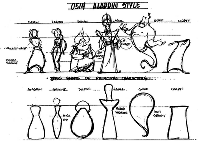
Drawing Disney Characters


Silver Bullet Comics has an article for aspiring comic artists, but I found this little gem.

A very simple infographic demonstrating that characters much each have a distinctive shape that makes them recognizable even from a distance. Very similar to the “silhouette test” for good character drawings to be recognizable in silhouette.

Sunday
Aug122007

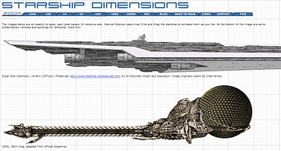
Starship Dimensions


As a follow-up to my earlier post on the Starship Comparison Poster, the Starship Dimensions website has a much more extensive library of sci-fi ships all shown to scale. There are so many here that the website is broken up into different pages from small scale up to "Big" scale. Click on the tabs across the top to pick a scale (100X, 10X, 1X, etc.).

Fantastic resource. Jeff Russell has done a great job accumulating the images and tracking down their relative sizes.

Thursday
Jul192007

The Size of Our World


This is a simple, but great infographic. How big are the planets? How big is our Sun? How small is the Earth? The site shows five different images on increasingly larger scales.

No numbers or measurements. Easy to understand. So simple, yet SO informative.

The Size of Our World

Wednesday
Jul182007

Digg Swarm


If you don't read Digg...shame on you.

For the rest of us, Digg has become an incredibly valuable source of information. But paging through pages of text for something to catch your eye gets old quick.

Digg Swarm was launched in 2006, and I have increasingly used it more and more since then. It has really grown on me. You can watch in real-time stories that get "Dugg" to become more popular. The visual size of the story bubble grows as the story's popularity grows. The yellow dots connected to the story show you who is digging the story, and the size of the yellow dot shows you how important that user is in the Digg universe.

Also, if the same person Diggs two stories, a connecting line is shown to highlight other story bubbles that may interest you. The connecting line between two stories gets thicker as more users Digg the same two stories showing a stronger connection.

Usually I start it up and let it run for a little while before I check it out. That way it has some time to build up some connections and story history. It starts from scratch when you start, so you only see the stories that are Dugg from that point in time and after.

Sunday
Jul152007

Starship Comparison


Huge starship comparison image/poster that combines the starships from most of the poular scifi movies and shows into one graphic. Someone spend a lot of time figuring out the relative dimensions of these, and this really adds a new perspective to your favorite shows.

Includes Star Wars, Star Trek, Babylon 5, Battlestar Gallactica (the original series), Farscape, 2001:A Space Odessey, and a few others.

Sunday
Jul152007

Hydrogen Atom


phrenopolis.com

Cool website that visualizes a hydrogen atom, showing how much empty space makes up our universe.

The page is scaled so that the smallest thing on it, the electron, is one pixel. That makes the proton, this big ball right next to us, a thousand pixels across, and the distance between them is... yep, fifty million pixels

If your monitor displays 72 pixels to the inch, then that works out to eleven miles - making this possibly the biggest page you've ever seen.

Sunday
Jul152007

Death and Taxes 2007


One of my favorite infographics is the Death and Taxes series.

This infographic visually breaks down the US Federal Discretionary Budget for 2007 into smaller and smaller bubbles. The actual values are also included as text, but the size of the bubbles instantly gives you an understanding of how the different budget items compare.

An online version in Flash is also available at thebudgetgraph.com

Just to be clear, this only shows the Discretionary Budget which totals $938 Billion. The total budget is $2.8 Trillion. Notice the circle in the background (just barely visible at the top and bottom) showing the National Debt of $9.35 Trillion.

One older version is the 2004 Budget.

Page 1 ... 1 2 3 4