About
Randy Krum
President of InfoNewt.
Data Visualization and Infographic Design

Infographic Design

Infographics Design | Presentations
Consulting | Data Visualizations

DFW DataViz Meetup

Join the DFW Data Visualization and Infographics Meetup Group if you're in the Dallas/Fort Worth area!

Search the Cool Infographics site

Custom Search

Subscriptions:


Feedburner

The Cool Infographics® Gallery:

How to add the
Cool Infographics button to your:

Cool Infographics iOS icon

- iPhone
- iPad
- iPod Touch


Read on Flipboard for iPad and iPhone

Featured in the Tech & Science category

Flipboard icon

Twitter Feed
From the Bookstore

Caffeine Poster

The Caffeine Poster infographic

Entries in campaign (17)

Thursday
Jun202013

How to Create a Winning Email Marketing Campaign

How to Create a Winning Marketing Campaign infographic

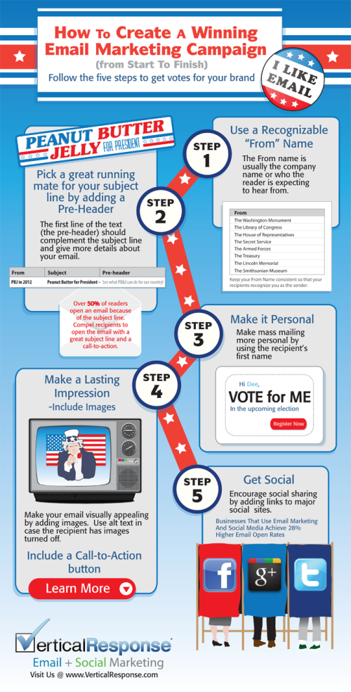
Originally intended for the election year, VerticalResponse has created an infographic on How to Create a Winning Email Marketing Campaign

With over three billion email accounts open worldwide, numbers are showing that email marketing is a viable strategy to target and captivate potential customers. That number is expected to grow to a whopping 4.3 billion by 2016.

How do you make your email stand out from an inbox that receives an average of 112 emails per day? If stats citing click-through rates for 2011 are accurate, only 22 of those emails are opened, leaving the other 90 emails to become unopened, or worse, marked as spam (a four-letter word that strikes fear into the hearts of email marketers).

With election day coming up, we wanted to celebrate the occasion with a patriotic infographic on email marketing. From choosing the right “from” name to integrating your email with social networks, if email marketing has your vote, check out the infographic for five steps towards a winning email marketing campaign.

This is a good way to use an infographic as a visual explanation instead of a bullet list in text for a blog post.  It’s easier to share and includes the images to make it easier to understand.

They had some great data about the growing number of email accounts, but they didn’t include that in the infographic.  Any text description on the infographic landing page is usually lost when people share the infographic, so all of that information should be included in the infographics itself.

Thanks to Leigh for sending in the link!

Tuesday
Dec012009

Vote With Your Dollars! - Corporate Political Contributions infographic


Vote With Your Dollars, is a corporate political contributions map.  Using the public data from the Center for Responsive Politics (2004-2008), GoodGuide.com has plotted the balance of contributions from companies.  Mouse-over a specific company logo to see the detailed data (like Dell above).
View the political contributions of your favorite companies and see how you vote with your dollars.  The data is surprising!
You can choose specific companies or business sectors, and then change the sort order.  Here is the retail sector sorted by Most Democratic Leaning:


Thanks Anthony for sending in the link.  Sorry it took so long to get posted.

Wednesday
Apr152009

GE: Plug into the Smart Grid


Great interactive infographic website from GE for their Plug Into The Smart Grid ad campaign.  Beautiful graphics, fast, clean interface and all-around good job.  The viewer can change the setting, and see the infographic results change in response.

My son loves the Augmented Reality part!  Not really infographic, but fun.

Wednesday
Feb252009

Taking Apart the $819B Stimulus Package

Very detailed infographic from the Washington Post showing how the proposed stimulus package is broken out between ares of spending and tax cuts.

The centerpiece of President Obama's domestic agenda is an $819 billion economic stimulus plan. The Senate will consider the measure this week, with an eye toward the amount of tax cuts and spending. Republicans and Democrats spar over what to consider a tax cut. An analysis by the nonpartisan Congressional Budget Office tallies the tax-cut portion to be significantly less than the one-third Democrats claim it to be.

SOURCE: Congressional Budget Office | Reporting by Karen Yourish, graphic by Laura Stanton - The Washington Post - February 01, 2009

Wednesday
Jan212009

A New President - Wordle

Wordle: A New President

I don't think I've ever posted about Wordle.net. So I thought this word cloud of President Barack Obama's inaugural address yesterday would be a good example.

Wordle is a toy for generating “word clouds” from text that you provide. The clouds give greater prominence to words that appear more frequently in the source text. You can tweak your clouds with different fonts, layouts, and color schemes.

Tuesday
Nov042008

Create Your Own Electoral Map


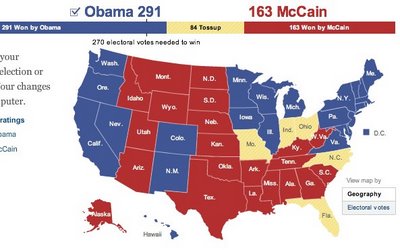
Since today is Election Day, the nytimes.com has a neat feature that lets you create your own Electoral Map.  Ireally like that it also gives you the option (seen above) to view the country with teh states sized by electoral votes or by geography (below).


It's been preloaded with the NYTimes.com breakdown of how the states may fall today, and which states are still undecided.  It's a little misleading because there are more undecided states, but they have assumed they will lean as the have historically.  It also allows you to change them on your own so you can see the effect on the overall election.

When your done playing, you can also see the NYTimes version of the map that includes the states that are leaning, but are not yet truly decided.


As you can see, the NYTimes.com site is predicting a Democratic win.  Let's see what really happens today.

Tuesday
Oct282008

Map of Newspaper Presidential Endorsements


Staying on the presidential election theme, here's a great infographic on infochimps.org.  Red shows newspapers endorsing McCain, and Blue show newspapers endorsing Obama.  The inner color of each circle also represents which candidate the newspaper endorsed in the 2004 election.  The size of the circle represents each newspapers circulation.

Also notice the mismatch between the newspaper endorsement and each state's "Red vs. Blue" alignment.

Thanks Garrett for the link!

Sunday
Oct262008

Does Your Vote Matter?  YES!


Sticking with the stuff from GOOD magazine, this is one of the GOOD Sheets available for sale as a poster at Starbucks for a limited time.  I've been looking for some good election related graphics.  There are a ton out there, but I'm looking for the gems.

I hear all the time that people don't think their vote matters, and in some cases it may get lost in an election that isn't close or competitive.  However, you never actually know if a race is going to be close or not (unless there is only one candidate).

In some of our local elections, I've seen some decisions put up to vote that won by only 12 votes!

I'm not pushing any specific politcal opinion, just that everyone should get out and vote.  Early voting is already open in many areas, so do your part and be heard!

Monday
Jun232008

Obama Funding Graphic


A small poster from our friends at XPLANE,

How Obama Reinvented Campaign Finance Barack Obama is the first major candidate to decline participation in the public financing system for presidential campaigns. He’s found a more effective way to raise money — by leveraging the power of the American people through online Social Networks.
Available as a PDF formatted for printing on 11x17 paper.

Wednesday
Jun112008

Democratic Party Voting Margins


New interactive infographic by Shan Carter and Amanda Cox on nytimes.com that shows the voter margins between Democratic candidates Hilary Clinton and Barrak Obama. These are based on exit poll data.


Choose any of the sorting criteria on the bottom, and then you can see specific data about any particular state by hovering the mouse over the blocks. The top chart shows how Men voted overall, and the second chart is how voters with No College Education voted.

Thanks Les for sending in the link!