About
Randy Krum
President of InfoNewt.
Data Visualization and Infographic Design

Infographic Design

Infographics Design | Presentations
Consulting | Data Visualizations

DFW DataViz Meetup

Join the DFW Data Visualization and Infographics Meetup Group if you're in the Dallas/Fort Worth area!

Search the Cool Infographics site

Custom Search

Subscriptions:


Feedburner

The Cool Infographics® Gallery:

How to add the
Cool Infographics button to your:

Cool Infographics iOS icon

- iPhone
- iPad
- iPod Touch


Read on Flipboard for iPad and iPhone

Featured in the Tech & Science category

Flipboard icon

Twitter Feed
From the Bookstore

Caffeine Poster

The Caffeine Poster infographic

Entries in scale (154)

Monday
Aug282017

The Perfect Temperatures for Beer, Wine, Coffee and More

The Ideal Temperature for Beer, Coffee, and More infographic

The Perfect Temperatures for Beer, Wine and Beverages from GB Energy Supply is no longer visible on their site, but I was able to find it on LifeHacker.

I really appreciate infographics that tell one story really well. You want the information to be clear and easy to understand for the audience. Personally, I wish it was also available in Fahrenheit.

Wednesday
May242017

Interactive Cocktail Shaker

Interactive Cocktail Shaker interactive infographic

David McCandless and the team at Information Is Beautiful have created this impressive Guide to Cocktails in both interactive and static versions.

75+ classic cocktail recipes from the International Bartender’s Association’s list of drinks every bartender should know.

Forget old-school measures like ml and oz. We’ve calculated our own universal metric. One of any ingredient represents one part of any measuring vessel you choose: cup, spoon, lid, shoe, whatever – it’s your party! These universal recipes scale up for any level of mayhem. Enjoy! Um…responsibly of course.

Select the booze in your cabinet: our 'measurement agnostic' interactive will conjure the rest.

All of their designs are very Data Transparent, and they have made all of the data from this design available in this Google Spreadsheet listed in the footer for anyone to see.

Wednesday
Apr262017

Visualizing Climate Change

Climate Change is Rewriting the History Books is an infographic from Climate Central that uses a heatmap design style to show how average temperatures have changed over the last 137 years.

This March clocked in as the second warmest March on record when compared to the 20th century average, according to newly released data from the National Oceanic and Atmospheric Administration. NASA data published last week came to the same conclusion, comparing temperatures to a 1951-1980 baseline.

The NOAA data shows the planet was 1.9°F (1.05°C) above the 20th century average for March, the first time any month has breached the 1°C threshold in the absence of El Niño. This March is the latest freakishly hot month following three years in a row of record heat.

NOAA and NASA baselines don’t really tell the whole story. How much the world has warmed since pre-industrial times is a crucial measuring stick for international climate talks and a more accurate representation of how much climate change is altering the planet.

Using the baseline of 1881-1910, a new, more dire picture of global warming emerges. This March was 2.4°F (1.3°C) above the pre-industrial average by that measure. More notably, this March marks a whopping 627 months in a row of warmer than normal temperatures. If you were born after December 1964, you’ve never experienced a month cooler than average on this planet.

To understand what that looks like, take a peek at the global temperature chart below. Each month is represented by a box. Cool blues have been disappearing, replaced by a wave of unending heat. Climate change is likely to continue the streak of warmer than normal months into the foreseeable future as temperatures keep marching upward.

There are a few things about this design worth commenting on:

  • I'm accepting the data from NASA and NOAA at face value, because this blog discusses the visual communication and design of data. However, I can't find the data they used. It would be helpful if they provided the final data they used to build the visualization. Provide a spreadsheet with the data as an act of data transparency.
  • This looks like a great use of the Conditional Formatting capability in Microsoft Excel. If it wasn't designed in Excel, it easily could be.
  • Heatmaps or choropleth maps (ie. using color hue, density, shading, opacity, or saturation) are impossible for the reader to differentiate the exact difference between the values. You can get a general impression, but this is at the bottom of the Scale of Graphical Perception
  • In a heatmap, the designer chooses the minimum and maximum values, and the data dictates all of the actual color saturations shown for each month. The minimum would be solid blue, the midpoint would be white and the maximum value would be solid red.
  • In this case, the chart colors start near the average, not the minimum value. So, all of the months from 1881-1910 are very close to white because these are the values that were used to calculate the midpoint
  • The maximum temperature value is 1.9° higher than the average, and that value is shown as the fully saturated red color. This is a choice by the designer, and makes the average temperatures in the highest months visually appear as very dramatic.
  • This is the default setting for a function like Conditional Formatting. It takes the maximum value in a given dataset, and correlates that to the maximum color saturation. It's up to the designer to decide if this default setting is correct for visualizing the data.


  • The article suggests that the trend will continue with warmer temperatures in the future, so an alternate choice the designer could make is to set the maximum color saturation to something like 10°F over the Baseline. The current temperatures would look much less dramatic, but it would allow for future higher temperatures to be displayed on the same scale.


The choices a data visualization designer makes has a huge impact on how the data is perceived by the audience!

Monday
Feb202017

Millions of Lines of Code

Codebases: Millions of Lines of Code infographic

Codebases: Millions of Lines of Code is another great infographic from David McCandless and Information Is Beautiful showing the massive complexity of today's modern apps and programs.

Is a million lines of code a lot? How many lines are there in Windows? Facebook? iPhone apps?

Great use of the matrix of squares to represent scale. I do think the users can lose their perception of scale when the section changes jump different values. If it was always a factor of 10, that would be clearer.

Thursday
Jan282016

The Snowzilla Snowball

The Snowzilla Snowball DC Infographic

Winter Storm Jonas hit the East coast of the U.S. last weekend, and dropped an estimated 6.6 trillion cubic feet of snow, with 2.7 billion cubic feet on the nation's capital alone. (Data estimated by Ryan Maue, a digital meteorologist for Models WeatherbellJavier Zarracina at Vox Media visualized that immense amount of snow as the Snowzilla Snowball.

These are absurd numbers, too big to really comprehend. To make them more understandable, I used a 3D modeling program to show what all that snow would look like in one snowball.

I started with just Washington's snowfall — this is what it looks like compared with the US Capitol building.

The results get even more mind-boggling when you look at all the snow that fell across the United States over this past weekend.

The Snowzilla Snowball World infographic

As a general rule, I don't like 3D visualizations. However, I like this use of 3D modeling to visualize the volume of the sphere of snow. It gives the real-world perspective of space and size.

The design concept is very reminiscent of the Big Blue Marble of Water

Thanks to Michael Stoll for posting a link on Facebook!

Tuesday
Oct272015

Asteroid ‘Spooky’ Will Flyby Earth on Halloween

National Geographic has published a great data visualization that compares the estimated size of the asteroid "Spooky" discovered only a few weeks ago with the well-known skyscrapers in New York City, Asteroid Called ‘Spooky’ Will Buzz Earth on Halloween

Astronomers from NASA's Near Earth Object Program first spotted the incoming asteroid on October 10, just three weeks before its closest approach. It was too small and faint to detect until it came within the range of large survey telescopes.

Nicknamed Spooky, the asteroid (officially called 2015 TB145) is estimated to be about 950 to 2,100 feet wide (290 to 650 meters). Scientists won't be sure of its exact size until they can do radar measurements—and the most accurate will be on Halloween, when it passes the closest.

This is a perfect way to use data visualization to put the information into perspective for the audience. It would be nice to have more of the building identified.

Monday
Jun012015

A World of Languages

A World of Languages infographic

A World of Languages - and How Many Speak Them is a new infographic by Alberto Lucas López for the South China Morning Post that compares the number of people that speak the top 23 languages in the world as their primary language. High resolution image version available HERE.

There are at least 7,102 known languages alive in the world today. Twenty-three of these languages are a mother  tongue for more than 50 million people. The 23 languages make up the native tongue of 4.1 billion people. We represent each language within black borders and then provide the numbers of native speakers (in millions)  by country. The colour of these countries shows how languages have taken root in many different regions

The dominant visual centerpiece appears to be a combination of a voronoi diagram & circular treemap, where the area of each section is representative of the number of people that speak each language as their first language. I don’t know any any software that will create this specific visualization style, so I’m assuming the area of each section had to be calculated separately. With the different, organic shapes how were those areas calculated? Iteration?

The data is a little bit controversial. It’s an estimate of the number of people that speak each language as their first language. There’s no accounting for multi-lingual people or language families. I love the data visualization design, but the underlying data may cause some concern.

Wednesday
May132015

The Slow Speed of Light

Riding Light from Alphonse Swinehart on Vimeo.


We think of the speed of light as incredibly fast, but in the video Riding Light, by Alphonse Swinehart, we ride along with light as it starts in our Sun and moves out past Jupiter in our solar system. The video is 45 minutes long and helps show both how large our solar system is, and that it still takes light a long time to travel these large distances.

In our terrestrial view of things, the speed of light seems incredibly fast. But as soon as you view it against the vast distances of the universe, it's unfortunately very slow. This animation illustrates, in realtime, the journey of a photon of light emitted from the surface of the sun and traveling across a portion of the solar system, from a human perspective.

I've taken liberties with certain things like the alignment of planets and asteroids, as well as ignoring the laws of relativity concerning what a photon actually "sees" or how time is experienced at the speed of light, but overall I've kept the size and distances of all the objects as accurate as possible. I also decided to end the animation just past Jupiter as I wanted to keep the running length below an hour.

During the course of the video, I also love the data visualziations shown during the flight, like how large the orbits of different planets appear to us as we move outward.

Also available on YouTube:

Tuesday
Mar102015

Baking Units Demystified

Baking Units Demystified infographic

Memorizing cooking unit conversions can be frustrating. Most of us just have a cheat sheet on the refrigerator that tells us that 1 Gallon= 4 Quarts. Well thanks to Andrew M.H. Alexander you might want to replace those boring magnets with the Baking Units Demystified infographic!

Infographics should simplify information and make it easier to understand without “dumbing it down.” This is a perfect example of showing the measuring relationships to make them easy to understand and even remember.

Found on Flowing Data.

Monday
Feb092015

The Massive SciFi Starship Size Comparison Chart

The Final SciFi Starship Spaceship Size Comparison Chart infographic

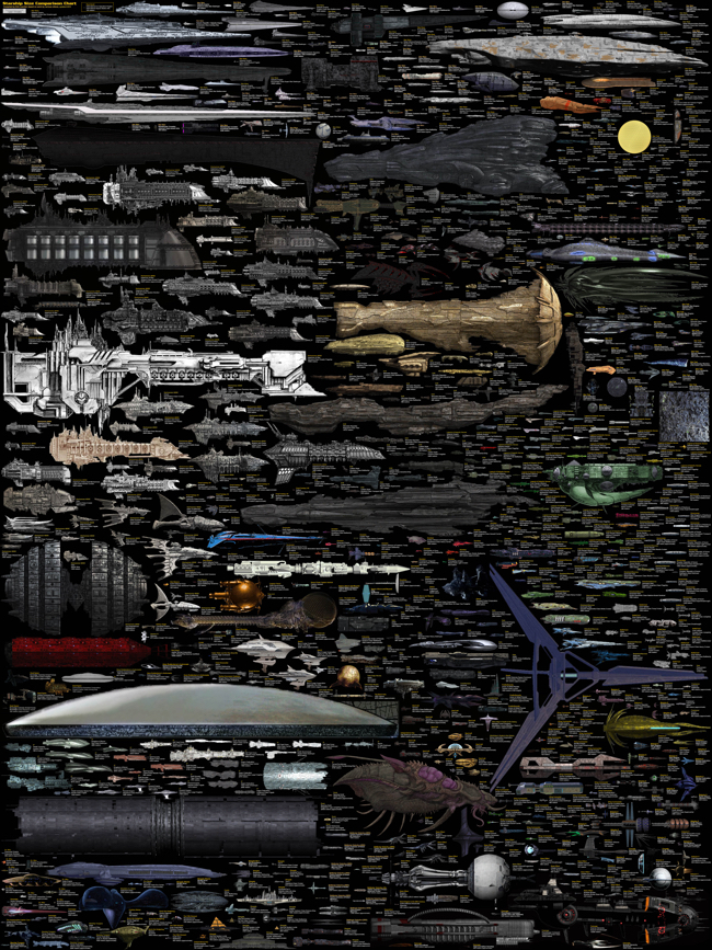
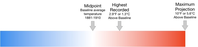
The massive SciFi Starship Size Comparison Chart is one of my favorite infographic design projects. Designed by Dirk Loechel and shared on DeviantArt, this is a project he has been working on for years. I posted an earlier version of his design in 2013 here which was hugely popular. Dirk’s notes claim that this may be the last update.

The last update

For real this time: This is the final major content update, though if there are issues I’ll still fix them. I also haven’t forgotten I wanted to vectorize the writing. It’s still on the radar. But content-wise, I think that is about all I can put in. 

Also, I added the ISS. For scale. It’s on top, with a yellow frame so it’s relatively easy to find.

Lots of errors fixed, lots of new ships too. Well, off for now, but I’ll be replying in the comments more or less regularily. 

This is probably at least for the forseseeable future the last round of adding ships. I have pretty much all I wanted now (excepting some old scifi, and many Anime series, which tend to not have many usable images). Lots of new content.

And that’s it for now. Enjoy the new-and-improved chart! 

This is one of the visual designs that clearly demonstrates why visuals can be much more effective than text descriptions. Especially when it comes to comparing size and scale. You just don’t comprehend the scope when someone tells you that the Star Wars Executor Class Super Star Destroyer is 19,000 meters long. You have to see it in comparison to something you already know.

The images on DeviantArt are high enough in resolution, that you can download and print it out as a poster yourself to hang on your wall. The full-size poster resolution is 4,268 x 5,690 pixels. Most of the ships are clustered by franchise (Star Wars, Star Trek, Halo, Eve, Warhammer, etc.). As a reality check, the International Space Station (ISS) is included for reference.

Found on Geyser of Awesome, Nerd Approved and Nerdist