About
Randy Krum
President of InfoNewt.
Data Visualization and Infographic Design

Infographic Design

Infographics Design | Presentations
Consulting | Data Visualizations

DFW DataViz Meetup

Join the DFW Data Visualization and Infographics Meetup Group if you're in the Dallas/Fort Worth area!

Search the Cool Infographics site

Custom Search

Subscriptions:


Feedburner

The Cool Infographics® Gallery:

How to add the
Cool Infographics button to your:

Cool Infographics iOS icon

- iPhone
- iPad
- iPod Touch


Read on Flipboard for iPad and iPhone

Featured in the Tech & Science category

Flipboard icon

Twitter Feed
From the Bookstore

Caffeine Poster

The Caffeine Poster infographic

Entries in distance (3)

Wednesday
May132015

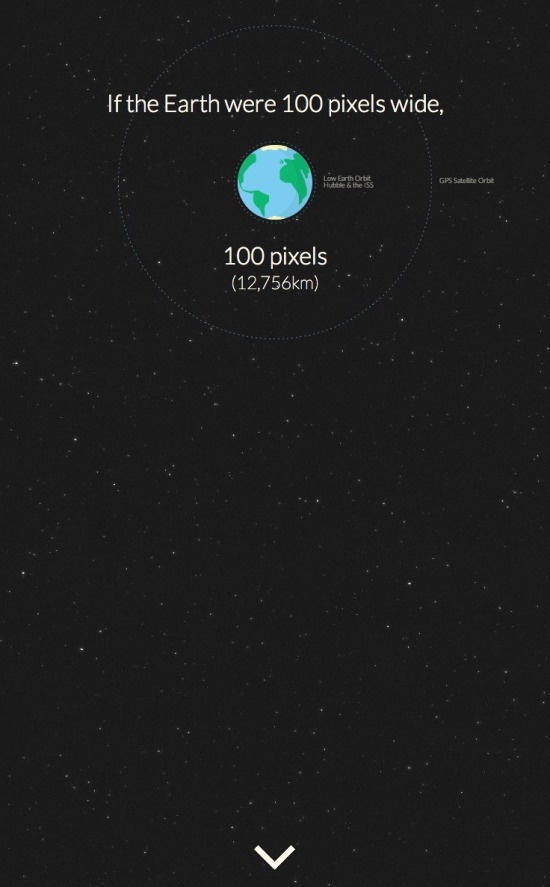
The Slow Speed of Light

Riding Light from Alphonse Swinehart on Vimeo.


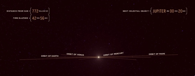
We think of the speed of light as incredibly fast, but in the video Riding Light, by Alphonse Swinehart, we ride along with light as it starts in our Sun and moves out past Jupiter in our solar system. The video is 45 minutes long and helps show both how large our solar system is, and that it still takes light a long time to travel these large distances.

In our terrestrial view of things, the speed of light seems incredibly fast. But as soon as you view it against the vast distances of the universe, it's unfortunately very slow. This animation illustrates, in realtime, the journey of a photon of light emitted from the surface of the sun and traveling across a portion of the solar system, from a human perspective.

I've taken liberties with certain things like the alignment of planets and asteroids, as well as ignoring the laws of relativity concerning what a photon actually "sees" or how time is experienced at the speed of light, but overall I've kept the size and distances of all the objects as accurate as possible. I also decided to end the animation just past Jupiter as I wanted to keep the running length below an hour.

During the course of the video, I also love the data visualziations shown during the flight, like how large the orbits of different planets appear to us as we move outward.

Also available on YouTube:

Thursday
Jun272013

The Nearest Stars

The Nearest Stars infographic

The Nearest Stars infographic from Space tracks the 53 closest stars to the earth. Their classification and distance is also included.

The nearest stars to Earth are in the Alpha Centauri triple-star system, about 4.37 light-years away. One of these stars, Proxima Centauri, is slightly closer, at 4.24 light-years.

Of all the stars closer than 15 light-years, only two are spectral type G, similar to our sun: Alpha Centauri A and Tau Ceti. The majority are M-type red dwarf stars.

Only nine of the stars in this area are bright enough to be seen by the naked human eye from Earth. These brightest stars include Alpha Centauri A and B, Sirius A, Epsilon Eridani, Procyon, 61 Cygni A and B, Epsilon Indi A and Tau Ceti.

Barnard’s Star, a red dwarf 5.96 light-years away, has the largest proper motion of any known star. This means that Barnard’s Star moves rapidly against the background of more distant stars, at a rate of 10.3 seconds of arc per Earth year.

Sirius A is the brightest star in Earth’s night sky, due to its intrinsic brightness and its proximity to us. Sirius B, a white dwarf star, is smaller than Earth but has a mass 98 percent that of our sun. 

In late 2012, astronomers discovered that Tau Ceti may host five planets including one within the star’s habitable zone. Tau Ceti is the nearest single G-type star like our sun (although the Alpha Centauri triple-star system also hosts a G-type star and is much closer).

The masses of Tau Ceti’s planets range from between two and six times the mass of Earth.

Great data from Space.com.  The infographic focuses on visualizing the distance of the stars from Earth. In that process, it caused some of the visual to be cluttered.  It’s always hard to convey 3D information on a 2D image.

From a data visualization standpoint, the lower table is unnecessary.  All of that information could have been conveyed in the star map illustration.  The color coding of the names in the map doesn’t match the color coding of the star classifications, and that’s confusing to readers.  It would have also helped to provide an explanation of why star systems can have multiple classifications.

If they wanted to keep the detailed table below, it should include more visual elements. The stellar types with the classification are redundant and can be combined.  The distances could have included bars to show the light years from Earth.  The number of observed planets could have used icons.

Found on Visual.ly

Thursday
Apr042013

How Far is it to Mars?

How Far is it to Mars? motion infographic

How Far is it to Mars? by David Paliwoda is a fantastic animated, interactive infographic website that shows the viewer the scale of the distance to the Moon and to Mars as measured in pixels.  David calls this a motion-infographic.

Click the image above to see the animated site.  Very cool! 

Found on Daring Fireball