About
Randy Krum
President of InfoNewt.
Data Visualization and Infographic Design

Infographic Design

Infographics Design | Presentations
Consulting | Data Visualizations

DFW DataViz Meetup

Join the DFW Data Visualization and Infographics Meetup Group if you're in the Dallas/Fort Worth area!

Search the Cool Infographics site

Custom Search

Subscriptions:


Feedburner

The Cool Infographics® Gallery:

How to add the
Cool Infographics button to your:

Cool Infographics iOS icon

- iPhone
- iPad
- iPod Touch


Read on Flipboard for iPad and iPhone

Featured in the Tech & Science category

Flipboard icon

Twitter Feed
From the Bookstore

Caffeine Poster

The Caffeine Poster infographic

Entries in words (10)

Monday
Dec012014

The Internet Is a Zoo: The Ideal Length of Everything Online

The Internet Is a Zoo: The Ideal Length of Everything Online infographic

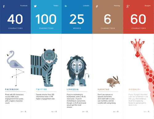
Short, sweet, and to the point! The Internet Is a Zoo: The Ideal Length of Everything Online infographic from a partnership between SumAll and Buffer explains the fine line between when extra words are helpful, and when they become too much information. Whether you are posting a facebook post to your friends, or a blog post to your avid followers. This infographic will help make sure your posts reach the most readers!

Have you ever woken up in cold sweat in the middle of the night wondering exactly how many characters long a tweet should be to get the most engagement, or how many words long a blog post should be so that it actually gets read?

Ok, that may just be me, but knowing exactly how many characters a Facebook post should be or what the ideal subject line length is should be endlessly fascinating (and useful) information to most people who are active on social media.

So, to make all this data digestible and easy to understand, we partnered with our awesome friends over at Buffer to produce an infographic that shows the optimal length of pretty much everything on the internet.

Great design that tells one story really well, totally focused on the length of posts on different social media platforms. The footer should include the URL to the infographic landing page so readers can find the full-size original when the infographic is posted without links.

They went one fantastic step further, and created a more print friendly version near the bottom of the landing page that spans multiple printed pages. The pages are formatted to fit on standard Letter-size paper or in presentation slides. This is a great example of using the research and design from the original infographic to share the information in additional formats.

Infographic was found on SumAll

Tuesday
Jan252011

Horoscoped: Visualizing Our Common Future

Horoscoped is another cool infographic project from Information Is Beautiful.  Scraping the text from over 22,000 horoscopes, a word cloud is created separately for each sign.  This visually shows you how common the words used truly are.

As part of their transparency, the team has also done a fantastic job of providing a description of their entire process and links to all of the data and the scripts here and here.

Taking the most common words from all of the horoscopes, they have created the Grand Unifying Horoscope:

Credits:

CONCEPT & RESEARCH: DAVID MCCANDLESS

DESIGN: MATT HANCOCK

ADDITIONAL RESEARCH: MIRIAM QUICK

HACKING: THOMAS WINNINGHAM

SOURCE: YAHOO SHINE HOROSCOPES


Found on Bad Astronomy and Chart Porn.

Friday
Jun112010

The Color Strata, a beautiful color naming infographic

Stephen Von Worley at WeatherSealed.com has taken the data made public from XKCD’s Color Name Survey and created a very cool infographic, The Color Strata.  Check out the high-resolution version.

The Color Strata includes the 200 most common color names (excluding black-white-grayish tones), organized by hue horizontally and relative usage vertically, stacked by overall popularity, shaded representatively, and labeled where possible.  Besides filtering spam, ignoring cruft, normalizing grey to gray, and correcting the most egregious misspellings (here’s looking at you, fuchsia), the results are otherwise unadulterated.  As such, similar color names, like sea green, seafoam green, and seafoam, each appear separately.  They’re synonymous… or are they?

Also check out the smoothed version:

It’s the same basic graph, but with flipped shading, label-free, stretched to fill the vertical, and whipped until creamy smooth.

The volunteer survey have over 200,00 respondents that named over 5,000,000 color samples.  Here’s the original image created by XKCD.com when they posted the data.

Found on ChartPorn.org and FlowingData.com

Monday
May032010

Lies, Damned Lies and Statistics (about TEDTalks)

Very funny video from TEDActive, by Sebastian Wernicke that analyses the best and worst of TEDTalks using statistics and word analysis.

In a brilliantly tongue-in-cheek analysis, Sebastian Wernicke turns the tools of statistical analysis on TEDTalks, to come up with a metric for creating “the optimum TEDTalk” based on user ratings. How do you rate it? “Jaw-dropping”? “Unconvincing”? Or just plain “Funny”?

Found on ILoveCharts.tumblr.com

Friday
Dec182009

Word Spectrums! The Online Infographic Battleground


On Chris Harrison's site, there are a number of graphics that he calls Word Spectrums.  More like a battleground, Chris is using the enormous amount of data from websites that has been made public by Google.  This is an advanced form of a word cloud that visualizes related words and their relative connections to the two topics.  (FYI, since this is based on raw Google data, foul language does appear in some of them).


Using Google's enormous bigram dataset, I produced a series of visualizations that explore word associations. Each visualization pits two primary terms against each other. Then, the use frequency of words that follow these two terms are analyzed. For example, "war memorial" occurs 531,205 times, while "peace memorial" occurs only 25,699. A position for each word is generated by looking at the ratio of the two frequencies. If they are equal, the word is placed in the middle of the scale. However, if there is a imbalance in the uses, the word is drawn towards the more frequently related term. This process is repeated for thousands of other word combinations, creating a spectrum of word associations. Font size is based on a inverse power function (uniquely set for each visualization, so you can't compare across pieces). Vertical positioning is random.


Chris has created and shared a number of different versions on the Word Spectrum page of his website, and you can see high-resolutions PDFs of each there.

Want to try your own?  Building on Chris' idea, Jeff Clark from Neoformix has created interactive Word Spectrums using either Twitter or News as the source that lets you enter your own terms to compete.  I especially like the idea of pitting two competing brands against one another.


Friday
Oct302009

What's a Gruzzle?


So, what's a Gruzzle?  With extensive use of Venn Diagrams, GL Hoffman often posts these visual blog posts on his blog, What Would Dad Say, and Fast Company has also started pubishing them as well.


So back to the original question, What's a Gruzzle?  Here's a really good answer, by one of his readers:


But here's the official answer:


You can also follow @GLHoffman on Twitter

Tuesday
Jul072009

Illinois: Visualizing Music


Jax de Leon just graduated from the graphic design program at SUNY Purchase College School of Art and Design, and was kind enough to share some of her senior project work called Illinois: Visualizing Music. Jax focused on one music album (illinois, by Sufjan Stevens), and visually analyzed different aspects.
This project is an experiment in taking an audio recording of music that is beautiful and personally meaningful to many listeners, deconstructing it from different vantage points, rearranging it, and building it up again into visual interpretations. This project visualizes lyrics, instrumentation, notes, patterns, and word usage. Hopefully these interpretations will provide another way of experiencing this album, although no amount of analysis can adequately represent the visceral response one gets when presented with a compelling piece of music.
Above is one of the word usage circles, and below are a visual of the instruments used in the album and a visual of lyric content. Check out all of her different visualizations and photos from her final exhibition here.


Great job Jax!

Tuesday
Apr072009

Can design save the newspaper? (Jacek Utko)

Short TED Talk by Jacek Utko that explores how design can not only improve newspapers, but also your product or brand.

Jacek Utko is an extraordinary Polish newspaper designer whose redesigns for papers in Eastern Europe not only win awards, but increase circulation by up to 100%. Can good design save the newspaper? It just might.

Tuesday
Mar312009

Periodic Table of Typefaces


Created by Cameron Wilde/SquidSpot, The Periodic Table of Typefaces lays out the top ranked type fonts.  Makes a great poster for the office.


I found this over on Visual Think Map

Wednesday
Feb042009

One Month of Spam


From TimGraham.net, Tim plotted out some statistics about all of the spam email he received in February 2008. 

Tim, only 208.5 spam emails a day?  You need to get your email address out into more public places!

Thanks for the link Alwyn!