About
Randy Krum
President of InfoNewt.
Data Visualization and Infographic Design

Infographic Design

Infographics Design | Presentations
Consulting | Data Visualizations

DFW DataViz Meetup

Join the DFW Data Visualization and Infographics Meetup Group if you're in the Dallas/Fort Worth area!

Search the Cool Infographics site

Custom Search

Subscriptions:


Feedburner

The Cool Infographics® Gallery:

How to add the
Cool Infographics button to your:

Cool Infographics iOS icon

- iPhone
- iPad
- iPod Touch


Read on Flipboard for iPad and iPhone

Featured in the Tech & Science category

Flipboard icon

Twitter Feed
From the Bookstore

Caffeine Poster

The Caffeine Poster infographic

Entries in presentation (12)

Thursday
Jul132017

Presenting Data Effectively by Stephanie Evergreen!

Presenting Data Effectively Stephanie Evergreen 2nd Edition Interview and Giveaway

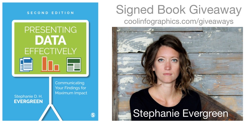
The updated 2nd Edition of Presenting Data Effectively by Dr. Stephanie Evergreen was just released! This is a fabulous resource, and the new edition includes full color images and screenshots as well as new content!

During JULY 2017, I am giving away one signed copy of Presenting Data Effectively! Register on the Giveaways Page by July 31st to be entered.

Now in striking full color, Presenting Data Effectively, Second Edition by Stephanie D. H. Evergreen shows readers how to make the research results presented in reports, slideshows, dashboards, posters, and data visualizations more interesting, engaging, and impactful. The book guides students, researchers, evaluators, and non-profit workers—anyone reporting data to an outside audience—through design choices in four primary areas: graphics, text, color, and arrangement. The Second Edition features an improved layout with larger screenshots, a review of the recent literature on data visualization, and input from a panel of graphic design experts.

Stephanie was very helpful and answered a bunch of questions I sent her about visualizing data and the updated book:

Who is the book intended for?

Stephanie Evergreen: Anyone who has to convey some information to other people should read this book, whether it is in a report, a slideshow, a dashboard, etc.


It’s been 4 years since the 1st edition. What has changed the most?

Stephanie Evergreen: Color! We are finally catching up with the modern world and printing in full color. And speaking of catching up, I’ve included a lot of new content about how we have to change how we report to adapt to a mobile reading culture.


What does it mean to present data effectively?

Stephanie Evergreen: At the very core, that means people understand what we are trying to say. Which means we will have to adjust how we talk about our work so it aligns with how humans come to understand things. So with a little bit of the research behind how brains work, we end up with many significant implications for how we report.


What makes presenting data effectively so challenging?

Stephanie Evergreen: The hardest part is uprooting the ways we have been taught to present, usually from academia. You know what I mean. Lots of bullet points. Dense slides. Too much detail. We think we have to come off this way because it will show we are studious, thorough, and very smart. But reality is that it will only confuse our audiences. And if we are confusing our audiences, we aren’t doing our job. It actually takes in-depth knowledge about a topic to be able to convey it to others with clarity.


What should readers expect to learn and apply to their own presentations?

Stephanie Evergreen: Readers will learn extremely practical guidelines to apply AND the buttons to push to make it happen, right inside the software we all already own.


Is there an ideal balance of text and visuals on a presentation slide?

Stephanie Evergreen: Slides are intended to be a visual support for our talk. So the ideal balance is enough text to frame your key point and a visual that provides the evidence or context for that key point.


How do you help people that are told to only use the company’s colors, fonts and presentation templates?

Stephanie Evergreen: Use them very well. And look for the places where the style guide *doesn’t* dictate your choices – such a font size – and do your magic in those gaps.


What are your thoughts on animated slide transitions and/or clicking to reveal different pieces of information on a slide.

Stephanie Evergreen: Please no transitions. The last thing you want is people thinking “oooh look at how her slide swept away like an ocean tide” because while they are thinking that, they’ve missed everything you were saying. Animating is a different story. Animation can be helpful to break down complex stuff and make it easier to digest. Just don’t be obnoxious (Swivel In, I’m talking about you).


How difficult is it to choose the right chart style?

Stephanie Evergreen: We have a lot of choices, so it can be difficult to even know where to begin. But if you start with your point – the thing you are actually trying to say with this data – you’re headed in the right direction. And coming up with your point, as in really doing the thinking and the analysis, is the hard part.


Is complexity the enemy of good data visualization design?

Stephanie Evergreen: Heck no! Clutter is the enemy of good data visualization design. Complex stuff can be clear and easy if we strip out all the junk.


How do you make it look so easy?

Stephanie Evergreen: I’m funny.


Is there a website to go along with the book?

Stephanie Evergreen: My website rocks. http://stephanieevergreen.com/ My blog is full of tons of resources and I put out new posts every other week that show you exactly how to do what I do. Books are awesome but they take 6 months to print and in that time, I’ve already had a dozen new ideas and the blog is where you’ll find them.


Are you speaking at any upcoming presentations or webinars?

Stephanie Evergreen: I’m on the road, criss-crossing the globe, working with truly awesome folks, giving keynotes and workshops about 35% of my life (typing on a plane right now). Check out my events here: http://stephanieevergreen.com/upcoming-events/ and come say hi or bring me in yourself.


Where’s the best place to follow you online?

Stephanie Evergreen: Dataviz nerds hang out on Twitter, so catch me there https://twitter.com/evergreendata . You can also follow my travel adventures on Instagram at: https://www.instagram.com/severgreen/

Wednesday
Nov232016

Better Presentations by Jon Schwabish: Interview & Giveaway

Better Presentations by Jon Schwabish: Interview & Giveaway

Better Presentations: A Guide for Scholars, Researchers, and Wonks is a great new book by Jon Schwabish from the newly redesigned PolicyViz! I'm especially excited about the chapter all about data visualization in presentations!

This December, I am giving away one signed copy of Better Presentations! Register on the Giveaways Page by December 31st to be entered.

 Whether you are a university professor, researcher at a think tank, graduate student, or analyst at a private firm, chances are that at some point you have presented your work in front of an audience. Most of us approach this task by converting a written document into slides, but the result is often a text-heavy presentation saddled with bullet points, stock images, and graphs too complex for an audience to decipherโ€•much less understand. Presenting is fundamentally different from writing, and with only a little more time, a little more effort, and a little more planning, you can communicate your work with force and clarity.

Designed for presenters of scholarly or data-intensive content, Better Presentations details essential strategies for developing clear, sophisticated, and visually captivating presentations. Following three core principlesโ€•visualize, unify, and focusโ€•Better Presentations describes how to visualize data effectively, find and use images appropriately, choose sensible fonts and colors, edit text for powerful delivery, and restructure a written argument for maximum engagement and persuasion. With a range of clear examples for what to do (and what not to do), the practical package offered in Better Presentations shares the best techniques to display work and the best tactics for winning over audiences. It pushes presenters past the frustration and intimidation of the process to more effective, memorable, and persuasive presentations.

Everyone should follow Jon Schwabish on Twitter (@jschwabish) and check out all the great resources on PolicyViz!


Jon answered a bunch of questions I sent him about visualizing data and the new book:

Who is the book intended for?

Jon Schwabish: I wrote the book for people who deliver data-rich content—researchers, scholars, analysts—anyone who works with data and who needs to present it to an audience. In my experience, many people who work with data and conduct research simply take their written reports and convert them to presentations—they copy their graphs and tables and paste them into a slide, and turn their text into bullet points. But there is a better way and it starts with recognizing that a written report and a presentation are two fundamentally different forms of communication. The goal of this book is to help presenters all the way through the process: From presentation construction and design, to building the presentation, to ultimately delivering the presentation.

What makes presenting so different from writing?

Jon Schwabish: The differences between writing and presenting are clearest when you think carefully about the audience. When your reader sits down with your paper, she has the opportunity to read the notes and footnotes, decipher the labels on your charts, even perhaps work through your equations. When you present, however, your audience does not have that opportunity: They are bound to your pace and content. If you fill your slides with text and bullet points, equations, and complex, detailed graphs, your audience will strain to follow you and understand your message.

There are also (or at least there should be) similarities between the two—at least when it comes to your preparation. We are all taught in grade school to set out an outline when we write a book report. Yet, we rarely do this when it comes to presentations. In the book, I propose that presenters develop their presentation before they start making slides. I walk through this outlining process and provide a worksheet that readers can use to help them outline and develop their presentation.

What should readers expect to learn and apply to their own presentations?

Jon Schwabish: The book takes you through the entire process of planning, designing, and delivering your presentation by following three guiding principles:

  • Visualize your content. We are better able to grasp and retain information through pictures than through just words, so visualize your content when you can; this includes text, statistics, and numbers whenever possible.
  • Unify the elements of your presentation. This means consistency in your use of colors and fonts, format of your slides, and integrating what you say with what you show.
  • Focus your audience’s attention where you want it at all times. Instead of putting up as much information as possible on every slide, keep your slides simple and free of clutter so that you can direct your audience’s attention. Here, I demonstrate a technique I call Layering—presenting each piece of information on its own. Together, the points come back to the original, but are now presented in more effective way for the audience. 

These three guidelines are applied to different slide elements such as text, images, and data visualizations. in the latter sections of the book, I talk about tools and technologies to create and deliver presentations.

What are the key mistakes people make in their presentations?

Jon Schwabish: I think many people view their presentation as a simple translation of their written report to slides, but again, a presentation is a fundamentally different form of communication than a report. Presenters need to put their audience first—think about how difficult it’s going to be for them to absorb your content and buy into your message as you zip through bullet after bullet, slide after slide, dense table after table.

The other big mistake people make is to not practice their presentation before they deliver it. You can practice your 15-minute conference presentation four times in an hour, which is probably four more times than anyone else at the conference. And it will show! The more you practice—actually, rehearse is probably a better term—the more familiar you will be with your content, which will reduce the need for text- and bullet-point heavy presentation. Practicing moves you away from the natural inclination to include lots of text on your slides. 

 Why is visualizing data and information in a presentation so important?

Jon Schwabish: There is a long research history that demonstrates we are more likely to grasp and retain information through pictures than just through words (typically known as the “Picture Superiority Effect”). By visualizing information, you make it easier for your audience to grasp your content and remember it. Visualizing data may be even more important in a presentation because, again, your audience is bound to your pace and how you present your data through graph choice, color, and layout.

There is a long chapter in the book on how to create effective data visualizations for presentations. I walk through basic data visualization principles and outline ways to effective communicate those data in a presentation. I demonstrate ways you can apply the Layering technique to graphs, by showing one data series at a time. But you don’t need to just Layer data—if you’re showing a more complex graph (or perhaps a graph type that is new for your audience), for example, you can start by just showing and defining the axes, and then sequentially add your data. In this way, you have defined the graphic space for the audience so they are prepared for what comes next.

What are your thoughts on animated slide transitions and/or clicking to reveal different pieces of information on a slide? 

Jon Schwabish: I’m generally not a big fan of animated slide transitions, especially the good ol’ Blinds and Checkerboard in PowerPoint and other tools. They tend to look cheesy and immature. That being said, I have found some of the “morphing” animations—Magic Move in Keynote and Morph in the newest versions of PowerPoint—to be quite useful. Say, for example, you want to walk your audience through an infographic. With these morphing animations, you can show the entire infographic and then seamlessly zoom in and scroll through the infographic on the screen. These sorts of techniques can be especially useful when you need to show the audience the full visual and then zoom in so they can see the details.

You also recently gave your presentation at a TED event. Can you share your experience?

Jon Schwabish: I spoke at the TEDxJNJ (Johnson & Johnson) event in Philadelphia. I was invited months earlier and even though I basically knew what I wanted to present right off the bat, it was a long haul to get the message just right and get the slides in great shape. I spent countless hours refining my message (especially the beginning and end), tweaking the slides, and practicing the talk.

When you’re invited to give a TEDx talk, you’re assigned a ‘coach’ who helps you develop your talk and design your visuals. We had weekly calls as I kept tweaking my message, content, and slides; I would send her audio recordings of my practice runs; and we would walk through slide design options. Just having someone who knew my content, my slides, and my struggles was invaluable. I typically try to rehearse my presentations in front of a live audience (and many of my co-workers at the Urban Institute sat in as I practiced the TEDx talk), but this experience really made me realize how valuable it is to have someone to help bounce ideas, concepts, and design off of.

Standing on that big red circle with the TEDx sign behind me was an incredible experience, and I’m thankful that people find my message value and of interest, and that I can communicate that to them in an engaging way.

Is there a website to go along with the book?

Jon Schwabish: Yes, my newly-redesigned website PolicyViz, has a whole section dedicated to the book (http://policyviz.com/better-presentations/).In that section of the site, you will find presentation, design, and data visualization resources including blogs, books, and tools. I’ve also included a section of Book Materials that you can download for your own use. In that section, I’ve included a Better Presentations Supplies Checklist that includes the technical things you may need when you go out and present. I’ve also included a Better Presentations Worksheet (the focus of Chapter 1), which will help guide your outline and organization. I’ve also included downloadable slides, icons, color palettes, and more.

Where’s the best place to follow you online?

Jon Schwabish: You can follow me on my newly-redesigned website, PolicyViz.com, which now hosts my blog, podcast, shop, and HelpMeViz project. I’m also active on the Urban Institute blog, Urban Wire, and have a researcher page there as well. I’m most active on Twitter, and you can easily find me there @jschwabish.


Jon's Bio

Jon Schwabish is an economist, writer, teacher, and creator of policy-relevant data visualizations. He is considered a leading voice for clarity and accessibility in how researchers communicate their findings. His new book Better Presentations: A Guide for Scholars, Researchers, and Wonks helps people improve the way they prepare, design, and deliver data-rich content. He is on Twitter @jschwabish


Monday
Oct102016

5 Great TED Talks about DataViz

DataViz is a broad term that has been trending for years, so what exactly is DataViz, and why does it matter? DataViz (or data visualization) is simply the visual representation of data or information. For example, charts, maps, diagrams, infographics, icons and illustrations are all forms of data visualization. It is commonly understood that humans are visual creatures. We understand visual information faster than reading text, and we are more likely to remember visual information later when it can impact a decision or behavior. As the amount of data we generate continues to increase, we need more efficient ways to understand and communicate insights from the data, and this is where DataViz is very effective.

The world is changing, and the world of DataViz is changing. In this ever evolving world, one thing is constant, TED’s ability to understand the pulse of what’s next. This is no more apparent than when TED talk influencers focus on the world of dataviz. From DataViz guru David McCandles talk on The Beauty of Visualization to medical doctor and statistician Hans Rosling talk on The Best Stats You’ve Ever Seen, you can experience the depth and breadth in the world of DataViz.


David McCandless - The Beauty of Visualization

“Design is about solving problems and providing elegant solutions, and information design is about solving information problems.”

McCandless' repertoire of visualized data has ranged from politics and climate to pop music trends. But it’s not the actual graphics that present McCandless’ true brilliance. Rather, it’s his ability to discover new ways to combine data in a fresh and interesting way. In his TED Talk, he discusses his process of turning complex data into simple yet engaging graphics.

TED Talk: http://www.ted.com/talks/david_mccandless_the_beauty_of_data_visualization


Chris Jordan -  Turning Powerful Stats into Art

“That's what I'm trying to do with my work, is to take these numbers… and to translate them into a more universal visual language, that can be felt. Because my belief is, if we can feel these issues… then they'll matter to us more than they do now.”

Artist and photographer Chris Jordan has a passion for American consumption. He strives for unique visualizations of some of Western culture’s most unimaginable statistics, solidifying the phrase, “a picture is worth a thousand words.” In his speech, Jordan invites the audience into the inspiration and process behind some of his best work- including his powerful visualization of America’s annual incarceration rate.

TED Talk: https://www.ted.com/talks/chris_jordan_pictures_some_shocking_stats


Aaron Koblin - Visualizing Ourselves… With Crowd-Sourced Data

“Our lives are being driven by data, and the presentation of that data is an opportunity for us to make some amazing interfaces that tell great stories.”

From Johnny Cash’s final music video to animating the paths of every North American airline flight, Aaron Koblin’s work is all about fun. As more and more social data becomes available, Koblin discusses how he feels it’s his obligation to tell stories through visualizations. Standing by his belief that data makes us more human, Koblin shares how interface can be used as a powerful narrative device.

TED Talk: https://www.ted.com/talks/aaron_koblin 


Hans Rosling - The Best Stats You’ve Ever Seen

“We want to see how the world is changing. Why are we not using the data we have? Because the data is hidden down in the databases. And the public is there, and the Internet is there, but we have still not used it effectively.”

It’s guaranteed that you've never seen data presented like Hans Rosling presents it. His genius stems from his ability to transform development statistics into animations that make the information clear, intuitive, and playful. In this legendary TED Talk (the first of many TED Talks he has given), Rosling discusses the idea that making information more accessible has the potential to change the quality of the information itself.

TED Talk: https://www.ted.com/talks/hans_rosling_shows_the_best_stats_you_ve_ever_seen   


Jer Thorp - Make Data More Human

“I believe that this world of data is going to be transformative for society… By bringing the human element into this story, I think we can take it to tremendous places.”

Deeply inspired by science, Jer Thorp creates beautiful data visualizations to put abstract data into a human context. At TEDxVancouver, he shares some of his finest work, and delves deeper into why his art focuses on bringing big sets of data to life.

TED Talk: https://www.ted.com/talks/jer_thorp_make_data_more_human

Monday
Aug222016

Customizing 360 Photos - I Need Your Votes

Customizing 360 Photos for Digital Marketing

I NEED YOUR VOTES!

SxSW 2017 PanelPicker is open until September 2nd, and this is the community voting portion of the SxSW conference. This is a big part of getting accepted to speak at SxSW, and I need your votes to help support two proposals. My talks proposed for the 2017 conference relate to editing and publishing 360° photos with data visualizations and graphic elements for digital marketing. This is a new content format that can also take advantage of data visualizations and infographics!

Now that Facebook natively displays immersive 360° photos, you can use 360 photography to promote your product, service, and/or brand. However, just publishing raw images is already behind the curve. In this presentation I will teach you how to embrace this technology and harness its reach. You will learn how to inject your brand, call outs, data visualizations and graphic elements to make your 360 photos a full experience for your audience. This presentation will also cover how to optimize a 360 image file, adjust the metadata, demonstrate different editing tools, and help your brand take its marketing to the next level.

You'll need to sign in or create an account to vote. Here's the Login Page

Optimizing 360 Photos for Marketing Your Brand is my Solo talk proposal

Customizing 360 Photos for Digital Marketing is my Workshop proposal

You can help in three ways:

1. Click the links above and vote for my proposal.
2. Leave a positive comment about the talk or your experience with me.
3. Share this proposal on your social pages using the buttons from the SXSW website.

Below you can see a sample edited 360° image embedded here. This example image shows the potential for branding, callouts, data visualziations and other graphic elements that can be added before a company publishes a 360° photo. For example, the white square represents the original view when posted onto Facebook. 

Demonstration of adding graphics to Bedford Boys Ranch Pokemon GO Event 360 photo - Spherical Image - RICOH THETA

You can also see the original 360° photo here, before any of the graphic elements were added.

Friday
Aug212015

Visual Storytelling: The Big Trend for SXSW 2016

It’s only August, but voting is already underway for the March 2016 South By Southwest (SxSW) Interactive conference. Long thought of as the breeding ground for new ideas and creative technologies, we can gleam industry insights from the SXSW Interactive Festival. This year, I decided not to wait until the conference to delve into the veritable buffet of groundbreaking panels vying for festival space. This year’s PanelPicker interface received more than 4,000 proposals, which is an all-time record!

While a quick search of infographics yields only 11 results, a mere TWO actually have the word “Infographics” in the title. The industry discourse has shifted away from “how-to” models to “how to do it right.” Infographics have become a key format of the larger conversation: Visual Storytelling.

A quick search for “Visual Storytelling” yields over 200 talks in PanelPicker, along with hundreds more for “data visualization” and “visual content”.  Infographics are now used as one of many effective tools in the Marketer’s toolbox, and an accepted part of the larger conversation happening in the content marketing industry.

Visual storytelling is vital to content marketing success. The following types of visual content are at the forefront of the proposals for next year’s SXSW Interactive Festival.

1.    Animated GIFs

Source: Animagraffs by Jacob O'Neal

The social media world has been slow to adopt GIFs, with Facebook only just embracing the truncated clips this year. The average human attention span in 2015 is 8.25 seconds, so these bite-sized animations are the perfect for telling a complete story in a short amount of time. The motion in the image also captures attention on an already crowded news feed.

Check out these GIF-centric presentations, “Why GIFs are turning into the New Emojis on Mobile” and “Visual Storytelling - GIFs, Graphs, and Napoleon.


2.    Visual Presentations

Slideshare and other presentation-style platforms provide a visual and interactive way to share lots of information. With millions of visitors per month, Slideshare is an easy way to have your presentations seen by a large audience.

Perfect your visual presentations with “Sucking Less When Presenting Creative” and “The Power of Poise: Chi for Pitch and Presentation.”     


3.     Real-time storytelling

Real-time storytelling has increased in popularity with the rise of live feed social platforms like Periscope and Meerkat. The ease of execution and the sheer scope of the audience made these two platforms instantly successful. While Meerkat took the prize for most buzzed app at last year’s SXSW, Periscope has the weight of Twitter behind it and has become the more successful of the two.

Use these two tools to live broadcast your events, host a Q&A, or even share professional tips to a larger audience. Perfect your live-streaming with the “Live Streaming Killed Cable TV Star” and “Igniting Creativity with Periscope” PanelPicker proposals.

Twitter Periscope

Source: AdWeek


4.    Infographics

I couldn’t get through my list without mentioning infographics. Still one of the best ways to convey complex information in a shareable and visually appealing format, infographics should be worked into your content marketing strategy. While they are no longer the only way to tell a visual story, they remain a marketing industry staple.

Round out your visual storytelling prowess with great infographics. Learn how to rock your next infographic with my own proposal, “7 Deadly Sins of Infographics Design and How to Fix Them.

The Process of Designing an Infographic


Source: Visme 

Buzzword or not, visual storytelling is something we’ve all been doing since we first snapped a picture with a polaroid camera, we’re just getting better at it. Judging by PanelPicker entries alone, the 2016 SXSW Interactive Festival will be another great year for the content marketing industry.

Monday
Aug172015

I Need Your Votes for SxSW 2016

7 Deadly Sins of Infographics Design and How to Fix Them

7 Deadly Sins of Infographics Design and How to Fix Them


SXSW 2016 Interactive PanelPicker voting is now open, and I need your votes! My talk proposal entitled "7 Deadly Sins of Infographics Design and How to Fix Them" will explore examples of the top seven mistakes designers often make, and more importantly, offer design tips to overcome these common design blunders. Follow the steps below to vote:

Step 1: Go to PanelPicker to view my proposal.
Step 2: Log in or create an account.
Step 3: Give my proposal the thumbs up to vote!
Step 4: Post a comment (SXSW loves this).
Step 5: Share with your friends on social media.


I've only given this talk once before at the Malofiej Infographics World Summit in Spain, and I'm scheduled to present it at the Big Design Dallas conference in September. (Come join me if you're in the Dallas area!)

Community voting is a large part of the PanelPicker process, so I'm reaching out to you for your support. Please vote before September 4th!

For more information on my talk, please visit Slideshare for a preview.

Thanks for your help!

Monday
Feb022015

The Anatomy of the Perfect Sales Presentation

The Anatomy of the Perfect Sales Presentation infographic

Good infographics tell stories to the audience, and you sales presentations should too. The Anatomy of the Perfect Sales Presentation from Clemence Lepers (@PPTPOP) uses an infographic story to help people learn to tell better stories with PowerPoint. Very meta isn’t it?

You’re not gonna like it, but if you’re willing to start making some solid sales presentations that’ll help you generate more business, you’ll have to print the next sentence in your brain. Nobody cares about you. I repeat, nobody cares about you.  People care about how YOU can solve their problems and deliver the outcomes they are interested in. To grab prospects attention and close more sales, you need to bring consistent, clear solutions to their problems.

Easier said than done, right?

To help you with that, I’ve created an infographic that breaks down the key elements of a highly effective sales presentation. Follow them, and you’ll be set to get your value proposition across, communicate a compelling message and convert more prospects.

There’s a structure to a story, no matter what medium is being used to tell it. Don’t just throw your data and talking points into an infographic (or a presentation). Tell a story that makes your data meaningful to the audience.

Monday
Aug182014

SxSW Voting Guide for Infographics and Data Visualization

We Need Your Votes!

The 2015 SxSW Voting Guide for Infographics and Data Visualization

It’s already time to start thinking about the 2015 SxSW Interactive Conference!  This past year there were more than 15 fantastic sessions about infographics and data visualization, which I summarized in my recap post “The State of Infographics at SxSW 2014”.  We’re planning for 2015 to be even bigger for the world of infographics, but we need your help!

Event proposals have all been submitted, and the next part of the process is public voting on the presentations and panels to help the SxSW committee choose which events to include in the schedule of events.  All of you can vote on the proposals related to data visualization and infographics to help make sure they make it into the schedule.  Please register on the SxSW PanelPicker site and cast your votes for all of them or just your favorites.

The voting period is August 11th - September 5th!  There were over 3,000 proposals submitted this year, and the best proposals related to infographics and data visualization I could find are in the list below.  However, I’m sure there are more.  Please post links to any proposals I missed in the comments below.  We need your votes, social shares and comments on the SxSW site to help convince the committee to include these sessions. 

To make sure each of these are chosen we need you to:

First - Vote for each of your favorites

Second -  Share on social using the buttons on the SxSW pages to increase the counters

Third - Comment on their relevancy to you personally, the committee will review the comments

Help us make data visualization and infographics the best topic at SxSW 2015!

Tuesday
Feb042014

Live Events in Washington DC and Florida

Cool Infographics On The Road February 2014

If you’re located near Washington, DC or Fort Lauderdale, FL, I’ll be there next week!  I have a packed schedule of both public and private events, so check your schedule and join me if you can!  I’ll be presenting about data visualization and infographics, and signing books.  I look forward to meeting you!

Washington DC

Monday, Feb 10th, 3:00pm CBO (Congressional Budget Office) - private event and book signing

Tuesday, Feb 11th, 12:00pm, Noblis Tech Tuesday - private event and book signing

Tuesday, Feb 11th, 6:30pm, Data Visualization DC Meetup group - PUBLIC presentation, book signing and data drinks!

Register here: http://www.meetup.com/Data-Visualization-DC/events/164211042/

Wednesday, Feb 12th, Greater Washington Board of Trade Morning Star Speaker Series - PUBLIC event

* Discount for Cool Infographics readers - use the code “Cool*Infographics” at checkout to get the member price even if you’re a non-member ($25 discount)!

** No book sales allowed in the Ronald Reagan Building, so you must purchase a book beforehand if you would like me to sign it at the event.  You will be offered the chance to buy a book during online registration.

Register here: http://www.bot.org/events/programs/morning-star-speaker-series/randy-krum.aspx


Miami, FL

Thursday, Feb 13th, 11:00am, University of Miami - Guest Lecturer in Alberto Cairo’s Visual Journalism Infographics class


Fort Lauderdale, FL

Thursday, Feb 13th, 6:30pm, sfim@ (South Florida Interactive Marketing Association) - PUBLIC event and networking

Register here: http://www.sfima.com/EventDetail.aspx?id=872


You can always find my current list of upcoming events on the Appearances page!


Monday
Mar182013

See Conference April 20th

see#8 | 20 APRIL 2013 | SCHLACHTHOF WIESBADEN from Scholz & Volkmer GmbH on Vimeo.


I really wish I could make it to the See Conference (The Conference on Visualization of Information) in Germany (www.see-conference.org).  This year looks like they have a great conference lined up!

For eighth years now the see conference has been gathering the most creative people and exciting ideas on the topic of information visualization. The interdisciplinary platform brings together fields like design, art, architecture and new technologies. Our international speakers will show the latest ideas and approaches on how to deal with the current flood of information, on how to visualize it and turn it into something that can be experienced. Among our new speakers at see#8: Data journalist Francesco Franchi, Dutch design studio Catalogtree and British-born Antony Turner from Carbon Visuals. More info regarding program and tickets at www.see-conference.org

Event: see conference #8 
Date: 20 April 2013 
Location: Wiesbaden, Germany 
URL: www.see-conference.org

If you have a chance to make it to this conference, I would highly recommend it.  When I looked today, there were only 161 seats left!

Let me know what you think if you make it to the conference!