About
Randy Krum
President of InfoNewt.
Data Visualization and Infographic Design

Infographic Design

Infographics Design | Presentations
Consulting | Data Visualizations

DFW DataViz Meetup

Join the DFW Data Visualization and Infographics Meetup Group if you're in the Dallas/Fort Worth area!

Search the Cool Infographics site

Custom Search

Subscriptions:


Feedburner

The Cool Infographics® Gallery:

How to add the
Cool Infographics button to your:

Cool Infographics iOS icon

- iPhone
- iPad
- iPod Touch


Read on Flipboard for iPad and iPhone

Featured in the Tech & Science category

Flipboard icon

Twitter Feed
From the Bookstore

Caffeine Poster

The Caffeine Poster infographic

Entries in innovation (10)

Wednesday
Mar062013

3D Printing: How Long Till The Revolution?

I can’t wait!  3D Printing: How Long till the Revolution? from the Farnell/Newark Group and designed by Neo Mammalian Studios takes a stab at predicting the rise of 3D printing.  Seriously, I want the day when I can print out my own coffee cup design, custom LEGO shapes and a new iPhone case!  Download the model, and print!  That flimsy plastic piece from the vacuum broke again?!?  Just print a new one!

3D printing has slowly started to get popular in use in the industry, by the hobbyists and ordinary individuals in their homes. If you can design it, the 3D printer can build it. However, we are still in the early stage of owning and using 3D printer. So, what is the length of time before it will become mainstream like the PC? The infographic will show when will every American own a 3D printer and how it affects the profit of those who are selling consumer objects and more.

The doughnut charts are colorful and unique in that hexagon shape.  The use of Roger’s Diffusion of Innovations line charts is actually very easy to understand.  The comparisons to the PC market and to music sales online are great analogies.

“3D printing is only gonna get more awesome.”

Found on Visual Loop!

Monday
Jul302012

Olympic Swimming 2012: Faster, Better, Stronger

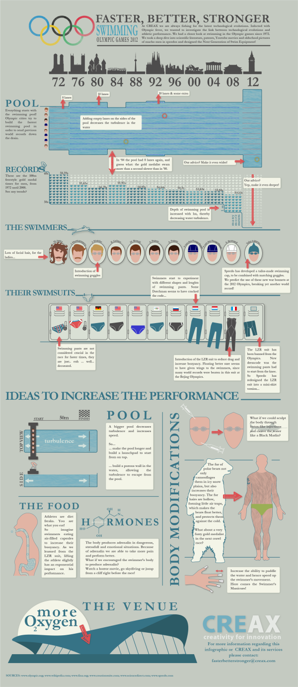
Olympic Swimming 2012: Faster, Better, Stronger infographic

CREAX created this infographic for their June 2012 newsletter. Every day, they analyse tens of thousands of patents and look for clues of “the next breakthrough innovation” in all kinds of industries.  In their Olympic Swimming 2012: Faster, Better, Stronger infographic, they combined their knowledge of innovation with the upcoming olympics.  The infographic links the performances of swimmers with technology in swimming gear, pools and venues for the last 10 Olympics, and their predictions for the future.

At CREAX we are always fishing for the latest technological evolutions. Infected with Olympic fever, we wanted to investigate the link between technological evolutions and athletic performance. We had a closer look at swimming in the Olympic games since 1972. We took a deep dive into scientific literature, patents, Youtube movies and old school pictures of macho men in speedos and designed the Next Generation of Swim Equipment!

This design had a number of really cool data visualization styles that are nicely customized to the data they represent.  Just remember that the 2012 data is their suggestion, not the actual data from the current Olympics!

  • I like that each visualization matches the timeline across the top for consistency, and the monument silhouettes are great for each location.
  • The timeline of swimming pool lanes is great, as the overal width changed over the years.
  • I liked the depth of the swimming pool as an inverted bar chart, but the small icons of Speedo swimsuits are totally unnecessary and detract from the data.
  • Love the isotype hair styles
  • I like actually seeing designs of the swim suit styles, and I guess the flags are for the gold medal winner for each Olympics?

Overall, a good design.  The text blocks are too small to be full-justified.  A copyright statement and the URL to the high-resolution original infographic should be included at the bottom.

Thanks to Frederik for sending in the link!

Thursday
May212009

What is Wolfram|Alpha?

I'm not sure I understand what Wolfram|Alpha is yet, but so far it's pretty impressive.  Developed by Stephen Wolfram and his team, it claims to be a "computational knowledge engine".  The input box looks like a search engine, but it is definitely NOT a search engine.


When you type in a question, it attempts to show you all of the relevant data it can find.  It is actually calculating and charting this information real-time in order to present it to you.  Because its built on top of the Mathematica Engine, it can also handle math problems.


I think this will be an important tool for many designers of infographics, because you can get some of your raw data directly from Wolfram|Alpha.  As they add more data into the system over time, this will become one of your best resources for information.  They have a pretty extensive page of examples by category that is a great place to start.  Also watch the short video by Stephen Wolfram showing what the system can do.

Monday
Mar092009

Microsoft's Vision 2019

Apparently by 2019, we will all live in an infographic world, and that's good news for us.  Microsoft had the first public showing of the video at the Wharton Business Technology Conference.  Some found Microsoft's video inspiring, and some were not impressed.

I love some of the ideas shown in the video, but much of it also felt like the magic of Hollywood.  Because this blog is focused on infographics, I understand how much thought and effort from the designer goes into making just one infographic image useful and easy to understand.

Tuesday
Jan202009

Dramatic Shift in Marketing Reality


Scholz & Friends: "Dramatic shift in marketing reality from Michael Reissinger on Vimeo.

Great little video from Michael Reissinger on the need for innovation and consumer interactions in today's marketing world.

Found through Twitter: @stonepayton

Monday
Aug042008

The Art of Visual Thinking

Last week, Guy Kawasaki posted a good interview with Dan Roam on his blog.

Do you recognize this picture? It's how Southwest Airlines was pitched.

To provide more insight into the process of visual thinking, I tapped Dan Roam. He is the author of The Back of the Napkin: Solving Problems and Selling Ideas with Pictures . In this interview he explains why and how to use visual thinking in your business. Click here to read it. To learn even more about visual thinking, be sure to read his book.

Monday
Jul282008

Visualizing the Design Process: Michael DiTullo

Over on Think>Map>Draw, Michael DiTullo, the Design Director for Converse, shared his thoughts about design and sketched this parallel design process between the intended design process and the actual design process.

Sketch image: 2008 copyrighted Michael DiTullo and released under a Creative Commons Attribution-Noncommercial-No Derivative Works 3.0 Unported License.

Wednesday
Jul162008

iPhone 3G under the hood

Will all of the hype around the launch of the iPhone 3G, I wanted to share a simple infographic showing the circuitboard from inside one of the new phones.  It clearly identifies each major component and also adds what that compnent does inside the phone.  The graphic really adds a significant amount of depth to the article.

The full article is from TechOnline.

Tuesday
May272008

Approach to Creating Experiences


Found on Think>Draw>Make, the Approach to Creating Experiences is from David Armano from the very influential Logic + Emotion.

It’s a high-level attempt to document an approach to designing an interactive experience within an agency setting.

Saturday
May032008

Fostering Innovation at Pixar


Only a little bit off-topic. This is a great interview with Brad Bird from Pixar on how they build an environment for innovation. The lessons apply to movies, product development, design and of course designing infographics. Lesson Six is my personal favorite!

Found on Daringfireball.net