Olympic Swimming 2012: Faster, Better, Stronger
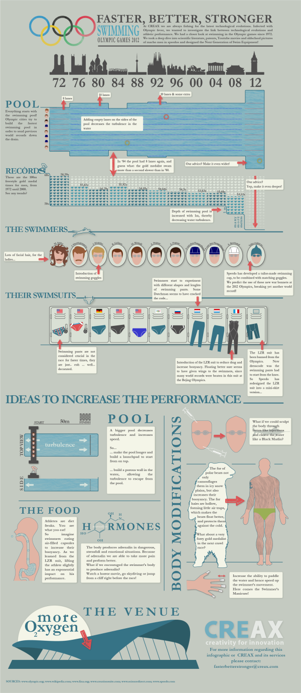
CREAX created this infographic for their June 2012 newsletter. Every day, they analyse tens of thousands of patents and look for clues of “the next breakthrough innovation” in all kinds of industries. In their Olympic Swimming 2012: Faster, Better, Stronger infographic, they combined their knowledge of innovation with the upcoming olympics. The infographic links the performances of swimmers with technology in swimming gear, pools and venues for the last 10 Olympics, and their predictions for the future.
At CREAX we are always fishing for the latest technological evolutions. Infected with Olympic fever, we wanted to investigate the link between technological evolutions and athletic performance. We had a closer look at swimming in the Olympic games since 1972. We took a deep dive into scientific literature, patents, Youtube movies and old school pictures of macho men in speedos and designed the Next Generation of Swim Equipment!
This design had a number of really cool data visualization styles that are nicely customized to the data they represent. Just remember that the 2012 data is their suggestion, not the actual data from the current Olympics!
- I like that each visualization matches the timeline across the top for consistency, and the monument silhouettes are great for each location.
- The timeline of swimming pool lanes is great, as the overal width changed over the years.
- I liked the depth of the swimming pool as an inverted bar chart, but the small icons of Speedo swimsuits are totally unnecessary and detract from the data.
- Love the isotype hair styles
- I like actually seeing designs of the swim suit styles, and I guess the flags are for the gold medal winner for each Olympics?
Overall, a good design. The text blocks are too small to be full-justified. A copyright statement and the URL to the high-resolution original infographic should be included at the bottom.
Thanks to Frederik for sending in the link!


 Randy
Randy

Reader Comments (6)
Glucose Test Strips
http://www.diaticmedical.com/