2012 London Olympic Venues
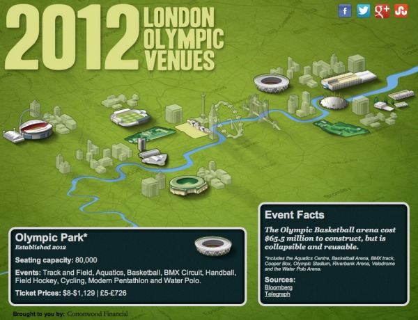
The 2012 London Olympic Venues from Cottonwood Financial’s CashStore.com site is an interactive infographic design showing facts and information about each of the main event locations in London.
The 2012 London Olympics are rapidly approaching, and they’re set to become the most expensive games yet with a budget of $14.5 billion. So what can Olympic attendees expect this year? Impressive landmarks, state of the art facilities, millions of sports fans and of course the best athletes in the world competing for the title of Olympic Champion.
Click the venues for more information on the events and ticket prices (figures in U.S. dollars and British pounds) for each one.
I really like the interactivity, but I think they used way too much text. All of the statistics (like seating capacity and ticket prices) should have been visualized to make it easy for the reader to see. Event icons and the Olympics are always tied together, so lining up this year’s icon designs instead of the text event names would have been more visually appealing as well.
The reader clicks on each of the venues to bring up different information, but the building illustration is the only indicator showing which venue the information is referring . A connecting line or a highlight color to indicate which building is currently being displayed would have helped out tremendously.
It’s all designed in HTML5 too, so all of the interactivity works on mobile devices (like the iPad) as well! Very cool!
I’m very jealous if you’re going to any of these events, but this guide could give you some idea of what to expect when you get there.
Thanks to Joe for sending in the link!


 Randy
Randy

Reader Comments (3)